


Structural Demographic Trends in U.S. Employment Data
Economics / Employment Oct 24, 2013 - 04:12 PM GMTBy: PhilStockWorld

 Courtesy of Doug Short: The Labor Force Participation Rate (LFPR) is a simple computation: You take the Civilian Labor Force (people age 16 and over employed or seeking employment) and divide it by the Civilian Noninstitutional Population (those 16 and over not in the military and or committed to an institution). The result is the participation rate expressed as a percent.
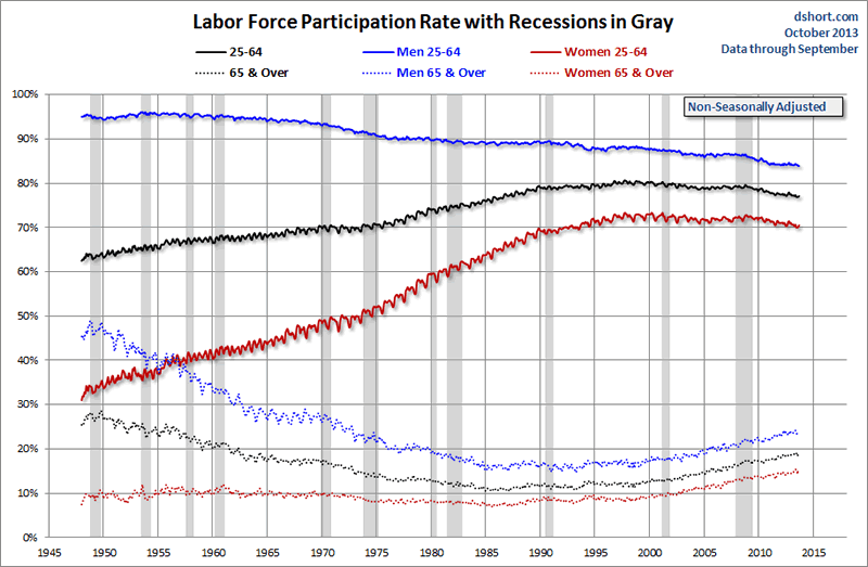
The first chart below splits up the LFPR data since 1948 in two ways: by age and by gender. For the former, I chose the 25-64 age cohorts to represent what we traditionally think of as the “productive” (pre-retirement age) work force. The BLS has data for ages 16 and over, but across this 64-year time frame college attendance has surged dramatically. So I opted for age 25 as the lower boundary to reduce the college-years skew.
Note the squiggly lines for the productive years and jumbled dots for the older cohorts. These result from my use of non-seasonally adjusted data. The BLS does have seasonally adjusted data for many cohorts, but not the older ones, so I used the non-adjusted numbers for consistency.
The next chart eliminates the squiggles with a simple but effective seasonal adjustment suitable for long timeframes, a 12-month moving average. I’ve also added some callouts to quantify the data in 1948 and the present.
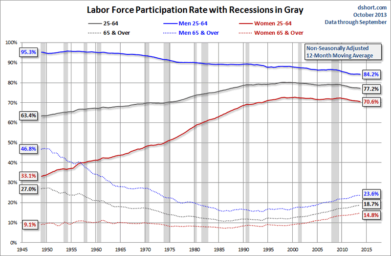
It doesn’t take Ph.D. in sociology to recognize some significant changes in the chart above. The growth of women in the workplace, the solid red line, was a major trend. The financial advantage of two income households was boosted by Title VII of the Civil Rights Act of 1964, which prohibits discrimination by race, color, religion, sex, or national origin. The Age Discrimination in Employment Act of 1967 helped to stabilize the decline in the 65 and over participation rate, at least until the 11-month recession that started in December 1969.
As for the age 25-64 cohorts, the participation rate for men peaked way back in May 1954 at 95.9%; for women it was fifty years later in October 2004 at 72.8%, and for the combined cohort is was in March 1998 at 80.2%.
The dotted lines representing ages 65 and over also illustrate some dramatic changes. A vision of the good life in retirement, assisted by a burgeoning Social Security system, was a standard expectation for pre-Boomer generations. The advent of Medicare in 1965 and Social Security COLAs (cost-of-living adjustments) in 1975 added to their confidence in the Golden Years.
However, the LFPR for the “elderly” (a term I use respectfully as a member of that cohort) flattened out in the mid-1980s and then began increasing — slowly at first and more significantly around the turn of the century, as the numbers for the productive cohort continued to decline. The next chart gives us a clearer look at the relative patterns of growth and contraction.
Since January 2000, the participation rate for all the elderly has soared by 50 percent and by more than 60 percent for elderly women.
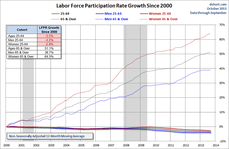
Labor Force Participation Rate by Age Groups Since 2000
The next chart shows the data for six age cohorts since 2000 with no gender distinction. Two recessions and two savage market selloffs were no doubt major drivers of the trends we see here. For this close-up I used seasonally the BLS’s adjusted data for four cohorts ranging in age from 16-54, but only non-seasonally adjusted data is available for the two older cohorts, which accounts for the more noticeable squiggles.
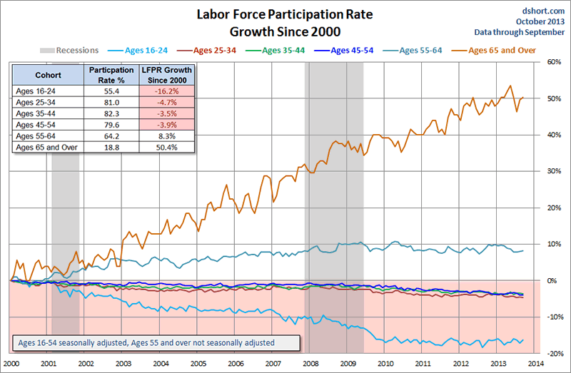
For an apples-to-apples comparison, here is the non-seasonally adjusted data for all six cohorts smoothed with 12-month moving averages.
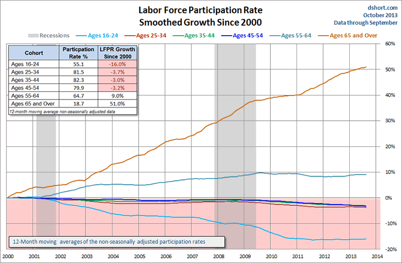
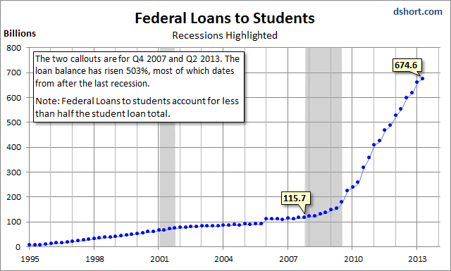
While the LFPR growth for the elderly is the most striking feature in the chart above, we also see a noticeable decline for the youngest cohort. A significant driver of this trend has been the decision to stay in (or go back to) school for more education. Supporting evidence is found in the eye-popping growth of student loan debt, especially since the onset of the Great Recession. To be sure, some of that trend is accounted for by older cohorts heading back to school in hopes of improving their employment prospects.
Another interesting if less conspicuous line in the chart of the six age cohorts above is the blue one, representing ages 45-54. Household income data tells us that historically this age bracket has the distinction of being the peak earning years. For more on this topic, see this commentary. It thus comes as a surprise that the LFPR for the peak earners is down 3.2% since the turn of the century.
Our Aging Work Force
I’ll close this commentary with a pair of pie charts based on annual data to illustrate the change in the six cohorts from 2000 to 2012.
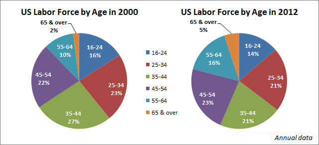
For some simple math: In 2000, the three younger cohorts constituted 66% of the workforce. Now they have shrunk to 56%, which means the 45 and older workers have grown from 34% to 44% of the labor force. In the late 1990s the dream of early retirement was common among the Boomers. But the reality is that an increasing number are delaying retirement, and many who did retire have now reentered the workforce.
There is little doubt that the two 20th century recessions and major market selloffs devastated the retirement readiness for a great many of the individuals nearing that milestone. And many who had retired were ultimately forced to reenter the workforce to make ends meet.
Footnote on Data Revisions: The BLS’s monthly employment data is probably the most closely watched economic report, especially in light of the Fed’s linkage of monetary policy with the unemployment rate. Last Friday’s news of 169K new jobs in August made headlines in the financial press. History tells us, however, to have little confidence in its accuracy, for the series is subject to substantial revisions. How substantial? For some particulars, see this BLS publication showing the rather amazing revisions since 1979.
In contrast, the Labor Force Participation Rate discussed in this commentary is based on large enough numbers that historical revisions are quite small. For example, if we study the revisions of the 16-and-over LFPR since 1948, the earliest changes date from 1994. Since then, the initial LFPR number has been revised about 62 percent of the time. Most revisions were 0.1 percent, a few were 0.2 percent, and only once has there been a revision of 0.3 percent; that was for February 2000, the month before the market peaked. That data point was dropped by 0.2 percent in the January 2001 report and another 0.1 percent 25 months later in the February 2003 report.
My data source for the charts and numbers in the commentary is the BLS’s Databases & Tools page — specifically the Labor Force Statistics here.- Phil
Philip R. Davis is a founder of Phil's Stock World (www.philstockworld.com), a stock and options trading site that teaches the art of options trading to newcomers and devises advanced strategies for expert traders. Mr. Davis is a serial entrepreneur, having founded software company Accu-Title, a real estate title insurance software solution, and is also the President of the Delphi Consulting Corp., an M&A consulting firm that helps large and small companies obtain funding and close deals. He was also the founder of Accu-Search, a property data corporation that was sold to DataTrace in 2004 and Personality Plus, a precursor to eHarmony.com. Phil was a former editor of a UMass/Amherst humor magazine and it shows in his writing -- which is filled with colorful commentary along with very specific ideas on stock option purchases (Phil rarely holds actual stocks). Visit: Phil's Stock World (www.philstockworld.com)
© 2013 Copyright PhilStockWorld - All Rights Reserved Disclaimer: The above is a matter of opinion provided for general information purposes only and is not intended as investment advice. Information and analysis above are derived from sources and utilising methods believed to be reliable, but we cannot accept responsibility for any losses you may incur as a result of this analysis. Individuals should consult with their personal financial advisors.
PhilStockWorld Archive |
© 2005-2022 http://www.MarketOracle.co.uk - The Market Oracle is a FREE Daily Financial Markets Analysis & Forecasting online publication.