


Bitcoin Price Charts In-Depth Analysis
Currencies / Bitcoin Sep 19, 2014 - 02:02 PM GMTBy: Steve_H_Hanke

 Bitcoin, the new digital currency, remains a mystery to many. There is no better way to lift the fog surrounding bitcoin than to let the data speak. And data speaks loudest through charts. Yes, topological analysis is often the best route to comprehension.
I have constructed -- with my assistant, Mazin Al-Rayes -- a series of charts that contain illuminating data about bitcoins and brief directions for use following each chart.
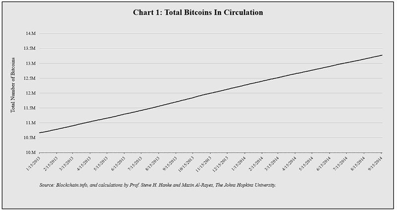
How to interpret: Currently there are 13.235 million bitcoins in circulation. The issuance of new bitcoins will halt when the total number of bitcoins "mined" (read: in circulation) reaches 21 million.
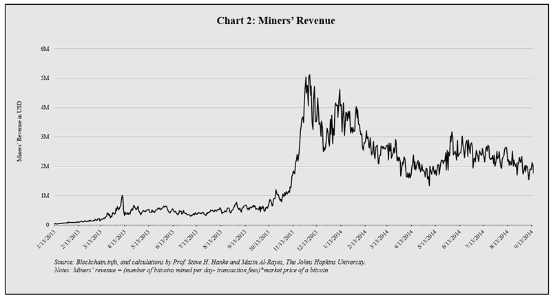
How to interpret: This chart shows the total revenue in USD of bitcoin miners (See: the formula at the bottom of the chart for the calculation). A bitcoin miner can be anyone with a computer and a connection to the internet. Miners lend their computers' processing power to the bitcoin network and are compensated with new bitcoins. Many miners use hardware designed specifically for mining, others simply use their home computers -- pooling their processing power via the internet and sharing the rewards.
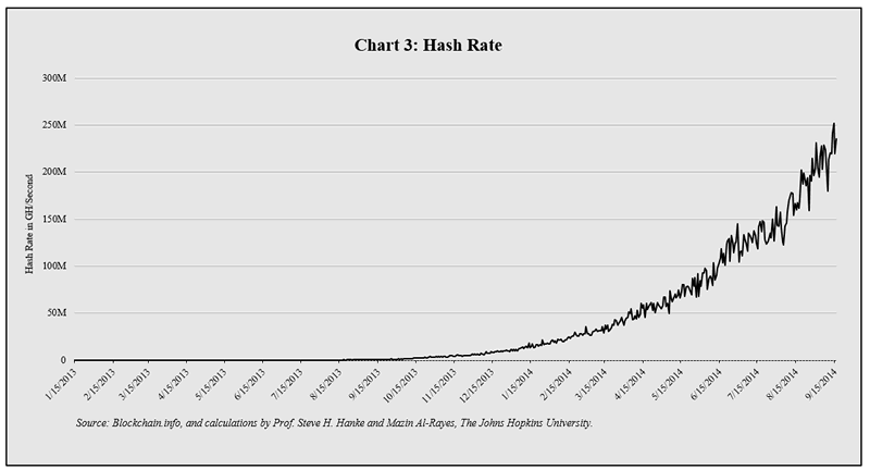
How to interpret: This chart shows the estimated number of giga-hashes per second that the bitcoin network is performing. It's clear that the processing power of the bitcoin network increased over time. The hash rate increased for a myriad of reasons: an increased number of miners, collaboration of miners in pools and hardware capacity.
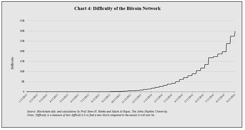
How to interpret: New bitcoins are created at a predictable rate. This rate is a function of both the difficulty level of a bitcoin miner's mathematical operation and the processing power of a miner's hardware.
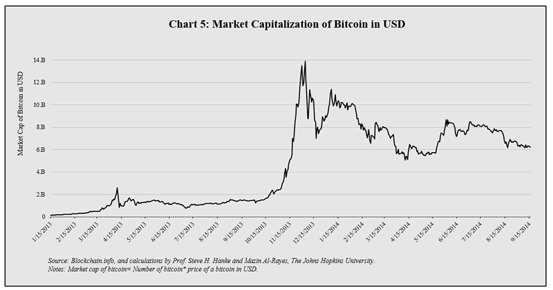
How to interpret: This chart shows the bitcoin market capitalization. This is calculated by multiplying the total number of bitcoins by the market price of a bitcoin in USD.
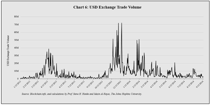
How to interpret: This chart shows the trade volume in USD from the largest bitcoin exchanges.
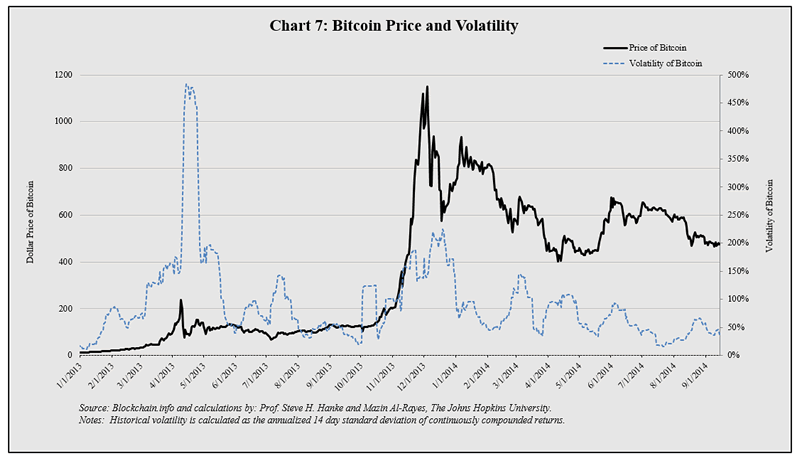
How to Interpret: This chart shows the price and volatility of the bitcoin. Volatility is calculated by annualizing the standard deviation of the daily returns of the past 14 days. If the price behavior over the past 14 days remains the same for one year, the volatility charted above can be interpreted as the expected price change range (+ or -) at the end of the year.
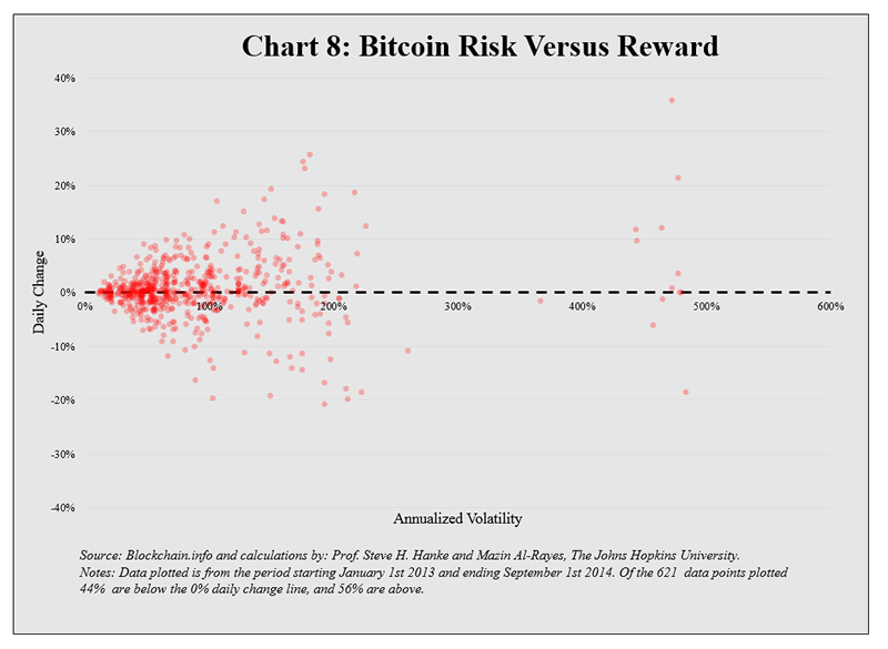
How to Interpret: Each day the volatility of bitcoins (as calculated in Chart 7) is plotted against the return on bitcoins that day. In the chart, the number of days above the 0% line is greater than the number of days below the 0% line, because the price of bitcoins has been trending upward since 1 January 2013.
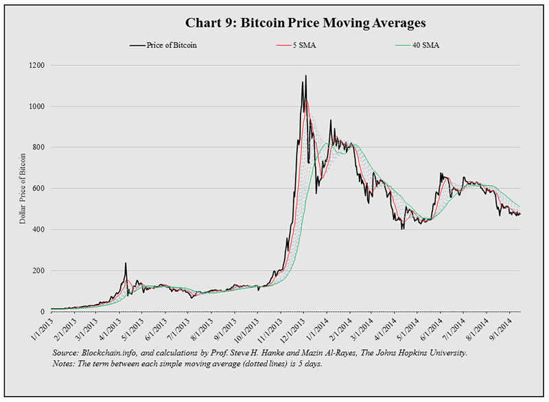
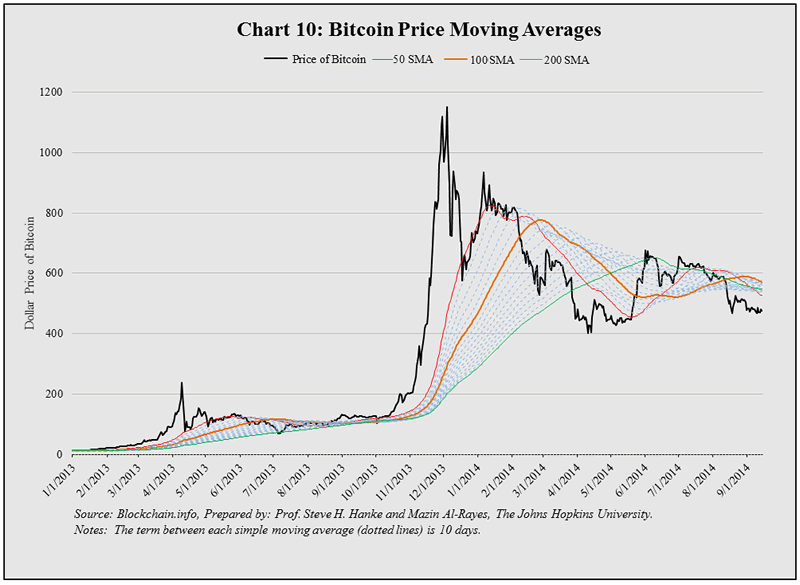
How to interpret: A simple moving average (SMA) is the average of the price over the past X days. When a short-term moving average crosses over and exceeds a long-term moving average, price momentum in the market is accelerating. When a short-term moving average falls below a long-term moving average, price momentum in the market is decelerating.
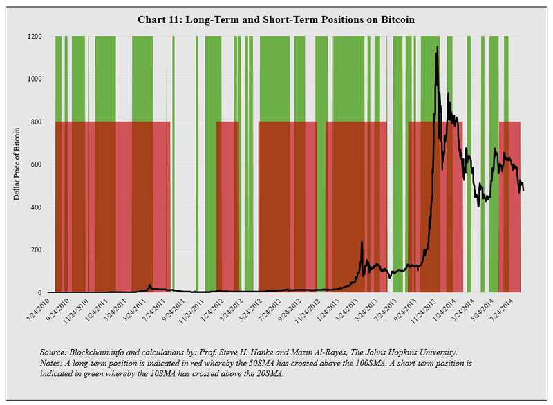
How to interpret: We have chosen to measure long-term trends with 50- and 100-day simple moving averages, and short-term trends with 10- and 20-day simple moving averages. When the 50-day simple moving average is greater than the 100-day moving average, the long-term position is indicated in red. When the 10-day simple moving average is greater than the 20-day simple moving average, the short-term position is indicated in green.
By Steve H. Hanke
www.cato.org/people/hanke.html
Twitter: @Steve_Hanke
Steve H. Hanke is a Professor of Applied Economics and Co-Director of the Institute for Applied Economics, Global Health, and the Study of Business Enterprise at The Johns Hopkins University in Baltimore. Prof. Hanke is also a Senior Fellow at the Cato Institute in Washington, D.C.; a Distinguished Professor at the Universitas Pelita Harapan in Jakarta, Indonesia; a Senior Advisor at the Renmin University of China’s International Monetary Research Institute in Beijing; a Special Counselor to the Center for Financial Stability in New York; a member of the National Bank of Kuwait’s International Advisory Board (chaired by Sir John Major); a member of the Financial Advisory Council of the United Arab Emirates; and a contributing editor at Globe Asia Magazine.
Copyright © 2014 Steve H. Hanke - All Rights Reserved
Disclaimer: The above is a matter of opinion provided for general information purposes only and is not intended as investment advice. Information and analysis above are derived from sources and utilising methods believed to be reliable, but we cannot accept responsibility for any losses you may incur as a result of this analysis. Individuals should consult with their personal financial advisors.
Steve H. Hanke Archive |
© 2005-2022 http://www.MarketOracle.co.uk - The Market Oracle is a FREE Daily Financial Markets Analysis & Forecasting online publication.