


Gold Oil and Commodities …Back to the Future ?
Commodities / Commodities Trading Nov 16, 2018 - 09:53 AM GMT

 Before we look at tonights charts I would like to take a minute to discuss trading the three X leveraged etf’s. Leveraged etf’s aren’t for everyone as they can be very volatile. These instruments are for those that can take a bigger risk and still come out OK when they go against you. For the average investor a 1 X leveraged etf is all they can handle and that should be fine. When you start playing with the 2 X and 3 X leveraged etf’s your risk factor goes up very fast.
Placing a sell/stop in the correct place works great for the 1 X leveraged etf, but when you are in a 3 X leveraged etf setting the sell/stop is a totally different game. Very rarely do I let the original sell/stop be hit before I will exit the trade as you have to give the stock some wiggle room when you first take a position. As more information becomes available you can start to make adjustments to your sell/stop mentally. A 3 X etf can get away from you in a heartbeat so one has to pay very close attention at all times.
With the 3 X Kamikaze stocks the leverage can be very high and can knock you out of a decent trade before it has time to start working in your favor. There is no worse feeling than waking up in the morning and seeing one of your Kamikaze stocks trading down15% or more before you can do anything about it. This is why we call them Kamikaze stocks.
Always keep in mind that leverage can cut both ways. During that two year bull run in the stock markets from 2016 to January of this year we had as many as 35 stocks at one time with many being 3 X leveraged positions. Once you can get ahead on your positions you can then move your sell/stop accordingly. As I’m more of an intermediate term trader I like to use the 30 week ema as my sell/stop as it usually gives the stock enough room to breathe. Again, leveraged stocks are not for everyone so please keep that in mind the next time you are deciding where or not to take on the leverage.
Tonight I would like to start out by looking at the HUI and show you why I decided to exit all my Kamikaze stocks today. The Kamikaze stocks are similar to options that decrease in value over time, but not to the extreme an option can lose value. It’s more of a slow decay in price, but after a fair amount of time you can begin to see the decay working against you which is why you try to time your purchases during an impulse move. Even then when a consolidation pattern starts to build out time is eroding your Kamikaze stock.
Below is one of the weekly charts we’ve been following which shows the parallel 2016 downtrend channel. In the center of the downtrend channel you can see the blue 7 point falling wedge reversal pattern. It’s a reversal pattern because it formed above the December 2016 low. The blue arrows measure the price objective which was down to the 119 area. The actual low came in at 131which was about 12 points higher than the price objective which could be close enough to call it done. Also you can see the black dashed horizontal line that is taken from the double bottom hump made back in 2015 which led to that impulse move up to the August 2016 high. Note how the HUI has been trading around the double bottom hump trendline around the 139 area making little progress.
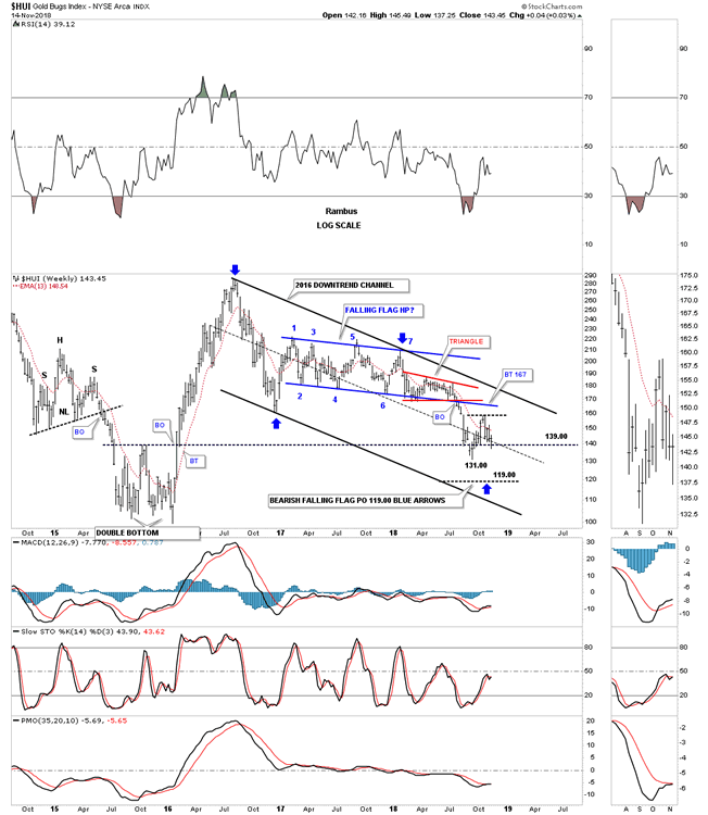
This next chart is a longer term weekly look at the HUI which shows the same percentage bear market rallies in the blue shaded vertical areas. Note the brown shaded support and resistance zone the HUI has been trading in that runs from the 2015 double bottom hump at 139 to the 2008 low at 150 with a quick tick up to the bottom of the first reversal point point in the blue triangle at 162. So far the HUI has been trading within the brown shaded S&R zone for close to three months now frustrating both the bulls and bears alike.
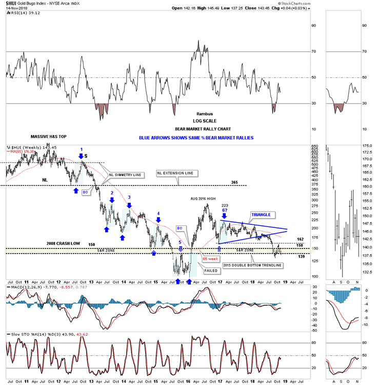
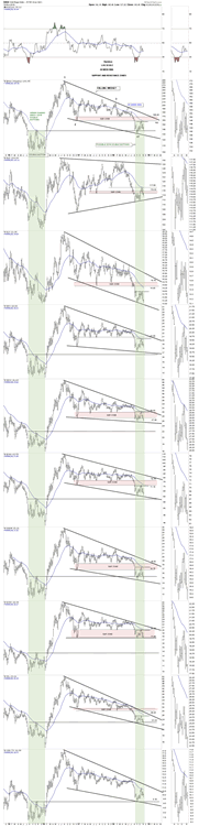
This next combo chart I’ve only shared with you one time several months ago which shows the pink shaded S&R zones. It’s too early to know yet, but there is a possibility that the PM stock indexes may be building out a double bottom on the double bottom hump from the 2015 double bottom. That was a mouthful. The green vertical shaded area on the left hand side of the chart shows the 2015 double bottoms where applicable. The green vertical shaded area on the right side of the chart shows the possible 2018 double bottoms forming on many of the stocks indexes. Some of the possible double bottoms are forming right on or just above the 2015 double bottom hump like the HUI, SGDM, XAU, XGD.TO and SIL.
I’ve been showing you the 2016 decline as a possible parallel downtrend channel as shown on the weekly chart just above the one above. With the possible double bottom building out I changed the angle of the lower trendline to intersect the possible double bottom which gives us a 25 month falling wedge formation in most cases. Please keep in mind this is only a possibility right now as there is a lot of overhead work that needs to be done before we can entertain the thought that we have a potentially bullish rising wedge building out. If in fact these PM stocks are putting in a small double bottom, which is creating the fourth reversal point in the falling wedge, then in most cases we could possibly be trading right at a very important low. Let me stress one more time, this is only a possibility right now, but it shouldn’t take too long to get our answer.
Next we need to look at oil as it may be sending us an alarm about the US stock markets. There is kind of a misconception that the economy does better when oil is cheap and plentiful, but that’s not totally accurate. Normally the stock markets and the Transportation Average like a rising oil price as long as it doesn’t get out of control to the upside. With oil crashing since the first of October it’s not what I wanted to see for the continuation of the bull market in stocks. Oil should be trading sideways while the US stock markets continue their sideways trading range that began in January of this year.
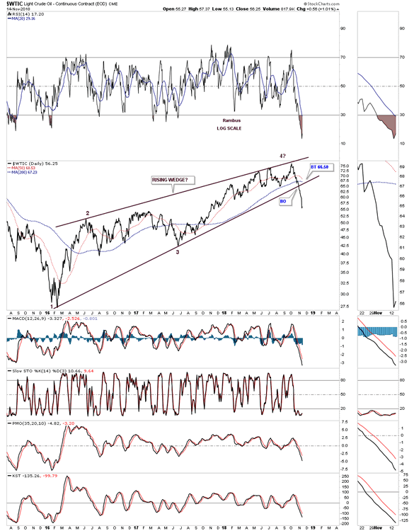
I have a ton of oil charts so lets start with a daily line chart, in linear scale, which shows the bottom rail of the 2016 uptrend channel giving way this week.
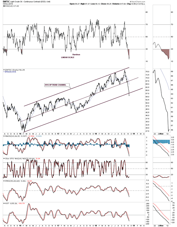
The daly log scale of the same price action shows us a bearish rising wedge.
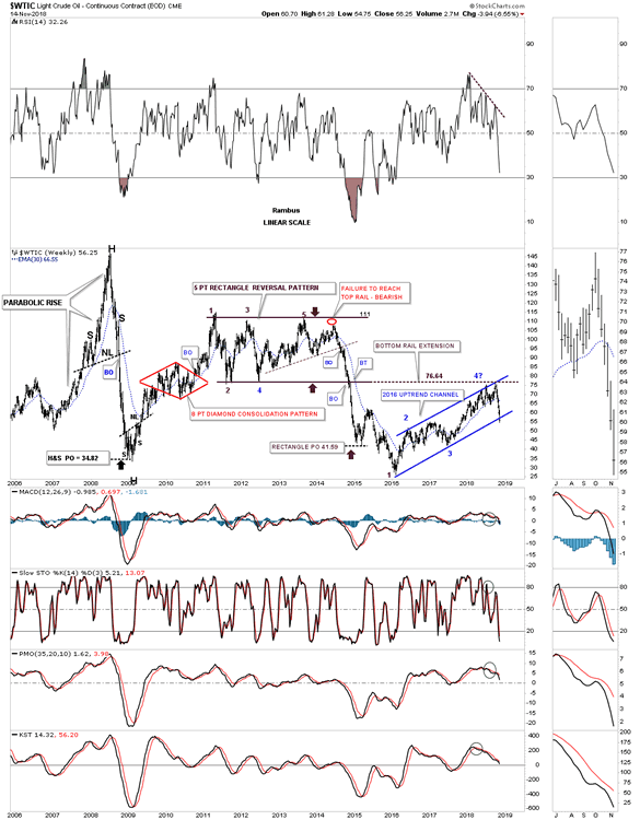
This next chart for oil is a long term weekly chart in linear scale, which shows the 2016 uptrend channel hitting the underside of the 5 point rectangle reversal pattern that formed the last major high. Note how short and sweet the breakout and backtest were when the bottom rail finally gave way after nearly four years of trading. That big rectangle is just part of an even bigger topping pattern. Note the parabolic rise on the left side of the chart which finally ended at 147 and then the parabolic decline down to 34.82 as measured by that H&S top. For whatever reasons oil measures out best using the linear scale.
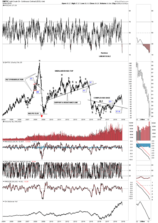
This next chart shows the massive H&S top that we had to wait forever before the price action finally broke down below the neckline. As you can see when oil decides it’s time to decline it doesn’t waste anytime in doing so. Note the decline during the 2008 crash and the one that broke down in August of 2014 when the US dollar was in its breakout move out of its eleven year base. A backtest to the neckline extension line would come into play around the 48 area.
This next chart I built out after the 2015 decline ended and drew in the top and bottom rails of a potential downtrend channel that is actually converging. Earlier before the breakdown began I thought the price action would at least hit the top rail before we would see any serious decline, but that doesn’t look like the case now.
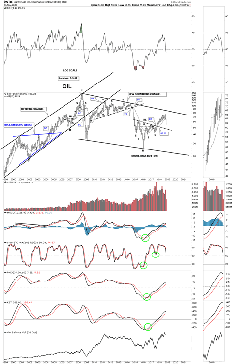
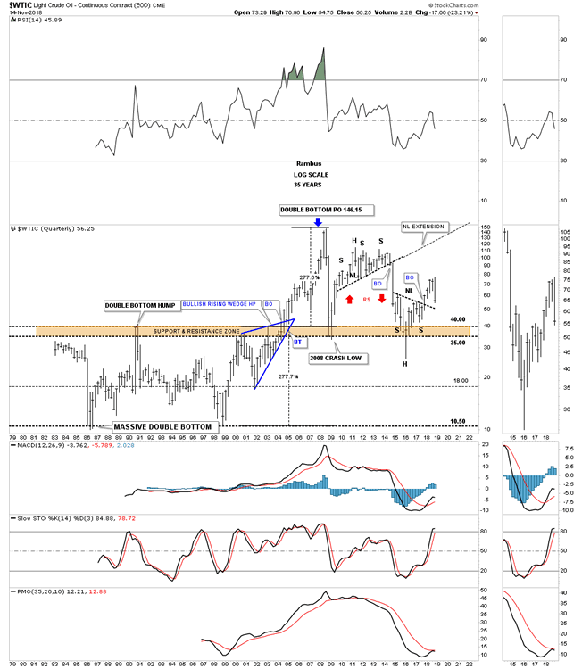
This last chart for the $WTIC shows the entire history going all the way back to the early 1980’s. When oil was crashing in 2015 it broke below the long term brown shaded S&R zone and it looked like it may go all the way down to the bottom of that generational trading range. Oil finally turned on a dime and left a long tail on the quarterly bar which ended up being the bottom. There are a couple interesting points of Chartology on this chart starting with the blue bullish rising wedge which formed just below the brown shaded S&R zone which gave oil the strength to breakout above that 20 year S&R zone. Note the width of that large double bottom that finally ended in July of 2004. The price objective of that generational double bottom measured out to 146.15, each being 277%. If we see oil trading back below the neckline the next area of support would be the top of the brown shaded S&R zone at 40, and below that the 35 area, and below that, well one step at a time.
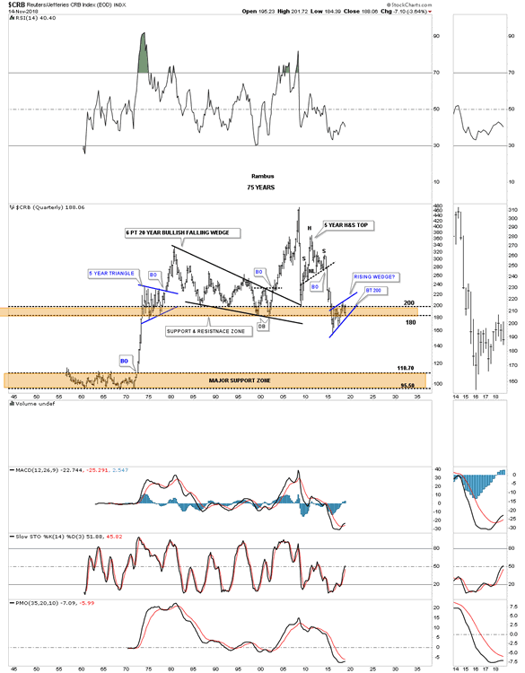
I would like to finish off this Wednesday Report by looking at the CRB index. Like so many different stock markets, commodities, and the PM complex, 2016 was an important turn in many markets.
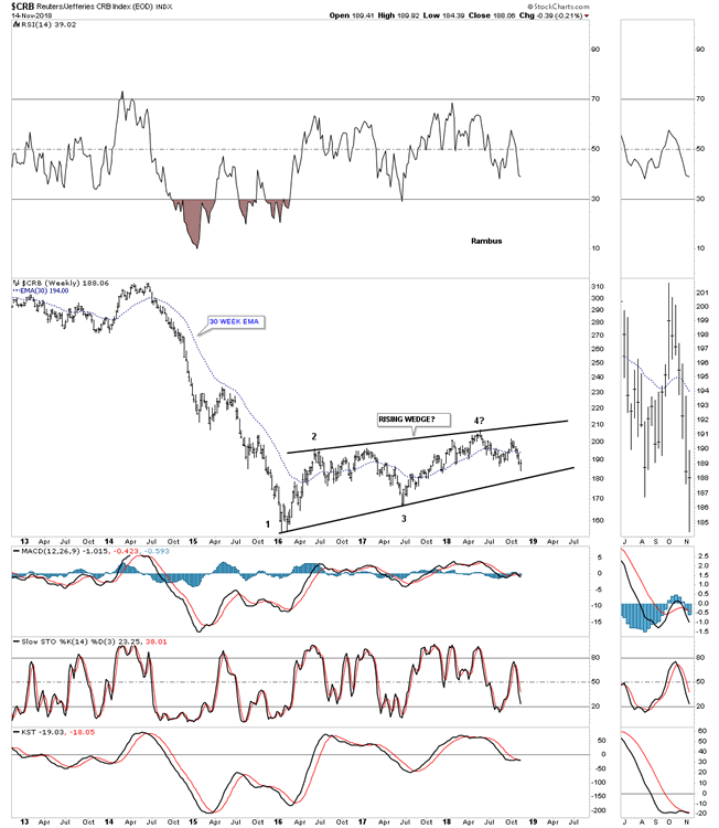
This 20 year monthly chart shows the H&S top which launched the impulse leg down during the 2014 – 2015 crash. After bottoming in 2016 the CRB index has been working on its rising wedge formation.
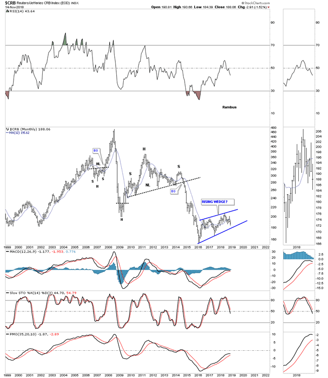
Looking at these long term quarterly charts feels like deja vu all over again. We were also following this chart during the 2014 – 2015 crash in commodities that broke important support at the brown shaded S&R zone. Again, when markets are crashing like that we were looking for a possible test of the major support zone at the bottom of the chart. Like the quarterly chart for oil the CRB finally found support in 2016. As you can see how the rising wedge fits into the big picture. If that 2016 rising wedge breaks to the downside, I know it seems impossible, but could we see the support zone at the bottom of the chart tested if the rising wedge is a halfway pattern to the downside? Commodities back to 1960s prices is hard to fathom . Just following the Chartology
All the best
By Rambus Chartology
FREE TRIAL - http://rambus1.com/?page_id=10
© 2018 Copyright Rambus- All Rights Reserved
Disclaimer: The above is a matter of opinion provided for general information purposes only and is not intended as investment advice. Information and analysis above are derived from sources and utilising methods believed to be reliable, but we cannot accept responsibility for any losses you may incur as a result of this analysis. Individuals should consult with their personal financial advisors.
© 2005-2022 http://www.MarketOracle.co.uk - The Market Oracle is a FREE Daily Financial Markets Analysis & Forecasting online publication.