


Commodity Charts Point to Stock Market and Economic Vulnerability
Stock-Markets / Financial Markets 2010 May 17, 2010 - 04:57 PM GMTBy: Mike_Paulenoff

 This week we look at commodities charts, which indicate there may be some concerns regarding future global economic growth. Precious metals gold and silver, as safe havens in uncertain market environments, have constructive-looking charts, while industrial metals such as copper, steel, and aluminum, as well as oil and the materials sector, look vulnerable, suggesting a problem in terms of buyers and demand.
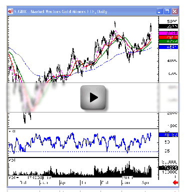
Starting with gold and the Market Vectors Gold Miners ETF (GDX), the daily chart going back to October 2008 shows a series of higher lows and higher highs, with the GDX last week trying to get back up to the December 2 prior high of 55.40. As it's approaching that level all the relevant moving averages and the stair-step ascension of the chart look very constructive.
The weekly chart shows that the GDX is bumping up against some very serious resistance. There's a lot of accumulation in the area between early '08 and now, which could blow the GDX through the topside of the chart at 56.80-90, and if it really takes off, maybe even reach as high as 62 or 63.
Newmont Mining Corp. (NEM), one of the components of the GDX, which is in the MPTrader portfolio, actually looks better than the GDX. Why? Because NEM made a new high last week above the Dec high, whereas the GDX itself has not. On the weekly chart NEM broke the high that goes way back to Jan '08 at 57.55, an enormous breakout that’s probably going to retest 62 1/2, if not higher, possibly the low 70s.
Another component of the GDX is the Barrick Gold Corporation (ABX), which looks pretty good though a lot like the GDX itself. ABX is pushing its Dec high, and looks like after the consolidation it had it should retest and take out the Dec high. Its weekly chart shows it's bumping up against some resistance, and if it takes out last week's high at 47 1/4 or so, it should take out the Nov-Dec high at 48, and then it's off to the races for ABX.
So, those are two components of the GDX that look relatively constructive, and in the case of NEM very constructive.
Moving from the gold side of commodities to silver, the iShares Silver Trust (SLV) last week made a new high above its Dec high, consolidating at around 19, and still looks pretty good. (The SLV is not a silver mining index, but that index, the SIL, does not have a lot of data on it, so we'll use the SLV.)
The weekly chart shows how much upside the SLV can generate off a huge accumulation pattern. It's probably going to take off and move above 20, a break above which could send silver rocketing.
Pan American Silver Corp. (PAAS), one of the silver components, looks very powerful as well, largely because it took out its prior high from Dec at 27.31 late last week, consolidated, pulled back on Friday, but managed to close relatively strong. It looks as though it may have had a completed pullback already and is ready to take off again.
The weekly chart looks pretty exciting, with the channel pointing up roughly to 30–32. If silver takes off, Pan Am Silver could go right with it, and I would not be surprised to see this go up to 10-15 percent from where it is right now in a very short period of time.
Silver Wheaton Corp. (SLW), another component of SLV, also has a very powerful, constructive chart. The area between 13 and 19 appear to represent an accumulation and huge base, with the stock probably on its way to 25-27 area, especially if silver itself takes off and goes through 20.
While gold and silver stocks and their ETFs look strong, a look at copper shows a different picture. The iPath UBS Copper ETN (JJC), which tracks the price of copper, looks like it’s put in a pretty big top on this very powerful upmove from Dec 2008 through April 2010. This top could generate quite a bit of selling pressure to take the copper ETN down 25-30 percent to around 30-31.
Freeport-McMoRan Copper & Gold (FCX) hardly looks like NEM or ABX, but more like the copper chart. If it takes out 66-65 1/4, you could have some serious selling pressure in FCX.
Steel, as represented by the Market Vectors Steel ETF (SLX), looks pretty much like copper, with US Steel (X), a key component, pressing support and looking terrible. Cliffs Natural Resources (CLF) has had quite the pullback as well.
Whereas steel is working on creating tops, aluminum, as represented by Alcoa (AA), looks like it has a mature top. AA’s head and shoulders top looks like it could probably go to 10-9 area.
This is an aluminum miner, and the same can be asked of it as of miners of steel and copper: Who’s buying this metal – and why does this metal chart look like that? These are all vulnerable metal commodities, telling us that something is wrong with the fundamentals.
Coal looks even worse than the metals. The Market Vectors Coal ETF (KOL) chart shows a double top, a big M formation, with a lot of downside pressure. It broke the 200-day at about 34, came down to 31.15, bounced, and now is trying to consolidate back above the 200-day. If it does take out 31-30.80, it could get clobbered, with components like Peabody Energy (BTU) and CONSOL Energy (CNX) following suit.
Let's look at another industrial commodity, oil, as represented by the Oil Service HLDRS ETF (OIH), which looks a lot like coal. The OIH has a big top on it. It broke down at 117 and change, tested and broke very important multi-month support at 112, broke down to 105.69, popped up to the breakdown point, and now looks like it’s rolling over again. This picture shows a problem, and components impacted include Transocean (RIG), which was putting in a big top even before the Gulf of Mexico crisis, and Schlumberger (SLB), which has come down as well, even though its business isn't part of the Gulf problem.
Another sector to watch is the Materials Select Sector SPDR (XLB), whose companies often procure from the miners to build the infrastructure. The XLB made some moves higher when the stimulus package was first put into effect for the purpose of spending money on infrastructure projects and allocating capital to get the economy going. However, the XLB now has a big problem, with a top on it.
What does this mean? Well, it doesn't look as bad as aluminum. It doesn’t look as bad as RIG, because it doesn’t have that stigma right now. It doesn't look as bad as oil, but it still looks pretty bad. It definitely doesn’t look as strong as gold or silver for sure, but more like steel, copper, and coal.
So, here you have the companies that are utilizing some of the production of the other indices we’ve looked at, and maybe they’re not feeling it. They’re not buying, they’re not procuring and continuing to do what they did during the time of the uptrend when they first received funds from the stimulus package.
Dow Chemical (DOW), for example, doesn't look terrible at first glance. However, looking closer you will see that it has a big distribution top on it. It broke down below 25 to 23.40, which was actually the spike down on the crash week. The "low of note," which is the low on May 7, the day after the Thursday crash, is 25.45, and if Dow comes back down and breaks the 25.45 level, it will have taken out the Feb low again, and then there will be a pretty big top on the chart. That top is capable of generating quite a big down move, of about $7 on a measured move, that would take it down to 18.
We also see problems in the Monsanto (MON) and Agrium (AGU) charts on the agricultural chemical side, as well as the PowerShares DB Agriculture ETF (DBA).
You probably don't want to be short, but you don’t want to buy and add to positions with these tops so mature, because they are going to break down.
You could buy the inverse of some of these, like the ProShares UltraShort Basic Materials (SMN), but I'm not talking about shorting right now. I just want to point out that the commodity complex is having a problem. We have steel, copper, aluminum, coal, oil service and now chemicals and agricultural commodities, which don't look very good.
Why aren't these commodities being bought? What's the problem that they aren't selling? How will this effect future global economic growth? These are questions I hope to be able to answer for you over the coming weeks as we continue to look at the Charts of the Week and watch this "recovery" with caution and concern.
Sign up for a free 15-day trial to Mike's ETF & Stock Trading Diary today.
By Mike Paulenoff
Mike Paulenoff is author of MPTrader.com (www.mptrader.com), a real-time diary of his technical analysis and trading alerts on ETFs covering metals, energy, equity indices, currencies, Treasuries, and specific industries and international regions.
© 2002-2010 MPTrader.com, an AdviceTrade publication. All rights reserved. Any publication, distribution, retransmission or reproduction of information or data contained on this Web site without written consent from MPTrader is prohibited. See our disclaimer.
Mike Paulenoff Archive |
© 2005-2022 http://www.MarketOracle.co.uk - The Market Oracle is a FREE Daily Financial Markets Analysis & Forecasting online publication.