


Stock Market Melting Up, A Different Take
Stock-Markets / Stock Markets 2010 Mar 31, 2010 - 06:38 PM GMTBy: Guy_Lerner

 Over at the ZeroHedge website, they have a post attributed to Michael Panzer of the Financial Armageddon website entitled: "The Latest Red Flag - The Market's Rate of Melting Up". Here is a different take.
From the Panzer article, I quote: "Based on data going back 90 years, whenever the 12-month rate of change (ROC) in the Dow Jones Industrials Average has exceeded 40 percent, it has generally signaled trouble ahead."
I would disagree with that statement, and to understand why, let's put together a very simple study and replicate Panzer's observations. Like Panzer, our data set is the Dow Jones Industrial Average going back 90 years. I will also use the 12 month rate of change (ROC) indicator, and my strategy is to "buy" the DJIA when the indicator exceeds the 40 percent level. I will sell my position after holding it for exactly 12 months.
Now the purpose isn't to develop a trading strategy, but to show you what happens to the DJIA after the ROC indicator exceeds the 40% level, and the best way to demonstrate my "different take" is through the use of the maximum adverse excursion (MAE) graph. See figure 1.
Figure 1. MAE Graph
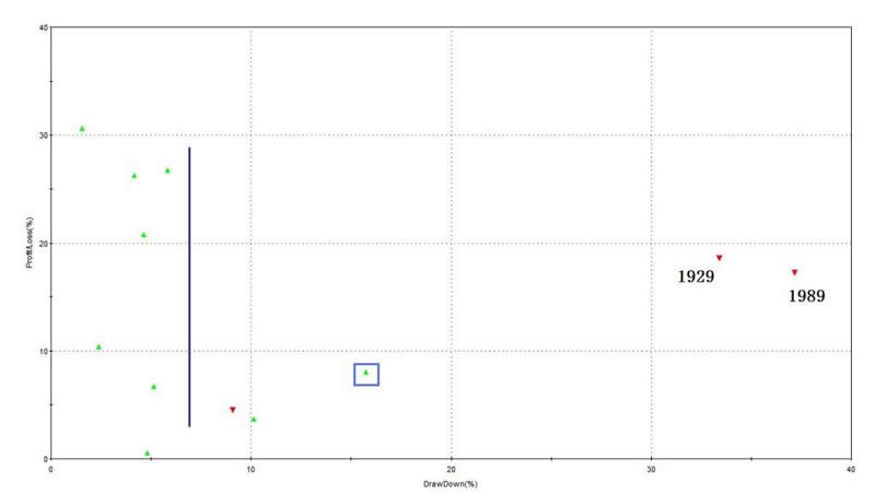
MAE assesses each trade from the strategy and determines how much a trade had to lose in percentage terms before being closed out for a winner or loser. You put on a trade and if you are like most traders, the position will move against you. MAE measures how much you have to angst and squirm while you are in that position. Because once you close the position out for a loss or a win, you are done worrying about it. As an example, look at the caret in figure 1 with the blue box around it. This one trade lost 16% (x-axis) before being closed out for a 8% winner (y-axis). We know this was a winning trade because it is a green caret.
So what does the MAE tell us about our strategy of buying the DJIA after the ROC indicator exceeds 40%? We had 12 trades since the 1920's. Two trades had excessive or portfolio ruining draw downs (or MAE's) and these were 1929 and 1987. 7 trades had MAE's less than 6%, and this would be the trades to the left of the blue vertical line. I would consider this a very tolerable draw down especially since 4 of those trades returned over 20% for the 12 month holding period. More importantly, 9 of the 12 trades were winners, and even a moderately excessive MAE of 16% recovered.
I think utilizing the MAE graph and methodology is a much better way to look at the data. Panzer states that on 11 occasions "rapid advances have been followed by notable corrections". This statement doesn't take in to account possible losses or draw downs experienced by the investor. For example, a 10% correction could have occurred after the DJIA had already run up 15% or so. In this instance, the investor would not have suffered a loss of principle despite the correction. Panzer's statement isn't as informative as the MAE graph, which actually shows how much an investor has to angst or squirm because he has lost his principle.
One other graph is worth introducing and this is the maximum favorable excursion graph (MFE). MFE measures how much a trade runs up before being closed out for a loss or a win. See figure 2 for the MFE graph for this strategy, and look at the caret with the blue box. This one trade ran up or had gains of 15% (x-axis) before being closed out for a 9% (y- axis) winner. So this trade gave back 6% before being closed out a winner, and we know this is a winner because of the green caret.
Figure 2. MFE Graph
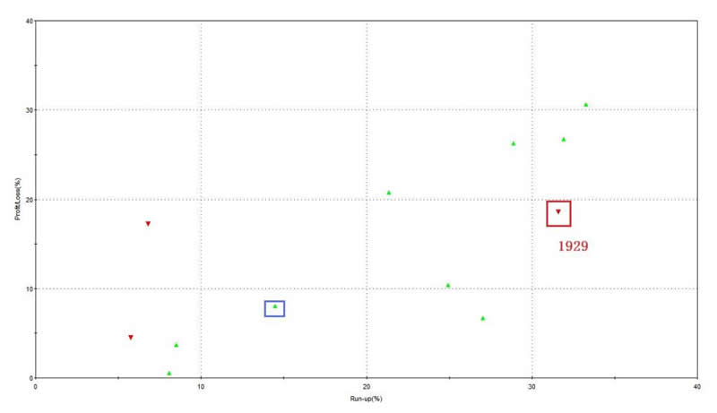
So what does the MFE graph tell us about this strategy? 8 out of the 12 trades had MFE's of greater than 14%, so at some time over the next 12 months after exceeding a 40% 12 month gain the DJIA ran up some 14% or more from the entry point 75% of the time.
Now, let's focus in on the caret inside the red box. This is the trade from 1929. As it turns out, this trade actually made 31% before being closed out for a 19% loser after experiencing a 33% draw down or MAE. So let me set the record straight on the 1929 Armageddon trade: 1) the ROC indicator exceeded 40%; 2) the DJIA went on to make 31% over the next 9 months; 3) over the following 3 months, the DJIA lost 38%. So what Panzer has left out is the fact that the 1929 trade had a 30% plus run up that the market eventually gave back.
When considering the MFE and MAE graphs and what really happens after the DJIA makes 40% in a year, I would have to disagree with Panzer's assessment. When the ROC indicator exceeds 40%, it doesn't always signal trouble ahead. Even the 1929 trade actually had a 31% gain before being closed out for an 18% loss. If a trader or investor "gives back" that much, they probably should not be in the market in the first place.
I can easily make the argument that a 40% gain in over a year implies strong momentum that is likely to continue. But I won't make that argument, and instead, I will just state that this appears to be what it is: another data point that doesn't provide too much clarity.
By Guy Lerner
http://thetechnicaltakedotcom.blogspot.com/
Guy M. Lerner, MD is the founder of ARL Advisers, LLC and managing partner of ARL Investment Partners, L.P. Dr. Lerner utilizes a research driven approach to determine those factors which lead to sustainable moves in the markets. He has developed many proprietary tools and trading models in his quest to outperform. Over the past four years, Lerner has shared his innovative approach with the readers of RealMoney.com and TheStreet.com as a featured columnist. He has been a regular guest on the Money Man Radio Show, DEX-TV, routinely published in the some of the most widely-read financial publications and has been a marquee speaker at financial seminars around the world.
© 2010 Copyright Guy Lerner - All Rights Reserved
Disclaimer: The above is a matter of opinion provided for general information purposes only and is not intended as investment advice. Information and analysis above are derived from sources and utilising methods believed to be reliable, but we cannot accept responsibility for any losses you may incur as a result of this analysis. Individuals should consult with their personal financial advisors.
Guy Lerner Archive |
© 2005-2022 http://www.MarketOracle.co.uk - The Market Oracle is a FREE Daily Financial Markets Analysis & Forecasting online publication.