


Silver Break Out From Ascending Triangle Price Pattern
Commodities / Gold and Silver 2010 Sep 13, 2010 - 03:20 AM GMTBy: Howard_Katz

 Below we see the chart of silver (weekly basis) from its peak in March 2008. Clearly drawn is a triangle which is almost ascending. (The top line would have to be horizontal.) We can regard it either as an ascending triangle or a symmetrical triangle. This triangle broke out on Sept. 3.
A triangle is often called a coil in technical analysis because it suggests a spring being compressed so that it is ready to move rapidly in the opposite direction. A triangle is also a consolidation formation. This means that the odds are, even before the breakout, that after the triangle is over the good will continue to move in the same direction it moved before the triangle started. We can imagine a major term bullish force dominating before the triangle; then an intermediate bearish force enters and balances the bullish force for a while (giving us basically a sideways market). When the upper line of the triangle is penetrated, this is a sign that the bearish force has been overcome and that the major term uptrend will resume.
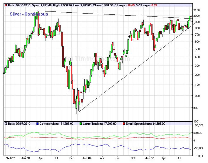
Chart patterns such as the above are discussed in the book by Edwards and Magee, Technical Analysis of Stock Trends, and I have found them a very useful tool for prediction of the markets. Edwards and Magee say that such patterns have a 70% chance of working out as predicted. And it is possible to make money on an event when you have a 70% chance of being right on each trade.
However, 70% is not my style. It requires too conservative a trading strategy. So I have developed other techniques which increase that percentage.
My basic philosophy is that the universe is governed by the law of cause and effect. This is why science has been so successful in finding out so many relationships. If B occurs shortly after A occurs and if this happens again and again and again, it becomes more and more likely that A causes B. If B continues to occur shortly after A for the indefinite future, then the probability that this is just luck becomes infinitesimal. In other words, the cause and effect relationship has, in practical terms, been proven.
Sad to say, at this stage of technical analysis there is no interest in looking for the causes of phenomena. Technicians say, “I don’t care why it works, but it works.” In my view, this does not past muster. Most of the knowledge of the human species has been accumulated by the use of the law of cause and effect. The problem is that, if you don’t know why it works, then you don’t understand it and will not be able to design an experiment to accurately test it.
Chart patterns do work, although the original chartists could not tell us why. However, I have solved that problem. It must be kept in mind that the speculator makes his money by correctly valuing economic goods. Since the future value of goods is always uncertain, all that it is necessary for the winning speculator to do is to come closer to predicting future events than the other speculators. In other words, the winning speculator predicts the markets better than the other speculators.
In words of one syllable, we need to look for areas where the vast majority of other speculators are irrational. Is there such an area?
Fortunately, there is. About 800 years ago, the philosopher Thomas Aquinas taught that every economic good has a fair price. The fair price is the price which allows the merchant who sells it to make enough money that he is able to live in the style fitting to his profession and station in life. Unfortunately, this is not a clear definition. Who decides what style and which station in life? And after this has been decided, what if the market does not provide him with enough profits to enjoy this life style? He can protest all that he wants. He can shout, “unfair, unfair.” But that will not give him the life style he wants.
Fortunately for the science of economics, Adam Smith came along 6 centuries later and pointed out that there was no such thing as a fair price. All there was was the price agreed upon by buyer and seller. If they both agreed to it, who has the authority to say that it is not fair?
And fortunately for us rational speculators the vast majority of the people trading the markets have, to this day, not read Adam Smith. They are back in the 12th century with Thomas Acquinas arguing that every good has a fair price. But as we have seen, there is no fair price, and they do not know how to find it.
So what do all these people who believe in the fair price do? They substitute the price which stands out in their minds. For example, if a commodity moves sideways for a long time, then many people assume that this price is the fair price (e.g., gold at $1,000/oz. from March ’08 to October ’09 or silver at $20/oz. from March ’08 to ‘September ’10). Many traders then assume that this is the fair price. If the good then moves up, short term traders will conclude that it is too high. Some will back away from their buying. Others will take profits. This diminished buying and increased selling will cause a down move which, son-of-a-gun, takes the good back down to the believed fair price. In the case of gold, this “fair” price, as noted, was $1,000. It moved up from $1,000 to $1,225 (Dec. 2009), and there was then a down move which took gold back down to $1,050 (Feb. 2010). This was unusual in that this gold bottom did not go all the way down to $1,000. Experienced chartists know that something like 95% of all such down moves will carry all the way back to the “fair” price. The existence of that 50 point gap stands out like a sore thumb. And the experienced chartist understands that this gap was caused by the major term bullish force, which distorted the normal pull back in a bullish direction. That 50 point gap is a giant, long term signal that this major term gold bull market is unusually powerful. And the way we know this to be true is via the theory of the fair price.
In the same way, after an advance in silver there will probably be a down move back to the $20 level (perhaps slightly lower because the “horizontal” line of the triangle is actually slanting slightly downward). If this down move holds above the expected pull back point (slightly lower than $20), then this will confirm the very strong signal in gold, and we will be able to predict an extremely strong major term bull move in the precious metals for the foreseeable future (meaning until we get a signal of a major term top).
In a similar manner, this mistaken belief that there is such a thing as a fair price causes the kinds of moves in technical charts which were discovered empirically by Edwards and Magee and which are known as charting theory. Although Edwards and Magee did not know the cause of these moves, their cause is the fact that the overwhelming majority of traders believe the medieval economics of Thomas Aquinas and have still not learned the modern economics of Adam Smith.
One might note that Adam Smith published Wealth of Nations in 1776, well over 200 years ago. Isn’t it about time that people learned which side is up? Every time they make one of these mistakes they lose money to seasoned chartists like me. They lose, and they lose and they lose, but they never learn. Some of them are so stupid that, when they lose, they do not even know it. Suppose an “investor” buys a 20 year bond for par and redeems it at the end of the 20 years (again at par). He has received a yield on the bond, but this yield has been offset by the depreciation of the currency. He has lost real value. But since he has gained value in nominal dollars (like the starving people of Zimbabwe), he thinks he is a winner.
You may have met this guy. He was just ahead of you the last time you walked into the convenience store. He bought a lottery ticket, and the machine told him, “You’re a winner.” Not so. The machine lies. He is a loser, and he will probably be a loser for the rest of his life. Fortunately, there are a great many suckers (believers in Thomas Aquinas) around, enough to last for your and my lifetime. That is why you and I do not have to work for a living.
All chart patterns have what is called a price objective, that is, a point representing the minimum advance or decline once the pattern breaks out. However, for triangles the minimum objective is not a point. It is a line. This line is drawn from the beginning of the triangle (at $21 in March 2008) parallel to the bottom (ascending) line of the triangle.
What is astonishing about the precious metals group is that several major indexes have almost the exact same triangle. The HUI has it. The XAU has it. Several of the individual gold stocks have it. All of these patterns reinforce each other. But since the patterns are appearing in so many instruments and the probability of each succeeding is 70%, then the resulting probability is far higher. What is even more astounding is that the price objective lines are very steep, implying a rapid advance. For example, the price objective line in silver (p. 1) started from 21 in March 2008 and is advancing at a rate of about 50% per year. It is currently at $60. A year from now it will be at $90. We can not say when silver will hit its price objective line, but the longer it takes to hit it the higher it will be at the time.
Right now two of these triangles have broken out (gold in Oct. 2009 and silver a week ago). Since this predicts that both of these goods will advance, they will also drag along many of the individual gold stocks. Therefore, it is a slam-dunk that the XAU, the HUI and most of the individual gold/silver stocks will also break their patterns to the upside. In short, things are shaping up for a massive move in the entire precious metals group, and this move is entirely consistent with the fact that the Federal Reserve has more than doubled the U.S. money supply over the past 2 years. Just to put this in context, over the 1970s the U.S. money supply almost doubled over a period of 10 years (about 7% increase per year). By 1979, the Consumer Price Index rose by 13.3%, and in that year the price of gold multiplied by 3.8 times. I am not yet ready to make a firm prediction for the gold price a few years hence, but my basic sense is that it is going to surprise everyone to the up side.
My vehicle for aiding the adherents of Adam Smith to make money in the financial markets is the One-handed Economist. This is my newsletter, published fortnightly (every 2 weeks). The next issue will be dated Sept. 17 and mailed the following day. The price is $300 per year, and you may subscribe by going to my website: www.thegoldspeculator.com and pressing the Pay Pal button.
Or, you may subscribe via U.S. mail at a $10 discount ($290). Send to: The One-handed Economist, 614 Nashua St. #122, Milford, N.H. 03055
Remember that this gold bull market began with a rounding bottom around the turn of the century and that such formations tend to start slowly and accelerate to the upside. They are moving up most rapidly just before the top. Thank you for your interest.
© 2005-2022 http://www.MarketOracle.co.uk - The Market Oracle is a FREE Daily Financial Markets Analysis & Forecasting online publication.