


Disconnected Financial and Commodity Markets Generating Great Trading Opportunities
Stock-Markets / Financial Markets 2012 Mar 12, 2012 - 07:04 AM GMTBy: Capital3X

 We look at key charts and analysis to understand the bias in the markets. Not wasting too much time, lets go straight to the point.
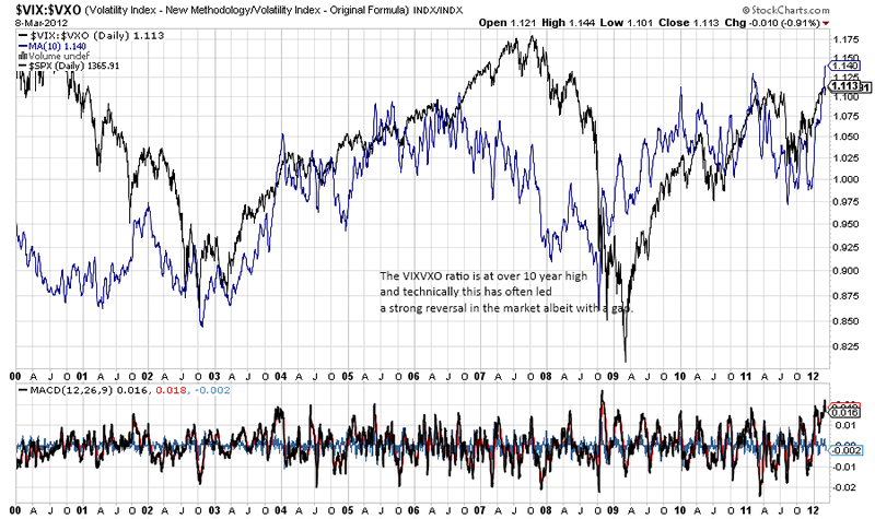
First up has been the VIX/VXO charts which is still at the ceiling of a decade high. Nothing much has changed their.
The ratio between VIX and VXO is at a decade high and cannot have come at a more crucial level. It is at levels where it clearly signifies an unhealthy equilibrium in the option market. Often this ratio has been harbinger to market reversals albeit after a few days of range trading.
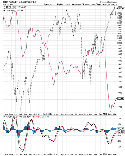
The BDI index has been climbing from its low and now has broken above 800 levels. That is a bullish sign but we need to watch what happens post NFP.
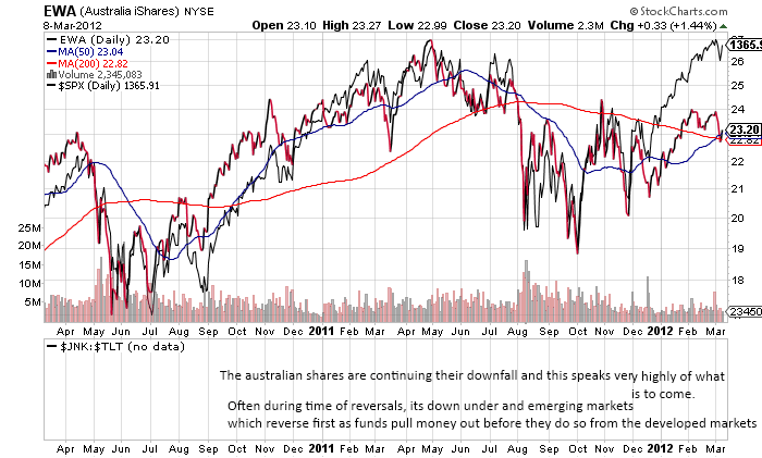
The australian index now has started to put in a top in 2012 and now following bearish reversal which could be disastrous for risk appetite. As we have noted earlier, that SPX may defy gravity for some time, but ultimately Australian markets is proxy to the global economy.
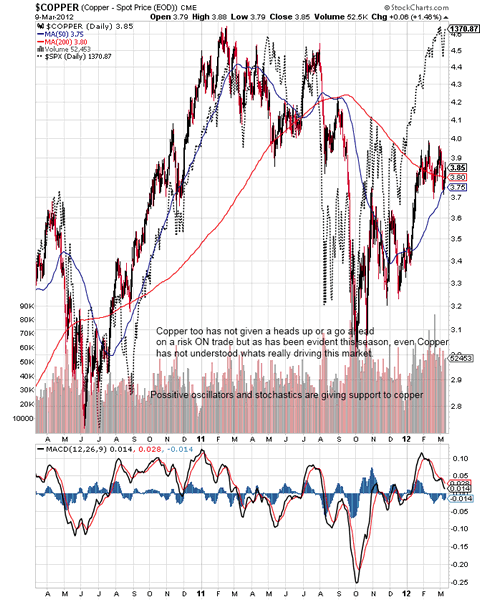
Copper as noted through out the last week has been lagging and has refused to even test the important barrier at 4.0.
More charts on forex, gold, us treasury, yen index, emerging market divergences etc.
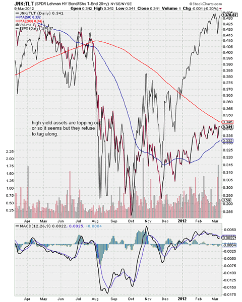
The ratio between prices of high yield assets to US treasury has slowed its advance quite dramatically as it approaches the 200 ma at 0.34 now almost giving the first signs that a curve top may be forming here. The ratio is pure money flow indicator which shows the bond managers risk abilities and risk appetite.
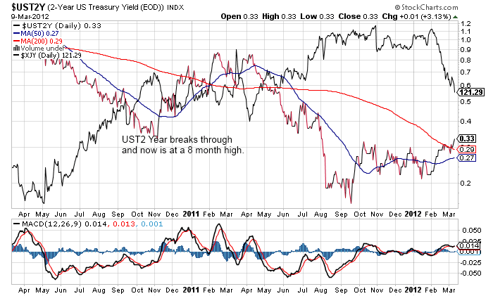
There is big news here as the US 2 year treasury yields have broken above 0.30% which is the 200 dma. That is a 8 month high and it does seem that unwind in yen positions has been a harbinger of yield break out as money has flowed out to more attractive markets like the US short term markets. The next target is 0.36/0.4% and could mean further yen weakness. The trades that may do well will be AUDJPY and EURJPY and CADJPY in addition to USDJPY. All hands on board as the trends of last week may still continue.
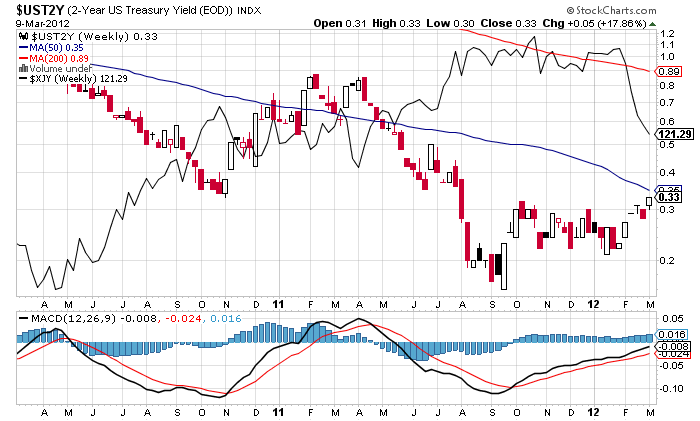
So while the daily has crossed over the 200 dma, on the weekly we still have the 50 dma at 0.34 and capping the yield at 0.33.
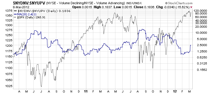
The market internals have been disturbed and it will be an uphill task for markets to reimpose healthy internals from here on. The strong NFP did not change the 20 SMA of the declining to advancing volume ratio of the NYSE.
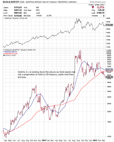
Gold to the UST2Y yield is looking down the abyss here once again. As the 2 year yield becomes costlier, Gold will look more difficult to continue its climb.
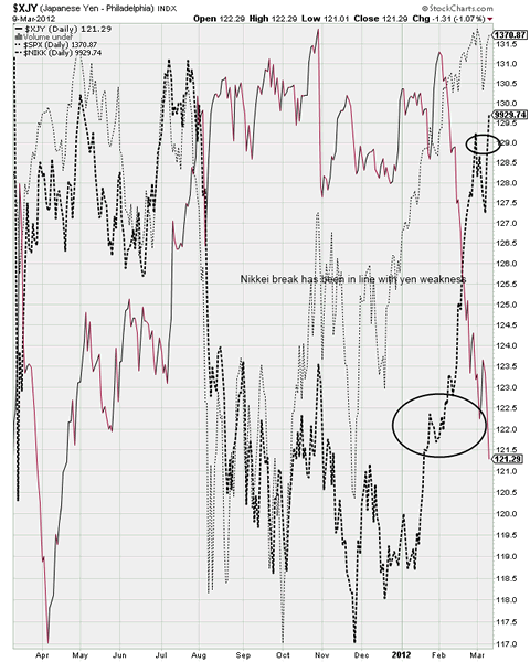
Nikkei break has been in line with yen weakness and almost confirming that the global money flow for the risk rally has been initiated at BoJ. So while correlations have broken down, as we have pointed out earlier, the correlations have only shifted from the dollar trade to a yen trade.
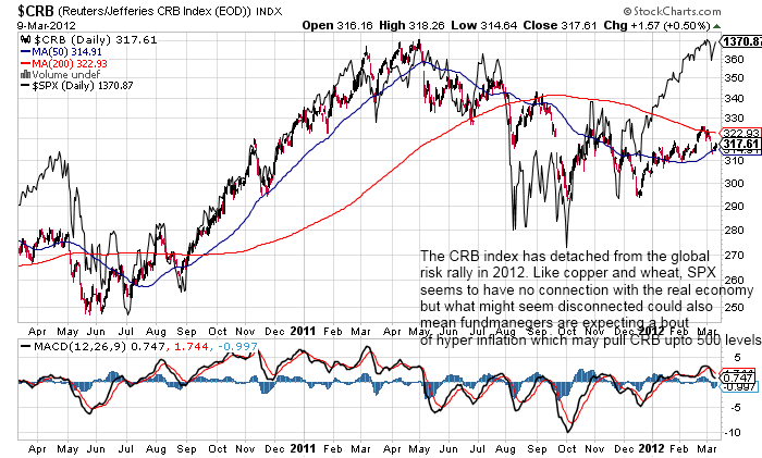
The CRB charts are waning away which seems to suggest a moderate breakout in inflation but no where close to what SPX has been suggesting.
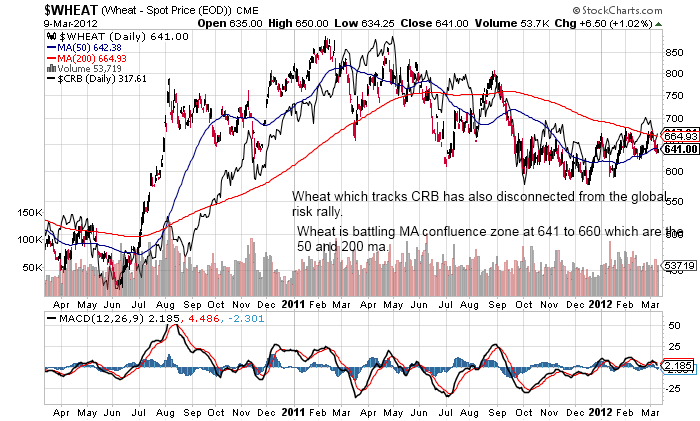
Wheat futures which track the CRB is tight range bound between the ma confluence zone.
Markets have had a tough 2 months in 2012 if you have been trying to short based on correlations and mean reversion. Market can stay irrational far longer than you can stay liquid.
We provide the following forex charts to prove why FX seems to be leading the way in leading the markets.
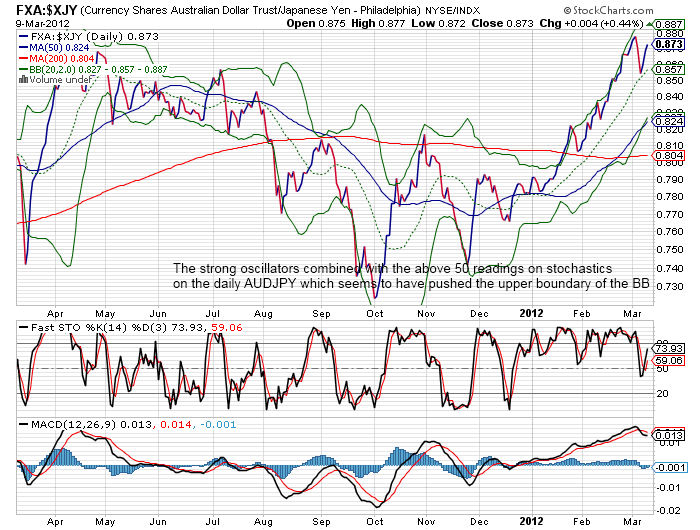
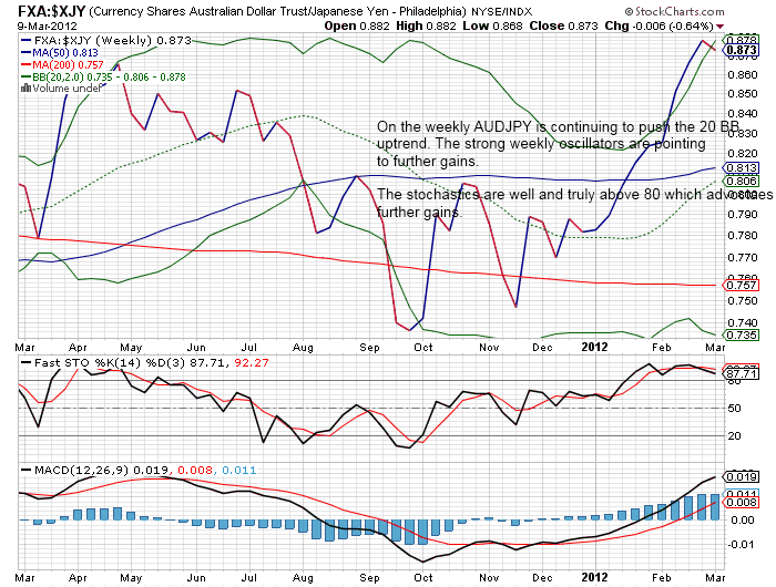
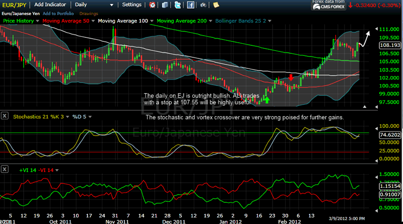
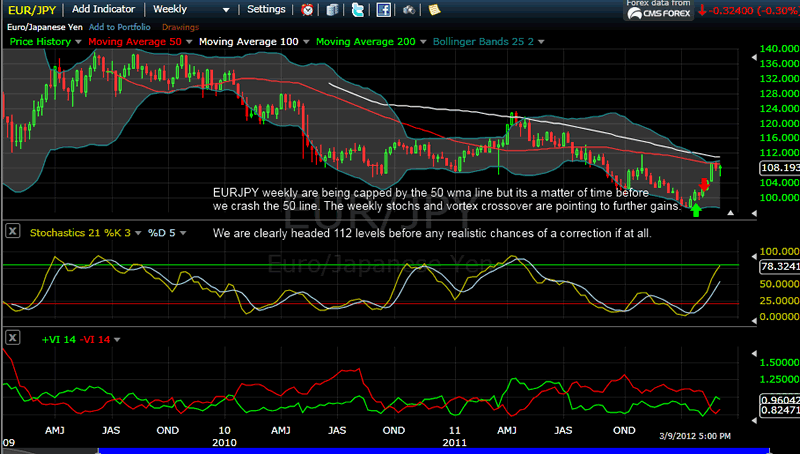
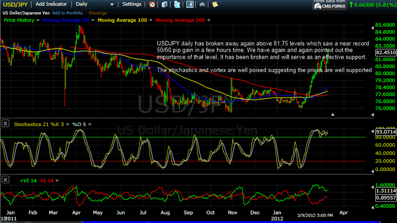
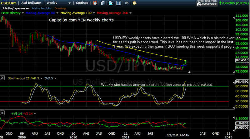
As the FX charts indicate that we are setting up nicely on yen pair charts and we expect yen weakness to continue until given new information. Yen weakness has been the primary reason why markets have been buoyant. Yen weakness may be for all practical purpose be supported by BOJ but we know when it comes to who decides currency markets, US treasury is the ultimate decision maker. The US 2 year yield has broken through the barrier at 0.30 clearly indicating the flow of capital into USD from yen.
Thats it for now. Lots to think about.
If you are not a member with us: There are two levels of membership
- Capital3x membership which comes with all the benefits of Capital3x FX portfolio and premium analysis.
- Capital3x Membership with MNI news bulletsThere is a combined package where you can get both Capital3x and MNI forex real time news bullets. You can explore membership to that via this link:
Our Twitter: Follow Us
Kate
Capital3x.com
Kate, trading experience with PIMCO, now manage capital3x.com. Check performance before you subscribe.
© 2012 Copyright Capital3X - All Rights Reserved
Disclaimer: The above is a matter of opinion provided for general information purposes only and is not intended as investment advice. Information and analysis above are derived from sources and utilising methods believed to be reliable, but we cannot accept responsibility for any losses you may incur as a result of this analysis. Individuals should consult with their personal financial advisors.
© 2005-2022 http://www.MarketOracle.co.uk - The Market Oracle is a FREE Daily Financial Markets Analysis & Forecasting online publication.