


HUI Stocks vs Gold
Commodities / Gold & Silver Stocks Mar 13, 2012 - 03:07 PM GMTBy: Willem_Weytjens

 In this article we will have a look at the performance of the HUI index (Amex Gold Bugs) compared to the performance of Gold.
First of all, here is a composition of the HUI index:
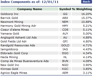
Source: AMEX
Now here is a chart that plots the HUI index since January 1st 2000:
We can see that the HUI index had a very impressive run, from about $35 at the end of 2000 to about $635 last year.
That is a MUCH better performance that the SP500 index for example, which is now roughly at the same point as where it started about 12 years ago.
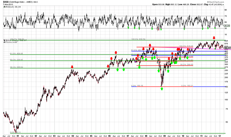
Chart courtesy stockcharts.com
When we take a look at the medium term (5 years) for the HUI index, we can see that in 2008 it got flushed because of the liquidity crisis. Everything was being sold for cash, even the best quality assets. However, from the low of $150 in 2008, the HUI rallied more than 4-fold over the next 3.5 years, which is very impressive to say the least. In the autumn of 2010, the HUI broke out above the pink dotted line, and as we can see, it retested this level several times. If this line fails to hold, then the Fibonacci Retracement levels come in to play.
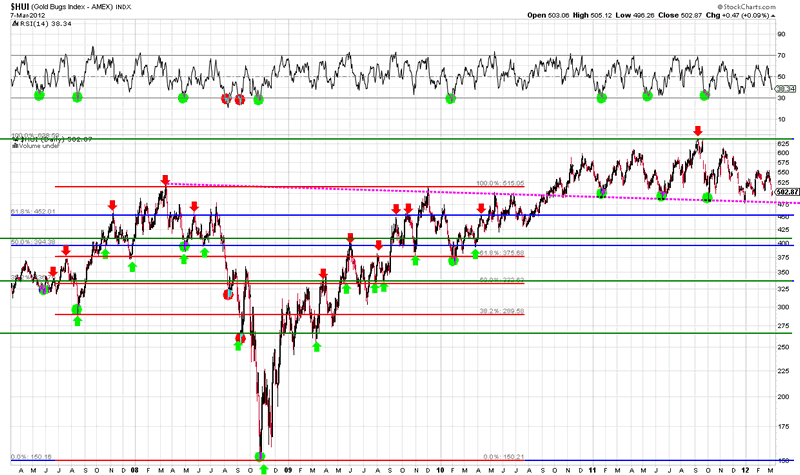
Chart courtesy stockcharts.com
The performance of the HUI index seems to be very strong. But is it really that strong? Perhaps not.
Mining stocks are expected to provide some sort of leverage to the price of the underlying metals.
However, when we look at the following chart, which plots the HUI index divided by the price of Gold, we can see that the HUI index is not acting that strong at all. In fact, since April-May 2011 (remember that Silver set a top back then), the ratio of the HUI:Gold is falling, indicating that Gold outperforms the mining companies (or that the mining stocks underperform the price of Gold).
The ratio is now laying at an important Fibonacci Retracement level from the bottom in 2008 to the top in 2009. If this level breaks, the first support would lay at the green line (around 0.26), followed by the low of 2008.
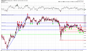
Chart courtesy stockcharts.com
That’s a bit scary, isn’t it?
Now let’s have a look at the medium term chart. We can see that the HUI:Gold ratio is showing signs of weakness, just like it did in 2008, right before the big crash:
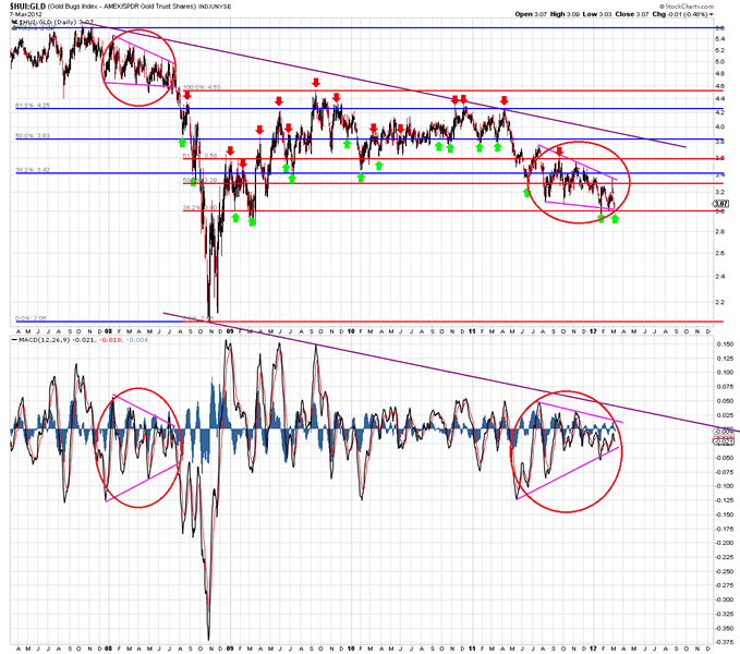
Chart courtesy stockcharts.com
However, this doesn’t necessarily mean that we are going to see a similar crash this time around, but a warned investor counts for 2.
Now here is an interesting observation: Gold is acting in a similar way as it did in 2006.
I have written about this observation more than once (see HERE and HERE for example).
Check out the chart below, which compares the Gold price since early 2011 until now to the Gold price in 2006 and beyond.
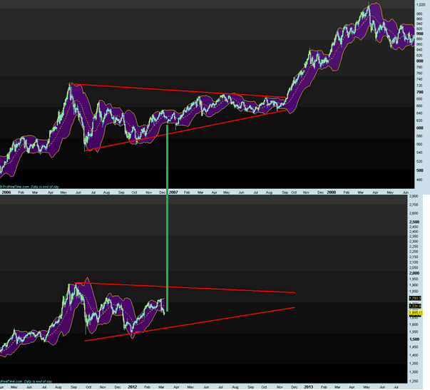
Chart courtesy Prorealtime.com
If the pattern holds, one would expect Gold to trade sideways for the remainder of the year, followed by a new sharp increase in price, which could take it up to $2,800 per ounce.
The interesting about it, is that the HUI is also acting similarly to 2006, as price has been trading sideways for over a year now:
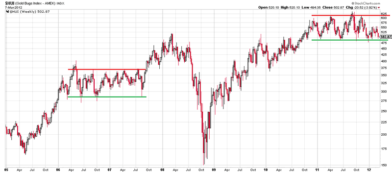
Chart courtesy stockcharts.com
Last but not least, below you can see a chart of Silver.
We can see that every time silver had a very sharp run up, it also came down sharply, which was then followed by a long period of price consolidation.
The last time the sharp increase occured was in late 2010 until May 2011, which was followed by a sharp drop (almost 50%) in price.
If the observation we made in Gold would be correct, this could mean that Silver might also trade sideways throughout the year (of course with ups and downs), followed by a new rally into the $75 area:
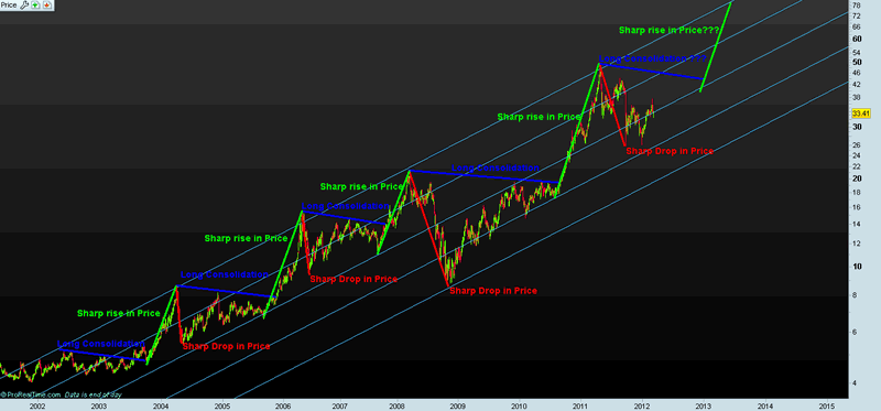
Chart courtesy Prorealtime.com
In another article (subscribers only) called “A Look At The 16 HUI Stocks“, I analyzed the performance of each component of the HUI index relative to the price of Gold and had a look at fundamental valuations (Price/Earnings, Price/Sales and Price/Book ratios). You can read a brief excerpt here:
Barrick Gold (ABX):
Barrick Gold, the world’s largest Gold producer, has underperformed Gold over the last 12 years as the following chart shows:
The ratio of ABX:$Gold is now near the 2008 low:
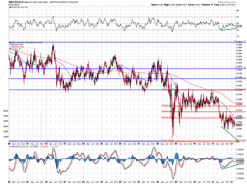
Chart courtesy stockcharts.com
Barrick Gold is trading at only 7.5 times Forward Earnings, the lowest level since at least 1990 and pays a Dividend Yield of 1.30%:
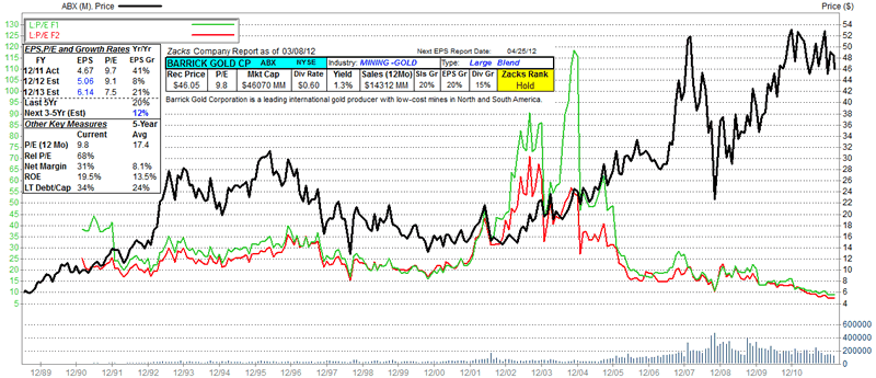
Chart courtesy Zacks Research Wizard
ABX is trading at 3.22 times Sales, which is not far above the level reached in 2008:
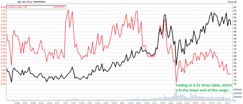
Chart courtesy Zacks Research Wizard
ABX is trading at 1.80 times BookValue, and appears to bounce when trading at 1.4-1.60 times BookValue:
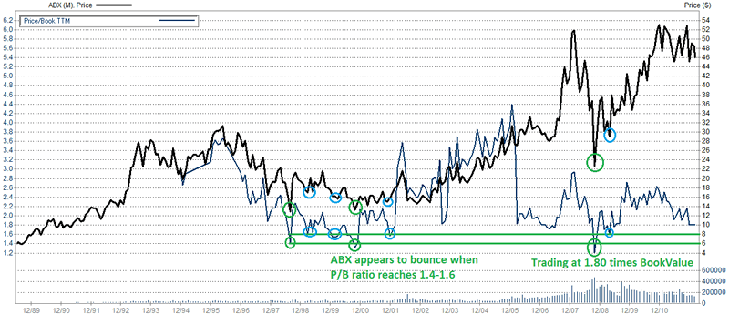
Chart courtesy Zacks Research Wizard
For more articles, trading Updates, Nightly Reports and much more, please visit www.profitimes.com and feel free to sign up for our services!
Willem Weytjens
www.profitimes.com
© 2012 Copyright Willem Weytjens - All Rights Reserved
Disclaimer: The above is a matter of opinion provided for general information purposes only and is not intended as investment advice. Information and analysis above are derived from sources and utilising methods believed to be reliable, but we cannot accept responsibility for any losses you may incur as a result of this analysis. Individuals should consult with their personal financial advisors.
© 2005-2022 http://www.MarketOracle.co.uk - The Market Oracle is a FREE Daily Financial Markets Analysis & Forecasting online publication.