


Apple Stock Price Parabolic Move Compared to Past Parabolic Trends
Companies / Company Chart Analysis Mar 22, 2012 - 12:22 PM GMTBy: Tim_Wood

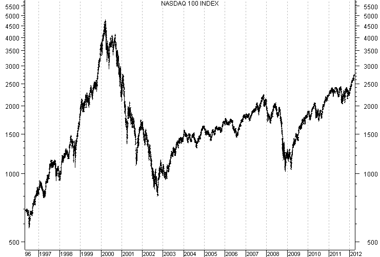
 In the first chart below I have included a weekly chart of the Nasdaq 100. Beginning at the 4-year cycle low that occurred in October 1998, we can see that price rose sharply into February 1999. In fact, in that 4 month period this index moved from a low of 1,063.74 up to 2,150.83. This was a 102% advance in only 4 months. As we moved into October of 1999 this advance was much more modest, but still managed to advance another 400 points during this time period and in doing so the Nasdaq 100 had advanced 143% in a mere 12 months. As this move received more and more attention more and more people jumped on the bandwagon with the hottest tech stock. As a result, a bubble began to form. From the October low at 2,299.95 the Nasdaq then advanced another 2,516. 39 points over the next 5 months. It was at this point that the advance went parabolic and in some 17 months the Nasdaq 100 had altogether advanced from the 1998 4-year cycle low at 1,063.74 into the March 2000 high at 4,816.34 for a total advance of 352.77%. From that high the Nasdaq 100 fell back to 795.25, which totally erased the entire move up from the 1998 4-year cycle low in which the dot-com bubble began and I still remember people talking about the tech stocks and why tech was back at the 2002 bottom. To date the Nasdaq 100 is still off of its high by some 40%.
NDX Chart
In another example of bubble mania I want to show you a weekly chart of the Shanghai Index, which can be found below. During the time of this advance in 2006 and 2007, the talk was about China and their extreme growth. China, China, China. Every market that was going up was because of China. I remember being at an investor's conference and even there the talk was about China. If something was rising, then it was because of China. I knew then that this was a sign of a bubble. Anyway, as the general population began to be bombarded about China's growth, investors flocked to their stock markets at record pace. From the 2005 low the Shanghai Index advanced from 998.23 into its 2007 peak of 6,124.04, which equates to an advance of 513.49%. This is yet another example of how a parabolic advance unfolds. These moves begin as normal advances out normal cyclical bottoms. But, if an advance is strong enough to begin to attract a lot of attention, then at that point the herds begin to pile on board. It is then that this massive inflow of speculation launches a move into a parabolic state. A parabolic advance will continue as long as there is an inflow of money to keep the move going. But, then at some point the inflow of funds begins to fade and when it does gravity sets in. It is at that point that price begins to soften. As price begins to soften the smarter money begins to exit and prices begin to soften more. In the end all parabolic advances end pretty much the same and the late-comers to the party are typically left holding the bag. The decline into the 2008 low took the Shanghai down over 72% and to date, the Shanghai Index is down some 60% off of its top.
Shanghai Chart
Next I want to show you what may be the biggest bubble of the last 34 years and I bet that only 1 in100,000 people, or less, even know about it. The next chart below is a chart of sugar. At the low in September of 1968 sugar was selling for 1.31 cents per pound. By January 1971 sugar had advanced to 5.32 cents a pound. This was a 306% advance over a 28 month period. By December 1973 sugar prices had advanced to 13.53 per pound, which accounted for a 932.82% advance from the 1968 lows. But, there was still more in this case as this is the point in which the parabolic price spike began and sugar finally peaked at 66 cents a pound in November 1974. This bubble had then advanced 4,938%.
But wait, at the time this was not viewed as a bubble. There were "reasons" to justify such advance. I found an article about the rising sugar prices in the early 1970's and I thought that you might find this quote of interest.
Sugar Chart
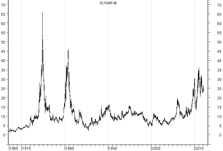
"By the end of 1972, there had been four straight sugar seasons with record crops. Yet consumption actually outpaced supplies in 1972, literally eating into sugar inventories over the next year. The 1973-74 sugar season began with extremely tight supply conditions worldwide; demand continued to rise." There were no stockpiles of sugar. Sounds to me like we had hit "Peak Sugar."
The article goes on to say, "There was evidence that some big industry users were stockpiling sugar in anticipation of higher prices. Soon people were grabbing sugar off the shelves in armloads to offset rising prices. Others were grabbing cubes off restaurant tables for home use. Dinner guests were arriving with five-pound bags of sugar instead of the traditional bottle of wine or bouquet of flowers. Even people who had never given the sugar futures markets a moment's thought knew something was up when they walked into the local coffee shop and noticed that the sugar had vanished from the table. Quite simply, global demand for sugar had exceeded supply, and before long the price of sugar headed for the roof.
"Everyone had a theory for the high prices. Sugar traders had no idea where prices might be when the US's long-standing price supports expired at the end of 1974; some blamed the high prices on a 'scarcity of cheap labour to harvest sugarcane'; others pointed to the failure of the European sugar-beet crop. Others even suspected that both the Soviet Union, which had just suffered two bad production years in a row in its own sugar crop, and 'Arab oil money' (remember that oil crisis of the 1970s?) had moved into the sugar futures markets, along with a rise in speculation by others looking to make money from rising prices."
This reminds me of what we were hearing about oil in 2007 and into 2008. There is always a so-called "reason" for these parabolic advances. But, fact is, they are still irrational parabolic advances that tend to retrace the entire parabolic advance. As you can see on this sugar chart, by 1977 sugar had dropped back down to just over 6 cents, erasing the entire parabolic advance. Into 1980 there was a rebound move that also went parabolic and by 1985 sugar prices had dropped to 2.3 cents per pound, erasing that entire move.
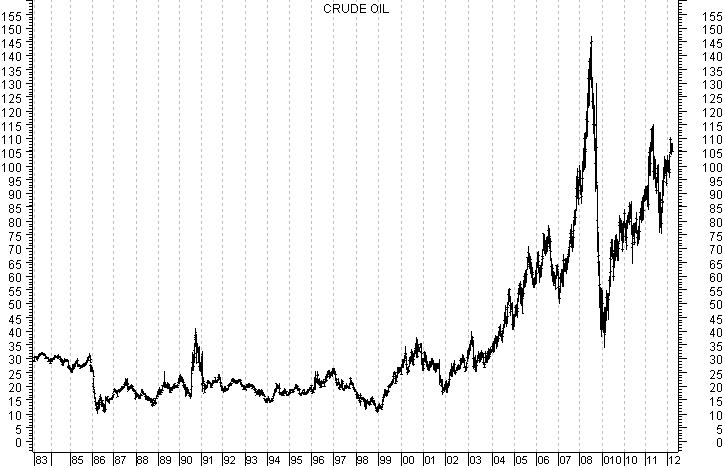
Now I want to show you a weekly chart of crude oil, which is the next chart below. Many of you may not remember, but in December 1998 crude oil touched $10.35 per barrel. I remember buying gasoline in December of 1998 for 68 cents a gallon. Between 1999 and 2001 there were major longer-term cycles bottoming in most every commodity. As price began to advance out of these naturally occurring cyclical lows no one gave too much thought to them. But, as price began to move up, commodities drew more and more attention. This in turn drove prices higher and higher and higher. As we moved into 2008 the advance in crude oil had become parabolic and finally hit an all time high of $142.99. As prices advanced, just as with sugar, people began to say that it was for this reason and that. Some say that it was because of the weak dollar. If that's the case then why is it that oil was trading in the 14 to 20 dollar range between 1992 and 1995 when the dollar was trading in the low 80's, which is basically where it is now. Others say that it was "Peak Oil." The bottom line was that it was a parabolic move that drew the attention of the public just as sugar and the dot com mania did and it was fueled by the stories of "Peak Oil", a "weak dollar" and "China." As a result, people began to jump on the hottest trend and the normal advance was transformed into a parabolic mania. It is that simple. Also, as with any parabolic speculative driven advance it was the Johnny-come-latelys who got burned once the inflow of speculation began to fade. In 7 months crude oil dropped over 77%. I believe that the rally we have seen since the 2009 low is the typical rebound rally that follows the collapse of any parabolic move.
Crude Oil Chart
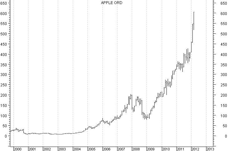
Now, this brings me to Apple in the chart below. Here too, this is a parabolic advance that will ultimately end just like all the others. When it does, the consequences will not be limited to just Apple. The parabolic portion of a move is kind of like shooting an arrow straight up into the sky. At first the move is hard and fast as there is plenty of energy and momentum behind the move. But, at some point the momentum begins to fade. There is then a point in which the arrow sort of hangs in the air as the fight between the last remaining bit of forward momentum competes with gravity. This is the point in the speculative mania in which the masses are "all in." At that point, the masses have committed themselves heavily and there are not enough new speculative buyers to keep prices rising. This is when gravity takes over, the arrow rolls over and picks up moment to the downside. I do not yet know if we have reached that point with Apple, but I suspect we may be close. The first opportunity for us to reach this point will come once an intermediate-term sell signal is triggered in association with my cycles work. Then, first indication that the parabolic advance is over will come once an intermediate-term sell signal evolves into the annual cycle top. At that point, many will think that it's just a healthy correction. But, if the buying doesn't come in very quickly at that point, then the parabolic move will be over and the top will in place, the decline will accelerate and the parabolic advance will begin to deflate even further. If this occurs in conjunction with the proper setup to cap the bear market advance that began at the 2009 low, the fallout from this will not be limited to just Apple. So, as I watch for indications of the top in Apple, I'm also watching for evidence that is suggestive of the top in the broader market as well. Such evidence should come from the cyclical structure of the market, the statistical data and the DNA Markers that have been seen at every major top since 1896. If these stars all line up, then it "ain't going to be pretty." If they don't line up, then the broader market advance will limp along.
Apple Chart
I have begun doing free market commentary that is available at www.cyclesman.info/Articles.htm The specifics on Dow theory, my statistics, model expectations, and timing are available through a subscription to Cycles News & Views and the short-term updates. I have gone back to the inception of the Dow Jones Industrial Average in 1896 and identified the common traits associated with all major market tops. Thus, I know with a high degree of probability what this bear market rally top will look like and how to identify it. These details are covered in the monthly research letters as it unfolds. I also provide important turn point analysis using the unique Cycle Turn Indicator on the stock market, the dollar, bonds, gold, silver, oil, gasoline, the XAU and more. A subscription includes access to the monthly issues of Cycles News & Views covering the Dow theory, and very detailed statistical-based analysis plus updates 3 times a week.
By Tim Wood
Cyclesman.com
© 2011 Cycles News & Views; All Rights Reserved
Tim Wood specialises in Dow Theory and Cycles Analysis - Should you be interested in analysis that provides intermediate-term turn points utilizing the Cycle Turn Indicator as well as coverage on the Dow theory, other price quantification methods and all the statistical data surrounding the 4-year cycle, then please visit www.cyclesman.com for more details. A subscription includes access to the monthly issues of Cycles News & Views covering the stock market, the dollar, bonds and gold. I also cover other areas of interest at important turn points such as gasoline, oil, silver, the XAU and recently I have even covered corn. I also provide updates 3 times a week plus additional weekend updates on the Cycle Turn Indicator on most all areas of concern. I also give specific expectations for turn points of the short, intermediate and longer-term cycles based on historical quantification.
Tim Wood Archive |
© 2005-2022 http://www.MarketOracle.co.uk - The Market Oracle is a FREE Daily Financial Markets Analysis & Forecasting online publication.