Gold $XAU Death Cross
Commodities / Gold and Silver 2012 Dec 14, 2012 - 07:09 AM GMTBy: Brian_Bloom
 Summary and conclusion
The behaviour of the gold share index may be an early warning sign that Quantitative Easing is about to take a back seat and be replaced by an emphasis on balancing the US budget. Should this turn out to be the case it will place a lid on “growth” of the US economy and will shift the focus of the authorities towards the desire to maintain the economy’s equilibrium. This will allow for a slow (multi year) deflation of the debt bubble but will be hostile to the mainstream investment world. Wealth Creation activities will offer (high business risk) investment opportunities.
**********
To the irritation of many in the gold world, this analyst continues to monitor the gold price looking for signs of an emerging pullback from its technically overbought situation. It is his contention that such a pullback would be a healthy development from the perspective of the Global Economy.
Sometimes the signs are subtle, and the following two charts reflect such subtleties:
Chart #1 – Death Cross of the XAU
(Courtesy DecisionPoint.com)
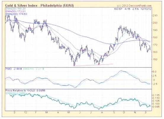
Note how the 50 day MA has fallen below the 200 day MA. This is referred to by some in the charting world as a “Death Cross” – which is a melodramatic way of saying that the previously entrenched short term trend is no longer entrenched and may be reversing.
This is not necessary a sign that the gold price will fall because mining profits might fall for other reasons – eg rising costs (for example, if interest rates should rise, then highly geared gold mines might experience downward pressure on profits).
Chart #2 – Ratio of Gold Share index divided by Gold Price
(Courtesy Stockcharts.com)
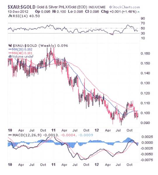
This weekly chart is showing a break-UP of the 20 week MA above the 40 week MA but, more relevant, the ratio gave a sell signal in April 2011 when the 20 week MA crossed below the 40 week MA.
To get some context of a possible implication of that sell signal, below is a chart of the gold price on its own:
Chart #3 – Weekly Gold Price
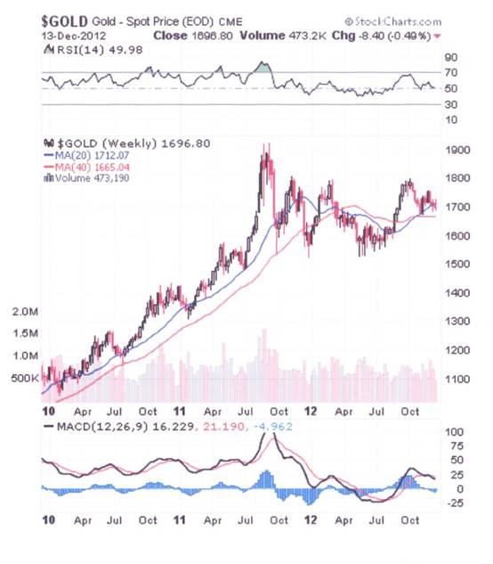
What seems to have happened – to cause the breakdown in Chart #2 – is that the gold price shot up and the gold shares did not confirm. It took a further 6 months before the gold price finally peaked. From this, one might conclude that the gold shares are a leading indicator but that the lead time is measured in months rather than days.
Note from Chart #2 that the ratio took another dive in April 2012 and note also how the gold price peaked yet again in October 2012. Once again, even though the gold price “appeared” to break up from that notorious descending right angled triangle, that was the object of some attention by this analyst at the time, it is arguable that the break up in question may have been a false break.
And this begs the question as to whether the gold price will resume its upward trend or continue to dither – perhaps retrace all the way back to $1109 an ounce (time indeterminate) – before resuming its bull trend?
Ultimately, this will be a function of how governments address their debt levels and, in particular, how the US addresses the fiscal cliff issue. There is a dogmatic view by some gold-philes that QE Infinity is inevitable and that, therefore, inflation is inevitable and that, therefore a rising gold price is inevitable.
To my way of thinking, whilst this logic is sound, it is based on an unspoken assumption that the financial markets will merely stand and watch. Inevitably, if inflation rears its head then real interests rates will turn sharply negative – unless the interest rates rise to compensate. In turn, this will beg the question: What will the impact be of rising interest rates in an environment where the US sovereign debt is $17 trillion and the ratio of Debt:GDP is over 100%?
Chart #4 – Ratio of Interest on Government Debt to GDP
Source: http://www.usgovernmentspending.com/debt_deficit_brief.php
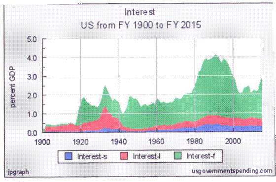
Chart 4.05: Federal Deficit 1900-2016
The real risk from government debt is the burden of interest payments. Experts say that when interest payments reach about 12% of GDP then a government will likely default on its debt. Chart 4.05 shows that the US is a long way from that risk. The peak period for government interest payments, including federal, state, and local governments, was in the 1980s, when interest rates were still high after the inflationary 1970s. Of course, the numbers don’t show the burden of interest payments from Government Sponsored Enterprises like Fannie Mae and Freddie Mac.
Clearly, from the above chart, the main reason that the US economy has managed to survive that country’s recession is that interest rates have been kept low by the Federal Reserve. This has enabled the ratio of interest to debt to remain at below 1990s levels. Equally clearly, if interest rates start to rise against a background of high Sovereign Debt:GDP, the fiscal cliff will turn out to be just that – a cliff from which the economy will fall into the canyon below. Not only will the US deficit blow out, but the living standards highly indebted consumers will be savaged.
Below is a chart showing the ratio of consumer income to consumer debt and the debt service ratio – of household interest as a percentage of income – Source: http://www.creditwritedowns.com/2012/10/us-household-debt-to-income-debt-servicing-cost-ratios.html
Chart #5 – Consumer debt affordability ratios
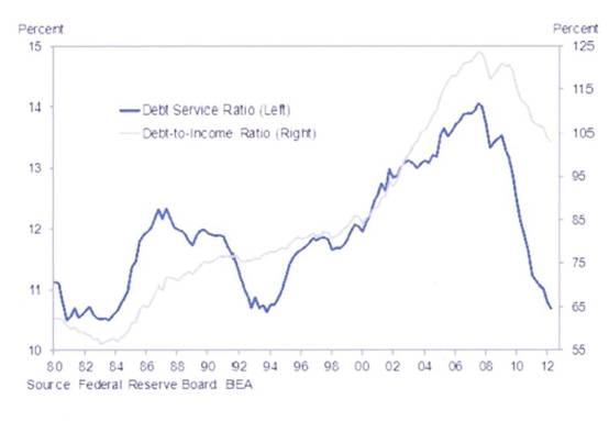
If interest rates rise then you can kiss goodbye the concept of consumer spending continuing to drive the US economy.
So, against this background, what is the probability that QE Infinity will turn out to be real? Does anyone possessed of the above information really believe that the US Federal Reserve has the power to simultaneously dump trillions of dollars cash into the financial markets AND keep the interest rates down? If so, then the assumptions must be that the economy and the financial markets are no longer operating in the same universe and that all this cash will go into the financial markets and yet somehow leave consumer prices unaffected. Mind you, I have noticed on TV recently that there is more than one “adult” series that is based on a resurrection of fairy stories. Perhaps there are still some people who believe in fairy stories.
Well, let’s look at what the bond yield charts are showing us:
Chart 6 – Weekly Chart of 10 year US Treasury Yield
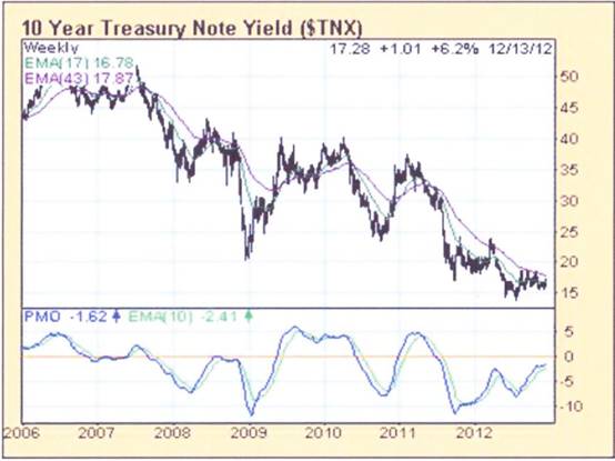
Note how the PMO oscillator has been rising, as the rate of fall of the yield on the ten year note has been slowing. Clearly, the Fed is running out of wriggle room here. If the PMO rises above zero then this will be warning signal of impending rises in yields. From the perspective of the Fed, that absolutely cannot be allowed to happen.
Conclusion
In the rhetoric surrounding the fiscal cliff and whether taxes are going to be raised for the rich or whether greater emphasis should be placed on cutting government expenditure, the point that seems to have been missed by the media commentators is that QE has not featured in the discussion at all. It has been all about “How are we going to balance the budget?” Clearly, if the emphasis – of both political parties’ thinking – is on budget balancing, then the fairy story of Quantitative Easing must now be history. Ultimately, that is what the death cross of the XAU “may” be signallingAuthor, Beyond Neanderthal and The Last Finesse
Beyond Neanderthal and The Last Finesse are now available to purchase in e-book format, at under US$10 a copy, via almost 60 web based book retailers across the globe. In addition to Kindle, the entertaining, easy-to-read fact based adventure novels may also be downloaded on Kindle for PC, iPhone, iPod Touch, Blackberry, Nook, iPad and Adobe Digital Editions. Together, these two books offer a holistic right brain/left brain view of the current human condition, and of possibilities for a more positive future for humanity.
Copyright © 2012 Brian Bloom - All Rights Reserved
Disclaimer: The above is a matter of opinion provided for general information purposes only and is not intended as investment advice. Information and analysis above are derived from sources and utilising methods believed to be reliable, but we cannot accept responsibility for any losses you may incur as a result of this analysis. Individuals should consult with their personal financial advisors.
Brian Bloom Archive |
© 2005-2022 http://www.MarketOracle.co.uk - The Market Oracle is a FREE Daily Financial Markets Analysis & Forecasting online publication.


