


Google and General Electric Technical Analysis
Companies / Company Chart Analysis Jan 07, 2015 - 11:50 AM GMTBy: Austin_Galt

 Google
Google Inc (GOOG) is a global technology company listed on the NASDAQ with a market capitalisation of around $350billion. Price last traded at $501.96. To learn more about the company, please visit its website at www.google.com
Let’s examine the technicals of the company using the monthly, weekly and daily charts.
GOOG MONTHLY CHART
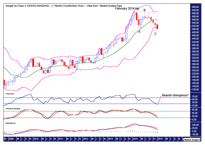
This chart shows the move into the February 2014 top was of a parabolic nature which is common behaviour found leading into highs.
It looks as if an ABC correction has just played out which would imply a move to new highs. But rules are made for breaking and it is possible that any move higher truncates failing to make new highs.
The Bollinger Bands show price moving away from the upper band before finding temporary support at the middle band. Price eventually made up its mind that it wanted to go lower and is now at the lower band.
Price looks to be a critical juncture. Does price continue on downwards clinging to the lower band or does it reverse back up? I favour the latter. Whatever decision price makes, it is now time to make it!
The Parabolic Stop and Reverse (PSAR) indicator has a bearish bias with the dots above price. These dots are currently at $595. Taking out those dots now would likely mean new rally highs are in store. I have my doubts about that happening. I’d like to see how price behaves if and when it trades back up to test the dots on the upside.
The lower indicators, being the Relative Strength Indicator (RSI), Stochastic and Moving Average Convergence Divergence (MACD), are all trending down and looking bearish. New lows are being made in these indicators as price also makes new lows. This is bearish. However, it is worth keeping in mind the possibility that price makes new highs that are accompanied by bearish divergences in these indicators.
GOOG WEEKLY CHART
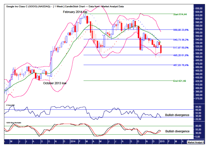
The previous swing low was the October 2013 low and until that level is taken out then bias has to be given to a continuation of the uptrend.
The recent low was accompanied by bullish divergences in the RSI and Stochastic indicator. That is encouraging for the bulls although it doesn’t rule out a further low. I doubt that though. Why?
The PSAR indicator is now showing a bullish bias after price busted the dots to the upside last week. As often happens, price then goes back down to test the support. Price has done just that here and as long as the dots on the downside are not taken out then the bulls will keep on rocking. The dots currently stand at $491.29.
Also, the Bollinger Bands show the recent low spiked below the lower band before rallying up to the middle band. This middle band has provided resistance and price has come back down to the lower band. Will this lower band provide support once again? I think so.
I have added Fibonacci retracement levels of the move up from October 2013 low to February 2014 top. The recent low tickled the underside of the 61.8% level and that may signal the end of this current move down.
So while there appears some short term upside in store, the longer term picture does not look so rosy. We’ll know soon enough whether or not Google has had its last giggle.
Disclosure – I have no financial interest in GOOG.
General Electric
General Electric Company (GE) is a diversified technology and financial services company and is listed on the New York Stock Exchange (NYSE) with a market capitalisation of around $250billion. Price last traded at $24.07. To learn more about the company, please visit its website at www.ge.com
Let’s take a top down approach to the analysis starting with the yearly chart.
GE YEARLY CHART
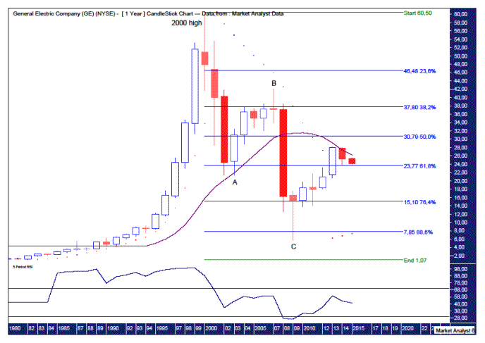
Price hit a high of $60.50 in 2000 and has been clobbered ever since. The price action since that high looks corrective in nature compared to the move into the all time high. It looks like an ABC corrective pattern is now complete. It is possible a further wave D and E are playing out but I doubt that scenario. Why?
I have added Fibonacci retracement levels of the move up from the 1980 low to all time high. We can see price dipped below the 88.6% level which was an extremely deep correction. There really isn’t much more downside to be had unless the company goes belly up!
Also, I have added the Parabolic Stop and Reverse (PSAR) indicator which shows price busting the dots on the upside back in 2013. So the dots on the downside now act as support. These dots currently stand at $7.36. Breaking below there would most likely signify new lows are in store. I doubt it.
The Relative Strength Indicator (RSI) has rallied up from its lows but has failed to make a new swing high. Nothing to get excited about here yet.
I have added a 14 period moving average denoted by the purple line. Price seems to be finding some resistance around this average which is trending down so nothing to get too excited about here either. While price is currently below the purple line, I favour price doing some more work around this average which implies a move higher in price from current levels. The moving average currently sits at $26.26.
GE MONTHLY CHART
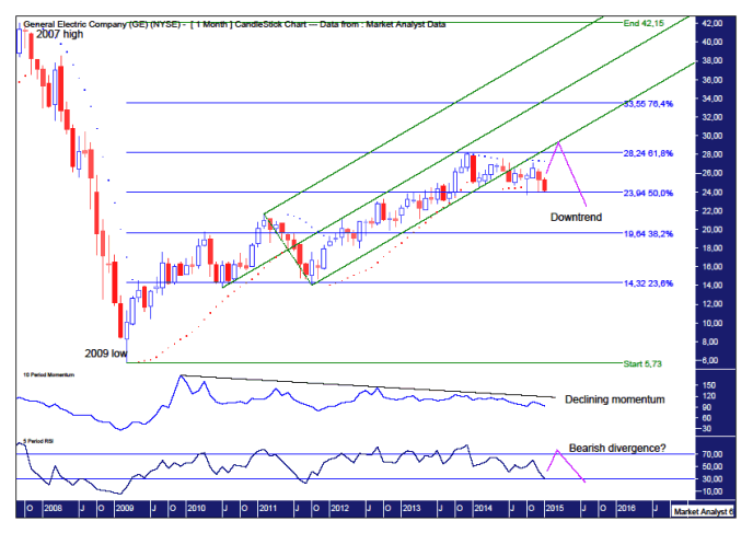
The Andrew’s Pitchfork shows a recent bearish development with price breaking below the lower channel which had provided support for the uptrend since October 2011. A common occurrence after this happens is price rallies in an attempt to get back into the lower channel however the efforts are normally in vain.
Now it is quite possible that price hits new rally highs in its failed attempt to get back into the pitchfork formation. The current rally high is $28.09 set in December 2013 and price trading back up to the lower pitchfork trend line would see price around the $29 to $30 mark. That is also right around the 50% Fibonacci retracement level as seen in the yearly analysis.
I have added Fibonacci retracement levels of the move down from the 2007 high to 2009 low. The rally high pulled up just short of the 61.8% level which stands at $28.24. Now the 61.8% level is one of the most popular levels and I have noticed price often trades marginally past this level in an attempt to fake out the traders that monitor these levels. I suspect that is what will happen here with price making a new rally high just above the 61.8% level. And the 50% level looks to be providing support currently and can be the springboard for price to get back up to the 61.8% level.
The PSAR indicator is showing a bearish bias but this may just be part of the toing and froing of price as it consolidates.
The Momentum indicator shows the rally up from the 2009 low has been losing steam. A move up to new rally highs now would likely see this indicator move back up to the downtrend line I have drawn. I’d venture if and when that happens the rally will have run its course.
The RSI is looking quite weak and I’d like to see price rally to new highs while this indicator only makes a lower high implying a bearish divergence. Let’s see.
GE WEEKLY CHART
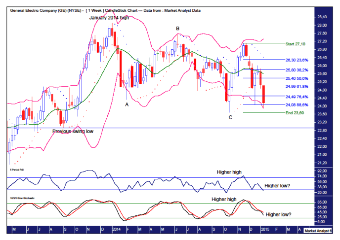
The move down from the January 2014 looks like an ABC corrective move that has already finished. It is possible that this pattern may finish with a wave E low while as long as the previous swing low at $22.92, denoted by the horizontal line, is not breached then the uptrend remains intact.
I have added Fibonacci retracement levels of the move up from the wave C low to recent high. This shows the recent move down has breached the 88.6% level before rallying back above the level. That could well be it.
The PSAR indicator is evidence of the corrective nature of trading with price busting the dots all over the place. This is also testament to the fact that this indicator is more effective in a trending market.
The Bollinger Bands is further evidence of the consolidation taking place with price bouncing up and down between the upper and lower bands. Price is now back down at the lower band. It looks like decision time for price. Will it bounce back up or will the downtrend accelerate as it clings to the lower band? I favour the former.
The RSI and Stochastic indicator are showing a recent pattern of higher highs and higher lows which would provide some comfort to the bulls. Perhaps the next leg up in these indicators will commence shortly.
GE DAILY CHART
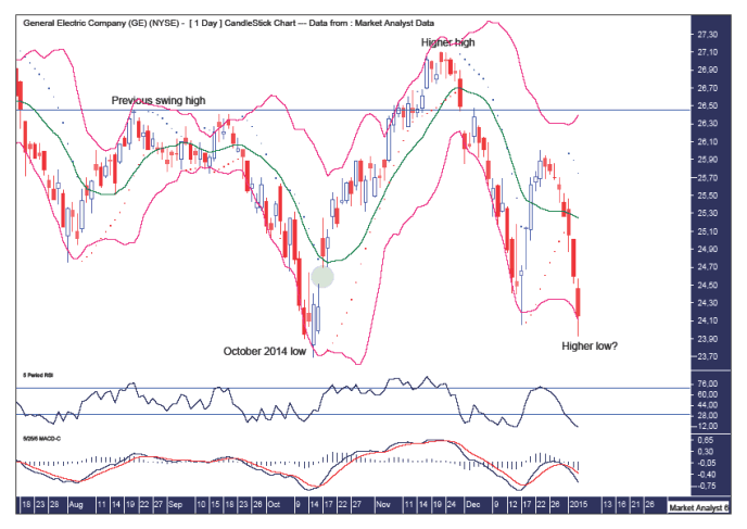
I have drawn a horizontal line denoting a previous swing high. We can see price busted above this level to put in a higher high. This move up left a gap which can be seen in the green highlighted circle and sure enough price came back down to fill in this gap.
As long as price now stays above the October 2014 low, we will have a higher low in place.
The Bollinger Bands show price trading well outside the lower band on this current low. This is a common occurrence at lows so perhaps we now have one in place.
The RSI is back in deeply oversold territory while the MACD indicator has a bearish bias but the averages have diverged quite a lot. Either there is some regression to the mean in the form of a rally now or things get ugly quickly.
Summing up, the short term outlook remains positive while there appear to be some big storm clouds gathering over the medium term.
Disclosure – I have no financial interest in GE.
By Austin Galt
Austin Galt is The Voodoo Analyst. I have studied charts for over 20 years and am currently a private trader. Several years ago I worked as a licensed advisor with a well known Australian stock broker. While there was an abundance of fundamental analysts, there seemed to be a dearth of technical analysts. My aim here is to provide my view of technical analysis that is both intriguing and misunderstood by many. I like to refer to it as the black magic of stock market analysis.
© 2014 Copyright The Voodoo Analyst - All Rights Reserved
Disclaimer: The above is a matter of opinion provided for general information purposes only and is not intended as investment advice. Information and analysis above are derived from sources and utilising methods believed to be reliable, but we cannot accept responsibility for any losses you may incur as a result of this analysis. Individuals should consult with their personal financial advisors.
© 2005-2022 http://www.MarketOracle.co.uk - The Market Oracle is a FREE Daily Financial Markets Analysis & Forecasting online publication.