


If You Invest In Stocks Now, Expect No More Than 3% Returns In The Next 20 Years
Stock-Markets / Stock Market 2017 Apr 18, 2017 - 05:52 PM GMTBy: John_Mauldin

 BY JOHN MAULDIN : We didn’t have all of this big data or computing power when I started in the investment publishing industry in 1982. But we do today.
This data not only shows us the present state of the stock market, but also tells what that means in terms of probable returns over the coming 7, 10, and 12 years and what it means in terms of relative risks.
Below, I picked out three telling charts that reveal how pricey the stock market is and what that tells us about probable forward returns.
Median P/E (Price-to-Earnings Ratio) Shows That We Are At The Second Most Overvalued Point Since 1964
Think of the P/E like this. Your business has 10,000 shares outstanding, and your current share price is $10. That means your company is worth $100,000 (10,000 x $10).
Now, let’s say your company earned $20,000 over the last 12 months. That works out to $2 in earnings for every share of outstanding stock ($20,000 in earnings divided by 10,000 shares).
So, if your stock price is $10 and your current earnings per share is $2, then your stock price is trading at a P/E of 5 (or simply $10 divided by $2 equals 5).
Note, this P/E calculation is based on your previous year’s earnings, not your estimated next year’s—or forward—earnings. If you expect to make $25,000 next year, then your forward P/E ratio is 4.
Optimistic earnings projections can make valuations appear much better than they are. It’s like the old warning: “Objects in the mirror may be closer or larger than they appear.”
Now that we cleared up the basics of the P/E ratio, let’s look at the following chart. Here is how you read it:
- Median P/E is the P/E in the middle—meaning there are 250 companies out of 500 that have a higher P/E and 250 that have a lower P/E. Using the median number eliminates the effect that a few very richly valued companies have on the average P/E, which is what you normally see reported in the media and presentations.
- The red line in the lower section shows you how P/Es have moved over time.
- The green dotted line is the 52.8-year median P/E. So a P/E of 17 is the historical “fair value.” Simply a point of reference.
- You can see that over time, the red line moves above and below the dotted green line.
- If you remove the 2000–2002 period (the “great bull market”), we currently sit at the second most overvalued point since 1964. (Note: 1966 marked a secular bull market high, to be followed by a bear market that lasted from 1966 to 1982.)
- In the lower section of the chart, you also see the labels “Very Overvalued,” “Overvalued,” and “Bargains.”
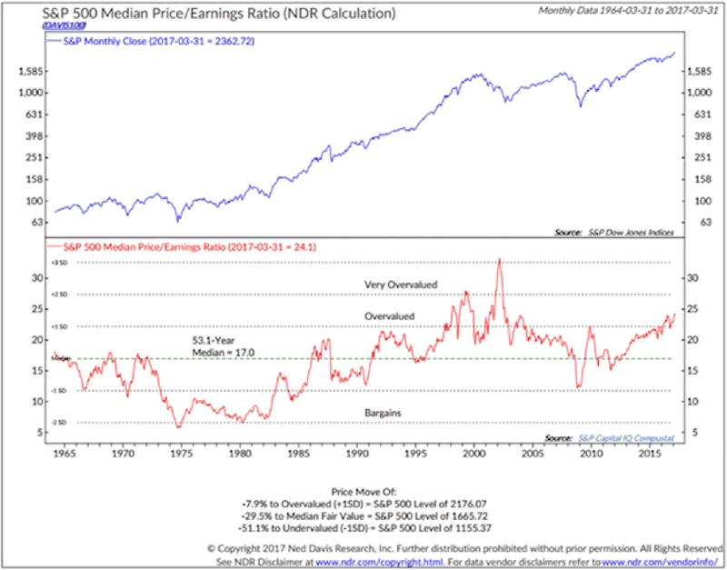
One last comment on the chart. At the very bottom of the chart, Ned Davis states that the market is now 7.9% above the level at which it is considered to be overvalued.
- That means the market would need to decline from the March 31 S&P 500 Index level of 2362.72 to 2176.07 to get back down to the “overvalued” threshold.
- It would need to decline to 1665.72 to be get to “fair value” (the median). That’s a drop of 29.5%.
- Also note “undervalued,” which we could see in a recession (now -51.1% away).
Median P/E Shows How The Entry Price Determines Your Forward 10-Year Returns
Median P/E can help us predict what future 10-year annualized returns are likely to be for the S&P 500 Index. The price at which you initially buy matters. Here is how you read the following chart (data is from 1926 through 2014):
- Median P/E is broken down into quintiles. Ned Davis Research looked at every month-end median P/E and ranked the numbers—with the lowest 20% going into quintile 1, the next 20% into quintile 2, and so on, with the most expensive or highest P/Es going into quintile 5.
- They then looked at forward 10-year returns by taking each month-end P/E and calculating the subsequent 10-year annualized S&P return.
- They sorted those returns into quintiles and determined that returns were greatest when initial P/Es where low and worse when P/Es were high.
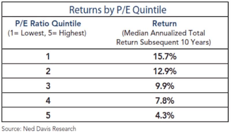
With a current median P/E for the S&P of 24, we find ourselves firmly in quintile 5. That tells us to expect low returns over the coming 10 years.
Though it appears that most investors are expecting 10% from equities, history tells us that the market as a whole will have a hard time growing much faster than our country’s GDP does.
At Current Valuations, Your Average Return Will Likely Be Lower Than That
Note that 4.3% returns are the average of what happens when stocks are purchased in the top 20% of valuations. That forward return number goes down considerably if we are in the top 10% or top 5%, which is where we are today. The below chart, from Ed Easterling, shows what 20-year returns look like based on starting P/E ratios.
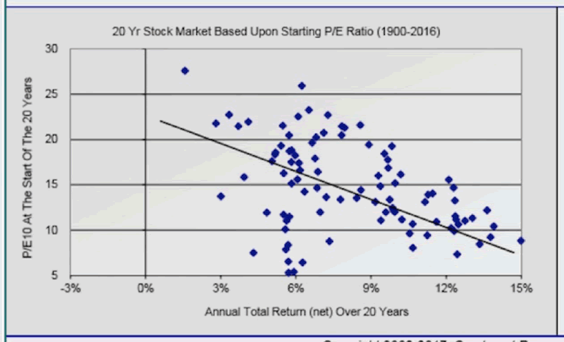
Using average P/E ratios rather than the median, we are looking at an average annual return over 20 years of less than 3% from where we are today.
Again, not what investors are expecting.
You Have To Rethink Your Portfolio
The next time you go in for a tune-up of your financial-planning program, have them adjust your forward returns based on some of the data presented above.
And then be prepared to exercise restraint when they show you the results. And then be determined to work longer and save more, because that’s what you may have to do.
The reality today is that equities are expensive. You’ll need to be mentally prepared to play offense when P/Es eventually shift back down into quintiles 3, 2, and 1; but for now, it’s time to play defense and think differently about your portfolio.
Get a Bird’s-Eye View of the Economy with John Mauldin’s Thoughts from the Frontline
This wildly popular newsletter by celebrated economic commentator, John Mauldin, is a must-read for informed investors who want to go beyond the mainstream media hype and find out about the trends and traps to watch out for. Join hundreds of thousands of fans worldwide, as John uncovers macroeconomic truths in Thoughts from the Frontline. Get it free in your inbox every Monday.
John Mauldin Archive |
© 2005-2022 http://www.MarketOracle.co.uk - The Market Oracle is a FREE Daily Financial Markets Analysis & Forecasting online publication.