The Fed's Misleading Money Supply Measures
Interest-Rates / Money Supply Nov 17, 2018 - 10:16 PM GMTBy: Steve_H_Hanke
 The most robust national income determination model is the monetarist model. The course of the economy when measured in nominal terms is determined by the course taken by the money supply. Indeed, the positive relationship between the growth rate of the money supply and both nominal GDP and nominal aggregate demand growth is unambiguous and overwhelming.
So, just what is the measure of money that is most suited for taking the temperature of the economy and forecasting its course? Is a narrow metric, like the monetary base (M0), the best? Or, should we focus on broad money metrics, like M3 and M4? For national income determination, the more inclusive the metric, the better. Indeed, for the most complete and accurate picture, one should include all the important components of money supply, not just a few.
 To obtain money supply data is simple enough. Just go to the Fed’s monetary data base and pick the broadest money supply measure, and you will be ready to go. Right? No, it’s not that simple. First, since the Fed stopped reporting the M3 money supply measure in March of 2006, one is left with M2 as the broadest measure reported by the Fed. And, M2 is not very broad.
The Fed’s money supply measures are limited to rather narrow metrics, and that’s a problem. To obtain superior, broader measures, one must go to The Center for Financial Stability (CFS) in New York, where I serve as a Special Counselor. The CFS was founded in 2009 by Lawrence “Larry” Goodman to, in part, improve on the measurement and reporting of money supply statistics. The CFS was fortunate in that William A. “Bill” Barnett, the world’s leading expert on Divisia monetary aggregates, agreed to develop and lead the CFS’s Advances in Monetary and Financial Measurement program. As a result, the CFS, under Bill’s watchful eye, produces a detailed monthly report “CFS Divisia Monetary Data for the United States.” That report contains a broad money measure M4. It includes five more components than M2: institutional money-market funds, long-term deposits, repurchase agreements, commercial paper, and T-bills. These components are important because they all serve, in varying degrees, as money. To exclude them from a measure of money would be to exclude a great deal.
So, the CFS money supply metrics contain important components that are excluded in the Fed’s M2. In this sense, the CFS data are superior. But, narrowness is only the start of the Fed’s data problems.
What really separates the CFS measures from the Fed’s is that the CFS’s measures of money are not just a simple sum of the various components that make up the different measures of money (read the various M’s). It has long been recognized that simple-sum aggregation can result in big measurement problems. Indeed, Irving Fisher in his classic 1922 book, The Making of Index Numbers, concluded that simple-sum aggregation can lead to the very worst type of index numbers. When it comes to measuring monetary aggregates, Milton Friedman acknowledged that there were cases in which simple-sum aggregation might result in poor measures of the money supply.
Why was Friedman’s conjecture correct? Money takes the form of various types of financial assets that are used for transaction purposes and as a store of value. Money created by the Fed (notes, coins, and banks’ deposits at the Fed) represent the monetary base (M0). This state money, or high-powered money, is imbued with the most moneyness of the various types of financial assets that are called money. Components of the monetary base are ready to use in transactions in which goods and services are exchanged for “money.”
But, in addition to the assets that make up monetary base, there are many others that possess varying degrees of moneyness—a characteristic which can be measured by the ease of, and the opportunity cost associated with, exchanging them for base money. These other assets are, in varying degrees, substitutes for money, and are included in broader measures of money. But, these other assets should not receive the same weights when they are summed to obtain a broad money supply measure. Instead, those assets should receive less weight per unit than the other components of high-powered monetary base, with the ones that are easiest to substitute for base money receiving higher weights than those that possess a lower degree of moneyness.
How can we dump simple-sum aggregates and determine the weights that should be attached to the components of broad money supply metrics? Enter Bill Barnett. Using a theory of aggregation developed in 1925 by the French engineer Francois Divisia (1889-1964), Bill pioneered the application of the Divisia index to money supply measurement. So, the broad measures of money produced in the CFS’s monthly report are not just simple-sum M3 and M4 numbers. They are superior Divisia M3 and Divisia M4 measures, in which their components are weighted according to the moneyness of each component.
We all know that good science is not possible without good data. After all, bad measurements and faulty data can result in disastrous missile launches. What pilot would want to be “flying blind,” with an altimeter that was malfunctioning? What about the money supply? Do the Fed’s faulty metrics really make any difference for policy makers and investors? In a word, the answer is “yes.” Let’s take a look at one dramatic example of how the Fed’s data caused economic “crash landings.”
When Paul Volcker took the reins at the Fed, the state of the U.S. economy’s health was “bad.” Indeed, 1979 ended with a double-digit inflation rate of 13.3%. Remember stagflation?
Chairman Volcker realized that money matters, and it didn’t take him long to make his move. On Saturday, October 6, 1979, he stunned the world with an unanticipated announcement. He proclaimed that he was going to put measures of the money supply on the Fed’s dashboard. For him, it was obvious that, to restore the U.S. economy to good health, inflation would have to be wrung out. And, to kill inflation, the money supply would have to be controlled.
Volcker achieved his goal. By 1982, the annual inflation rate dropped to 3.8%—a great accomplishment. But, the problem was that the Volcker inflation squeeze brought with it a relatively short recession (less than a year) that started in January 1980, and another, more severe slump that began shortly thereafter and ended in November 1982.
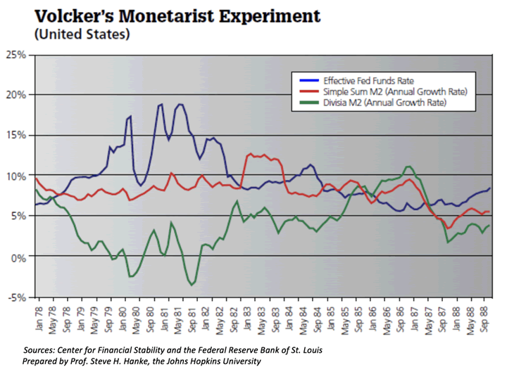
Paul Volcker’s problem was that the monetary altimeter installed on his dashboard was defective. When my friend Volcker looked at his M2 gauge, he was viewing M2 data that were calculated by a simple summation of their components—the normal Fed procedure. As shown in the chart below, the Fed thought that double-digit fed funds rates that it was engineering allowed it to tap on the money-supply brakes with just the right amount of pressure. In fact, if the money supply had been measured correctly by a Divisia metric, Volcker would have realized that the Fed was not just tapping on the breaks, but unnecessarily slamming on them from 1978 until early 1982. The Fed was imposing a monetary policy that was much tighter than it thought—an excessive tightness that resulted in two recessions.

Why the huge divergences between the standard simple-sum measures of M2 that Volcker was observing and the true Divisia M2 measure? As the Fed pushed the fed funds rate up, the opportunity cost of holding cash increased. In consequence, retail money market funds and time deposits, for example, became relatively more attractive and received a lower weight when measured by a Divisia metric. Faced with a higher interest rate, people had a much stronger incentive to avoid “large” cash and checking account balances, opting to keep their funds in relatively high-yielding assets. As the fed funds rate went up, the divergence between the simple-sum and Divisia M2 measures increased.
Alas, the data problems associated with Volcker’s monetary experiment have been ignored by the Fed. Indeed, as Bill Barnett concluded in his book Getting It Wrong: How Faulty Monetary Statistics Undermine the Fed, the Financial System, and the Economy: “When more and better data were needed by the private sector, as the complexity of financial products grew, the quantity and quality of Fed data declined.” Fortunately, we have a reliable alternative for the provision of high-quality money supply data: The Center for Financial Stability.
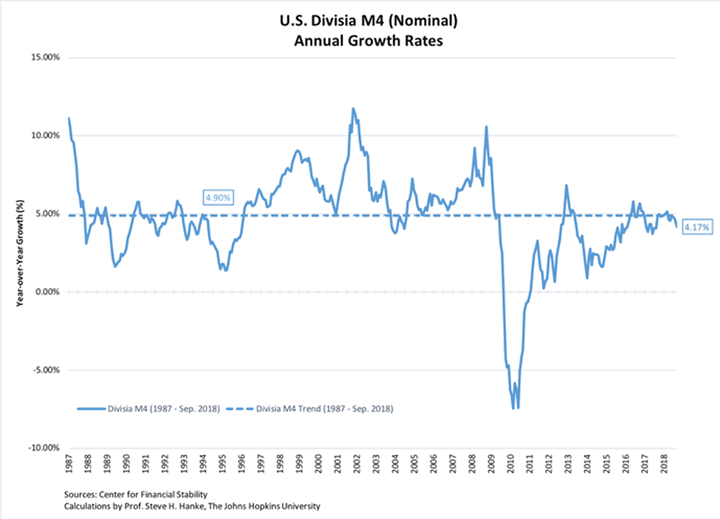
Where are we today? As shown in the chart below, the Divisia M4 growth rate is 4.2% yr/yr. That rate is a bit weak. Indeed, it is lower than it has been during the past year, and it is also below its trend rate for the past 30 years of 4.9%. This suggests that the Fed’s balance sheet unwind has resulted in a somewhat “tight” monetary stance.

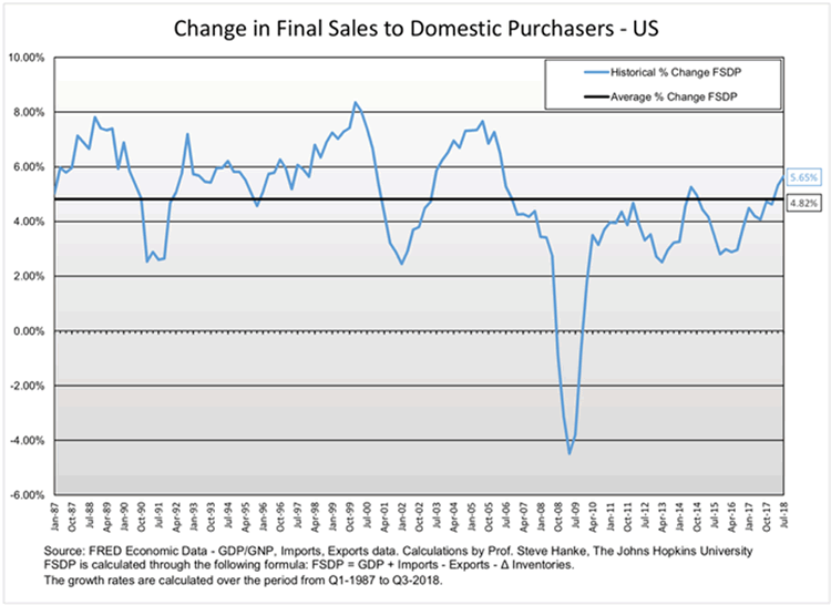
If we turn to aggregate demand measured in nominal terms, it is holding up rather well (see the chart below). At a 5.65% yr/yr rate, nominal aggregate demand, as measured by final sales to domestic purchases, is above its 30-year trend rate of 4.82%. So for now, things look pretty good. But, a monetary storm cloud would develop if the Fed were to misstep and slip into a quantitative tightening mode. Without Divisa M4 on the Fed’s dashboard, the Fed might not realize the storm forming on the horizon.

By Steve H. Hanke
www.cato.org/people/hanke.html
Twitter: @Steve_Hanke
Steve H. Hanke is a Professor of Applied Economics and Co-Director of the Institute for Applied Economics, Global Health, and the Study of Business Enterprise at The Johns Hopkins University in Baltimore. Prof. Hanke is also a Senior Fellow at the Cato Institute in Washington, D.C.; a Distinguished Professor at the Universitas Pelita Harapan in Jakarta, Indonesia; a Senior Advisor at the Renmin University of China’s International Monetary Research Institute in Beijing; a Special Counselor to the Center for Financial Stability in New York; a member of the National Bank of Kuwait’s International Advisory Board (chaired by Sir John Major); a member of the Financial Advisory Council of the United Arab Emirates; and a contributing editor at Globe Asia Magazine.
Copyright © 2018 Steve H. Hanke - All Rights Reserved
Disclaimer: The above is a matter of opinion provided for general information purposes only and is not intended as investment advice. Information and analysis above are derived from sources and utilising methods believed to be reliable, but we cannot accept responsibility for any losses you may incur as a result of this analysis. Individuals should consult with their personal financial advisors.
Steve H. Hanke Archive |
© 2005-2022 http://www.MarketOracle.co.uk - The Market Oracle is a FREE Daily Financial Markets Analysis & Forecasting online publication.


