


TSP Recession Indicator - Criss-Cross, Flip-Flop and Remembering 1966
Economics / Recession 2019 Mar 13, 2019 - 05:55 PM GMTBy: F_F_Wiley


In November, we argued that the business cycle rests heavily on a certain type of incremental spending—namely, spending that doesn’t require prior savings. We used the term thin-air spending power (TSP) to describe spending that’s financed by external “injections” instead of prior savings.
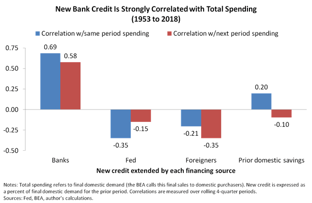
As part of our argument, we shared the chart below, which compares TSP-derived spending on the left (financed by fresh bank credit) to spending that merely recycles savings, such as the prior domestic savings category on the right.
We also shared a diagram that puts the argument in pictures, illustrating how bank credit boosts economy-wide spending.
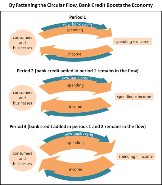
As shown, bank credit stands apart because it doesn’t require savings from prior income. Rather, it creates fresh TSP, which again represents spending power that materializes from “thin air.” (See articles here and here for further explanation.)
Measuring TSP
But banks aren’t the only source of TSP. Investment gains and losses can also boost or dampen spending in ways that leak into the circular flow depicted above. Recognizing the similarities between these TSP sources, we can build a highly predictive indicator from only two components:
- Real new bank credit. Inflation-adjusted new bank credit aggregated over four-quarter periods and expressed as a percent of final domestic demand in the prior period.
- Real holding gains. Inflation-adjusted holding gains (household and nonprofit gains from equities, mutual funds, real estate and pensions) aggregated over four-quarter periods and expressed as a percent of final domestic demand in the prior period
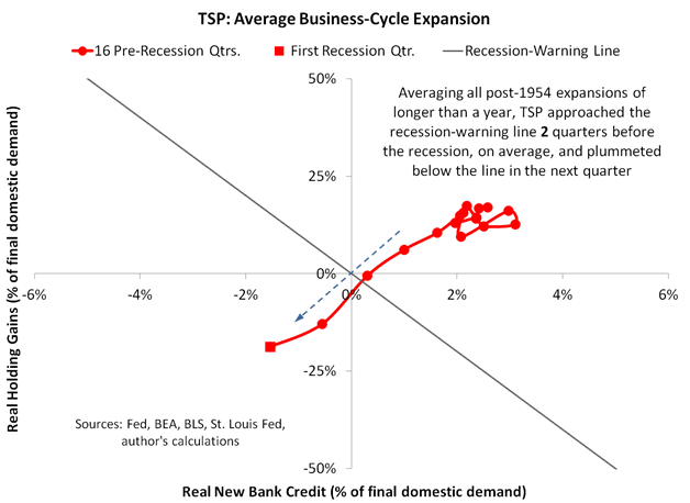
The chart below shows the indicator’s average path during the last nine business-cycle expansions. Note that we’re mapping a path through two dimensions—one for each of the two primary TSP sources—by connecting data sequentially.
And here’s the early 2000s expansion on its own.
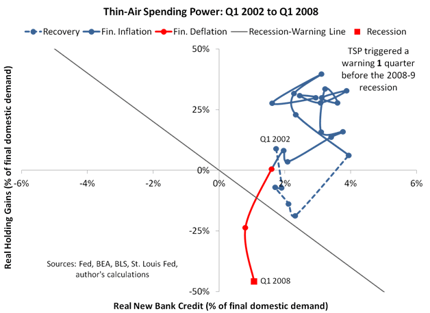
As shown in the last chart, TSP tends to cycle through three phases: recovery, financial inflation and financial deflation:
- Recovery. TSP meanders upwards and rightwards as the financial economy heals from the prior recession.
- Financial inflation. TSP enjoys the big air of the upper-right triangle.
- Financial deflation. TSP completes the cycle by becoming scarce once again, dropping below a diagonal recession warning.
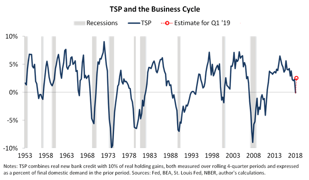
In other words, TSP normally triggers a recession warning shortly before the onset of a recession, anywhere from one to five quarters before. (Note that we use a ten-to-one ratio for our recession warning, meaning we expect a dollar of additional bank credit to have about ten times the effect on spending as a dollar of real asset holding gains—see the earlier TSP article for explanation.)
Remembering 1966
All of which brings us to our TSP indicator update, which begins with a look-back to 1966. After our November article, TSP carved a path that’s occurred only once before in the indicator’s 65-year history—during the 1960s expansion. As shown below, TSP breached the recession line in the midst of a 1966 credit crunch only to restore financial inflation one quarter later, completing a criss-cross that had much to do with monetary policy.
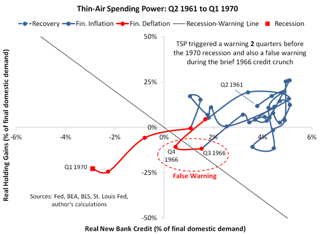
In the year and a half leading up the 1966 criss-cross, the FOMC was actively tightening policy—raising bank reserve requirements, pressuring credit growth and lifting the discount rate in December 1965 in an action that famously earned Fed chief Martin an invitation to LBJ’s Stonewall, Texas ranch.
But not for the first time and certainly not for the last, the financial sector responded to the monetary tightening in some ways that were expected and others that weren’t. On the expected side of the ledger, banks sold Treasuries to meet reserve requirements. But by the summer of 1966 they had few Treasuries left to sell, so they began dumping municipal bonds while removing their usual support for new municipal issues, an unexpected response that weighed heavily on municipalities while rattling confidence throughout the financial sector. A mini–financial crisis with convulsions in the muni market was hardly the result the FOMC was seeking.
And how did the Fed react?
On September 1, 1966, the Fed’s regional bank heads sent the same letter to all member banks in their regions—they asked those banks to restore the flow of credit to municipal issuers. The letter also encouraged banks to replenish reserves with borrowings at the discount window, and the FOMC then sharply increased its Treasury purchases during Q4, again with an aim of replenishing reserves and reversing prior policies.
In other words, the Fed’s 1966 flip-flop explained the TSP criss-cross. Perhaps not surprisingly, the economic expansion then continued for another three years. (Besides the Fed’s archives, you can find an interesting account of the 1966 credit crunch in Hyman Minsky’s Stabilizing an Unstable Economy.)
Fast-Forwarding to Today
With that story as background, here’s a chart showing TSP’s path during the current expansion, using last week’s flow-of-funds data for Q4 2018 and our preliminary estimate for Q1 2019.
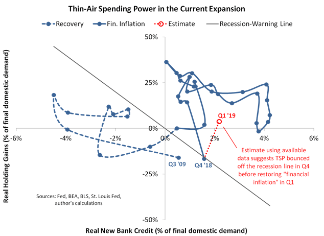
And here’s the same data in just one line, equating $1 of new bank credit to 10 cents of asset holding gains as in the rationale behind the recession-warning line. (Again, see the earlier TSP article for explanation.)
You can think of the Q1 estimate as like a GDP tracker—the final figure will surely be different but possibly not much different.
(As an aside, if you’re interested in more frequent TSP updates along with further detail on the underlying inputs, join our mailing list for indicator updates. You can do this by sending an email with “indicator updates” in the subject line to queries@nevinsresearch.com. Note that this is different to our blog subscriptions—we only update indicators on the blog when we find the time to write an article about them, meaning the blog doesn’t report most of our research.)
So TSP grazed the recession line and then almost certainly jumped back into financial inflation in Q1 (barring a market crash in the next two weeks). This most recent instance is less criss-cross than ricochet, but it’s still reminiscent of 1966. In both cases, TSP reversed direction just after the Fed sharply changed course. It’s almost as though the Powell Fed waited for TSP to touch the recession-warning line before unleashing a flurry of statements that walked back a prior commitment to policy tightening.
Conclusions
It’s not hard to spot risks to the U.S. economy in early 2019—most obviously: tepid auto sales and housing data, a sharp drop in retail sales, and continued weakness in Europe and Asia—but the Fed’s policy flip-flop has helped restore a degree of financial inflation.
So as weak as Q1 GDP is likely to be (see, for example, the Atlanta Fed tracker), we expect the expansion to muddle through, reaching the third quarter to become the longest on record at over ten years.
That said, we can’t rule out another TSP reversal, especially as stock prices remain vulnerable, the housing market grinds ever slower and the recent resurgence in bank credit appears to be leveling off. As we argued in November, TSP bears watching. It might once again prove to be the best indicator for timing the next recession.
For the full TSP chartbook, click here. For a deeper dive into the underlying philosophy, see Economics for Independent Thinkers.
F.F. Wiley
F.F. Wiley is a professional name for an experienced asset manager whose work has been included in the CFA program and featured in academic journals and other industry publications. He has advised and managed money for large institutions, sovereigns, wealthy individuals and financial advisors.
© 2019 Copyright F.F. Wiley - All Rights Reserved
Disclaimer: The above is a matter of opinion provided for general information purposes only and is not intended as investment advice. Information and analysis above are derived from sources and utilising methods believed to be reliable, but we cannot accept responsibility for any losses you may incur as a result of this analysis. Individuals should consult with their personal financial advisors.
© 2005-2022 http://www.MarketOracle.co.uk - The Market Oracle is a FREE Daily Financial Markets Analysis & Forecasting online publication.