


Yield Curves, 2yr Yield, SPX Stocks and a Crack Up Boom?
Stock-Markets / Financial Markets 2019 Mar 24, 2019 - 11:23 AM GMTBy: Gary_Tanashian

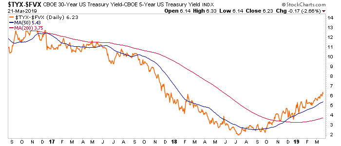
While the 30-5 year yield curve does this, implying some inflationary issues…
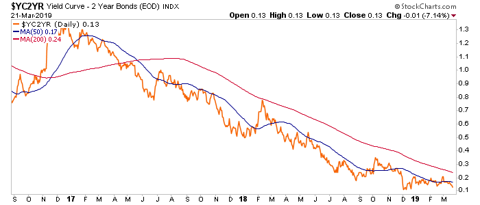
The more commonly watched 10-2 year does this, implying ongoing Goldilocks…
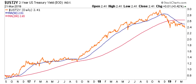
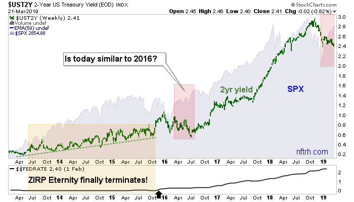
While the nominal 2 year yield does this, implying “ruh roh!”…
This last chart is ugly, isn’t it? As I’ve banged you over the head about since Q4 2018, this chart is surely out front in the signals that the Fed takes for its Fed Funds rate direction. The highly technical term for the state of the above daily chart is that it sucks. The less technical term is that it is on a breakdown.
Yesterday the stock market got happy and who knows, maybe we are on the great Armstrongian “slingshot” (what I would call the verge of a von Misesian “Crackup Boom” to include many other asset markets). But the chart above sucks as long as the yield resides below those crossed moving averages as it establishes a downtrend.
Never one to shy away from a shtick in my writing, we place ole’ “Dove Eye” strategically in this part of the post. The thing directly above is a dove maker and the thing directly below saw the light at the end of Q4.
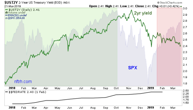
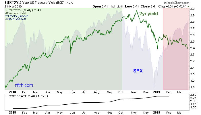
Now let’s journey through daily, weekly and monthly time frames that tie in the 2yr yield, the Fed Funds rate and the S&P 500. The daily chart asks what thing used to be in positive correlation with another thing but no longer is? That would the 2 year yield, heading down while SPX heads up. And that would be the product of a bullish view, as noted on FOMC day, that the Fed has returned the punch bowl to the party, with fresh mixer and double spiked.
The stock market is rallying as the Fed rate will go flat (at best) in 2019.
The weekly chart shows how the Bernanke Fed maintained an outrageously accommodative stance (plus QEs 1-3 and the yield curve flattening Op/Twist) despite a stock bull market and an economy that we (NFTRH) began gauging for positive traction as far back as Q1 2013 (ref. a then-fledgling Semi Equipment cycle).
I want to go off on Bernanke for the 1000th time because I think he was a perpetrator of evil, but I am going to keep this post buttoned down and proceed on. Suffice it to say that the Fed stuck its beak in the market and diddled it for years after the bond market had begun signaling “time to hike”. And so the Fed finally did as the bond market wished in late 2015.
But that was right into the correction of 2015-2016, a time where technical parameters broke on the stock market and there seemed a chance for an actual bear market. Stocks dropped and then the 2 year formed an ugly pattern and briefly turned down before that bear potential was erased in a giant swoosh of over-bearish sentiment in and around the BREXIT hysteria of the time. The Good Ship Lollypop broke out, set sail for higher levels and then got a reflationary afterburner with the Trump election.
And here we find ourselves, with an ugly pattern on weekly SPX and a divergence to the 2 year yield. Traditionally this is bearish as you can see by the monthly chart. The 2016 event turned out to be a hyper-bullish precursor. But traditionally at least, we are at a caution point.
But the Bernanke Fed blew up ‘tradition’ as it searched out and destroyed every bear (and sound economic thinker) on the planet in service to asset price appreciation (AKA the effects of ongoing inflation operations, and here again we hat tip Keith Weiner for putting it so well in his expose of the father of economic and social evil, John Maynard Keyes).
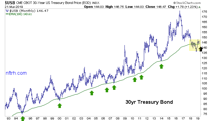
Flipping over our usual view of the Continuum (the monthly view of the 30yr yield and its monthly EMA 100 AKA the “limiter”) we note that every inflationary near-death experience has held at the 30 year bond’s monthly EMA 100. Currently, we are back at peace with sweet lullabies echoing in the ears of comfy bulls.
But the breakdown in the bond in H2 2018 may have been a shot across the bow. The bond has recovered but the Fed, with its newly dovish pivot, is now aggressively wooing inflation. It needs the declining 2 year yield for permission to do so.
Pending a potential deflationary event* (as indicated by currently dropping bond yields) if the Fed succeeds in wooing inflation yet again (the system runs on inflation and credit, after all) the next breakdown in the bond above (break up in the Continuum below) could happen in tandem with the next big global macro inflation trade (and eventual “Crack Up Boom”) before the thing ultimately falls apart at some point out in the future.
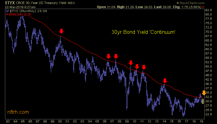
* They do tend to be merely events after all, with the Fed always on the job and ready to inflate when given permission by dropping yields.
Subscribe to NFTRH Premium (monthly at USD $33.50 or a 14% discounted yearly at USD $345.00) for an in-depth weekly market report, interim market updates and NFTRH+ chart and trade setup ideas, all archived/posted at the site and delivered to your inbox.
You can also keep up to date with plenty of actionable public content at NFTRH.com by using the email form on the right sidebar and get even more by joining our free eLetter. Or follow via Twitter ;@BiiwiiNFTRH, StockTwits or RSS. Also check out the quality market writers at Biiwii.com.
By Gary Tanashian
© 2019 Copyright Gary Tanashian - All Rights Reserved
Disclaimer: The above is a matter of opinion provided for general information purposes only and is not intended as investment advice. Information and analysis above are derived from sources and utilising methods believed to be reliable, but we cannot accept responsibility for any losses you may incur as a result of this analysis. Individuals should consult with their personal financial advisors.
Gary Tanashian Archive |
© 2005-2022 http://www.MarketOracle.co.uk - The Market Oracle is a FREE Daily Financial Markets Analysis & Forecasting online publication.