


Gold and Silver, When Will the Bottom Be?
Commodities / Gold and Silver 2013 Apr 30, 2013 - 06:35 AM GMT

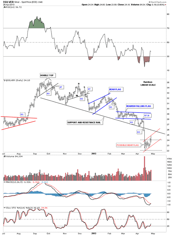
 In this weekend report I would like to answer some questions presented at the forum this weekend. First lets look at silver and see what the charts are telling us especially after last weeks price action. Lets start with a daily look that shows the downtrend channel that began back in October of last year. You can see all the different chart patterns we’ve been following during this delcine. You can see what happens when a strong support rail gives way. The bulls were exhausted and the bears took charged and moved the price down to the 22 area where we are getting our first counter trend rally after the breakout.
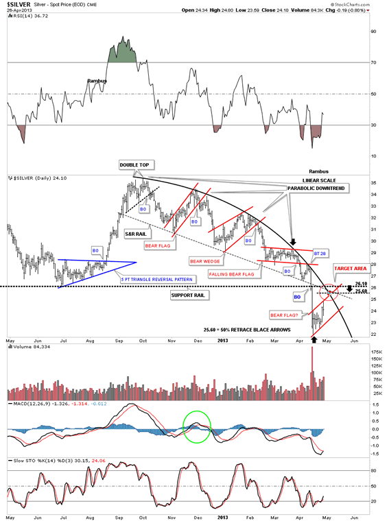
This next daily chart is the one I showed you on Friday night that shows the parabolic arc and the backtest to the 25.60 area. There are a lot of resistance points in that red circle that should hold any rally in check. If for some reason silver cuts through that overhead resistance that would be a warning flag that silver is stronger than what the chart are saying right now. It’s just something to keep in the back of your mind.
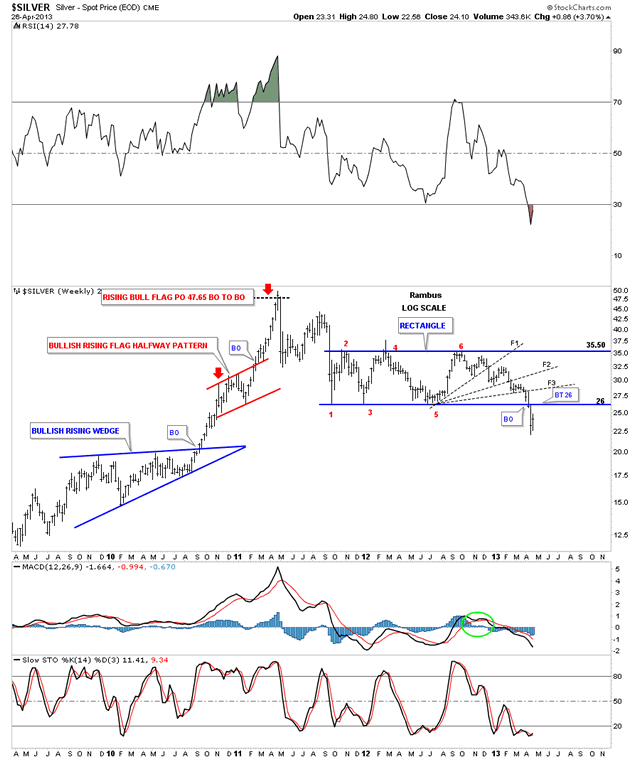
The weekly chart shows a classic 6 point rectangle consolidation pattern. Point #4 is the only flaw where the price action poked above the top blue rail during the week but close the week below the top blue rail so I view that as an aberration. The backtest will come in at the 26 area where the bottom rail should now reverse its role from what was support to now resistance.
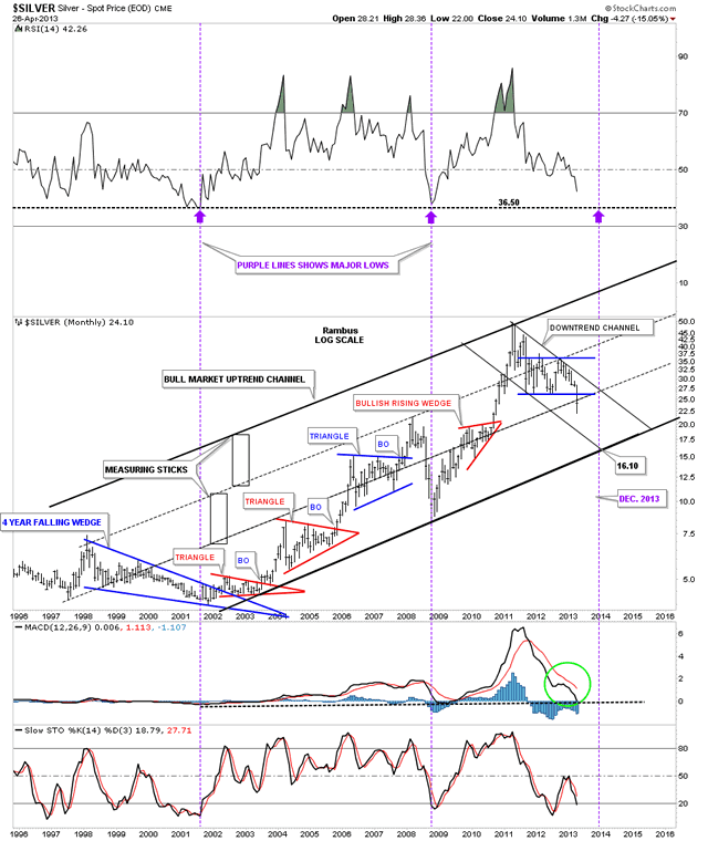
The monthly look shows the major uptrend channel for the bull market that started back in 2002 after finally breaking out of the blue 4 year bullish falling wedge. At the top right hand side of the chart you can see our current downtrend channel that started off the 50 all time high made 2 years ago this month. You can see that this monthly chart is showing lower lows and lower highs which is the definition of a downtrend. If silver trades within the parallel downtrend channel all the way down to the bottom rail of the major uptrend channel, silver could fall as low as 16 where the two bottom rails intersect. That would give the RSI indicator, at the top of the chart, a chance to reach the area of the two previous major lows at 36.50 purple arrows. If it did play out close to what the charts are showing and silver bottomed out at the bottom rail of the big uptrend channel that would still leave the bull market intact. I would have to consider that area a major buying opportunity.
Next I would like to show you several weekly chartS for SLV that show two different type of consolidation patterns, that fit with the Chartology of chart patterns. The first weekly chart for SLV shows the 8 point diamond consolidation pattern that we’ve been following since the first of the year.
Produced December 21 2012
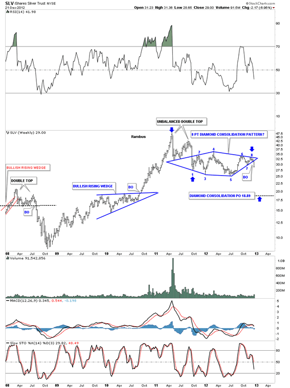
So far its played out beautifully making lower lows. The big blue diamond gave us an early indication that the big 20 month rectangle was going to break to the downside. You can see the diamond broke out in the middle of December of last year at 31.50 a full 5 1/2 points higher that where the big rectangle broke out at 26 or so.
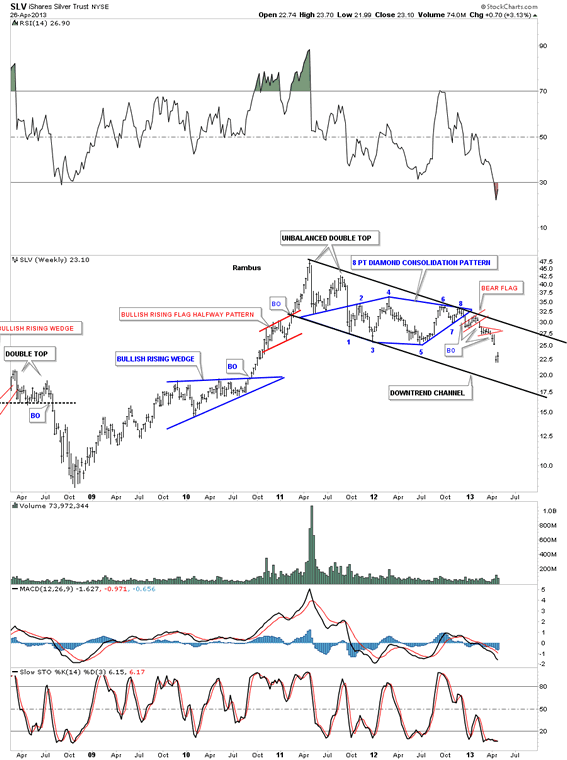
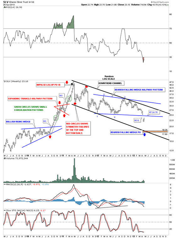
This next weekly chart for SLV shows another consolidation pattern that also makes sense from a Chartology perspective. First lets look at the parallel downtrend channel that shows 2 red circles toward the top. Those two red circles show what I call, Symmetry Failures. Failures to reach the top and bottom rails of the downtrend channel. These are impossible to see early on. It’s only after the downtrend channel starts to mature that you can finally recognize them as such. It’s always important to tweak your trendlines once you have more information to work with. Now lets look at blue bearish falling wedge that broke out two weeks ago with that huge gap. Whenever you see a gap and, Especially on a weekly chart, it’s always good to pay attention. Many times the gaps will show up at breakout points. That gap made 2 weeks ago on this chart also shows up on many of the precious metals stocks as well. The backtest would come in around the 24.75 area. The brown shade area shows the minimum price objective down to the 17.80 to 18.35 based on two measuring techniques I use.
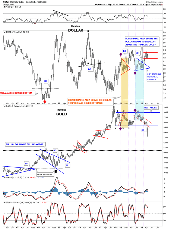
Lets take a look at the US dollar that shows it consolidating in a loose rectangle just above the brown shaded support and resistance zone. I call it loose because the top rail is sloppy, but you can see the trading range that has completed 4 reversal points and is now trading halfway down to the lower trendline. It’s trading smack dab in the middle of the rectangle right now. Usually the US dollar charts shows fairly nice tight trading ranges but lately they have seemed a little sloppy to me. The patterns are there but harder to define for most folks. The price objective for the red rectangle halfway pattern would be around the 86.25 area which will help our EUO trade.
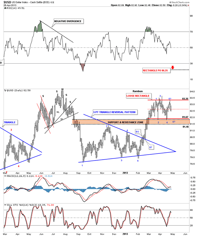
The next chart shows why the US dollar is trading in this rectangle trading range. It’s basically trapped between the top brown shaded support and resistance zone and the brown shaded support and resistance zone I showed you on the chart above which is the top point of the 5 point triangle reversal pattern.
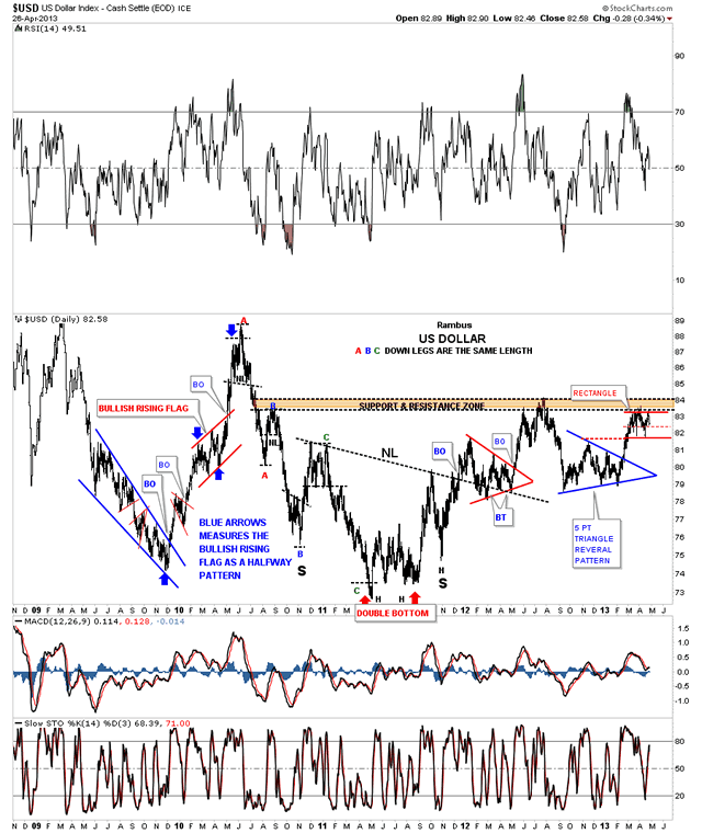
I posted this next chart the day the US dollar broke out of the 5 point triangle reversal pattern. The blue shaded area shows where the US dollar and gold were trading on that day. As you can see the inverse relationship is still alive and well. I think once the dollar breaks out above the red rectangle gold will be finishing up with its counter trend rally.
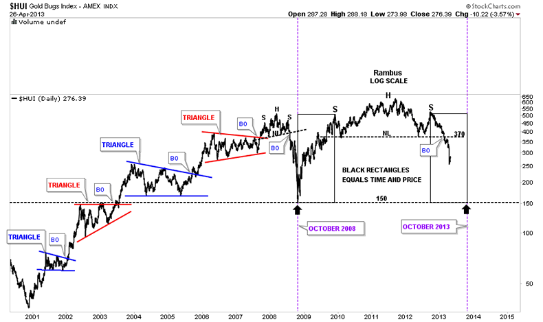
Lets take a look at the weekly log scale chart for the HUI that shows the weekly gap is still in play as the HUI failed to close it completely this week. The black rectangles measures time and price. If the bottom of the halfway gap plays out similar to the top half then the HUI could reach the bottom around the 160 area in October of this year based on both halves being equal.
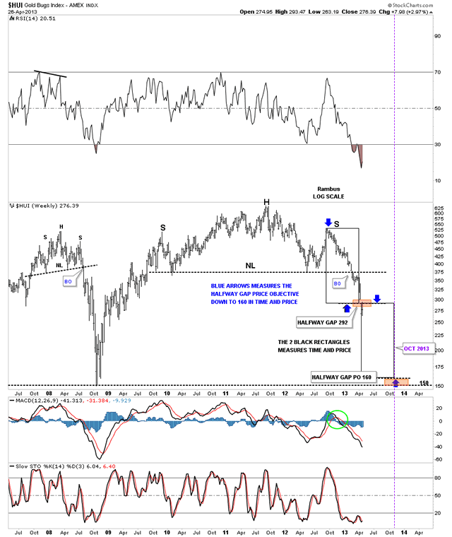
Here is an interesting observation. On the chart above I showed you how the 2 rectangles each measured time and price from the halfway gap that gave us a price objective down to the 160 area in October of this year. This next chart I’ve shown you before that shows the reverse symmetry taking place from the rally off the 2008 low to the height of the left shoulder. What is interesting is that the 2 rectangles on the chart below are unrelated to the two rectangles that measures the halfway gap. As you can see on the chart below both charts come up with the 160 price target in October of this year using 2 completely different scenarios.
On a positive note lets look at the very long term 30 year chart for Silver that shows two massive inverse H&S bottoms. This month the price action has come down and is testing the big neckline #2 which comes in around 23 the area. If silver ever closes below neckline #2, on a monthly basis, that would that would be bearish. If this big base holds then silver is going considerably higher as shown at the top of the chart. The main thing right now is to watch the price action on the shorter term charts and see how the bottoms of the consolidation patterns that I showed you earlier, hold up. If we start to see prices breaking above some of those bottom rails on the 20 month rectangle or the bottom rail of the bearish falling wedge then we will need to re-evaluate the situation accordingly. Silver will talk to us, we just have to listen.
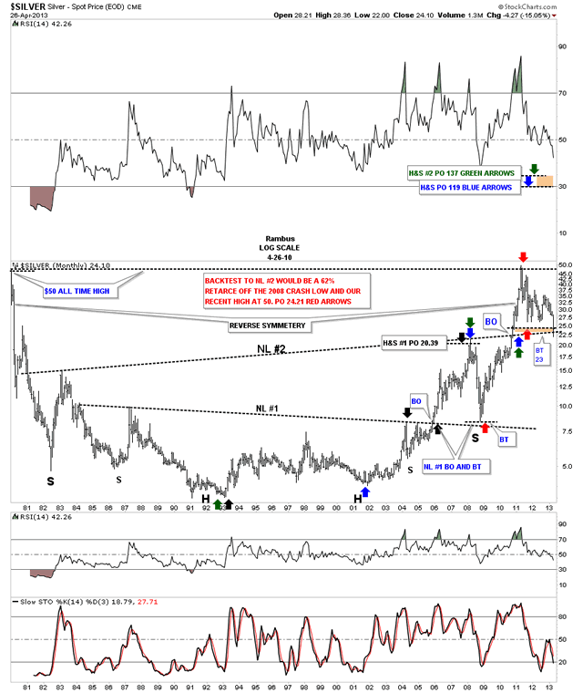
Below is a 30 year line chart for silver that shows the backtest still in progress down to the 21 area on a monthly closing basis.
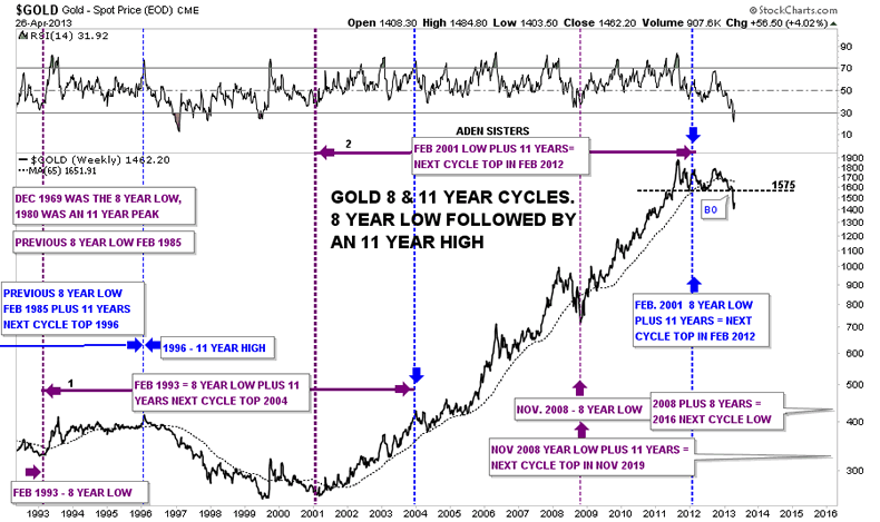
This last chart I would like to show you is a long term look at gold using an 8 year low followed by an 11 year high cycle chart that the Aden sisters posted back on June 22, 2010. Their chart shows up at the end of the article.
http://www.safehaven.com/article/17245/golden-times
After studying and seeing their chart I built my own chart so I could follow the 8 and 11 year cycles as they described them. Last year, in February was when the next 11 year cycle top was supposed to come due. At the time I noted it on my chart and just observed to see what would happen. I knew if the 11 year cycle high was in place that some sort of top should also be in place. Two weeks ago when gold had the big breakout move down, that confirmed for me, that the 11 year cycle high must be in place even though a whole year went by before the breakout came. You can now see the top, clear as day, on the chart below.
Oh I almost forgot for those inquiring about a Gold Target I posted this as the Friday Nite Chart:
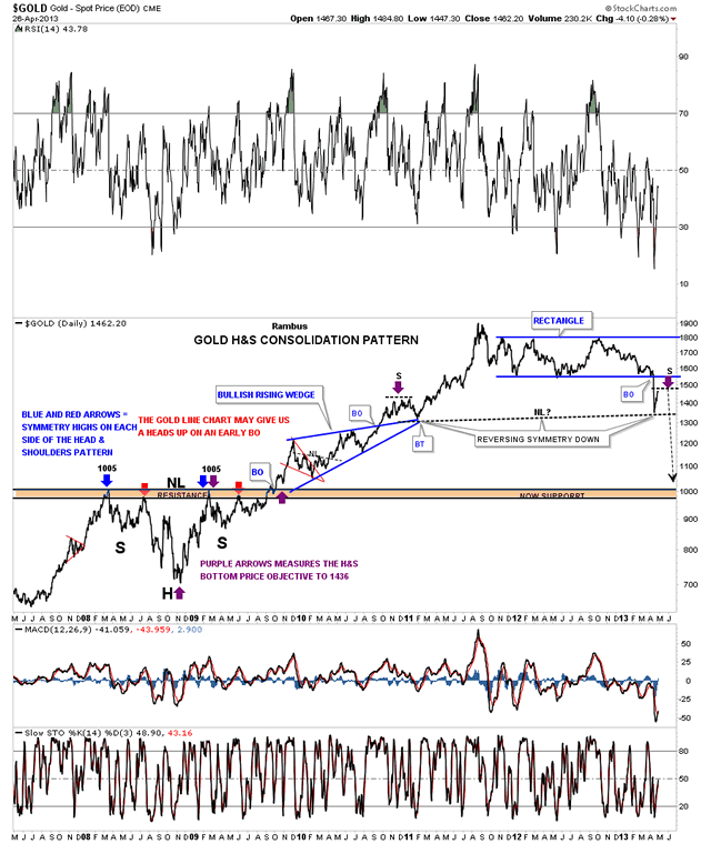
Usually on Friday night I’ll post a few charts that may be interesting to the current environment. Tonight lets look at an old, long term, 6 year daily line chart for gold that shows a H&S consolidation pattern that formed back at the crash low in 2008. It was one of the most symmetrical H&S patterns I ever charted. It’s hard to tell from this long term look but it was a thing of beauty. It’s hard to remember for some but the gold neckline came in at 1005 as shown by the blue and red arrows. I’ve extended the neckline, brown shaded area, all the way to the right side of the chart. If I was looking for the ultimate support zone it would have to be the brown shaded neckline.
I hope these charts gets everyone up to speed as to where we are and where we might be headed. The best I can tell right now is that the last quarter of this year looks like a decent place to see a good bottom for the precious metals complex. We might get more clues as this decline matures. We might see a consolidation pattern or two form before we bottom out that may give us a little insight. Right now, with the information we have, October through to December looks ripe for a time and price objective that could yield a good low. I’ll show you a few more things in the Wednesday Report that I’m looking at that might shed some more light on the bottom area later this year. All the best…Rambus
Rambus Chartology is Primarily a Goldbug TA Site where you can watch Rambus follow the markets on a daily basis and learn a great deal of Hands on Chartology from Rambus Tutorials and Question and Answers .
Most Members are Staunch Goldbugs who have seen Rambus in action from the 2007 to 2008 period … and now Here at Rambus Chartology since early 2012
where he has prepared us for this debilitating PM smackdown.
What is he seeing now ?
Gary (for Rambus Chartology)
FREE TRIAL - http://rambus1.com/?page_id=10
© 2013 Copyright Rambus- All Rights Reserved
Disclaimer: The above is a matter of opinion provided for general information purposes only and is not intended as investment advice. Information and analysis above are derived from sources and utilising methods believed to be reliable, but we cannot accept responsibility for any losses you may incur as a result of this analysis. Individuals should consult with their personal financial advisors.
© 2005-2022 http://www.MarketOracle.co.uk - The Market Oracle is a FREE Daily Financial Markets Analysis & Forecasting online publication.