


Markets At the Junction of Risk ‘On’ and Risk ‘Off’
Stock-Markets / Financial Markets 2017 Nov 04, 2017 - 04:52 PM GMTBy: Gary_Tanashian

 [edit] As I do the actual work of plowing through NFTRH 472 I am noting some non-bond related indicators in line with the fading Junk/Quality ratios and easing Treasury yields noted in this post. If preliminary hints in these indicators intensify and long-term yield breakouts fail, we may get a market reaction of some kind and lurch to risk ‘off’ sooner rather than later. Most market charts remain straight up bullish. But charts are charts and indicators are a whole other animal.
This post serves as a public version (i.e. more wordiness than is usual in an NFTRH report) of NFTRH 472’s Bonds & Related Indicators segment. If you’re not following bonds closely, you’re not really following stock and asset markets. You’re throwing darts.
At the junction of the inflated risk ‘on’ trade (stocks, global growth assets, etc.) and risk ‘off’ (gold, Treasury bonds, cash & equivalents, etc.) are the pivotal indicators to these conditions, Treasury bond yields, yield dynamics and bond market signals.
My assumptions are that inflation instigated speculation is in play, but it has been seen as ‘good’ inflation or not inflation at all because it’s been rooted in stocks on this cycle… and how can that be bad? That is sarcasm.
The other assumption is that the bond market, routinely manipulated at will by powerful policy makers over the last 9 years has served two purposes; to mask the inflation (the Fed’s Operation Twist literally had that as its primary goal and function) and to help fund asset speculation. I just shake my head when I hear economists talking about ‘GDP this, full capacity that and recession the other thing’ in conventional, buttoned down terms because the economic recovery is the asset bubble and after this one is resolved they’ll be doing what they always do, which is feed us all the reasons why it went down an unexpected path well after the fact. That is because it is not a conventional economist’s job to question why, only to extrapolate conventional Economics 101 through Masters degree level economic theory… until something breaks.
Look no further than economic guru Abbie Joseph Cohen, she of 2000 bubble era fame. Apparently she’s still taken seriously as there she was being interviewed on NPR this week. In a discussion about new Fed chairman Jay Powell (a non-economist she made sure to point out and fret about) Abbs talked about how Masters level economist Ben Bernanke was masterful in his deft handling of the 2008 “financial crisis”. People with vested interests in keeping you in conventional thinking mode never seem to mention that it was Federal Reserve policy excess that instigated the “financial crisis” in the first place. Take a view from Wonderland and you may see the folly of it all.
Back on message, the assumptions are that money printing in its various forms was used to promote asset speculation as an economic remedy and that bonds have been manipulated in order not to show true inflationary signals. If you ask me, these assumptions are self-evident, but for the sake of balance we’ll play it straight. We’ll also note again that stock market trends are bullish (Captain Obvious). That is what most people actually care about, I grant you. But I have a need to always be trying to flesh out the why along with the what. The why is the result of massive monetary stimulation and the what is bullish. Period.
But where are we going? That’s up to indicators, many of which are bemoaned to have been dysfunctional on this bull cycle. Yet the abused and bastardized bond market may yet provide us with the necessary signals. Right now it’s a bull party and is likely to remain a bull party as long as current bond indicator trends are in place; and so let’s update through the lens of bond yields and dynamics.
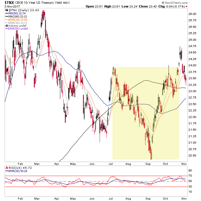
Using the 10 year yield we note that a bullish pattern is still in play, although bonds rallied hard this week and yields dropped. Should the pattern be reactivated after the false breakout, the target is 2.9%.
The implications? Well, for the bond market the implication is that the 2.9% daily pattern measurement fits nicely with some big picture macro points that would serve as either the death of yet another inflationary phase (the inflation is out there folks, not in the numbers the government cooks up but rather, it’s rooted in stocks and leveraged risk assets) or the gateway to a full frontal von Mises style inflationary “Crack Up Boom”, which would probably be perceived as bullish in its initial stages.
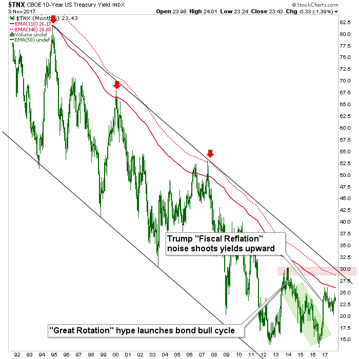
Maybe the simplest way of timing events is to not try to time them at all *, but instead patiently let the indicators play out. We should know shortly if chart #1 above is going to resume its bullish yield destiny (bearish for bonds) and go hand in hand with rising risk ‘on’ assets and increasing inflationary noise. This would be an extension of the yield rise in 2016 that gained fuel due to the perceived fiscal reflation to come, after Trump was elected. The yield is still in a bullish looking ‘handle’ to that initial big up surge.
Yields can rise quite a way with bullish stock prices, and referring to the second chart, no real inflationary hysteria is indicated until the resistance traffic in the 2.9% to 3% area is exceeded; although the media may once again get hysterical about inflation below the limit area as it did when Bill Gross famously went short bonds (long yields) in 2011’s ‘inflation expectations’ blow off and the “Great Rotation” promo that was spun in 2013. In each case, deflationary winds then blew in to varying degrees, capping yields and signaling new downturns.
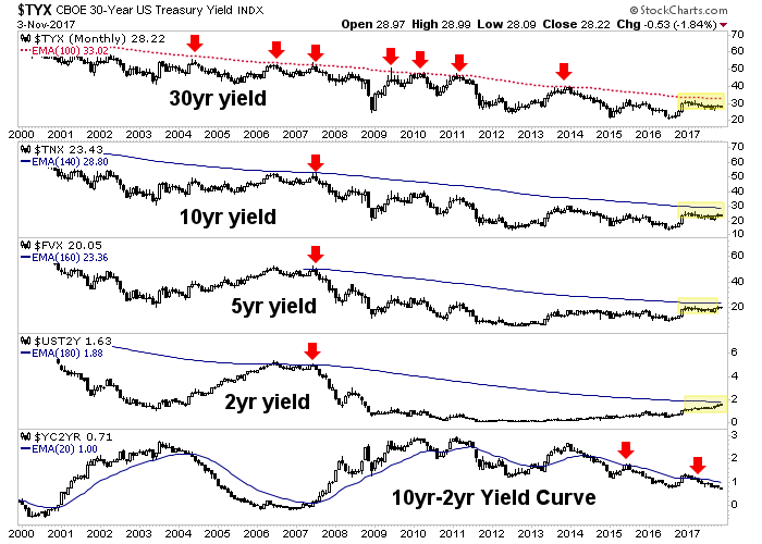
Here is another monthly chart, showing various yields and the yield curve. Things 1-3 are in bull flags and as yields rise with risk ‘on’, all is indicated to be okay. But again, the moving averages are either the limiters to the party or they are the gatekeepers to an inflation scenario that could run too hot. Goldilocks likes her porridge “just right”, after all. If the party is limited at the moving averages (30yr @ 3.3%, 10yr @ 2.9%) it would be a logical time for a correction in stocks. That has been our preferred view and that is what I am sticking with as long as the daily yield charts do not break down.
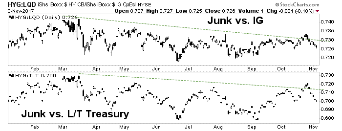
If the yield charts do break down before a try for the limiters, we will need to decide whether the immediate play is a bullish Goldilocks scenario (economic signals vs. inflation signals ‘just right’) or a real lurch to risk ‘off’. In this regard, it will be helpful to follow the signals from junk bonds vs. bonds of relative quality and inflation protected vs. unprotected Treasury bonds. Here we have a mixed view on the daily charts of these gauges of the will to speculate by casino patrons.
Last week risk inched ‘off’ below the market’s surface as Junk vs. both Investment Grade and Treasury faded along with the fade in nominal Treasury yields. If yields find footing and the markets continue upward these ratios are expected to turn back upward. If they don’t, they would be a negative divergence to the asset party.
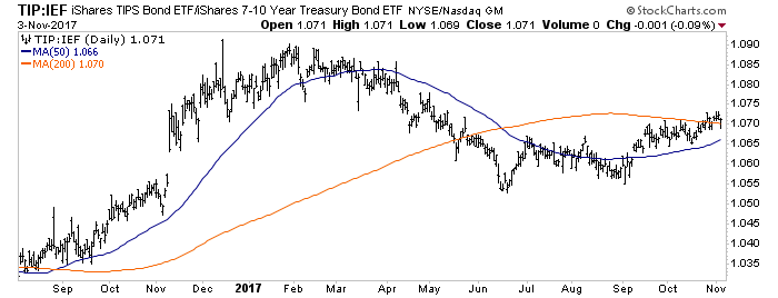
Yet TIP/IEF (an ‘inflation expectations’ gauge) held the 200 day moving average and as such, remains a constructive marker for the case of a renewed rise in nominal long-term interest rates.
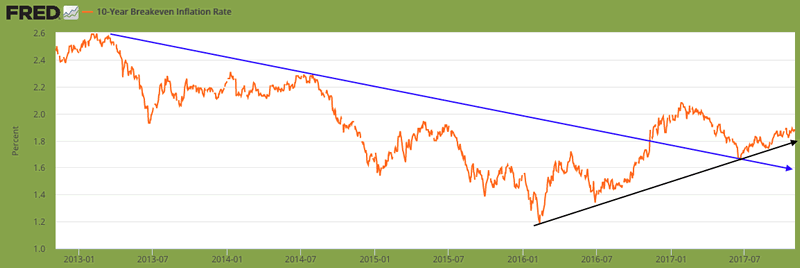
From the St. Louis Fed, the 10yr Breakeven rate is a similar gauge of inflation expectations. This longer-term view shows that not only was a downtrend broken in 2016 (blue), but a still-intact uptrend began earlier that year. The Fed wants inflation (in a “just right” amount, ha ha ha) and a test of the high or a new high in this gauge (above the Trump-fueled peak in early 2017) would give them inflation alright. As a tie-in to the first 3 charts above, a bout of inflationary expectations is probably needed to push nominal yields to their limiters.
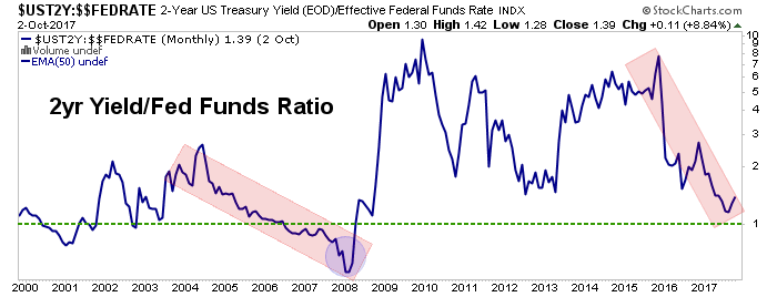
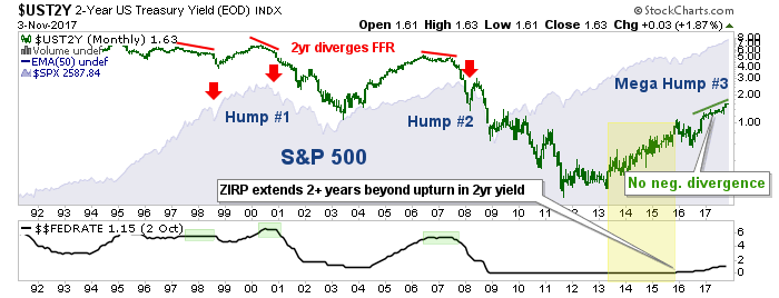
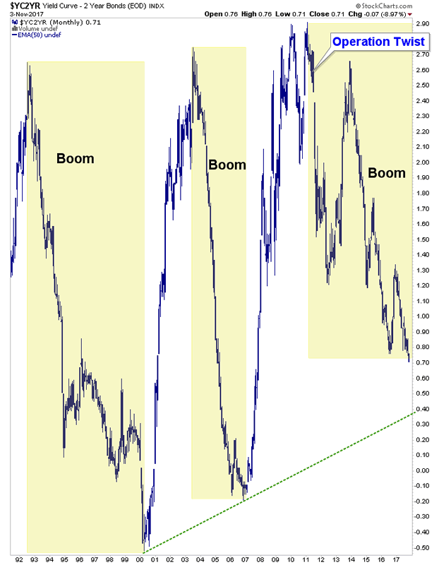
Yet the Fed is on a course to slowly take back the stimulants to the currently brewing asset bubble. But the Fed’s course is gradual, both in remedying its own QE-bloated balance sheet and taking back the egregious ZIRP (zero % interest rates for 7 years) policy. In NFTRH we are using this chart to note that the 2yr yield/Fed Funds rate (FFR) is on its way to 1, but not yet in a danger zone.
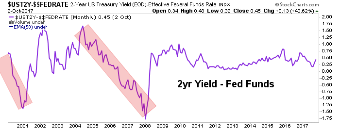
Here is the same chart showing the 2yr yield minus the Fed Funds rate. No danger yet.
For perspective, here is the big picture chart that shows what happened during the S&P 500’s Humps 1&2 after the FFR had climbed to the level of 2yr yields and the 2yr yield began to negatively diverge. The 2yr is currently safely above the FFR and there is no divergence. But while managing the bullish (risk ‘on’) present, we should also look ahead.
In line with the view in nominal Treasury yields and the 2yr vs. the FFR, the final component of our Treasury bond indicator fest is the yield curve, which is plainly in a daily downtrend.
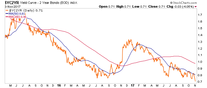
A down trending yield curve favors Goldilocks and the “just right” economy and inflation backdrop. But the question remains open as to where the decline will be arrested and beyond that, whether the next up turn will be inflationary or deflationary (a question that carries significant investment strategy implications, obviously).
Bottom Line
Barring a lurch to risk ‘off’ right now (per 30 & 10yr yield pattern failures and the negative hint in the ‘junk vs. quality’ ratios) a combination of nominal yield limiters (30yr @ 3.3%, 10yr @ 2.9%), inflation expectations, Fed Funds vs. 2yr yields and the state of the yield curve will give us all the information we need to know about the macro. It was the bond market that was used to instigate the current asset bull and it is the bond market that will signal either its continuation, interruption or its end.
Right now the favored view is that the bullish backdrop remains in play and is the dominant trend (Captain Obvious). But if/when certain indications register it will be time to favor a significant correction. It is either that or an inflationary von Mises Crack Up Boom awaits. We are not going to have “just right” porridge forever. No way in hell.
* My Q4 market top (for a significant correction at least) is still hanging out there and has the better part of 2 months left to prove out or fail. But again, the theme of this article is that bond indicators will actually decide the ‘when’ and for that matter, the ‘what’.
Subscribe to NFTRH Premium for your 40-55 page weekly report, interim updates and NFTRH+ chart and trade ideas or the free eLetter for an introduction to our work. Or simply keep up to date with plenty of public content at NFTRH.com and Biiwii.com. Also, you can follow via Twitter ;@BiiwiiNFTRH, StockTwits, RSS or sign up to receive posts directly by email (right sidebar).
By Gary Tanashian
© 2017 Copyright Gary Tanashian - All Rights Reserved
Disclaimer: The above is a matter of opinion provided for general information purposes only and is not intended as investment advice. Information and analysis above are derived from sources and utilising methods believed to be reliable, but we cannot accept responsibility for any losses you may incur as a result of this analysis. Individuals should consult with their personal financial advisors.
Gary Tanashian Archive |
© 2005-2022 http://www.MarketOracle.co.uk - The Market Oracle is a FREE Daily Financial Markets Analysis & Forecasting online publication.