


Silver Charts Say $5 Or Lower Is Coming
Commodities / Gold & Silver 2020 Apr 21, 2020 - 07:54 PM GMTBy: Kelsey_Williams

Even the most casual silver investor must be discouraged with what has happened to silver prices recently. But what about those who were/are super bullish? How do they feel?
As I read various reports and articles, I sense some back peddling on the more extreme predictions which were so prevalent just shortly more than a month ago. On the other hand, I also sense a reluctance to let go; to just admit they were wrong and move on.
Experiencing the reality of silver’s price decline of more than one-third in barely three weeks has left its mark in ways that cannot be ignored. It is ignored, though. And when it isn’t ignored, it is excused; or explained in terms that are supposed to make you feel better, but somehow make you feel worse.
Rather than rehash all of the depressing details verbally, I thought it might be a good idea to look at some silver charts which give us pictures of the damage that has been inflicted on a technical basis.
The charts are for time periods of one, five, ten, twenty, thirty, and one-hundred years. We’ll look at each chart in sequence. After each one, I will add some commentary.
CHART NO. 1/ONE-YEAR HISTORY OF SLV (SILVER ETF)
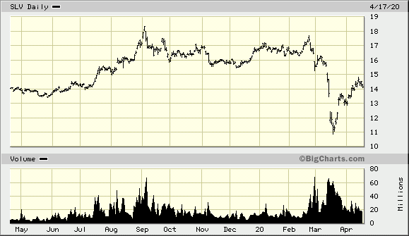
In this chart (source) we can see that SLV did not quite reach its previous peak from September 2019. Its rebound from lows of under $11.00 have taken it back to a level which was last seen just before its sharp increase last summer.
Another way of saying this is that silver prices today are no higher than they were a year ago. This comes after an increase in price of more than thirty percent last summer and failing to break through that level two months ago under conditions that were expected to take it to even higher levels.
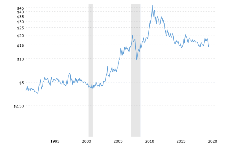
CHART NO. 2/FIVE-YEAR HISTORY OF SILVER PRICES
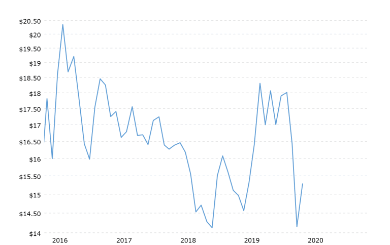
Here (chart no. 2) it is apparent that silver is in a longer-term downtrend in prices going back to its high point of more than $20 per ounce in 2016. Silver’s recent spike upwards and its subsequent retracement to new lows appears to be an just an aberration in the five-year pattern of lower highs and lower lows. (source for chart above and for all remaining charts)
CHART NO. 3/TEN-YEAR HISTORY OF SILVER PRICES
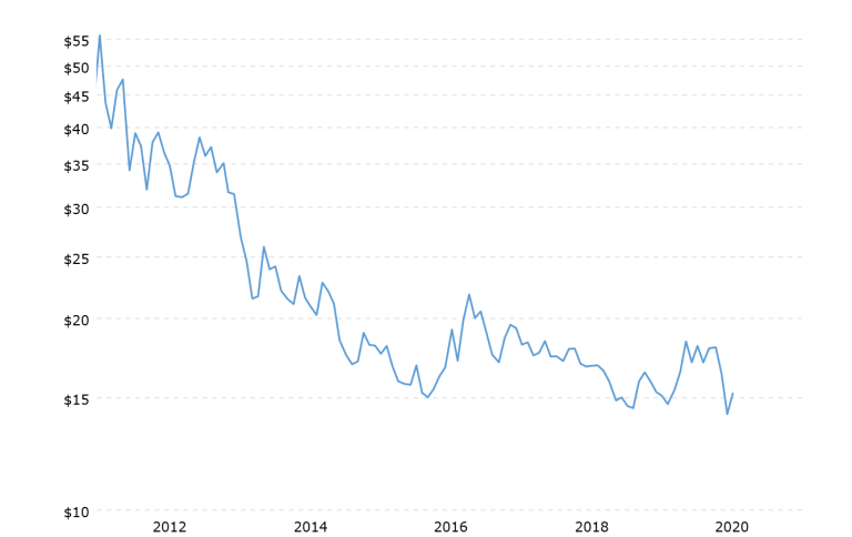
Here (chart no. 3) we see that silver prices have been declining since they peaked nine years ago, in 2011.
CHART NO. 4/TWENTY-YEAR HISTORY OF SILVER PRICES
In this chart (no. 4) silver’s recent nine-year decline in prices was preceded by a ten-year uptrend. It is clear that silver prices are higher than they were twenty years ago, but the slope of the uptrend continues to decline along with lower/sideways silver prices.
CHART NO. 5/THIRTY-YEAR HISTORY OF SILVER PRICES
This chart (no. 5) adds ten years of sideways prices for silver, loosely clustered around the $5 mark. Here it appears that silver prices may have moved to a general level of equilibrium about triple where they were during the 1990s.
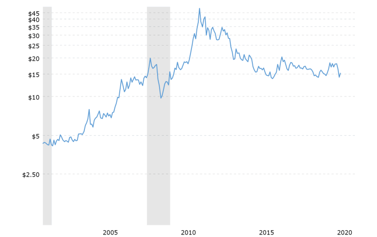
CHART NO. 6/ONE HUNDRED-YEAR HISTORY OF SILVER PRICES
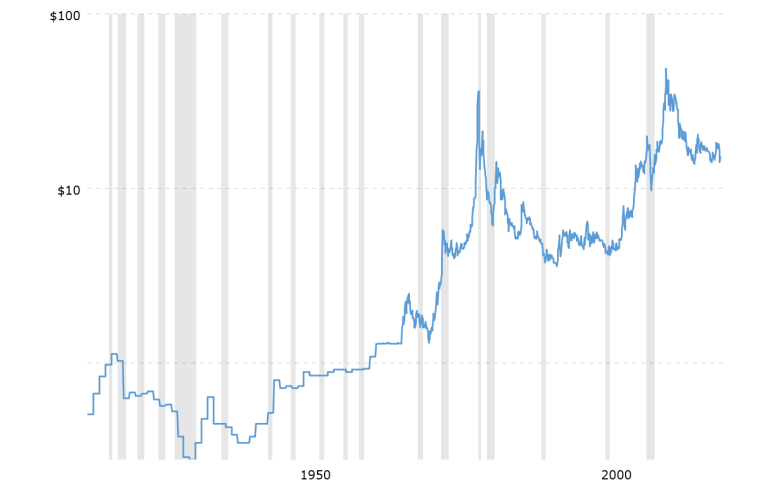
In this chart (no. 6), it is clear that the price of silver is in an uptrend dating back to 1932. Unfortunately, silver could drop to as low as $10 per ounce anytime in the next couple of years without violating that uptrend.
Assuming that the nearly ninety-year uptrend in prices remains intact, is there more we need to know? Absolutely. Lets look at one more chart. This one is the same one-hundred year history of silver prices as above, but on an inflation-adjusted basis.
CHART NO. 7/ONE-HUNDRED YEAR HISTORY OF SILVER PRICES (INFLATION-ADJUSTED)
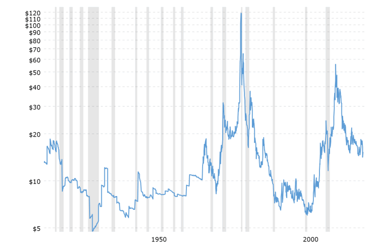
Several new things come to light in this chart (no. 7) giving us much needed additional information.
The long-term uptrend dating back to 1932 was decisively broken to the downside in the late 1980s. After that, silver’s price continued lower reaching its inflation-adjusted low in 2001.
If we connect the two extreme low price points occurring in 1932 and 2001, there is a subdued uptrend line of support, but the picture painted is radically different from the previous chart (no. 6).
If silver prices were to drop back to that subdued line of support, the intersection would come at close to $7 per ounce, rather than the $10 per ounce indicated in the previous chart.
The inflation-adjusted low for silver prices in 2001 was $6 per ounce. That represented a decline of ninety-five percent from its intraday peak in January 1980. A similar decline percentage-wise now from its 2011 peak would take silver right back to that same level.
On a nominal price basis, silver’s actual low point was hit in 1991 at $3.55 per ounce. This was ten years earlier than its inflation-adjusted low mentioned in the preceding paragraph, and represents a decline of almost ninety-three percent from its intraday peak of $49.45 in January 1980.
A similar price pattern and time frame now could take silver to $3.50 per ounce by the summer of 2022. After that, it could languish at those lower levels for another decade, as it did all during the 1990s.
Given that the winds of deflation are blowing strongly right now, it would be wise to see how silver fared during the Great Depression.
During the twelve years beginning in 1920 and ending in 1932, silver’s price dropped seventy-five percent from $1.13 to $.28.
Well, guess what? From its intraday peak in 2011 at $48.70 per ounce to its recent low point of $11.77 per ounce, the price of silver has already dropped 75.9 percent.
Silver can go lower still – much lower; and, it probably will. After that, even a best case scenario could keep silver prices in check for years to come.
It is wise to own some silver coins for physical exchange in the event of complete financial collapse and US dollar repudiation. Beyond that, investing in silver is costly and disastrous.
For wealth preservation, nothing else is better than gold.
(also see Silver Is Cheap And Getting Cheaper)
Kelsey Williams is the author of two books: INFLATION, WHAT IT IS, WHAT IT ISN’T, AND WHO’S RESPONSIBLE FOR IT and ALL HAIL THE FED!
By Kelsey Williams
http://www.kelseywilliamsgold.com
Kelsey Williams is a retired financial professional living in Southern Utah. His website, Kelsey’s Gold Facts, contains self-authored articles written for the purpose of educating others about Gold within an historical context.
© 2020 Copyright Kelsey Williams - All Rights Reserved Disclaimer: The above is a matter of opinion provided for general information purposes only and is not intended as investment advice. Information and analysis above are derived from sources and utilising methods believed to be reliable, but we cannot accept responsibility for any losses you may incur as a result of this analysis. Individuals should consult with their personal financial advisors.
© 2005-2022 http://www.MarketOracle.co.uk - The Market Oracle is a FREE Daily Financial Markets Analysis & Forecasting online publication.