


Weekly Stock Market Technical Analysis Report - 28th April 07
Stock-Markets / US Stock Markets Apr 28, 2007 - 01:11 PM GMTBy: Mike_Burk

The good news is: All of the major indices hit multi year or all time highs during the past week.
Short Term
The secondaries lead both up and down.
The first chart covers the past 6 months showing the S&P 500 (SPX) in green and the Russell 2000 (R2K) in red. The histogram at the bottom of the chart is a FastTrack relative strength indicator called Accutrack (AT). You can find out more about AT at: http://fasttrack.net/
When the R2K is outperforming the SPX AT moves upward and above the neutral line. Usually, AT turns upward near index lows and downward near index highs. AT turned downward in mid April and was below the 0 line as the indices hit their highs last week, very unusual.
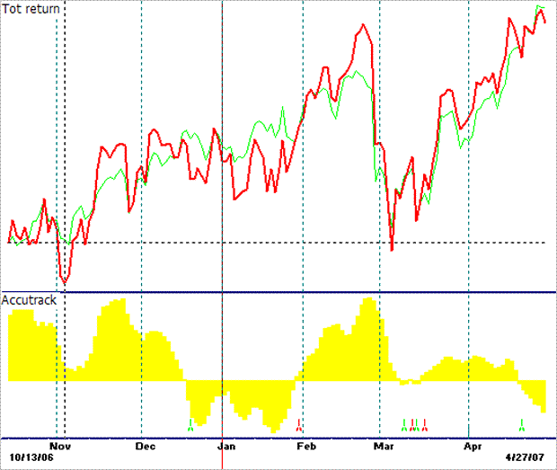
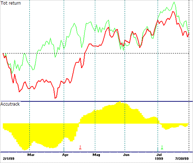
The last similar instance of AT being negative while the indices were hitting new highs was in July 1999. From this point the indices declined about 10% before resuming their upward move.
1999 was also the 3rd year of the Presidential Cycle and the market was manic in its upward move, similar to what we have been seeing for the past 9 months.
There are so few examples of the market hitting new highs while R2K/SPX AT was negative that you cannot be certain of the outcome, but, the short term implications are not positive.
Intermediate term
A healthy market has broad participation.
The chart below covers the past 2 years showing the S&P 500 (SPX) in red and an indicator showing the percentage of the component issues of the SPX that are above their respective 50 EMA's.
You can see how the indicator has deteriorated prior to every significant decline in the index. The current behavior of the indicator looks more like the beginning of an up move than an end.
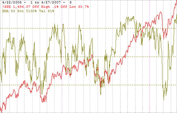
It is a little disconcerting that the highest percentages of component issues above their 50 day EMA's are found in the blue chip indices.
As of Friday the values for some of the major indices were:
DJIA 88%
OEX 86%
SPX 81%
S&P mid 68%
R2K 63%
S&P small 59%
Seasonality
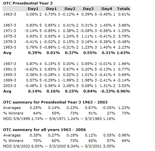
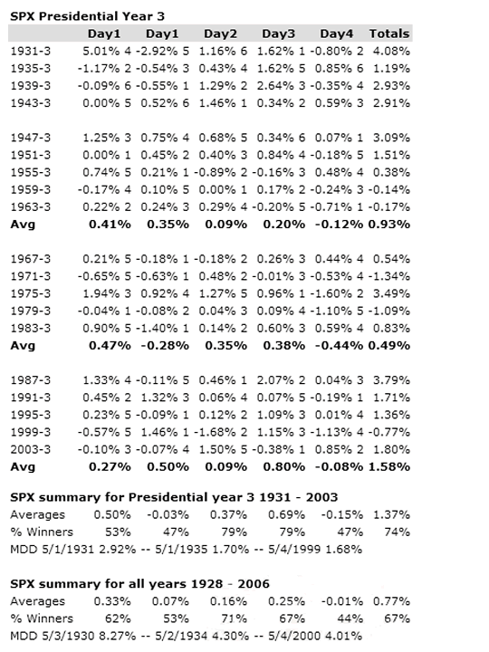
Next week includes the last trading day of April and the first 4 trading days of May during the 3rd year of the Presidential Cycle.
The tables below show the last trading day of April and first 4 trading days of may for the OTC from 1963 - 2003 during the 3rd year of the Presidential Cycle and the SPX from 1931 - 2003.
There are summaries for both the 3rd year of the Presidential Cycle and all years combined.
Next week has a very positive seasonal bias.
Both the OTC and SPX have been up about 75% of the time with an average gain in excess of 1%.
The number following the year represents its position in the presidential cycle.
The number following the daily return represents the day of the week;
1 = Monday, 2 = Tuesday etc.
May
Measured by the SPX since 1928 May has had the 3rd worst return of all months, up 56% of the time with an average return of -0.2%. The OTC has done a little better, up 55% of the time with an average return of +0.4% making May the 4th best month for the OTC.
The 3rd year of the Presidential Cycle measured by the SPX is only slightly better, up 58% of the time with an average return of 0%. The OTC has done a little better, up 64% of the time with an average return of 1.9%. SPX averages are skewed because the worst year for the SPX was 1931 when it was down 11.1% and OTC data begins in 1963.
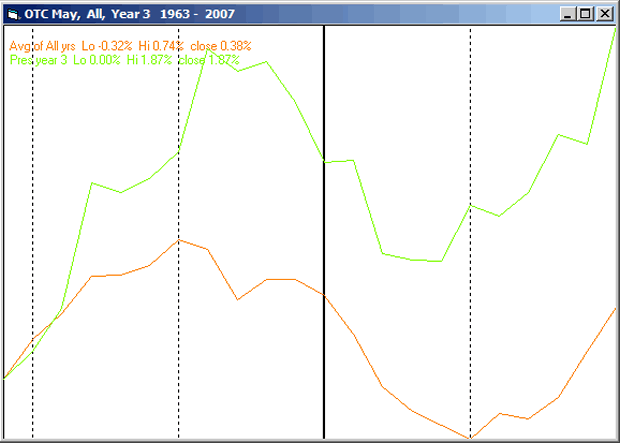
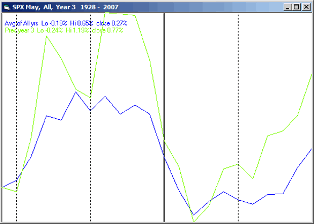
The charts below show the average daily return for May over all years and during the 3rd year of the Presidential cycle. The number of trading days for the month varies from year to year but average 21. The charts have been constructed by averaging the 1st 11 trading days and the last 10 trading days of the month. If a month had more than 21 trading days some of the days in the middle have not been counted while if the month had more than 21 trading days some of the days in the middle have been counted twice.
The first chart shows the average return of the OTC over all years in orange and the average for the 3rd year of the Presidential Cycle in green.
The next chart shows the average return of the SPX over all years in blue and the average for the 3rd year of the Presidential Cycle in green.
Mutual Fund
Compliance issues demand that I not mention the mutual fund that I manage by name or symbol in this letter.
To see a current chart of the fund go to: http://finance.yahoo.com/q/bc?s=APHAX&t=3m
For information about the fund go to: http://www.thealphafunds.com/index.htm
The fund now has service class shares available.
Conclusion
The market is still overbought and by many indications due for a tumble, however, seasonally next week has been very strong.
I expect the major indices to be higher on Friday May 4 than they were on Friday April 27.
Last weeks negative forecast based on an overbought market with weak seasonal support was a miss.
By Mike Burke
Mike Burk is an employee and principle of Alpha Investment Management (Alpha) a registered investment advisor. Charts and figures presented herein are believed to be reliable but we cannot attest to their accuracy. The views expressed are provided for information purposes only and should not be construed in any way as investment advice. Furthermore, the opinions expressed may change without notice. To subscribe to this report : http://alphaim.net/signup.html
© 2005-2022 http://www.MarketOracle.co.uk - The Market Oracle is a FREE Daily Financial Markets Analysis & Forecasting online publication.