


HUI Stocks to Gold Ratio Charts..When is Enough Enough?
Commodities / Gold and Silver Stocks 2013 Dec 09, 2013 - 10:35 AM GMT

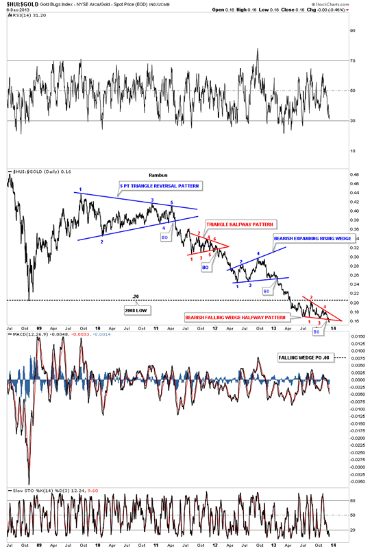
 Tonight I would like to show you some HUI to gold ratio charts that could give us a place to look for the ultimate low for the big cap precious metals stocks. So far these charts have been playing out for over five years. The first chart is a 5 year daily line chart that shows the blue 5 point triangle reversal pattern. That 5 point blue triangle reversal pattern has led the big cap PM stocks lower forming one consolation pattern after another.
As this is a line chart the low for the 2008 crash low was .20. I've shown you many times, that when you have an important support and resistance zone or rail, a consolidation pattern can form above, below or right on that important area. Note the red bearish falling wedge halfway pattern that has formed just below the all important support and resistance rail on the bottom right hand side of the chart. Also note the breakout that just occurred that is signaling the next impulse leg down is just beginning. The two red patterns are halfway consolidation patterns that I'll show you how they are measured in a bit.
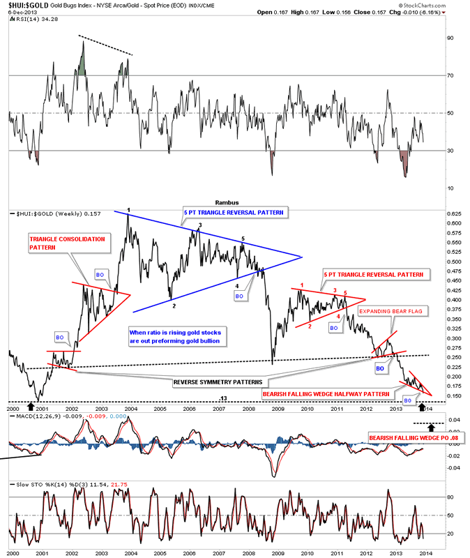
This next chart is a long term weekly look that shows the entire bull and bear cycle that began at the end of 2000 with that infamous 5 point blue triangle reversal pattern. As you can see this ratio chart has almost completed a round trip. Notice the massive blue 5 point triangle reversal pattern that called the end of the PM stocks outperforming gold. It was and still is hard to believe, that that was the end of the out performance of the big cap PM stocks to gold. You can see the 2008 crash that occurred when the massive 5 point triangle broke down.
Note the red 5 point triangle reversal pattern, that I showed you on the chart above, that formed when the rally off the 2008 crash low was finished. It has been all downhill even when gold went to its all time high in September of 2011 at 1920. I've been looking for the .13 low, that started the bull market back in 2000, to be hit at some point in time. That seems like the most logical area for the HUI to bottom but I will show you why I think this ratio maybe going lower before it's all said and done. First the weekly chart.
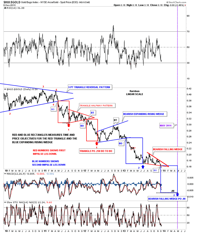
This last look for the HUI to gold ratio chart is a 5 year daily line chart that shows the measured moves since the breakout of the 5 point triangle reversal pattern. So far the measured moves down have been deadly accurate as measured by the red rectangles. As you can see the red triangle was a halfway pattern as measured by the two red rectangles with one on top and one below. The lower red rectangle measured to the beginning of the blue bearish expanding rising wedge, red #2, that is the start of the next impulse leg down that is slightly longer than the first one.
Now we are going to measure the second impulse leg down as measured from the blue bearish expanding rising wedge. The first half of this measured move is the upper blue rectangle. As you can see we just broke out from the red bearish falling wedge that shows the measured move, as shown by the lower blue rectangle, has a price objective down to .08 with a time objective around May of 2014. This could very well be the annihilation phase that Sir Plunger has been describing. All the best...Rambus
All the best
Gary (for Rambus Chartology)
FREE TRIAL - http://rambus1.com/?page_id=10
© 2013 Copyright Rambus- All Rights Reserved
Disclaimer: The above is a matter of opinion provided for general information purposes only and is not intended as investment advice. Information and analysis above are derived from sources and utilising methods believed to be reliable, but we cannot accept responsibility for any losses you may incur as a result of this analysis. Individuals should consult with their personal financial advisors.
© 2005-2022 http://www.MarketOracle.co.uk - The Market Oracle is a FREE Daily Financial Markets Analysis & Forecasting online publication.