


Major World Stock Market Indices Analysis: SPY, QQQ, DAX, FTSE, CAC, HSI
Stock-Markets / Global Stock Markets Nov 09, 2014 - 11:22 AM GMTBy: Michael_Noonan

 There can be one reason only for putting your money into the stock market and that is to earn a return on capital. Back in 2008-2009, many were faced with what would be their return OF capital once the market decline came to an end. Many never recovered their losses. For what lies ahead, from our perspective, a similar choice, but worse is in store for market participants. As context, it is worth remembering that no country can keep printing [actually now digitally creating] money-to-infinity, creating more debt than has ever existed, and with interest rates at near zero, without disastrous consequences. It defies common sense, and it defies prudent investing. Now there is a term we have not heard in quite some time. Our approach to markets is reading developing market activity in the form of price and volume without resorting to conventional technical analysis tools like moving averages, relative strength, MACD, Elliott Wave, whatever. The very best and most accurate source of information comes from the market itself, and it is available to everyone at the same time, as price and volume develop each minute, hour, day, week, month, etc, for whatever time frame one chooses.
The chart indices that follow are a composition of the stocks in each market, from the best performers to the worst and everything in between. If your objective is to make money, then it stands to reason that each and every stock you own should be performing better than the indices. If your objective is not to make money, then your portfolio likely has many stocks that are not making money, the justification for which is beyond any sound reason for investing in the first place. Maintaining lower financial standards seems to have a higher degree of following for many in the stock market. Is it so unreasonable to ask the question, if any stock purchased is not outperforming the averages, why commit money to it? If the rationalization is that it may catch up to the rest of the market, then wait for it to demonstrate that it can catch up and then buy it. It is like watching a horse race, out of 10 horses for example, you decide to place a bet on one that is running in the middle of the pack, or near the end, hoping it will somehow change its demonstrated ability to fail to meet just average standards and all of a sudden outrun the leaders to the finish line. When we look at charts, we are looking at present tense performance results that are facts in terms of where price is in relation to where you want/expect it to be. If the facts are not proving the standards you expect, move on to another possibility that is. As you view each of the stock indices below, compare your own stocks against the performance of the averages. It does not require a degree in finance to understand a simple comparison. If in doubt, ask a 5th grader to make the comparison. He or she is not burdened with outside complications that can cloud one’s viewing perspective. It is your money, therefore your responsibility, even if you turn over that responsibility to another to invest for you, you still should hold that party to the same standard and not accept rationalized excuses. Money printing by the US central bank keeps this market going, and anyone who has been betting that a bear market is just around the umpteenth corner simply does not know what a basic trend is. It is an established fact that more money is lost trying to pick bottoms and tops. As of Friday, the number of profitable short sellers in this market is not very big. The lesson to be learned here is two-fold: 1. Never bet against the trend, and 2. if your stock holdings are not at least as good in performance as the chart below, it is time to take a comparative inventory and make some responsible decisions to preserve capital from further risk.
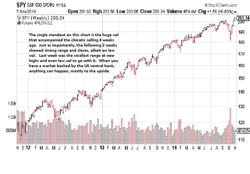
The September swing high is an example of how market tops form: a failed high and immediate downside follow-through. The “V”=type bottom is not a typical recovery, but nothing in the US markets over the past few years has been typical. If any of your holdings have not recovered in a similar fashion from the October low, the odds are against them recovering. Smart stock selectors are picking those which are outperforming the SPY index. If stocks are not at least matching the performance, then they are simply eliminated to reduce risk exposure. Nothing hurts performance more than holding on to losing stocks. Stock selection is a business, not a popularity contest or one based on sentiment.
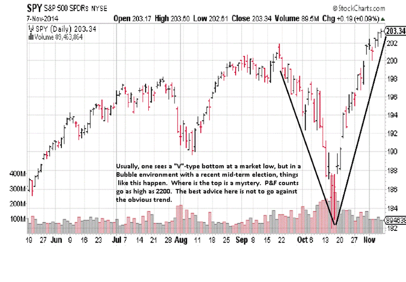
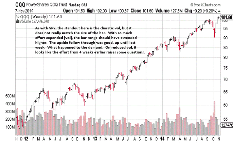
Many of the best performers have been NASDAQ stocks, and even they must still meet the standards of performance or else elimination. The small range for last week is typically a red flag, and a closer look at the weekly for a clearer explanation is in order.
The box captures the activity over the last 6 TDs, [Trading Days]. Is this a pause before resuming the trend, or a pause before reversing? Deference has to be given to the trend. The closes are mostly upper range, indicative of buyers being in control, and there is no evidence of supply, so higher prices should prevail. This also applies to individual stocks that should be doing at least as well as the index. We cannot repeat enough times the importance of maintaining performance for your holdings to at least match its index performance, for once these markets turn, stocks which have underperformed will often fare worse to the downside, and that can mean unwarranted risk exposure. Next to the importance of stock selection to make money is consideration for preserving capital from adverse moves lower. The two go hand-in- hand.
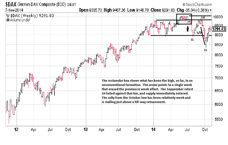
Dax performance has put that trend sideways, for now. [LH = Lower High, LL= Lower Low, S/D = Supply overcoming Demand]. The 9,800 area high established at the beginning of the year appears to be more meaningful because it is where the last swing high failed in September. The EDM [Ease of Downward Movement], after September indicated sellers entered in a big way, and it would make any recovery rally more difficult. The recovery rally from the October low has not been as strong as SPY or QQQ. It makes a difference when there is not as much central bank fiat being pumped into the market. If the current rally fails to go above the September swing high, it will turn the trend from sideways to down, as we measure trends. To turn a trend down, there has to be a sequence of two LLs and two LHs. It is a simple way to measure a trend change. There are many other ways, but whatever the chosen measure it must be applied consistently. Here again, if individual stocks are underperforming the DAX index, the probability of outperforming it is very slim, and that means increased risk exposure.The daily gives an amplified picture of what was discussed on the weekly. From that little retest rally in July, we drew a dashed horizontal line to the right to indicate potential future resistance. The September retest rally failed right there. The line did not mean that price would automatically fail that level. Instead, it is an alert to watch developing market activity for possible weakness that a rally could fail there. Everything must be confirmed before taking action.
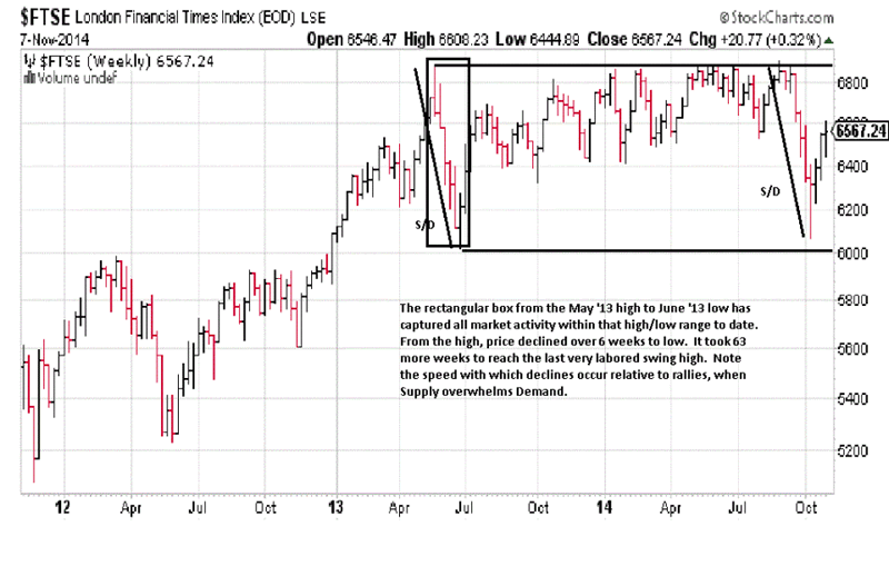
The rectangular box in the middle of the chart shows the importance of how strong directional moves can dominate. Price never did recover from that May sell-off, and the market was sending a clear message via the labored recovery over the next 18 months. Another clear message is that the strongest directional moves have been to the downside, both marked S/D [Supply overcoming Demand]. The speed of the recovery rally underway over the past 3 weeks has been somewhat strong, but the marginal net gain from last week’s close over the previous week has not been strong, and that could be a red flag. A red flag is a sign of caution that market activity may be giving a reason to expect change. Often, a look at the next lower time frame, the daily here, can provide more detail.
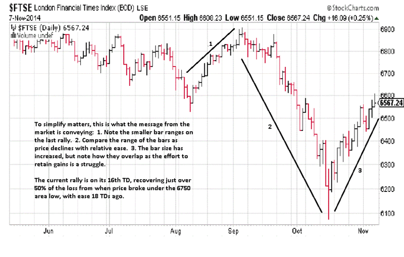
At the end of September, there was a series of overlapping bars that led to a breakdown in lower prices. The current rally has stalled where that breakdown occurred. We purposely did not draw in a dashed horizontal line to indicate a potential resistance area because some may think a line was drawn in hindsight. Having now qualified the end of market activity in September, you can now se why certain areas are used to drawing potential future support/resistance areas, and being aware of price failures like that is an alert for future activity. A look at just the last 3 bars in November shows a wide range strong close rally, 3rd bar from the right. The rally looks promising, at that point. Next day, the net gain is not much more than the strong rally bar, and the close is off the high and where price closed at the end of October. It is also where price closed on the 3rd TD of October. Friday’s smaller range bar and close below the half-way point is an indication that sellers were able to prevent buyers from making a better result that day, and it is at the resistance mentioned. The accumulated information over the 3 days was the market sending a message. If you were to now draw in a dashed horizontal line across 6,600, starting from the end of September you can see how market activity related to past performance, and HOW price behaved when it reached that level last week confirms 6,600 as resistance. You can even go back to August and see the one day probe under 6,600 that quickly recovered, showing that level as support, back then. Support, once broken, becomes future resistance. We direct you back to our third paragraph at the beginning of this article. The market is the best and most reliable source of information, and it is available for everyone to see at the same time. Compare your individual stock performance with this chart. If it is faring worse, it is unlikely to get better, so the market and results say.
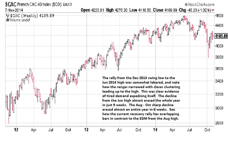
The performance of the CAC is weaker than the FTSE noted by the clearer October swing high compared to the September high. Last week’s close was under both the opening of the week and the previous week’s close, increasing the odds of another lower high and a change in trend from currently sideways to down. A look at the daily for more detail.
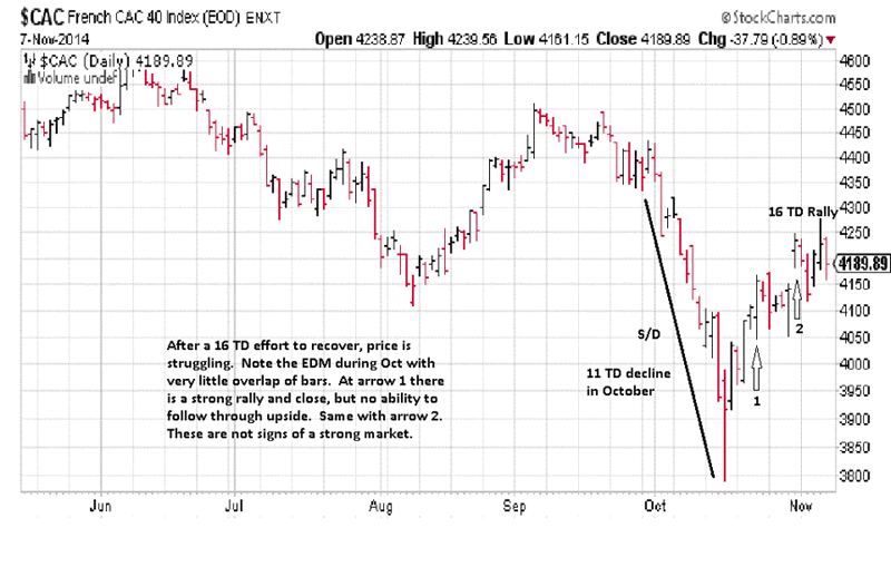
Last Thursday’s bar, wide range higher than the rally 4 bars earlier but failing to hold the rally and closing mid-range, tells us sellers were stronger than buyers. Friday’s lower day confirms that observable Thursday fact. To further illustrate a greater weakness in CAC, notice how last week’s rally failed to reach the September breakdown discussed in detail on the FTSE daily chart. This is how to determine when one index or stock is weaker than another. Assume for a moment that the CAC daily is an individual stock and a part of the FTSE. It is not performing as well as the index itself, and as an individual stock, CAC is not a candidate for staying long. This is how you measure relative strength of one your stock holdings v its index to determine if it should be retained.
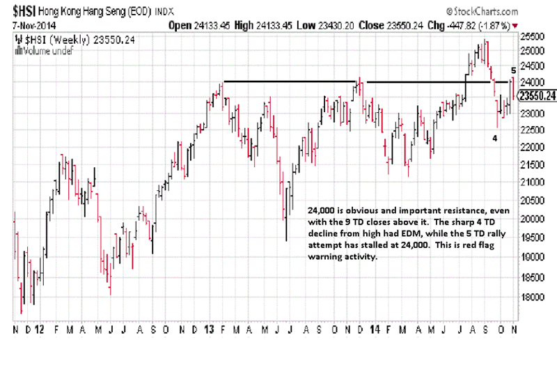
The weekly resistance line at 24,000 is similar to the 9,800 are line drawn on the DAX. A chart is a chart is a chart. The underlying price structure does not matter if it is an index, an individual stock, or a futures market. They all resonate to ultimate supply and demand factors that are pictured in price and volume behavior. Just as a retest rally stopped at a prior high in the DAX, you see the same market behavior in a totally different stock index. The large rally bar and strong close two weeks ago was promising for HSI. However, once price opened last week, it reversed to the downside, confirming resistance at 24,000. You must wait for confirmation of one form of market activity relative to a previous area. The daily chart should give greater clarity on the failure of last week’s bar.
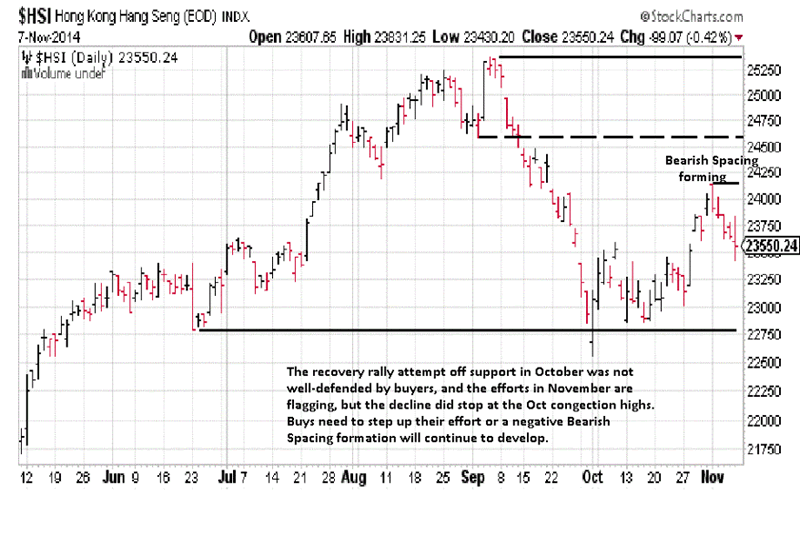
Monday’s price performance was a red flag that turned out to be an apt warning when price closed lower after making a higher high over the previous Friday. If this swing high failure holds, it will set up what is called Bearish Spacing. It occurs when the last swing high, [Monday], fails to reach the low of he last swing low, formed on the second TD of September, [see dashed line]. It is bearish because sellers are confident enough to sell before the market retests the prior low. This is just a potential scenario. We leave open the possibility that low of the week of September 15th could qualify as a more subtle swing low, and last Monday’s high closed any space between those two levels, thus eliminating any bearish spacing. Monday’s rally also stopped at a 50% retracement of the low to high, indicated by the two heavy lined horizontal line. A half-way retracement is a general measure of how strong or weak a rally may be, If price cannot rally past the half-way point, it is a sign of a tiring market. Individual stocks with HSI should be compared to the index to determine strength or weakness relative to the market order to evaluate individual performance and decide what risk exposure there is in one’s portfolio. As evidenced over the various markets, this is a wash, rinse, and repeat process which, if followed, will lead to more profitable results. Any questions can be sent to: mn@edgetraderplus.com.
By Michael Noonan
Michael Noonan, mn@edgetraderplus.com, is a Chicago-based trader with over 30 years in the business. His sole approach to analysis is derived from developing market pattern behavior, found in the form of Price, Volume, and Time, and it is generated from the best source possible, the market itself.
© 2014 Copyright Michael Noonan - All Rights Reserved Disclaimer: The above is a matter of opinion provided for general information purposes only and is not intended as investment advice. Information and analysis above are derived from sources and utilising methods believed to be reliable, but we cannot accept responsibility for any losses you may incur as a result of this analysis. Individuals should consult with their personal financial advisors.
Michael Noonan Archive |
© 2005-2022 http://www.MarketOracle.co.uk - The Market Oracle is a FREE Daily Financial Markets Analysis & Forecasting online publication.