


Dow Stocks Index Big Fake Out & VIX Analysis
Stock-Markets / Stock Markets 2014 Nov 30, 2014 - 12:47 PM GMTBy: Austin_Galt

 Dow
Dow
The Dow’s parabolic move higher has continued with gusto throughout November. So what’s next? Well, I think Santa is coming to the party with a Christmas rally that will be the last hurrah for this bull market that began in 2009.
Let’s begin the analysis with the weekly chart.
DOW WEEKLY CHART
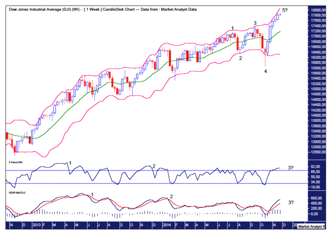
The Bollinger Bands show price clinging to the upper band as expected for a parabolic move higher. This move up still looks to have more price and time left in it.
There has hardly been any pullback of significance in the last month which is testament to the current strength of the bulls. I thought a minor 23.6% Fibonacci correction may occur but the bears couldn’t even manage that.
So we have a 5 point broadening top in play as denoted by the numbers 1,2,3,4 and 5. We are now just awaiting the final wave 5 high to form.
This is also a “three strikes and you’re out” topping pattern which consists of three consecutive higher highs.
As outlined in the November newsletter, I expect this final high to be much higher than the point 3 high as that high was only marginally higher than the first high at point 1. That appears to be holding true here.
There also appears the potential for the coming top to be accompanied by a triple bearish divergence in both the Relative Strength Indicator (RSI) and the Moving Average Convergence Divergence (MACD) indicator. This is denoted by the numbers 1, 2 and 3 on the respective lower indicators. This is commonly found at tops and generally leads to a significant decline.
Let’s move on to the monthly chart.
DOW MONTHLY CHART
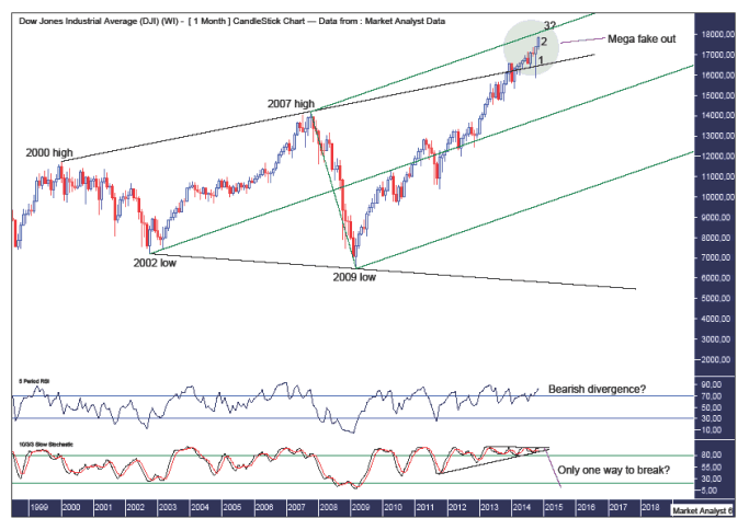
There has been a lot of talk recently about the big megaphone top that has formed. I have drawn this megaphone pattern on the chart which shows the upper trend line across the 2000 and 2007 highs and the lower trend line along the 2002 and 2009 lows.
This megaphone pattern is very obvious and when something is that obvious then caution needs to be heeded. In fact, instead of turning down, price has busted out above the top of this pattern. This is causing confusion with some now calling the next leg higher in an even greater bull market. So just what is going on?
It is my opinion that the current move higher above the upper trend line is a mega fake out of the megaphone pattern. This can be seen in the green highlighted circle.
So how high can we expect this fake out move to trade?
I have drawn an Andrew’s Pitchfork denoted by the three green parallel lines. We can see price now has the top pitchfork trend line in its sights. This currently stands above 18100. Price may do a little “up and over” by trading a bit above the trend line before reversing back down. In the November newsletter I forecast around 18500 but I suspect even that may be underestimating the power of this final surge.
And when might we expect this fake out move to end?
They say things happen in three’s. The old hip hop crew from New York, De La Soul, even had a song about the number 3 titled “The Magic Number”. So how does this relate to this fake out move?
These final moves often end after three higher candles. Just look at the move into the 2007 high which consisted of three higher candles. I think this is happening here but on a more extreme scale.
We can see October provided the first candle and November the second. December should be the third higher candle and I am favouring the high to come in the second half of December. Let’s see.
Another possibility is four higher candles but with the fourth candle being a bearish reversal. We can see this pattern comprised the move into the 2000 top. If this pattern plays out it would mean a top in the first half of January 2015 before price reverses and closes the month in the red.
The RSI is in overbought territory and may show a bearish divergence on the coming high.
The Stochastic indicator looks to be trading itself into a corner and considering where it is there looks to be only one escape route – to the south!
Let’s now do some big picture analysis using the yearly chart.
DOW YEARLY CHART
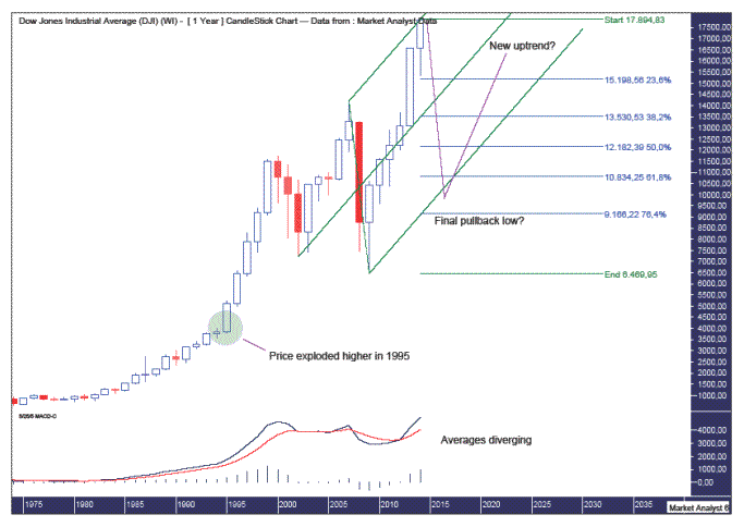
I have added the Andrew’s Pitchfork as shown in the monthly analysis. Price is butting up against the upper trend line and I expect this to provide solid resistance.
In previous analysis, I have shown the No Mercy cycle which is based on the 7 year cycle. The next No Mercy cycle year is next year in 2015 and I expect a stock market shellacking in line with this bearish cycle.
They say the market goes up by stairs and down in elevators and hence I am looking for the next move down to be fast and furious. I am looking for a move down into 2016 that wipes out many previous years gains.
In fact, I am looking for price to come down and test the lower pitchfork trend line. Price may even trade a bit lower in a false break of the pitchfork.
I have added Fibonacci retracement levels of the move up from 2009 low to recent high. Now I still expect a bit more upside but that should not overly affect this analysis. The retracement levels should only increase slightly.
Interestingly, the 76.4% level is just below the lower pitchfork trend line and around this level is my preferred target for low. I will also be watching closely the price action around the 61.8% level as that is certainly another possibility.
Also, one of Gann’s favourite levels to look for lows was 50% of the high price. Now we don’t yet know what the high price will be but if it is a bit above 18000 then this level would be just above the 9000 level. That also happens to be right around the 76.4% Fibonacci level. Hmmm.
But what if the stock market just keeps charging higher?
Well, anything and everything is possible in the market but it is my opinion that a correction is due. But that’s just me speculating and if there is no major correction then I am just plain wrong. Possible but not probable!
The MACD indicator shows the averages starting to diverge quite a lot and looks in need of some reversion to the mean. A big move down would do the trick there!
Can price plunge below the 2009 low as the mega-bears are predicting?
Of course it can. I have drawn a green highlighted circle which shows where price exploded higher in a parabolic move back in 1995. Price often returns to these exact levels further down the track. This level stands below the 4000 level.
I fully expect price to eventually trade down below the 4000 mark however I don’t expect it on the next move down. Once the next move down gets underway the mega-bears will be out in force calling for complete annihilation in world stock markets. That is, if the world doesn’t end first! This mega-bear scenario is still too obvious and too easy. I doubt it.
So how do I expect price to trade going forward?
Let’s move on to the logarithmic yearly chart to find out.
DOW LOGARITHMIC YEARLY CHART
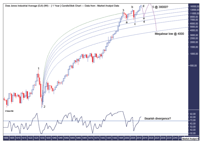
Some people use the logarithmic chart to make themselves look and feel like an expert. I use it because just looking at it makes me feel all warm and fuzzy inside. The nice curvy lines of the Fibonacci Fan especially ramp up that fuzzy feeling.
That aside, the logarithmic chart does put things in perspective and allows us to view in greater detail the price action of a time long since past.
I have added some Elliott Wave (EW) annotations in an attempt to give some structure to the picture. Now I am no EW expert and I only ever apply my bastardised version of it. I once saw a real EW expert go through all the possibilities and concluded that price could not go down as that would break several rules. Guess what? Yep, price went down. Nuff said.
I have labelled the 1929 high as the end of wave 1 and the 1932 low as the end of wave 2. This chart really does put that bear market in perspective! What a spanking!!
I know many EW technicians are viewing the coming high as wave 3. My take is the 2000 high was the wave 3 high and what has been transpiring since is an ABCDE correction. I am viewing the coming high as wave d while the coming plunge will be wave e.
But how can the price action since the 2000 high be corrective when new all time highs are being made?
Well, just as some impulsive waves truncate, some corrective waves hit new highs or lows. Also, I know the 2007 high was lower than the 2000 high when adjusted for inflation. Anyway, whatever the EW count is, this is how I expect price to trade going forward.
After the wave e and wave 4 low which I am expecting in 2016 at around 50% of the high price, I am looking for price to then trade back up and make new all time highs. This will be the end of wave 5. It is after this final wave 5 high that I am looking for price to get absolutely smashed ala the mega-bears predictions.
I have added a Fibonacci Fan using the 1932 low as the start point and the 2000 high as the end point. Price has shown some nice symmetry with this fan with the wave a low touching the 38.2% fan angle and the wave c low touching the 50% fan angle. Perhaps the wave e low will touch the 38.2% fan angle again which would imply a 50% drop or thereabouts. Let’s see.
Once the wave 5 high is in place in the years to come, I expect price to plunge all the way back to the 76.4% fan angle which will be somewhere just under the 4000 level. That would then consolidate the area where price initially exploded higher in a parabolic move back in 1995.
As for where the wave 5 move may end, I suspect we may be in for a catastrophic plunge such as we witnessed from 1929 to 1932. If the market were to experience a similar 90% drop to its final low around 4000 then working back from there the high would be around 38000.
As for when the wave 5 move may end, assuming we get a low in 2016-17 I’d be looking for another 5-6 year bull market that peaks around 2022-23. Then the mega-bears wait will finally be over!
I like this mega-bear scenario much more than price plunging to 4000 now. For starters, there are still too many people calling this calamitous event at the moment. These things happen when people least expect it and if and when price trades up to 38000, I can guarantee you there won’t be many people calling for a move back to 4000. Bingo!
Just as you would have been called crazy in 1929 calling for the Dow to hit 40 when it was trading at 380, so too will you be called off your rocker calling for 4000 when the Dow is trading at 38000.
By the way, did anyone notice some nice Gann symmetry in those numbers in the “once in a hundred years” bear market?!!
For the moment, let’s wait for the coming top to be put in which looks set to show a bearish divergence in the RSI with the wave 3 high in 2000. Then we can investigate in more detail potential ending points for the move down into low.
VIX
Let’s quickly look at both the big and small picture of the Volatility Index (VIX). Firstly, the big picture yearly chart.
VIX YEARLY CHART
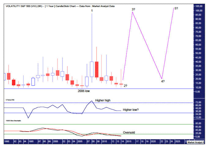
The Relative Strength Indicator (RS) is showing a pattern of higher highs and higher lows indicating strength is building in price while the Stochastic indicator is oversold so a move up would not surprise here.
I have added some simple Elliott Wave annotations which show the spike high in 2008 at 96.40 to be the end of wave 1. The wave 2 low is probably in place at this year’s low of 10.28. If there is lower to go then price should not go below the 2006 low of 8.60 which is denoted by the horizontal line.
Once the higher wave 2 low is in place, if it isn’t already, then a big wave 3 move up should occur that busts into all time highs. This should happen alongside the coming plunge in the stock market.
After that expected stock market plunge, I am looking for a move to new all time highs which would see the VIX come back down in a wave 4 corrective move.
Then the VIX should zoom back up to new all time wave 5 highs in the years following as the stock market begins the mega-bear plunge as laid out in the Dow analysis.
This wave 5 high would also set up a “three strikes and you’re out” topping formation with three consecutive spike highs. It all sounds too easy!
If my analysis is correct, then the end game is still around a decade ahead of us. Plenty of time left to worry about that.
Let’s bring it back in tight with the daily chart.
VIX DAILY CHART
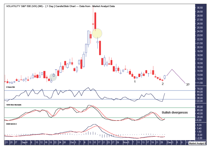
I have drawn a green highlighted circle which denotes a gap that I’ve been expecting to be filled. Done.
Price is now edging ever lower as it searches for its next major low. Rallies are weak in line with the strong downtrend.
There looks to be a “three strikes and you’re out” low formation setting up. That consists of three consecutive lower lows. The second low looks to have just formed. Then after a rally we could expect price to come back down for the third and probably final low.
There appear to be bullish divergences setting up on the lower indicators being the RSI, Stochastic and Moving Average Convergence Divergence (MACD). A triple bullish divergence would be especially nice. Let’s see.
There is a gap to the upside which can be seen in the yellow highlighted circle. Once the final low is in place a big move up should occur that sees this gap filled.
Summing up, the VIX bulls are pawing the ground while the bears lick their lips as they devour the last remnants of their meal.
By Austin Galt
Austin Galt is The Voodoo Analyst. I have studied charts for over 20 years and am currently a private trader. Several years ago I worked as a licensed advisor with a well known Australian stock broker. While there was an abundance of fundamental analysts, there seemed to be a dearth of technical analysts. My aim here is to provide my view of technical analysis that is both intriguing and misunderstood by many. I like to refer to it as the black magic of stock market analysis.
© 2014 Copyright The Voodoo Analyst - All Rights Reserved
Disclaimer: The above is a matter of opinion provided for general information purposes only and is not intended as investment advice. Information and analysis above are derived from sources and utilising methods believed to be reliable, but we cannot accept responsibility for any losses you may incur as a result of this analysis. Individuals should consult with their personal financial advisors.
© 2005-2022 http://www.MarketOracle.co.uk - The Market Oracle is a FREE Daily Financial Markets Analysis & Forecasting online publication.