


Precious Metals Complex Impulse Move : Where Is next Resistance?
Commodities / Gold & Silver 2020 Aug 11, 2020 - 06:19 PM GMT

Tonight I would like to go over some PM charts looking for a possible place for our current impulse move to find some strong resistance that could lead to the next consolidation phase. It’s not going to be easy as there are several possibilities that could work. Lets put the Chartology to work and see what we come up with.
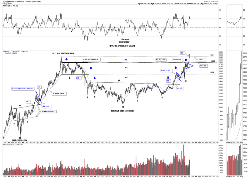
There was something fairly rare last week that happened to gold which sliced through its 2011 all time high at 1920 like a hot knife through butter. Normally when an old high is reached there is usually some initial resistance even if the breakout is going to occur. Many times we’ll see a small consolidation pattern form just below the old high that will give the stock the energy it needs to finally takeout overhead resistance. There is another way that an important resistance line can be taken out and that is with a gap which doesn’t show up on the gold chart but there is a gap on GLD close to the 2011 high.
This first chart I just built to see what happened during the bull market years when gold broke out to new all time highs as shown by the black dashed horizontal lines. The initial breakout into new all time highs lasted from a couple of months to 12 months when gold went nearly parabolic into its 2011 all time high. What each one of those breakouts into new all time high territory have in common is that everyone backtested the black dashed horizontal line from above with a couple of hard backtests. Now the question is how many months are left for our current impulse move before we see a backtest to the 2011 all time high around the 1920 area?
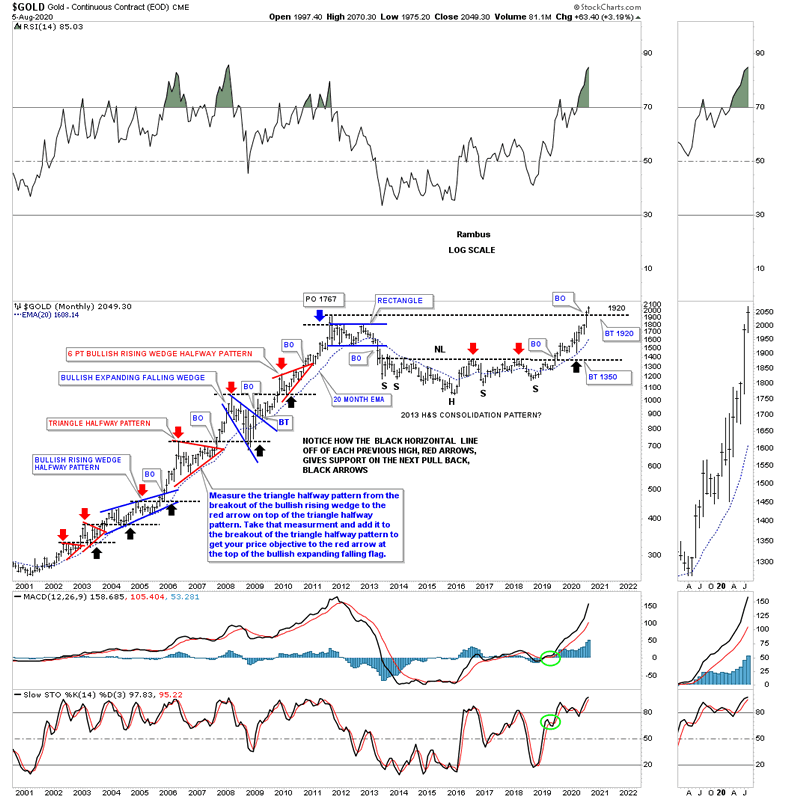
Note how well the 20 month ema held support during the bull market years except for the 2008 crash low and how well it held resistance until the 2016 low. There were some whipsaws during the formation of that massive H&S bottom but the 20 month ema seems to be on track once again showing support at the March 2020 low.
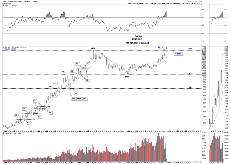
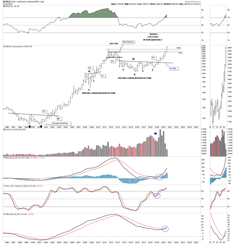
The monthly chart above shows you the breakout to new all time highs. This monthly chart below shows you that each high was the beginning of a consolation pattern during the bull market years. The red arrows shows the initial all time high and the black arrows showing the backtest. If you look to the right hand side of the chart you can see the massive 2013 H&S bottom which launched our current bull market. Just like all the new all time highs made during the 2000’s bull market, as shown by the red arrows, the neckline on the 2013 H&S bottom acted as resistance until it was overcome in June of last year. As you can see the neckline reversed its role to what had been resistance to support as shown by the black arrow which takes us to the present. Since the price action for gold closed last month above the all time high at 1920 we have to assume the breakout is authentic and at some point we should look for a correction back toward the previous all time high at 1920.
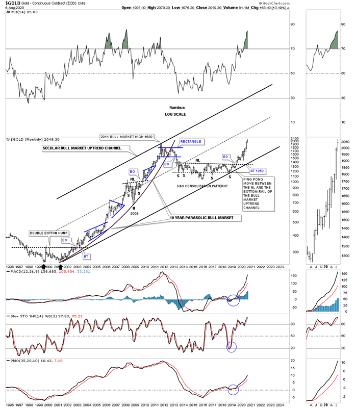
It’s always important to have a grasp of the big picture so you know where you are at any given time. This long term monthly chart shows the secular bull market for gold which began at the 2000 low with the first leg up lasting until 2011. We have officially been in the second leg up beginning at the September 2018 low where the right shoulder low and the bottom rail of the secular bull market intersect.
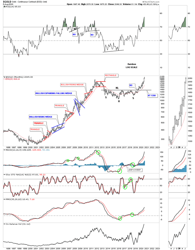
It is important to understand what to expect during the second leg of the secular bull market and what it might look like. This monthly chart shows a clearer picture of the 2000 to 2011 bull market with one consolidation pattern forming on top of the previous one with an impulse move in between. There were 2 bullish rising wedges which always strongly suggest the trend is very strong.
You’ve heard me say this a million times, big patterns lead to big moves. Below is a long term quarterly chart for gold which shows its massive 2000 base which led to the 11 year bull market. You can see our multi year H&S consolidation pattern is on par with the 2000 multi year reversal pattern.
Below is gold’s reverse symmetry chart which shows how gold came down during its bear market years and how it is going up over that same area as shown by the blue arrows. Now gold is trading in a vacuum with no overhead resistance. How high can it go before gravity kicks in and a new consolidation phase begins?
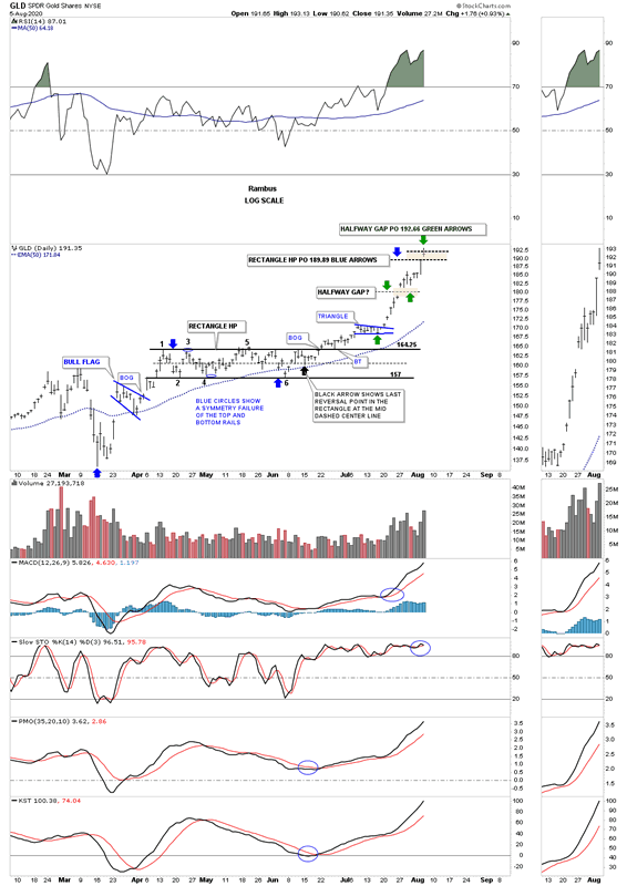
Today GLD hit our 2 price objectives based on the rectangle halfway pattern as shown by the blue arrows and the breakaway gap that has formed in the middle of our current impulse move, green arrows. This is an important milestone that I’m keeping a very close eye on.
There are times when the PM metals and the PM stocks move at different speeds during a bull market where one can be stronger or weaker than the other. Currently gold is making new all time highs where, lets use the HUI as an example which is still trading way below its all time highs. Below is a daily chart for the HUI which shows you the beginning of our current impulse move that began with the March H&S reversal pattern. There are 2 ways we can look at the rally so far. First, can the blue triangle be a halfway pattern to the upside that has a price objective up to the 532 area as shown by the blue arrows? The 2nd option could be that this current leg up is about finished and we are about to see a similar consolidation pattern start building out that could last 3 to 6 weeks or so before the next leg up begins?
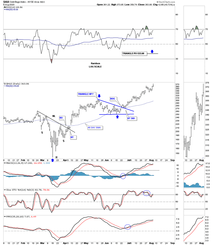
The second possible scenario is a little more complicated to show. If the HUI has reached an area where it needs to rest for awhile and starts to build out a 3 to 6 week consolidation pattern, below is a rough idea of how it could happen based on the Chartology. First, there is no way to know right now what type of consolidation pattern could form. It could be another triangle, rectangle or a bullish rising or falling wedge. The first 2 green arrows measures the impulse leg up from the last reversal point in the blue triangle to the first reversal point at our current high. They also measure the fib retracements as shown by the thin black dashed horizontal lines. The worst case scenario for a higher price objective would be if the impulse move starts at the 62% fib retrace which would be up to the 440 area. A higher price objective would be if the correction low starts at the 38% retrace level. Keep in mind this is pure speculation right now and could fall apart tomorrow. What we know right now is that the HUI is in a strong impulse move with no reversal pattern in view yet.
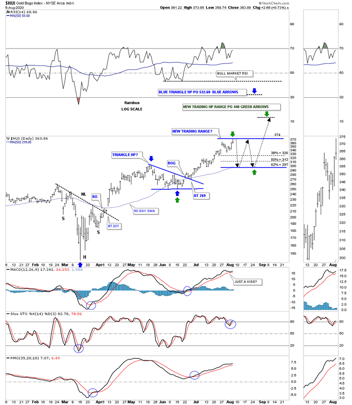
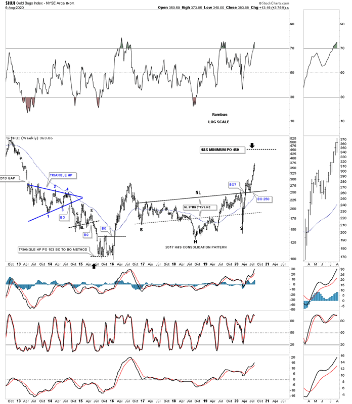
I’m running out of time but there is one last chart we’ve been following on the HUI which is the 2017 H&S consolidation pattern which has a minimum price objective up to the 450 area which is very close to the price objective if we see a second consolidation pattern build out as shown on the daly chart above.
At any rate we are closer to the end of this first impulse move off the March low than the beginning. My main focus now is on trying to find some type of reversal pattern around one of our price targets. It’s never easy even if you are looking for one.
All the best
By Rambus Chartology
FREE TRIAL - http://rambus1.com/?page_id=10
© 2020 Copyright Rambus- All Rights Reserved
Disclaimer: The above is a matter of opinion provided for general information purposes only and is not intended as investment advice. Information and analysis above are derived from sources and utilising methods believed to be reliable, but we cannot accept responsibility for any losses you may incur as a result of this analysis. Individuals should consult with their personal financial advisors.
© 2005-2022 http://www.MarketOracle.co.uk - The Market Oracle is a FREE Daily Financial Markets Analysis & Forecasting online publication.