


Portfolio Allocation Technical Analysis Tables Across 52 ETFs
Portfolio / Exchange Traded Funds May 17, 2009 - 05:50 PM GMTBy: Richard_Shaw

 Comparing the charts for multiple funds can be challenging. Visual memory is fleeting, and the sheer information complexity of chart patterns poses the problem of what and how to compare on the charts.
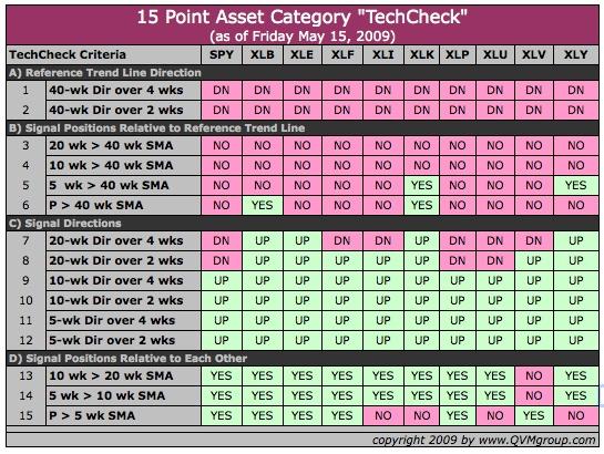
To reduce the extent of those problems, we collect 15 data points from each chart and post them in a table, then color code them red or green to aid in scanning the table. By that method we can compare dozens of charts in a standardized way that is completely beyond our visual memory capabilities.
We call that table, our “TechCheck”. While the TechCheck is the beginning, not the end of exploration, it really helps manage time and focus attention.
The 15 data points are based on the price and four simple moving averages (5-weeks, 10-weeks, 20-weeks, and 40-weeks), and are divided into four types:
- Reference Trend Line Direction (40-week moving average)
- Positions of Signals Relative to Reference Trend Line (price, 5-week, 10-week and 20-week moving averages)
- Direction of Signal Moving Averages (5-week, 10-week and 20-week)
- Positions of Signal Averages Relative to Each Other.
The Reference Trend Line is either going up or down. That is a primary fact. The Signals are positioned either above or below the Reference Trend Line. Those relative positions are also primary facts.
The Signal averages are themselves either going up or down. Those are important secondary facts. The Signals also have a positional relationship to each other (one being greater than the other). Those too are important secondary facts.
The table below (as of Friday May 15, 2009) for 10 important asset categories shows how we display the data points for easy visual scanning.
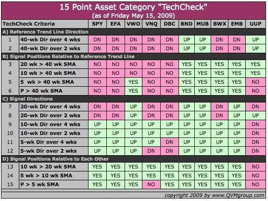
To a certain degree the table is self-sufficient to point to better and worse opportunities. However, to make it more useful, we add a proprietary scoring system that helps us decide what percentage of our ultimate allocation to each category or fund should be invested at the time the chart is assembled. We update the chart weekly, and assess risk commitments accordingly.
At the end of this article, we provide the charts we used to develop the table for the 10 key categories, so that you can see how the chart visuals relate to the tabular data.
Conservative Approach:
If you are conservative and don’t feel comfortable risking capital in this market until a well confirmed upward trend is in place, then you might stay on the sidelines with cash until the 40-week Reference Trend Line is sloped up, and the 20-week Signal is above the Reference Trend Line. It would be helpful if the price is also above the 20-week average, and it certainly should above the 40-week average.
This S&P 500 chart shows how that approach has worked in the past.
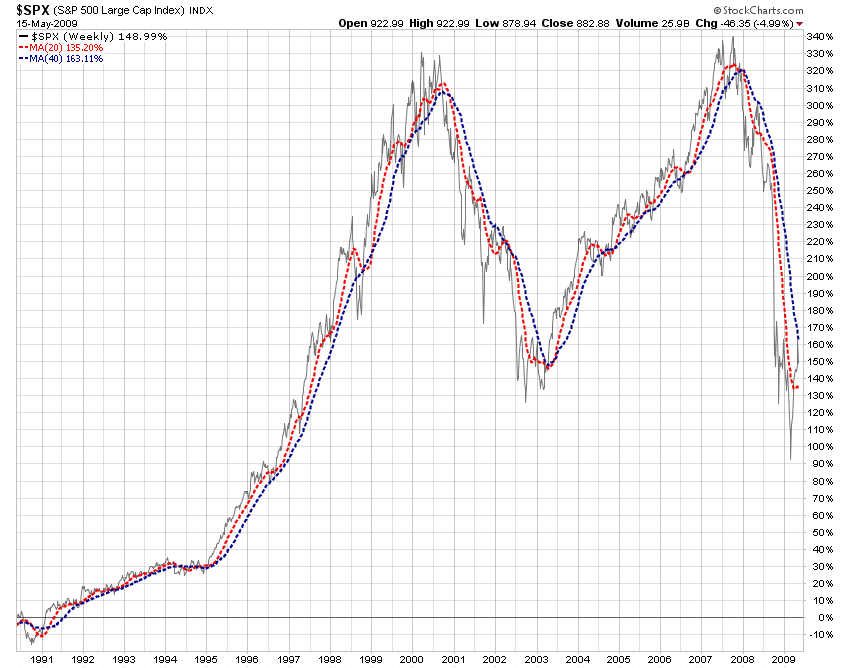
A more extensive discussion of using the 40-week and 20-week moving averages to judge when a trend may be changing is in a prior article (The Role of the 200-Day Average in Risk Management) that reviews the approach with seven different important indexes.
Remember that moving averages are trend identifiers and followers, but they have a lag. The longer the moving average, the greater the time lag before they confirm a trend. The good thing about longer averages is that you have fewer false positive signals. The bad thing about them is that you miss the early and late stages of trends as they begin and end.
If you are more adventurous, wish to participate earlier in a possible trend change from this bear to the next bull market, and understand and accept the higher likelihood of false positives, you could use shorter moving averages as signals (such as 10-weeks or 5-weeks, or even the price, which you could think of as a 1-day moving average) as indicators as they cross the 40-week Reference Trend Line.
None of this, however, should be used for any security unless you first know that you want to own it, and have sound fundamental reasons as to why you want to own it. Then and only then, does the question of best entry approach become appropriate.
Legging-In — Calendar Approach:
One common way to accomplish a staged investment is to invest 1/xth of the intended allocation to a category each month through a calendar-based system until it’s all committed. That, however, is not responsive to market conditions. It doesn’t speed up if the market moves faster than expected, and it doesn’t slow down if the market disappoints.
Legging-In– Dynamic Approach:
There is a dynamic alternative using moving averages that combines a more aggressive signals approach than the 40-week/20-week method, with a somewhat cautious staged investment process.
As an alternative to the calendar approach, an investor could be more market responsive by investing each 1/xth of the intended allocation when each of X progressively longer moving averages crosses a selected reference moving average.
Some people don’t want to wait as long as required for the 40-week/20-week confirmation of a new bull, but also don’t want to risk too much on the potential false positive whipsaws that can occur with short moving averages. They may wish to split the difference by entering the market in stages, committing 1/xth of capital in tranches as a each of X averages crosses the Reference Trend Line one-by-one.
For example, assuming the investor wanted to invest over four tranches, the table above or one like it could help manage such a process. The investor would risk 1/4 of the intended allocation for a particular security when the price rises above the 40-week moving average, then 1/4 more when the 5-week average rises above the 40-week, then 1/4 more when the 10-week rises above the 40-week, and the final 1/4 when the 20-week rises above the 40-week.
If the signal averages cross rapidly, the approach would cause the investor to commit rapidly. If the signals take a long time to cross over, the approach would correspondingly cause the investor to take a long time to commit to the risk asset. If the signal average never crossed over, the investor would never commit to the risk.
That approach is a compromise between potentially being all-in too early on a false positive indication, and being all-in later when a trend reversal from bear to bull is strongly confirmed with important early opportunity not having been captured.
The Signal Directions and Signal Positions Relative to each other provide the potential to have a more nuanced approach to the staged investment approach, which we believe we have built into our internal process.
What the Table Says To Us About Staged Investment:
Along the lines described above for legging-in over four tranches, and using all the data in the table in our scoring system, here are the current percentages of ultimate allocation that might make sense for each security in the table above:
- SPY: 0%
- EFA: 0%
- VWO: 25%
- VNQ: 0%
- DBC: 0%
- BND: 100%
- MUB: 100%
- BWX: 33%
- EMB: 50%
- UUP: 0%
To clarify the list above by example, if your ultimate intended allocation to a broad US stocks index fund is X%, this method suggests owning none today; and if your ultimate intended allocation to a broad US taxable bonds index fund is Y%, this method would suggest owning all of that allocation today.
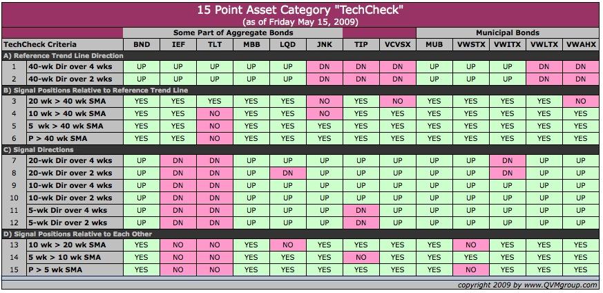
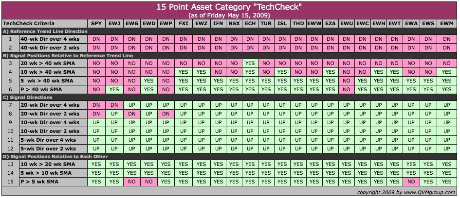
More Granular Tables:
Here are additional tables for 13 bond funds, 22 country funds, and 9 US stock sectors.
Bond Categories
Countries
US Sectors
Charts Used to Assemble the Key Categories Table:
Note that the charts are percentage performance charts. You get the same results whether you use price charts or percentage change charts, but we like the added utility of quickly and easily comparing performance between securities that the percentage change charts provide. Relative performance is not as immediately obvious when comparing price charts. Percentage performance charts do the math for you.


[Securities mentioned in this article: SPY, EFA, VWO, VNQ, DBC, BND, MUB, BWX, EMB, UUP, IEF, TLT, MBB, LQD, JNK, TIP, VCVSX, MUB, VWSTX, VWITX, VWLTX, VWAHX, EWJ, EWG, EWF, EWP, FXI, EWZ, IFN, RSX, ECH, TUR, ISL, THD, EWW, EZA, EWU, EWC, EWH, EWT, EWA, EWS, EWM, XLB, XLE, XLF, XLI, XLK XLP, XLU, XLV, XLY]
By Richard Shaw
http://www.qvmgroup.com
Richard Shaw leads the QVM team as President of QVM Group. Richard has extensive investment industry experience including serving on the board of directors of two large investment management companies, including Aberdeen Asset Management (listed London Stock Exchange) and as a charter investor and director of Lending Tree ( download short professional profile ). He provides portfolio design and management services to individual and corporate clients. He also edits the QVM investment blog. His writings are generally republished by SeekingAlpha and Reuters and are linked to sites such as Kiplinger and Yahoo Finance and other sites. He is a 1970 graduate of Dartmouth College.
Copyright 2006-2009 by QVM Group LLC All rights reserved.
Disclaimer: The above is a matter of opinion and is not intended as investment advice. Information and analysis above are derived from sources and utilizing methods believed reliable, but we cannot accept responsibility for any trading losses you may incur as a result of this analysis. Do your own due diligence.
Richard Shaw Archive |
© 2005-2022 http://www.MarketOracle.co.uk - The Market Oracle is a FREE Daily Financial Markets Analysis & Forecasting online publication.