


Gold Price January Effect, Forecast 2013
Commodities / Gold and Silver 2013 Jan 18, 2013 - 11:16 AM GMTBy: Peter_Degraaf

 In this essay we will present the expectation for the price of gold to rise during January and February, based on seasonal trends. Charts are courtesy Stockcharts.com unless indicated.
The energy for a rise in gold prices comes from at least four different sources.
#1 U.S. Federal Government deficits.
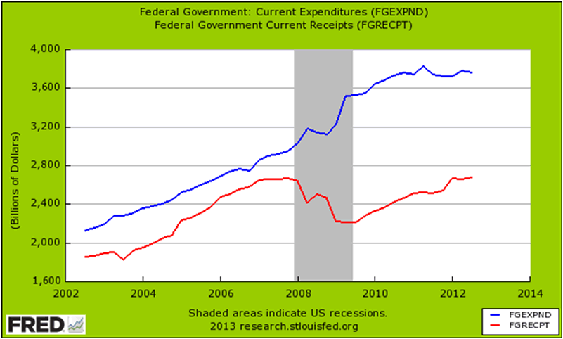
This chart courtesy Federal Reserve Bank of St. Louis and Mybudget360.com shows the widening of the U.S. Federal Government deficit since 2008. The gap shows no signs of narrowing, as it requires increased taxation (which stifles economic activity), or decreased spending (something Mr. Obama and most politicians find hard to do). Deficits are a source of energy for precious metals (as printing presses are used to make up the shortfall).
#2 Real Interest Rates.
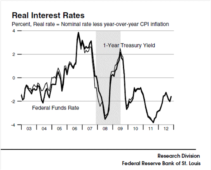
This chart shows the ‘real rate’ of interest. It is derived at by deducting price inflation as expressed by the CPI, from current Treasury Yield. This ‘real rate’ is presently -1.75%. This means money that is held in Treasuries is losing out by more than 1.75% per year (paying taxes on the yield adds insult to injury). In view of the fact that the official CPI rate is regularly understating the actual rate of price inflation, the ‘real rate of inflation’ is even worse than this chart portrays. In any event, this negative trend provides energy for gold and silver to rise in price.
#3. The expected rate of price inflation.
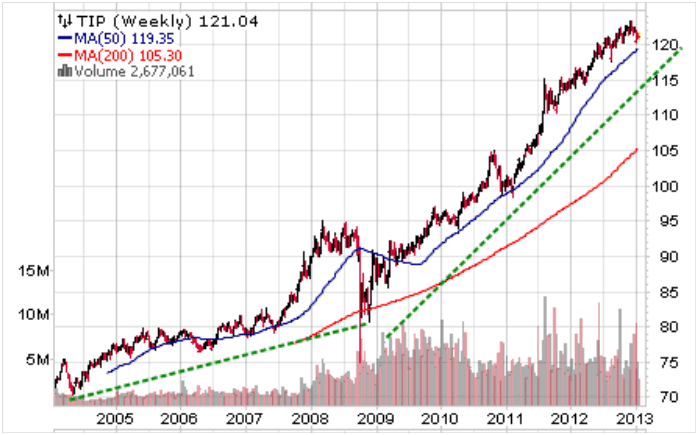
Featured is the daily bar chart for TIP, the bond fund that is indexed to inflation. The people who buy shares in this fund are concerned about price inflation, and the trend is clearly upward bound.
#4 Currency destruction.
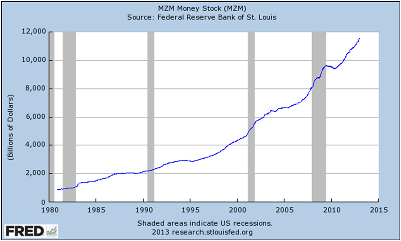
This chart courtesy Federal Reserve Bank of St. Louis shows the MZM Money stock continues to rise. In the past four years the Obama administration, in concert with the U.S. Congress, has added five trillion dollars to the U.S. Federal debt. At the same time five Central Banks printed seven trillion dollars in new currency. Thus twelve trillion dollars that did not exist in 2008 are now looking for a home. This monetary destruction produces price inflation (after a lag - as it takes the average person a while to catch on). “Like gold, US dollars have value only to the extent that they are strictly limited in supply. But the US government has a technology called the printing press that allows us to print as many dollars as the government wishes, at essentially no cost.” ...Ben Bernanke.
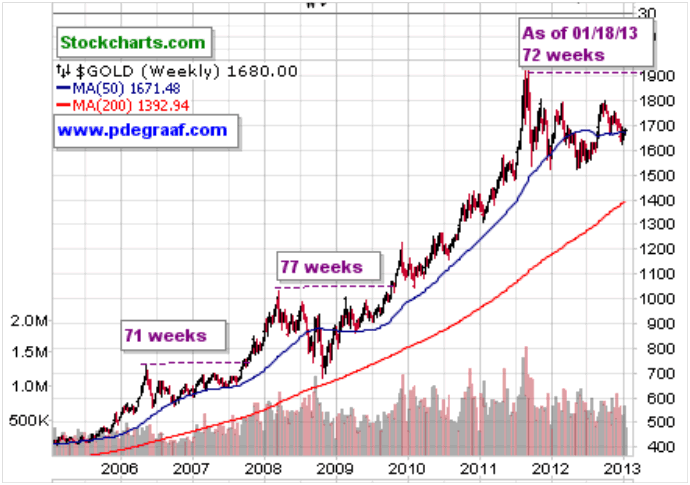
Featured is the weekly gold chart. Since the gold bull market began in 2002, there have been three major corrections. The first one began in 2006. It took 71 weeks before a new record high price was established. Gold then rose by 50%. The next correction began in 2008. 77 weeks later gold established a new record high. Price then rose by 90%. The current correction began in 2011. It has been 72 weeks since the last time gold was at a record high price. In five weeks we will have matched the 2008 price dip duration. As long as the four ‘drivers’ mentioned above remain in place, the expectation is that gold will continue its overall rise in price. To take advantage of this trend it behoves us to ‘BUY LOW SO WE CAN SELL HIGH.’
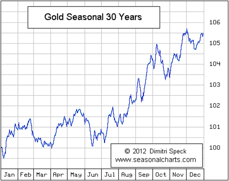
This chart courtesy seasonalcharts.com shows the seasonal pattern of the price of gold on a monthly basis. Historically gold moves higher during January and February -especially when the price has dipped during December, (as it did in December 2012).
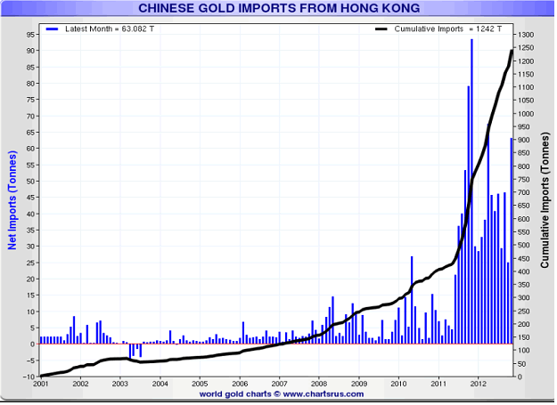
This chart courtesy Chartsrus.com shows the amount of gold that is moving through Hong Kong into China. Last month 63 tons of gold moved into Chinese vaults. According to ZeroHedge.com 90.8 tons moved into Chinese vaults in November. This was the second highest gross import number of 2012, double the 47 tons imported in October (which many saw, incorrectly, as an indication of China's waning interest in the yellow metal), and brings the Year to Date total to a massive 783 tons of gold.
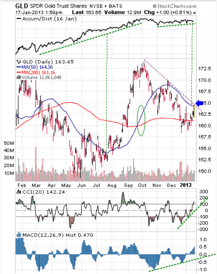
Featured is GLD the gold bullion ETF. The Accumulation/Distribution line is at the top. Usually, when price drops while the A/D line rises, pressure builds on price to follow the A/D line. The supporting indicators (green lines), are positive. The 50DMA is in positive alignment to the 200DMA (oval). A breakout at the blue arrow will be the first sign that a new uptrend is underway.
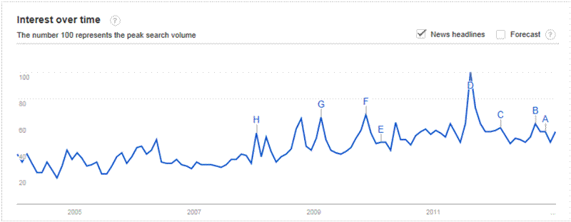
This chart courtesy Google Trends shows the interest in ‘gold investment’ as reflected by web searches. High points on the chart coincide with tops in gold and bottoms (as now) coincide with bottoms in the price of gold. The trend is turning up, and that is a positive sign for gold.
Gold at year’s end has been higher than at the beginning, every year since yr 2000. The gain during 2012 was 6.9%.
2001 = + 1.96; 2002 = + 24.8%; 2003 = +19.5%; 2004 = +5.35%; 2005 = +18.36%; 2006 = +22.95%; 2007 = +31.34%; 2008 = +5.14%; 2009 = +24.3%; 2010 =+29.8%; 2011 =+14.2%; 2012 = +6.9%. The average is 17.05%. Please note that the % rise in every year below the average of 17.05% was followed by a year where the rise was higher than the average. Odds are (no guarantee – just odds), that the 2013 increase will exceed 17.05%.
Silver stands to benefit from the same energy that is causing gold to rise in price.
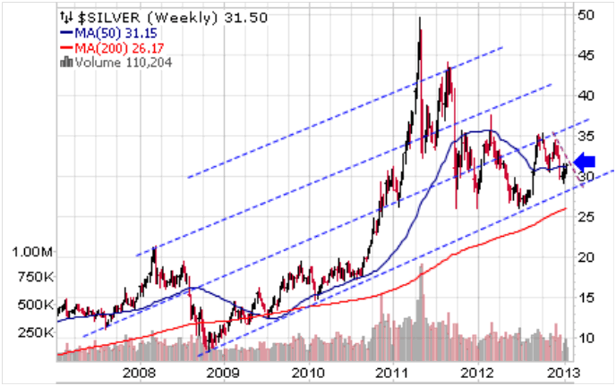
Featured is the weekly silver chart. The uptrend is clearly defined by the blue trendlines. A breakout at the blue arrow will be the first sign of a new ‘leg up.’
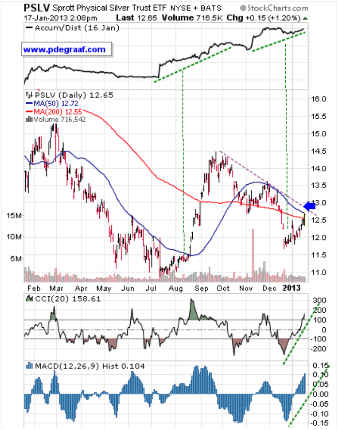
Featured is PSLV the silver trust. The Accumulation/Distribution line is at the top. Usually when the A/D line rises, it puts pressure on price to follow, as happened in August. As long as the AD continues to rise, the expectation is for price to follow.
Happy trading!
By Peter Degraaf
Peter Degraaf is an on-line stock trader with over 50 years of investing experience. He issues a weekend report on the markets for his many subscribers. For a sample issue send him an E-mail at itiswell@cogeco.net , or visit his website at www.pdegraaf.com where you will find many long-term charts, as well as an interesting collection of Worthwhile Quotes that make for fascinating reading.
© 2013 Copyright Peter Degraaf - All Rights Reserved
DISCLAIMER: Please do your own due diligence. I am NOT responsible for your trading decisions.
Peter Degraaf Archive |
© 2005-2022 http://www.MarketOracle.co.uk - The Market Oracle is a FREE Daily Financial Markets Analysis & Forecasting online publication.