


The Silver St. Valentine’s Day Breakout
Commodities / Gold and Silver 2014 Feb 17, 2014 - 10:09 AM GMT

 In this Weekend Report I would like to show you the Chartology of silver that you won’t see anywhere else on the planet. Some of these charts might not conform to the classic textbook scenarios most chartists believe are the only correct ways to construct a chart pattern. I have learned through many years of charting the markets that there are areas in this field that can be opened up for further interpretation and still fall within the loose confines of what is considered a chart pattern. Keeping an open mind in any of the trading disciplines of the markets from Elliot Wave, to cycles or charting can give one more insight and clarity than any one book can give you. Real time analysis and interpretation is the only way to really get to know your chosen field for investing in the markets.
With that said lets look at some silver charts. We’ll start with the short term charts and work our way out to the very long term charts that hopefully will put what silver is doing right now into perspective . When you look at the quarterly chart going back to the 1970′s, What happened those many years ago still has a direct impact on what is happening today , even though this seems impossible.
Lets start with a 10 month daily chart for silver that has a lot of information on it. If you’ve been follow the precious metals sector you know that silver had a huge day on Friday February 14. Happy St. Valentine’s day silver.
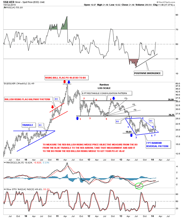
What makes Friday’s big move so special? There are several very good reasons. First, silver broke out from a red 2 1/2 month long rectangle reversal pattern to the upside. This breakout also took out the brown shaded support and resistance zone that had been in place since July and August from last year. Note how the brown shaded support and resistance zone acted as resistance back in August and then once it was broken to the upside it reversed its role and held support back in October and November. This support and resistance zone gave way to the downside when silver made its ultimate low in December, again reversing its role from support to now resistance. As you can see on the chart below silver was unable to penetrate that brown shaded support and resistance zone until Friday of this past week. For 2 1/2 months silver was trapped in the narrow rectangle while the precious metals stocks were racing higher. The top rail of the downtrend channel was also taken out this week which has now cleared the way for silver to run higher. Whenever you see a huge spike like we seen on Friday this tells us the bears have become exhausted and have no fight left. If you want to kick them while their down now is a good time to get your licks in.
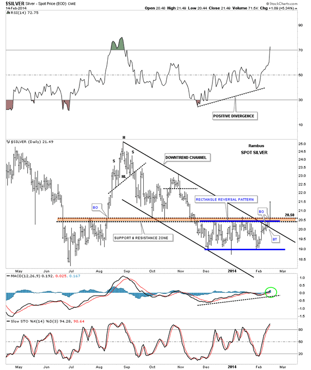
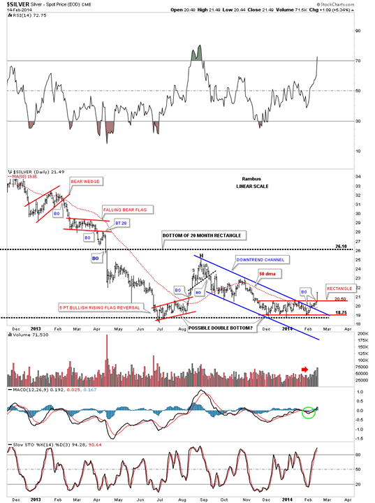
This next daily chart goes back about 1 1/2 years that puts the downtrend channel and the red rectangle into perspective. Note the last bar on the bottom far right hand side of the chart that shows you what a breakout looks like. These kinds of days don’t come around very often but when you see such a day take notice as it usually means something significant has happened. The other important feature on this daily chart is the possible double bottom that maybe forming. You can clearly see the June and December lows that formed in the same general area. Silver along with gold are both showing this same setup. I believe they are going to do one of two things. First, this possible double bottom will be the reversal pattern that reverses the almost 3 year decline in silver. Second silver could be building out a large consolidation pattern that will eventually break to the downside. The August high of last year will be the key to which pattern wins out. For the time being though we have a nice rally getting underway that should take the price of silver back up close to the August high around the 25 area. At that point we’ll have to reevaluate the situation again and take it from there.
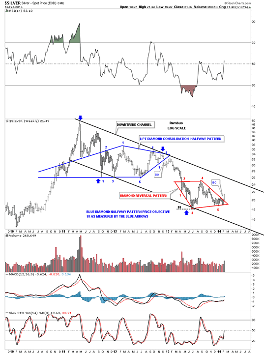
There has been a chart pattern we’ve been following, at Rambus Chartology, that was a blue 6 point Diamond consolidation pattern that has shown up on gold, silver and precious metals stock indexes. They had all the characteristics of playing out to the downside but a funny thing happened on the way to the Bottomz Inn. After they broke to the downside, as we anticipated, they slowly started to form a small chart pattern that ended up being a reversal pattern before the Diamonds could fulfill their measured move. This is how the markets talk to you. When you see a beautiful setup and it starts doing what you think it should do but then doesn’t follow through you have to take notice. The only way you can do this is to keep and open mind all the time as there are no absolutes in the stock markets. As you can see on the chart below the 6 point Diamond, the bottom dashed rail was the original bottom of the Diamond pattern. I just made two changes to the original 6 point Diamond. First I extended the top rail down to the apex keeping the same angle. The biggest change was the solid blue rail that starts at reversal point #3 and catches reversal points five and seven which creates a reversal pattern to the upside.This is a classic Example of a Morphing Pattern . What initially appeared to be a breakout to the downside of a perfect diamond turned out to be a Diamond of another cut . This is a very big deal because it now gives us a very nice reversal pattern that has formed after an almost three year decline. A Diamond Bottom . I will show you what I mean a bit later.
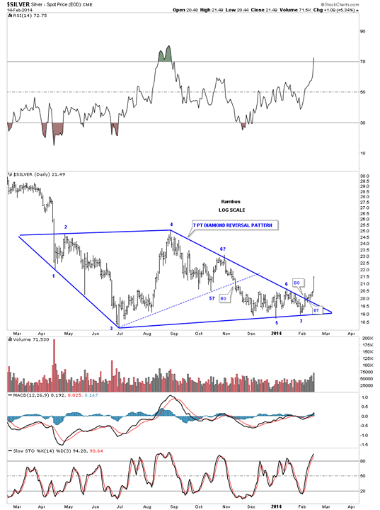
This next weekly chart shows you why this seven point Diamond reversal pattern is so important. This weekly chart goes all the way back to the all time high made in April of 2011. You can see silver formed another beautiful Diamond, the 8 point blue Diamond, that was a halfway pattern. Keep in mind an even number of reversal points creates a consolidation pattern and an odd number of reversal points creates a reversal pattern. Notice the big long bar on our red seven point Diamond reversal pattern. I will show you why I think this could very well be the bottom for silver on the charts to follow.
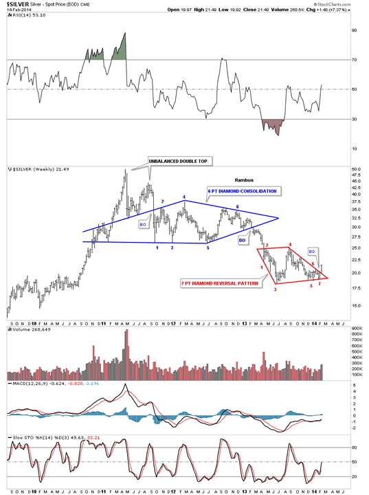
Below is basically the same chart I showed you above but this chart has a downtrend channel in place. As I mentioned above that the blue 8 point Diamond was a halfway pattern to the downside. By that I mean it formed in the middle of the three year downtrend channel. Many times these types of halfway patterns can measure out a price objective pretty close. In this case you can measure the distance between the first two blue arrows and add that distance to the last reversal point on the blue Diamond at reversal point #8 to get your price objective down to the 18 area. Once the price objective is reached the stock can do one of two things, First it can form another consolidation pattern, which the red Diamond could have been until last Friday. Or it can form a reversal pattern. With silver’s big move on Friday I have to give a really big edge to the red Diamond pattern being a reversal pattern to the upside instead of a consolidation pattern.
This next chart shows you why I think the red 7 point Diamond is a reversal pattern. On the left hand side of the chart you can see the red bullish rising flag that I measured using the breakout to breakout method as explained by the red annotations. As you can see it nailed the top of the bull market close to 50 which said that part of the bull market was over and started the three year decline. On this chart I’m using a rectangle as a halfway pattern to the downside which corresponds closely to golds 22 month rectangle. You can see the spike up through the top rail at reversal point #4 which I used to create the Diamond. In either case the price objective as measured by the blue arrows, and which I call an impulse measurement vs the breakout to breakout method, still has a price objective down to 18.64 which is still very close to the actual bottom. So we had a halfway pattern that nailed the top of the bull market at 50 and now it’s looking like we have another halfway pattern that maybe telling the bottom is in. I still have a couple of more chart to make the case that silver has indeed made an important bottom.
We started out by looking at some daily charts for silver that showed the red rectangle reversal pattern that was made at the bottom of this three year decline. We’ve looked at the blue 8 point Diamond consolidation pattern that gave us a price objective down to the 18 area. The red Diamond has 7 reversal points making it a reversal pattern to the upside that has formed at the price objective of the blue 8 point Diamond halfway consolidation pattern at eighteen or so. Now I would like to show you a couple of very long term charts for silver that I think will seal the fate for the bottom being in place.
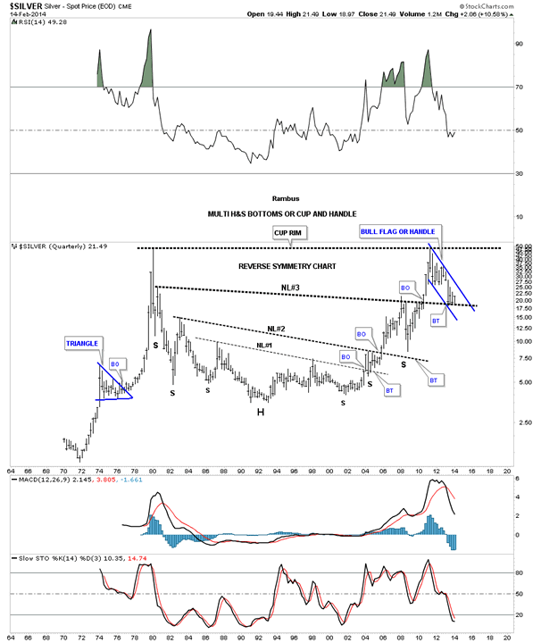
Below is a very long term Quarterly line chart for silver (in Log Scale) that goes all the way back to 1970. Keep in mind the price objectives that I showed you on the charts above that show how the 18 area could be the bottom. This chart doesn’t need any more explanation as you can see why 18 is such an important number.
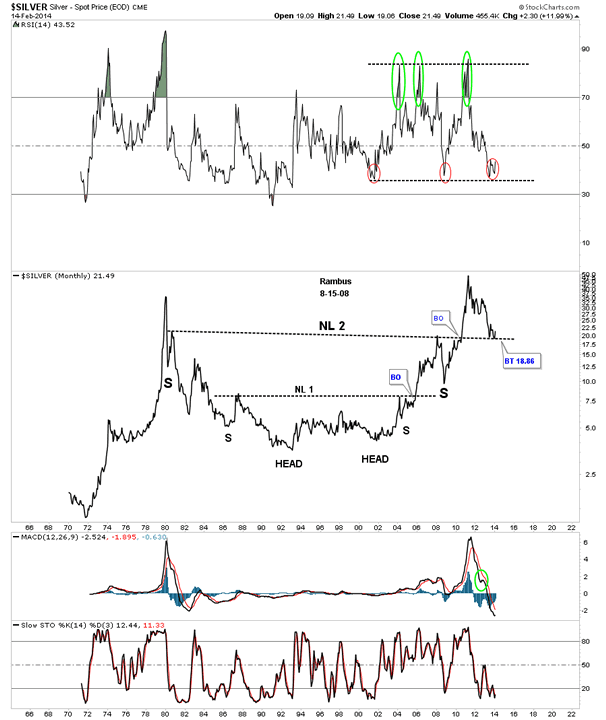
This last chart is the same chart above but this time I’m showing it as a bar chart. When we shorted the precious metals complex starting in December of 2012 there was one thing I kept repeating as we went lower. I kept saying, look for reverse symmetry. What this means is how a stock goes up, especially in fast moving market, they will reverse symmetry back down through that same area when they finally top out. That helped us out immensely during the PM crash last year. We knew where we were in the big picture which is very important to know. This long term chart for silver, that goes all the way back to 1970, shows how silver’s bull market has reversed symmetry back up vs how it went down in the early 1980′s. You can see three distinct H&S bottom patterns where each had a breakout with a backtest. Next I would like to focus your attention to neckline #3. Is this just a coincidence that the backtest is taking place at the 18 area after all the reasons I’ve shown you from all the charts above? I don’t know about you but this sure looks like a good low risk entry point if one wanted to buy some silver.
We never know until we can look back and see 100% for sure where a bottom or top took place. This whole scenario may blow up tomorrow but until it does I have to go with what the Chartology is telling me today and that is a very important bottom has formed or is forming based on all the charts I’ve shown you above. As I stated in the first paragraph that my charting techniques might not go by the book but I always try to paint a picture, using charts to explain what I think is happening. We must listen to the language of the Mr. Market to get an advantage in one of the toughest games there is to play on the planet,
All the best
Gary (for Rambus Chartology)
FREE TRIAL - http://rambus1.com/?page_id=10
© 2013 Copyright Rambus- All Rights Reserved
Disclaimer: The above is a matter of opinion provided for general information purposes only and is not intended as investment advice. Information and analysis above are derived from sources and utilising methods believed to be reliable, but we cannot accept responsibility for any losses you may incur as a result of this analysis. Individuals should consult with their personal financial advisors.
© 2005-2022 http://www.MarketOracle.co.uk - The Market Oracle is a FREE Daily Financial Markets Analysis & Forecasting online publication.