


Fourth Reversals in The Gold and Silver Charts
Commodities / Gold and Silver Stocks 2014 Apr 14, 2014 - 11:01 AM GMT

 In this Weekend Report I would like to look under the hood of some of the precious metals stocks indexes to see what is really taking place. We'll look at a bunch of PM stocks to get a feel for where we are in the short, intermediate and long term pictures. When one just observes an index you really don't get to see, in detail, the stocks that make up that index that could be showing some important clues to the overall big picture. For instance, there are just three or four of the biggest of the big cap precious metals stocks that account for a large percentage move for say the HUI. There are many more stocks in the index but they don't carry as much weight.
Before we look at some of the precious metals stocks I want to show you a combo chart that puts everything into perspective and gives you a feel for where we are in the intermediate term time frame. This combo chart has the HUI on top, GLD in the middle and SLV on the bottom. First I want you to look at the left hand side of the chart where you see that the HUI and silver each formed a blue triangle while gold formed a bullish rising wedge. Each consolidation pattern took the same amount of time to build and all three broke out together, first purple vertical dashed line. Note the impulse move out of the blue patterns that show SLV leading the way higher as GLD and the HUI had a backtest while SLV didn't. Here's where it gets interesting. As you can see SLV rallied straight up to its bull market top way ahead of the HUI and gold that were lagging behind, second thin purple vertical dashed line. After a few months of consolidation it was gold's turn to go parabolic and make its bull market high in September of 2011. The heavy purple dashed line shows where all three topped out together with the HUI and gold making their bull market highs while SLV was already in correction by falling way short of reaching its bull market top that it made back in April.
What was so frustrating for those of us that were holding precious metals stocks is that they hardly moved when gold and silver had their parabolic moves higher. As you can see the HUI did in fact make its bull market high at the same time gold did but the HUI had no parabolic move up. As you can see it was more of a slightly rising horizontal type move. That had to be one of the worst times to be a gold bug, to see gold and silver go parabolic and the precious metals stocks hardly budging. I'll post this chart here so you can see the blue consolidation patterns on the left side of the chart then we'll discuss the red consolidation patterns on the right side of the chart.
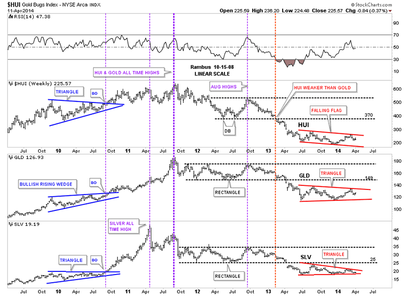
Let's not fast forward to the heavy red dashed vertical line that shows how the HUI was the first of the three to really show weakness by breaking below its horizontal black dashed line first. The precious metals stocks were leading he way down. It took about another 12 weeks or so before GLD and SLV joined the party to the downside when they finally broke out of their nearly 22 month consolidation patterns with a breakout gap. As with the blue consolidation patterns on the left side of the chart our current red consolidation patterns all bottomed at the same time, late June of 2013, and have been chopping out their respective chart patterns ever since. As you can see all three are working on their fourth reversal points right now. Even though the HUI is building out a falling flag formation, which will be pretty bearish if it breaks through the bottom rail, the SLV is trading the closest to its bottom rail of its red triangle. This chart gives you the big picture look and lets you know where we stand and what to look for.
One last comment before we move on. As you know reverse symmetry plays a big role in how I interpret the price action. Until something changes, I'm viewing the blue consolidation patterns, that formed on the left side of the chart with the price action going up, equal to the red triangles on the right side of the chart with the price action going down as reverse symmetry. Since the bull market top in 2011 you can see a series of lower lows and lower highs all the way down to our current price which is just the complete opposite of what we seen in the bull market years. Until we can see a higher low and a higher high the downtrend remains intact.
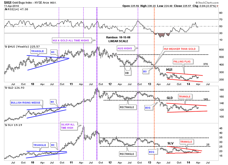
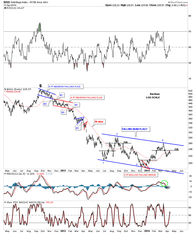
Lets take a quick peek at our red consolidation patterns starting with the HUI. Here we see the blue falling flag that is working on its fourth reversal point down. As you can see we had an important test of horizontal resistance last week at the 236 area. Also note the big impulse move down that has led to the formation of our current consolidation pattern that I will view as a halfway pattern if the bottom rail is broken to the downside. The HUI should show a similar move that led into our current blue falling flag when the price action leaves, thus this pattern will show up between the two impulse legs down.
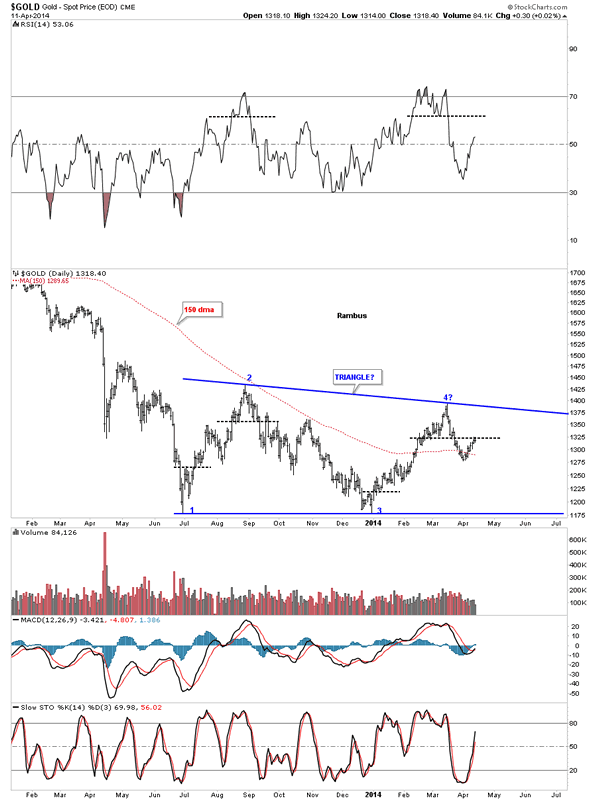
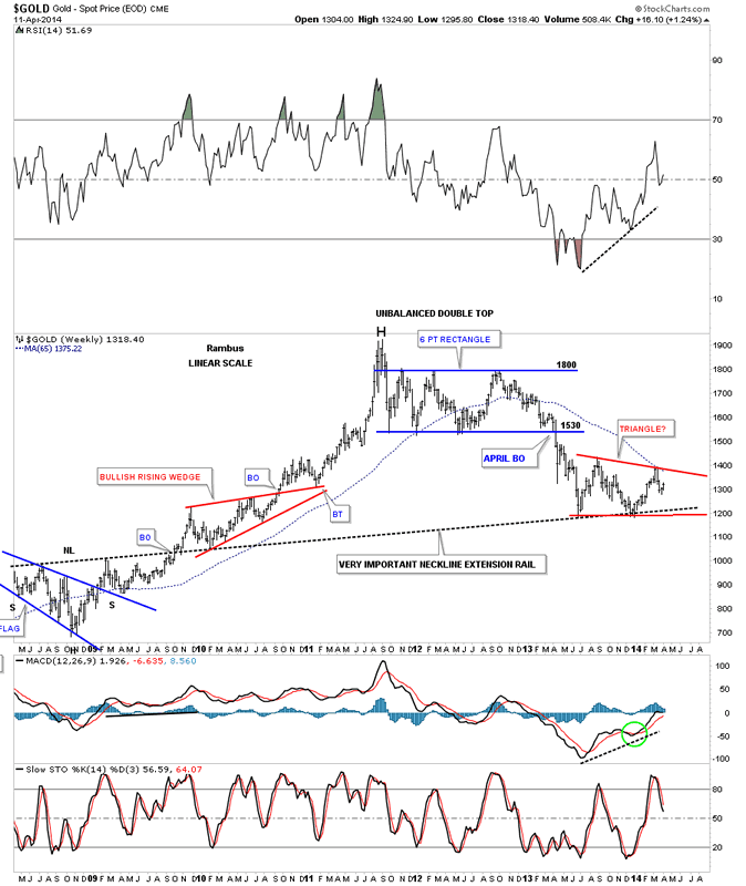
Below is gold's blue triangle that is showing the most strength right now between the three. It to is working on its fourth reversal point to the downside. Keep in mind these potential consolidation patterns won't be complete until their bottom rails are decisively broken to the downside. I expect there will be a very big down day once the possible breakouts occurs that will leaves no doubt as to what just happened.
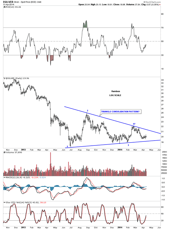
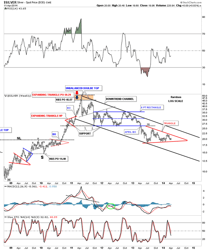
Below is silver's potential blue triangle that is trading the closest to the bottom blue rail. The 18.50 area on the bottom blue rail will be critical support.
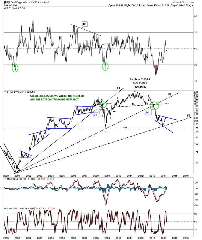
Lets now put our blue consolidation patterns in perspective so you can see how they fit into the big picture. This first chart is for the HUI, which is a long term weekly line chart, that goes all the way back to the beginning of the bull market. Keep in mind a line chart only uses the closing price so the patterns will look slightly different. There is a lot of good information on this chart that we can use to help us understand where we are in the big picture. First notice all the blue consolidation patterns that formed during the bull market years, one on top of the other. That's a bull market folks. Next notice our massive H&S top that reversed the bull market and has led to our current price. We are now reversing symmetry down and what I believe is our first consolidation pattern to the downside with its blue counterpart on the left side of the chart. Next lets look at the fanlines which is a chart pattern. The rule of thumb is when the 3rd fanline is broken to the downside is when you get your big move. Note fanline #1 and #2 that have the green circle around where the fanline and the neckline intersect. Once that area was broken to the downside the HUI wasted little time declining in earnest. Some of our long term subscribers may remember this chart as I was showing it as we were watching the neckline and fanline #2 breaking down. A daily bar chart will show there was a small backtest to the underside of the neckline before the impulse move began.
Lets now look at gold's potential triangle and how it may fit into the bigger picture. Gold's potential triangle has formed on top of the neckline extension rail that is taken off of the 2008 H&S consolidation pattern in which I extended all the way to the right hand side of the chart. Are we seeing reverse symmetry with our current red triangle vs the red bullish rising wedge that formed in the uptrend on opposite side of the chart?
If someone can look at this weekly chart for silver and tell me silver is in an uptrend I would have to call them crazy. Just look at the price action on the left side of the chart when silver was going parabolic creating a series of higher highs and higher lows all the way up to its bull market top. Now compare that price action to the right hand side of the chart since silver topped out just under 50 in April of 2011. Silver has now completed three years of its bear market, this month, by creating lower lows and lower highs. This is basic elementary Chartology. Maybe something will happen to create a new higher high and higher low but until that happens the major trend is down and that is the best direction to trade unless you're a day trader. It's always the easiest to trade in the same direction of the major trend as it can fix a mistake if you bought at the wrong time. Just the opposite in a bull market.
So far we looked at the HUI, gold and silver potential consolidation patterns on the short term to longer term look charts. Now we need to look under the hood and see what some of the precious metals stocks are showing us to help bolster these possible consolidation patterns as having some validity. What we have forming on some of the precious metals stocks are several different consolidation patterns ranging from triangles. expanding triangles, rectangles and rising wedges
Editors Note: This Portion of tonight's Weekend Report engaging the Chartology of 10 Individual Stocks is for Subscribers .
In Summary
There are many more charts I could post but I think you get the picture of what I'm trying to show you. By looking under the hood you can get a totally different perspective than just looking at an index. These charts give me the confidence to hang on to our game play when I know many are in doubt. So far nothing is broken from a Chartology perspective which is why we are still short. Until something changes, this is the way I will stay and hopefully we will be able to catch another big impulse move down. I believed we are positioned very well especially if these fourth reversal points hold on these nine month consolidation patterns.
All the best
Gary (for Rambus Chartology)
FREE TRIAL - http://rambus1.com/?page_id=10
© 2014 Copyright Rambus- All Rights Reserved
Disclaimer: The above is a matter of opinion provided for general information purposes only and is not intended as investment advice. Information and analysis above are derived from sources and utilising methods believed to be reliable, but we cannot accept responsibility for any losses you may incur as a result of this analysis. Individuals should consult with their personal financial advisors.
© 2005-2022 http://www.MarketOracle.co.uk - The Market Oracle is a FREE Daily Financial Markets Analysis & Forecasting online publication.