


Gold Stocks CDNX Wild and Whacky History
Commodities / Gold and Silver Stocks 2014 Jun 19, 2014 - 12:21 PM GMT

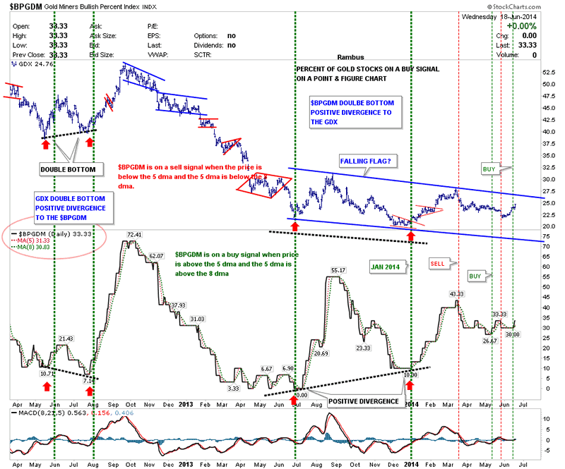
 The first chart I would like to show you is the BPGDM that shows you what percent of the big cap PM stocks are on a buy signal using the point & figure chart. After trading sideways for most of June the BPGDM finally gave a buy signal yesterday after being whipsawed several times lately. To get a buy signal you need to have the BPGDM trading higher than the 5 dma and the 5 dma trading higher than the 8 dma. We now have that.
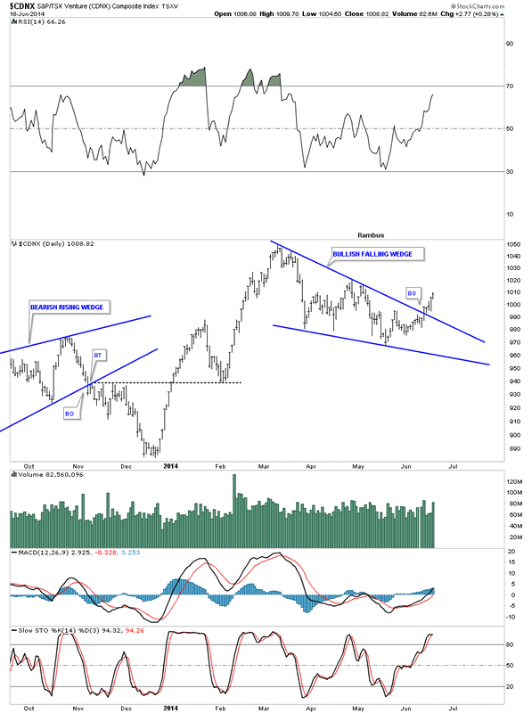
As you know the juniors have been leading the way higher since this move higher began. I would like to show you the CDNX which was our proxy for the small cap PM stocks before all the new etf's came out. This is a real good gauge on how the small cap universe is doing, in general, as there are small cap oil and gas stocks in there as well.
Presently the CDNX ( a Canadian Listed Index) has been relegated to the back pages and is watched by very few analysts anymore , but I believe it has an incredible story to tell and is still a very important clue as to the whole Precious Metals Complex
If this index is doing well that means there is some risk capital at work which is good for the entire markets. This is similar to the Russel 2000 small cap index for the stock markets. One always likes to see money flowing into these little guys as it shows overall strength.
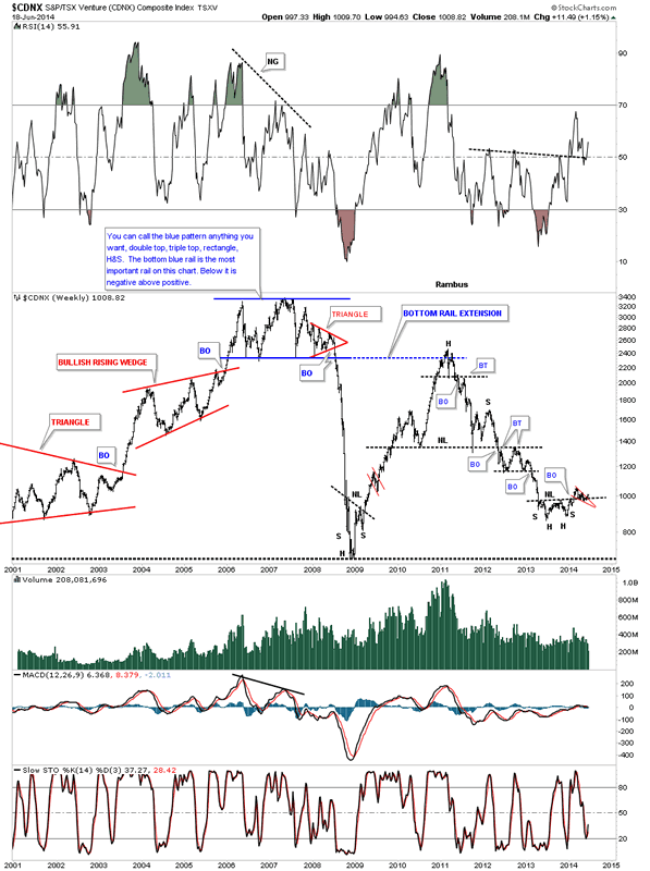
This first chart for the CDNX shows a blue bullish falling wedge similar to the big cap PM stock indexes I've been showing you.
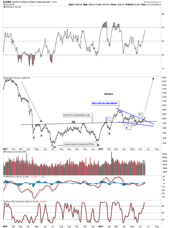
This next chart shows the inverse H&S bottom that I showed you earlier in the year when we tried our hand on the long side back in January and February of this year. As you can see it broke out above the neckline which was a good indication that the juniors were bottoming. After a brief rise the price action fell back to the neckline. It looked like the neckline may fail as there were so many different backtests taking place since the middle of March. It now looks like the neckline has held its ground as the price action is starting to rise. The bullish setup is that we have the blue falling wedge forming right on top of the neckline. As I have stated many times in the past when you have a smaller chart pattern form just below, just above or right on an important trendline that is a very big clue that the trendline is hot and to be respected.
I would now like to put our inverse H&S bottom in perspective by looking at a weekly chart for the CDNX. You can see how critical the neckline is to reversing the major downtrend that began in 2011. This is a perfect location to see an inverse H&S bottom form, at the end of a major move down. What I would really like to see happen next is see the CDNX takeout the high on the little red falling wedge for more confirmation the trend has indeed reversed and is turning up.
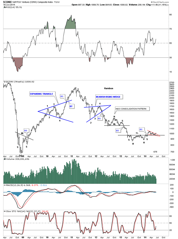
There is another reversal pattern in play that I showed you 6 months ago when the CDNX broke out from the big blue falling wedge. Six months is a long time and a lot of things can happen that one can lose track of. This is one reason why I keep literally 1000's of charts that I may not update very often but they can give me perspective when there is a possible trend change. Again what I would like to see now is for the CDNX to make a higher high to help confirm the breakout of the bullish falling wedge.
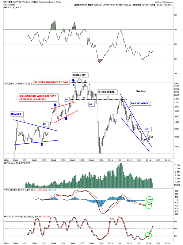
I would like to show you one last chart for the CDNX that helped me determine the top for the precious metals stocks in 2008. At the top of the chart in 2007 and 2008 you can read what I wrote back then as the chart pattern didn't show what direction a breakout would go. The little red triangle that formed on the bottom rail of that big horizontal trading range was a very big clue that the price action would eventually breakdown even though the bigger blue trading range hadn't yet. I had no idea of what was to come. As you can see once that blue trading range broke down it was all over for those that didn't get out in time. The drop was so vertical that most PM investors were in shock and awe. Keep in mind those investors in the PM bull market hadn't seen anything like what was about to happen before. There was a certain cockiness back then that nothing like this could ever happen to the precious metals stocks. I've learned the hard way many years ago that one never becomes cocky no matter how right you think your are. The markets can make a fool out of you before you even know you're a fool!
I have a lot more work to do tonight as these four different portfolios are really keeping me busy. Especially the Junior Miner Portfolio which is potentially very exciting. I just wanted to show you this possible turning point in the CDNX that may have a far reaching affect for the rest of the precious metals complex. All the best...Rambus
All the best
Gary (for Rambus Chartology)
FREE TRIAL - http://rambus1.com/?page_id=10
© 2014 Copyright Rambus- All Rights Reserved
Disclaimer: The above is a matter of opinion provided for general information purposes only and is not intended as investment advice. Information and analysis above are derived from sources and utilising methods believed to be reliable, but we cannot accept responsibility for any losses you may incur as a result of this analysis. Individuals should consult with their personal financial advisors.
© 2005-2022 http://www.MarketOracle.co.uk - The Market Oracle is a FREE Daily Financial Markets Analysis & Forecasting online publication.