


An In-Depth Look at Gold Chartology
Commodities / Gold and Silver 2014 Jul 21, 2014 - 10:05 AM GMT

 In this report I would like to take an in depth look at gold as there could be some important developments taking place that didn't show up until this weeks volatile swings. Keep in mind a week ago this particular pattern didn't exist as there was no evidence in place to even speculate on what what I'm seeing right now. As you know things can change very fast in the markets especially when the volatility increases as we seen this week. One always has to keep an open mind and look at what the markets are giving us to work with.
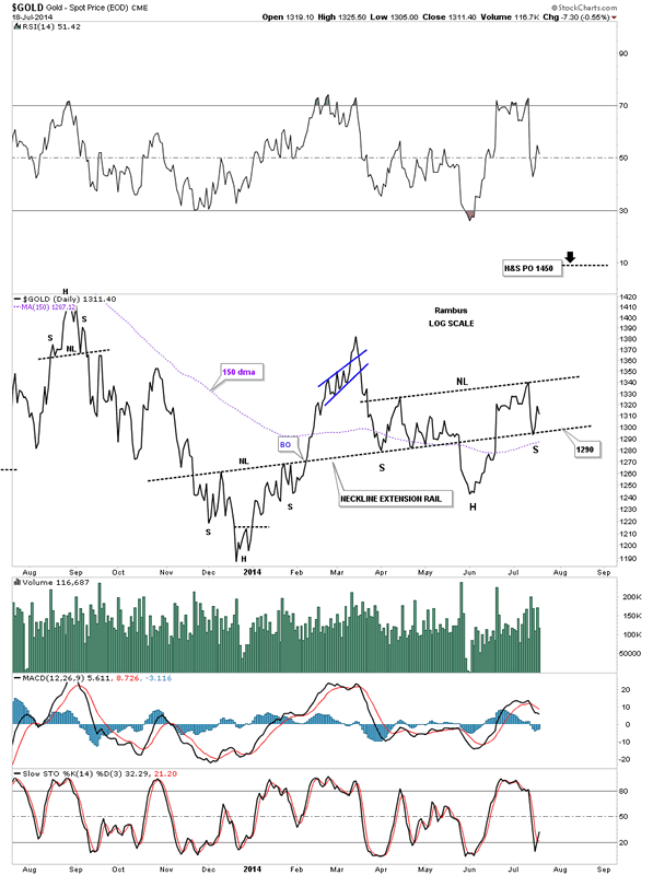
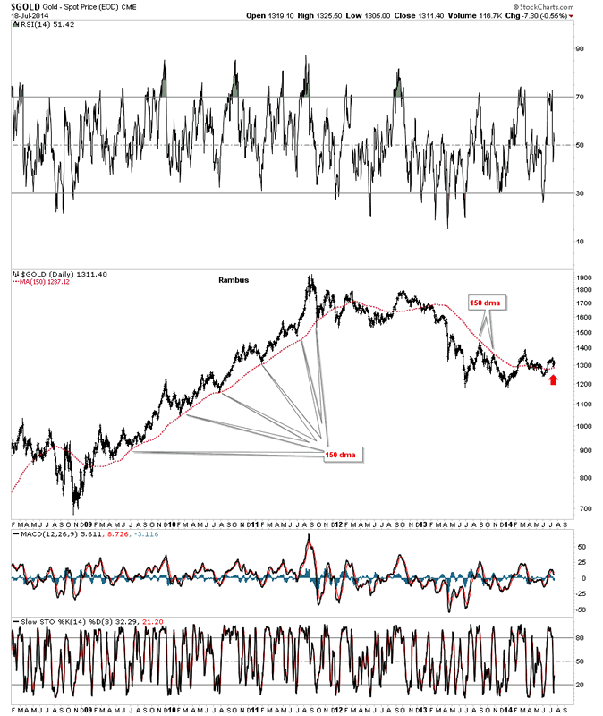
With that said lets start by looking at daily line chart for gold that shows, after this weeks wild price swings, we maybe seeing a right shoulder being formed. What's so important about the location of this possible H&S bottom is that it's forming above the December inverse H&S bottom, which if our current H&S bottom plays out, it will give us a higher low and a higher high creating an uptrend. There is a technique I use, which I've shown you before, where I will extend the neckline to the right side of the chart far beyond the actual breakout. There is an old expression that a neckline never dies it just slowly fades away. Many times you will see an old neckline act as support long after you think it's no longer relative. Here you can see how it has been working so far creating the bottom of the left shoulder, followed by a sharp break to form the head and then the rally back above the neckline extension rail which held support last week. As you can see the possible right shoulder is still in the early stage of development. I would really like to see some more work on the right shoulder but no closing price below the 1290 area. Just think of that neckline extension rail as a support and resistance line, below is bearish and above is bullish. If this possible H&S bottom plays out it will have a price objective up to around the 1450 area which would then give is a higher high vs the high made last August.
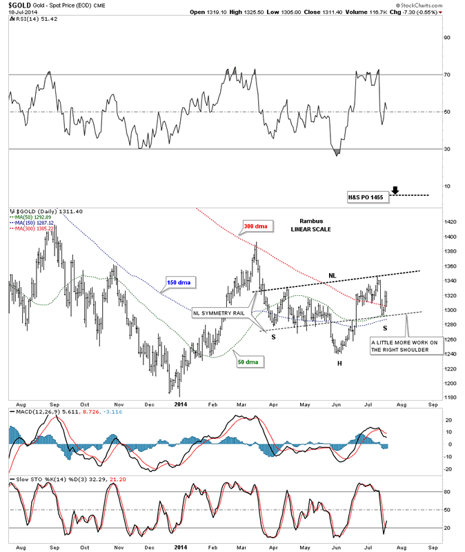
Lets look at the same time frame using a bar chart with what I think are the most important moving averages for gold, the 50 dma, the 150 dma and the 300 dma. During last weeks volatility the 50 dma and the 150 dma held their ground while the 300 dma finally held its ground at the low last Friday. So we have three important averages holding support at the bottom of the right shoulder so far. One big down day can change all that but for right now we have to give the benefit of a doubt that they will hold until proven otherwise.
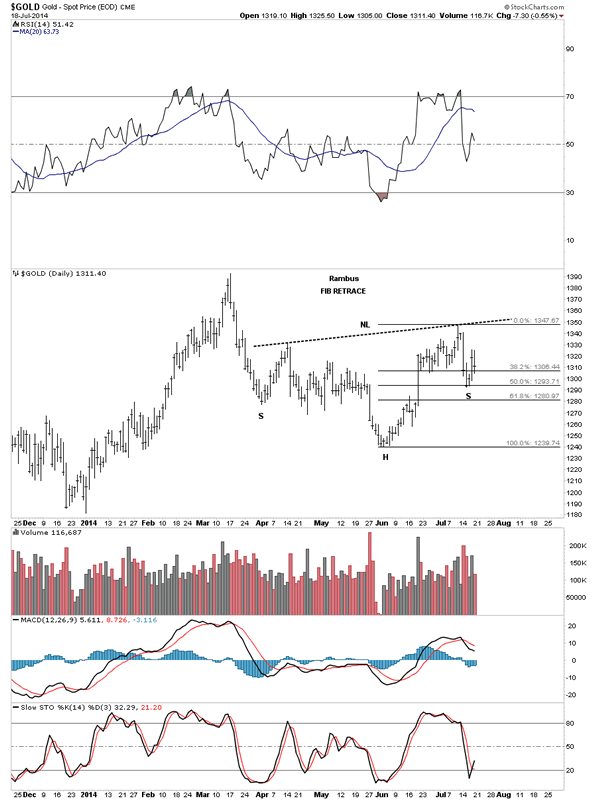
Along with the moving averages gold is also showing a fib 50% retrace that comes in also at the bottom of the right shoulder.
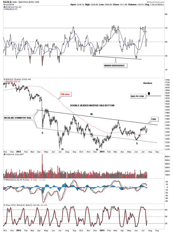
This next chart for gold is a long term daily look that shows our one year plus trading range which is hard to put a name on what type of pattern it will ultimately be. Most have been calling it a triangle which is still inconclusive as we don't have four completed reversal points in place yet. For a long time everyone was calling it a double bottom which isn't the case now. If the June low had made it all the way down to the bottom, at the December low, that would have completed the fourth reversal point and we could then call this one year trading range a triangle. We still wouldn't know if it was a consolidation pattern to the downside or a reversal triangle to the upside until we seen how the price action interacted with the bottom blue rail. If the price action broke through the bottom rail this one year trading range would be a consolidation pattern to the downside. If the price action bounces off the bottom rail and rallied up to breakout above the top blue rail it would then have five reversal points and we could call the triangle a reversal pattern.
This is where it gets interesting. The December inverse H&S bottom and our current H&S bottom are exactly the same size if you measure from the bottom of the head to the right shoulder armpit. If our current H&S plays out the price action will have to break above the top rail of the possible blue triangle. As I showed you earlier the price objective for our current H&S bottom comes in around the 1450 area which is slightly higher than the previous high made back in August of 2013. If that were to occur we would then have a horizontal trading range which would look more like a rectangle than a triangle. The fourth reversal point is always the hardest to locate in real time. It's easy in hindsight.
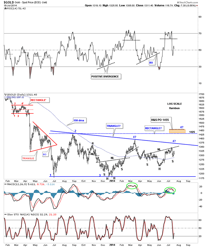
I have never shown you this long term daily chart for gold as it's not as pretty as I would like it to be. I can tell you that chartists are having a hard time trying to put a name on this one year plus trading range for gold as it doesn't have all the characteristics in place to actually call it something yet.
As you know I've been labeling some of the precious metals stock indexes as having an inverse H&S bottom in place. As I showed you on the chart above it's hard to put a name on this one year trading range so far. Many times the precious metals stock indexes and the precious metals will form very similar chart patterns and generally breakout about the same time. If we use our imagination I can see a double headed inverse H&S bottom that has been forming over the last year or so. There is some nice symmetry taking place where I added the neckline symmetry rail, where you take the neckline and move it down to the bottom of the left shoulder. It then projects to a possible bottom for the right shoulder if things progress that far, which they have. As you can see the June low hit the neckline symmetry rail dead on the money. Right now it looks like the neckline resistance will come in around the 1365 area which gold will have to overcome to enter into the next move higher. One step at a time.
I would like to make one last comment on this daily chart for gold that is showing a big divergence with the RSI and the bottom of the right shoulder. As you can see, the RSI at the top of the chart, bottomed at the December low along with gold. They both rallied up to the March highs where they both started to decline. The RSI declined and took out the December low while gold's decline was very modest and made a much higher low than the December low, which so far is the bottom of the right shoulder. This is a big divergence to say the least. Time will tell how this plays out but gold will have a head start vs the RSI if it decides it wants to put on a decent rally phase.
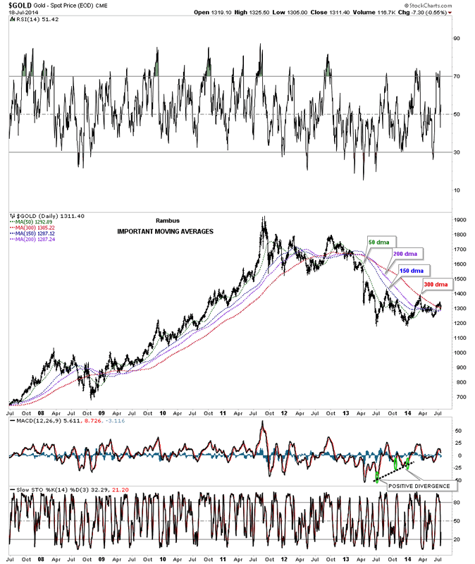
Lets look at a few more charts for gold, in no particular order, that shows the longer term look at the bull market and some of the interesting chart patterns and moving averages that have played a key role during gold's 14 year run. The 150 dma worked magic during gold's bull run off the 2008 crash low. It also reversed its role to resistance several times during this bear market. Right now gold is trading back above the 150 dma which comes in at 1287 and is slowly starting to rise.
Below is another daily chart that shows the important moving averages and what a true bull run will look like. Once a correction is over and the rally phase gets going these moving averages will start to aline themselves as shown by the rally off of the 2008 crash low to the top in 2011. You can see they also went into alinement during part of this bear phase gold has been in since 2011. What we see happening now is they are starting to squeeze together very tightly while gold is trading above all four moving averages. This is first time this has happened since late 2012.
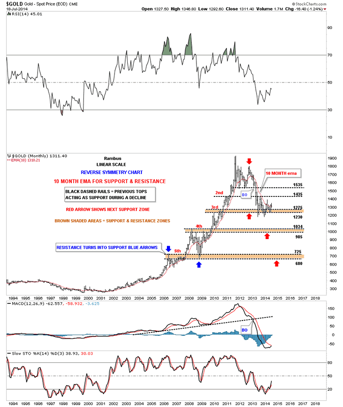
This next chart for gold is a long term monthly look that shows the 10 month ema and how good of a job it has done during gold's 14 year run showing both support and resistance. The only time it really failed on the upside is when gold had the 2008 crash and the top in 2011. You can see it has reversed its role to the downside and has held resistance since the second peak, top red arrow. Gold did manage to spike above it for a short time several months back but it couldn't hold. Then last month gold actually closed above it ever so slightly, and as of today gold is trading about a dollar higher with two weeks to go yet for July.
This next monthly chart for gold shows the bigger chart patterns that have formed during gold's 14 year run. On the first chart in the post I showed you a small neckline line extension rail that is helping to add support to the bottoms of the left and right shoulders. In this very long term monthly chart I've extended the neckline, that was part of the complex consolidation pattern, that was made back in 2008. It was made up of three different chart patterns with a H&S bottom being one of them. I drew in the neckline extension well over a year ago wondering how the price action was going to react to it. So far the neckline extension rail has reversed its role and has been acting as support for the last year and a half. I can't tell you how important that neckline extension rail is because if it gets broken to the downside that's when we get the flush to new lows. This chart also shows that when gold is in an impulse move up you will see a string of white candles form and just the opposite when gold is in an impulse move down, you will see a string of back candles. When you see a mix of black and white candles you know your in a trading range.
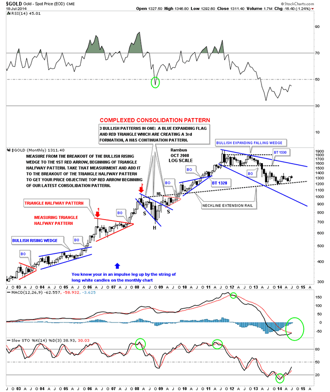
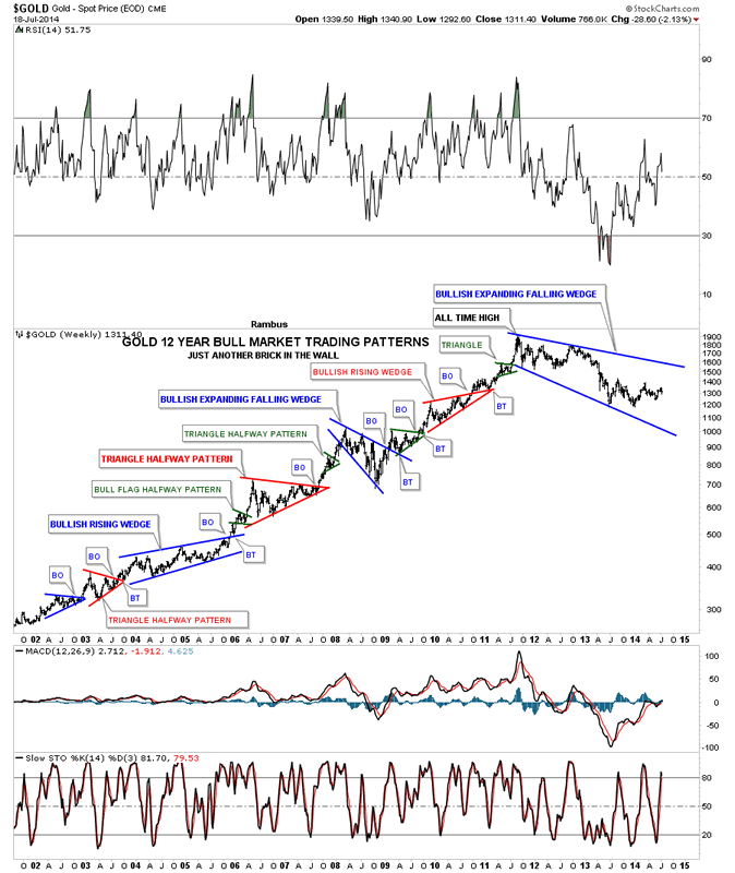
I would like to show you one last long term monthly chart for gold that has all the chart patterns that I've followed through the years. I call this chart, JUST ANOTHER BRICK IN THE WALL, because it has to be one of the most beautiful bull markets in recorded history. I've said the before and I'll say it again, they will look back at this gold bull market in the future and study it like we study the 1929 crash. From a Chartology perspective this is as good as it gets when you see one consolidation pattern form on top of the next, each one higher than the last. There are several bullish rising wedges that generally show up in strong bull markets. There was also a bullish expanded falling wedge that was one of the consolidation patterns made in 2008. As you can see the last chart pattern at the top of the chart is now three years in the making and is by far the biggest and longest running trading ranges for this bull market. It to is an expanding falling wedge. Is it going to be just another brick in the wall and lead gold to new all time highs or have we seen the end of gold's bull market. Stay tuned as we follow the price action to where ever it leads us. All the best...Rambus
PS: We'll look at silver in depth in the Wednesday Report.
All the best
Gary (for Rambus Chartology)
FREE TRIAL - http://rambus1.com/?page_id=10
© 2014 Copyright Rambus- All Rights Reserved
Disclaimer: The above is a matter of opinion provided for general information purposes only and is not intended as investment advice. Information and analysis above are derived from sources and utilising methods believed to be reliable, but we cannot accept responsibility for any losses you may incur as a result of this analysis. Individuals should consult with their personal financial advisors.
© 2005-2022 http://www.MarketOracle.co.uk - The Market Oracle is a FREE Daily Financial Markets Analysis & Forecasting online publication.