ASX200 Aussie Stocks Bulls Set To Be Culled
Stock-Markets / Stock Markets 2014 Aug 04, 2014 - 06:57 PM GMTBy: Austin_Galt
 With the ASX200 in the highest territory it's been since June 2008 and seemingly hopping along nicely (just getting a kangaroo reference out of the way!), I thought I'd investigate. Let's take a top down approach beginning with the yearly chart.
Yearly Chart

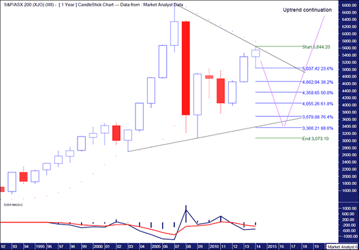
Ok, what stands out to me here is that no previous swing lows were broken during the 2008 crisis. On the contrary, a higher swing low formed in 2009 at 3073. So a massive bull market is still in play. Since the 2009 low, price has rallied albeit not at a great pace. The nature of trading looks more corrective than it does impulsive.
In fact, the trading looks like a big consolidation pattern is playing out. A triangle perhaps? Quite frankly, I don't bother getting into what this or that corrective pattern is called. A flag, a pennant. Show em the door. Couldn't care less. Now I know a lot of people feel the need to put labels on things as it makes them feel all warm and fuzzy inside. Well, I ain't one of them. The markets are complicated enough without trying to determine what the name of each pattern is. I like to keep things simple so as far as I'm concerned, a pattern is either impulsive or corrective.
But I digress. A big consolidation pattern. I have drawn two black trend lines, one trending up along bottoms and one trending down across tops. Now the recent top may or may not be the final top to this rally. If it is not then I expect only marginally higher. Not enough to have a significant impact on this analysis.
I have added a Parabolic Stop and Reverse Indicator (PSAR) which pertains to the dots on the chart. We can see these dots are to the upside of price and should provide some sort of resistance which currently stands at 5783. So while more upside is possible, as long as the dots remain to the upside, bias should be given to lower prices going forward.
I have also added a Moving Average Convergence Divergence (MACD) indicator which shows the red line currently above the blue line. That is generally negative for price so once again bias should be given to lower prices going forward.
So, if we assume that price is more than likely to head down from here, just how low will it go? I have added Fibonacci retracement levels of the rally leg from the 2009 low to the recent high. Interestingly, the back uptrend line looks to intersect the 76.4% and 88.6% levels in two to three years. So they are potential price targets to keep in mind.
But which level is more likely? Well, here's my opinion for what it's worth. I expect price to come down and marginally bust the black uptrend line. This trend line will be on the charts of many technical analysts. As it should be. But it is too obvious. I would like to see price trade below that line, taking out stop loss orders that will have built up under there. Once done, price can then rise back up over the trend line. This creates a false break of the trend line. A fake out which sets the stage for a new impulsive uptrend. Now this would be closer to the 88.6% at 3366 so that's the level I'll aim for.
Let's now move on to the monthly chart.
Monthly Chart

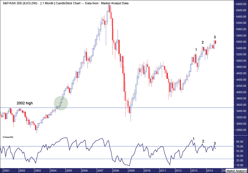
Just a few things of interest here. Firstly, I have drawn a green highlighted circle. This is the area whereby price really started to explode higher out of its normal uptrend. Now, when price finally tops out and starts correcting, price often pulls back to this exact same area where the explosion began. This has already happened with the 2009 low.
Also, old tops often provide support in future and we can see the 2002 high, denoted by the horizontal line, is not too far away from the 2009 low. I've found lows often penetrate a bit deeper into the old top support zones giving them a real test. That has certainly been the case here.
Finally, I have added a Relative Strength Indicator (RSI) and it is clearly evident that each new high is losing strength. This last top looks as if it will set up a triple bearish divergence. Generally after the third bearish divergence a significant decline can be expected. And this is the monthly chart no less!
Let's keep rolling.
Weekly Chart

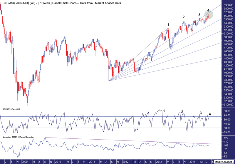
Firstly, I have drawn a Fibonacci Fan. We can see price has recently been hugging the 23.6% angle but now looks to be losing its grip. The most recent high turned down just failing to hit this angle. This can be seen in the green highlighted circle. While not the be all and end all, it's not a good sign.
I have added a Momentum indicator and it can be seen that ever since the October 2009 high, momentum has been declining. Momentum is just about done. Price is exhausted.
I have also added a RSI and lo and behold, looky at what we have here. No less than a rare fourth bearish divergence. Ahhh, hello!! Let's keep in mind what I just said about a triple bearish divergence in the monthly analysis.
Let's wrap it all up by having a quick look at the daily chart to really nail it down.
Daily Chart

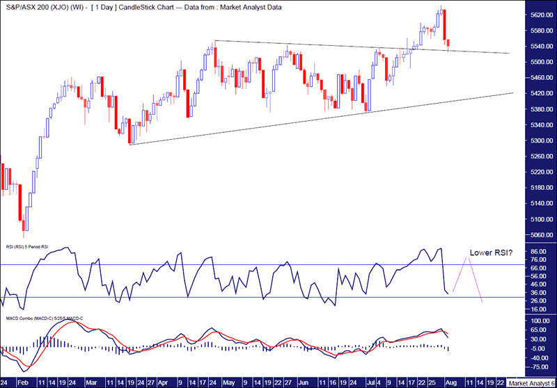
We can see price recently busted out higher from a consolidation zone that has been in play for the past few months. Price then came back and looks like it may find support at the top trend line from this consolidation zone. It may go a bit lower but as long as the bottom trend line holds then more upside can be expected.
A common topping pattern is when price cracks higher from a consolidation zone, it makes two or three new marginal highs before beginning a new downtrend. So far we have one new high. Personally, I think there is one last marginal high to be had just above the recent 5644 high. But that's just me speculating.
I have added a RSI and if my speculation proves on the money then perhaps the new marginal high can be accompanied by a lower RSI reading. A nice little bearish divergence. Let's see.
Also, I have added a MACD indicator which shows the recent move down caused a bearish crossover with the red line now above the blue line. A marginal new high may not be enough to alter that.
Generally, it's the Aussie kangaroos that need to be culled. In the analysis undertaken of its stock market, it appears as if it's now the bulls turn!
Bio
I have studied charts for over 20 years and currently am a private trader. Several years ago I worked as a licensed advisor with a well known Australian stock broker. While there was an abundance of fundamental analysts there seemed to be a dearth of technical analysts, at least ones that had a reasonable idea of things. So my aim here is to provide my view of technical analysis that is both intriguing and misunderstood by many. I like to refer to it as the black magic of stock market analysis.
Please register your interest in my website coming soon. Any questions or suggestions, please contact austingalt@hotmail.com
© 2014 Copyright Austin Galt - All Rights Reserved
Disclaimer: The above is a matter of opinion provided for general information purposes only and is not intended as investment advice. Information and analysis above are derived from sources and utilising methods believed to be reliable, but we cannot accept responsibility for any losses you may incur as a result of this analysis. Individuals should consult with their personal financial advisors.
© 2005-2022 http://www.MarketOracle.co.uk - The Market Oracle is a FREE Daily Financial Markets Analysis & Forecasting online publication.


