


Gold Longterm Trend Turns Bearish
Commodities / Gold & Silver Jun 14, 2008 - 03:55 PM GMTBy: Merv_Burak

 These $10 and $20 moves are quite frustrating, especially those on the down side, BUT if one looks closely on a chart there might be things that may be encouraging (or not). So, let's look at some charts.
GOLD: LONG TERM - What we have here is a long term point and figure chart of the gold price movement since 1987. The red lines are bear trend or resistance lines while the blue lines are bull trend or support lines. The thickest lines are primary lines while the thinner lines are secondary.
As readers to these commentaries already know, for a trend change I require the breaking of the primary line AND a move below (or above, depending upon trend) two previous lows ( O s) or highs ( X s). As you can see this simple criteria has kept you in during most of the major bull trend and now you are out. How long you will be out, per the P&F criteria, is anyone's guess but the downside projection according to this chart is to the $660 level and possibly to $600. However, projections are only guides and not certainties. I follow the chart and when it turns, I turn, regardless of projections. At the present time it would take a move to the $945 level to reverse the long term trend back to the bull.
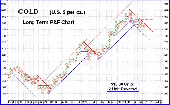
One question that is on many minds is if this latest reaction is similar to the one we had during 2006/2007 or if it is something different and more major. Well, if the action does not drop below $840 it just might be like the previous reaction BUT there is a difference. There is a concept in technical analysis that is so often proven by action (but not always) that major moves have a major reaction or rest period about at their mid-way of the overall move. Well, that 2006/2007 period DOES look like a mid-point rest period and if so then the recent top may just have been the top for a long while. Just something to keep in mind.
Now, let's go to our normal charts and indicators and see if they confirm the P&F view. First the moving average. Gold has been oscillating above and below its long term moving average line (the 200 day weighted moving average) but the slope of the moving average has remained positive throughout. Gold is once more below the line with the line slope remaining positive. On the price momentum front the long term momentum indicator (150 day RSI) remains in its positive zone where it has basically been since 2001. It is, however, moving lower and is below its trigger line. The volume indicator is often a lagging indicator at market tops and seems to be such at this time. It is showing more strength than the other indicators but has moved below its trigger line. All in all I would rate the long term, based upon these indicators, as – NEUTRAL , one step above a bear rating. Should either the moving average turn down or the momentum cross into the negative zone, then the rating would go bearish.
MOST market participants do not use the weighted moving average line but use the simple 200 day moving average. This is situated just above the $850 level. This level is a very strong support level from previous activity (see chart in the intermediate term section). On the P&F chart this is seen as the $855 level (due to $15 units) with $840 as being below the support. Whether you are watching a bar chart or a P&F chart, this is an area that needs close watching to see if it holds or is broken.
INTERMEDIATE TERM
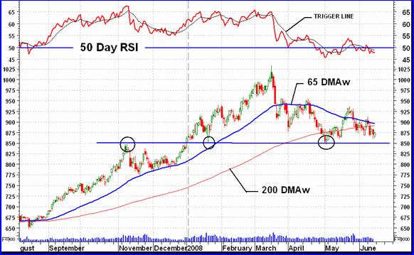
On this intermediate term chart one can readily see the support at the $850 level from previous activity. We need this support to hold or else we may have a real problem with gold.
The picture for the intermediate term is more bearish than that of the long term. Gold has been bouncing above and below its intermediate term moving average line but in this case the moving average line slope has remained negative. The price momentum indicator has been oscillating above and below its neutral line and is once more in its negative zone, below its negative trigger line. As mentioned above, the volume indicator seems to be acting stronger than the other indicators but is below its intermediate term trigger line. On the intermediate term the only rating I can give gold is a BEARISH rating at this time.
SHORT TERM
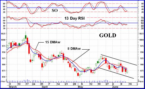
Despite some volatile moves the basic short term direction has been down for the past few weeks. Gold remains below its short term negative sloping moving average line (15 DMAw) with the more aggressive very short term line (8 DMAw) remaining below the short term line for a confirmation of the short term direction. The short term price momentum indicator (13 Day RSI) remains in its negative zone below its negative trigger line. Daily volume is low but this is normal during a down side move. All in all the short term remains BEARISH .
Despite the fact that Friday was an up day and the more aggressive Stochastic Oscillator is bouncing off its oversold line a turn around in the direction of the immediate trend has not yet been confirmed. It might take another day of upside action to do so but we'll just have to wait and see. For now, the immediate term direction remains towards the down side.
SILVER
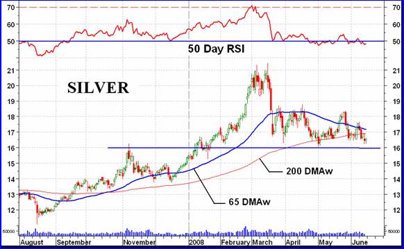
When looking at the gold and silver intermediate term charts one can see an almost identical picture. Silver has a major support at the $16.00 level although it is not as strong as that of gold. Also the silver momentum just seems to be a little weaker than the gold momentum but the difference is not critical. The basic comments in the gold section can therefore be applied to silver, except for the difference in price.
PRECIOUS METAL STOCKS
As readers to these commentaries know, I am more inclined to review what is happening in my Merv's Indices rather than the major North American Indices. This is due to the weighting of individual stocks in the major Indices and the average performance of each component stock in the Merv's Indices. The Precious Metals Indices Table (see below) provides a good overall view of what is happening to the various Indices, especially for the intermediate and long term. I may differ slightly from time to time in my chart and indicator analysis but this is due to slightly different indicators used in the Table. Nothing is perfect in this world.
This past week we have seen a major decline in precious metal stocks. It wasn't the first decline or the largest and unfortunately it may not be the last such decline. The overall universe of 160 stocks (the Merv's Gold & Silver 160 Index) declined an average of 4.7% while the major Indices declined somewhat more. Of the 160 stocks in the universe there were 134 decliners and only 23 advancers. This is a ration of decline to advance of 6 to 1, a very high negative ratio. Possibly such a high decline ratio is the set up for a reversal ahead.
Only one stock of the 30 component stocks in the “quality” sector was on the advance while 29 stocks were on the decline. Looking at the other end of the spectrum there were 8 stocks on the advance and 20 on the decline in the “gambling” sector. What does this mean? Possibly nothing unless such a divergence between the “quality” and “gambling” stocks continues.
Silver stocks seemed to have been the hardest hit as the price of silver takes a bigger hit than gold price.
All of the various Merv's Indices have long term momentum indicators in their negative zones. This has been a rare occurrence over the past several years and not a good sign unless the indicators reverse pretty soon. Even the Composite Index is showing its long term momentum indicator in the negative zone. This reflects a composite of all the 23 Indices and prices in the Table. Something is going on here that just does not look good.
With the direction and rating of the various Indices in the bearish camp I would be inclined to suggest that this is not the time to be jumping into the precious metals market, unless one is a real high risk taker and understands the risk.
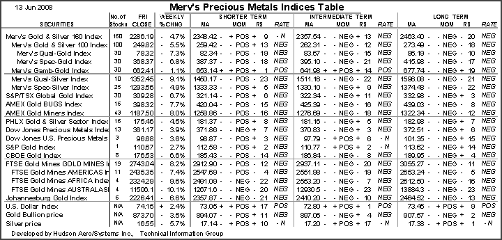
Merv's Precious Metals Indices Table
That's it for this week.
By Merv Burak, CMT
Hudson Aero/Systems Inc.
Technical Information Group
for Merv's Precious Metals Central
For DAILY Uranium stock commentary and WEEKLY Uranium market update check out my new Technically Uranium with Merv blog at http://techuranium.blogspot.com .
During the day Merv practices his engineering profession as a Consulting Aerospace Engineer. Once the sun goes down and night descends upon the earth Merv dons his other hat as a Chartered Market Technician ( CMT ) and tries to decipher what's going on in the securities markets. As an underground surveyor in the gold mines of Canada 's Northwest Territories in his youth, Merv has a soft spot for the gold industry and has developed several Gold Indices reflecting different aspects of the industry. As a basically lazy individual Merv's driving focus is to KEEP IT SIMPLE .
To find out more about Merv's various Gold Indices and component stocks, please visit http://preciousmetalscentral.com . There you will find samples of the Indices and their component stocks plus other publications of interest to gold investors.
Before you invest, Always check your market timing with a Qualified Professional Market Technician
Merv Burak Archive |
© 2005-2022 http://www.MarketOracle.co.uk - The Market Oracle is a FREE Daily Financial Markets Analysis & Forecasting online publication.