


The Yield Curve - 3 Big Stories Not Being Covered With Graham Mehl
Interest-Rates / US Interest Rates Aug 02, 2016 - 07:03 AM GMTBy: Andy_Sutton

 It occurred to us as we were laying out the contents of this article that we should probably not assume certain things. This publication has a wide readership, from corporate CEOs to high school students. The former are looking for analysis, the latter to become educated. The topic we are going to tackle in this second installment is a complex one, so some introduction is in order. Therefore, this piece will consist of two parts: an opening introduction, a primer if you will, then the analysis will follow. If you are well-versed in interest rates, bonds, bond yields, and debt, you can probably skip the primer, although we’ve been surprised at the number of people who have subscribed to the misconceptions stated therein.
The topic we are going to tackle is the negative US yield curve. It is being talked about a little in the media, but not nearly enough and without anything in the way of background. If you have taken finance classes you can understand it, but if you haven’t, then you’re out of luck. We reject that out of hand. This is a topic that affects everyone, so understanding will not be limited to the Wharton MBA types. Without further delay, we begin.
Part I - The Primer
Andy will handle this portion because he’s got the knack for making this stuff understandable in less than ten thousand words. We’ll both handle the second portion of the piece. As most of you realize, there is a debt problem in the world. It’s why many of you started reading this column and others like it. The debt problem exists at all levels – global, federal, state, municipal, and personal. While these are all separate in nature, they are linked as well, which makes it complicated. What I’m going to describe to you is how this situation is, minus any manipulation, just so you can get a sense of what is going on. Let’s begin with interest rates.
Interest rates are set basically in two ways – by policy fiat and by various financial markets. For example, when you hear about the not-so-USFed raising interest rates, they are mostly talking about what is known as the Fed Funds Rate, which is the rate banks charge each other for overnight loans. When you hear the term ‘interest rates’ on the news along with the ‘fed’, this is most commonly what is being referred to. There are some other lesser interest rates that are set by the not-so-USFed, but they don’t fall within the scope of this article.
Next we have interest rates that consumers deal with such as credit card rates, the Prime Rate, mortgage rates, auto loan rates, and so forth. Of these, the Prime Rate, credit card rates, and auto loan rates are set by the banks. For example, the Prime Rate has historically been 3% higher than the target for the aforementioned Fed Funds Rate. Mortgage rates have traditionally been different in that they have been determined by the bond market, specifically, the 10-Year USTreasury Note. I’ll get to that in a bit.
So when we talk about interest rates, we’re talking about the cost of borrowing money (debt). If you borrow for a car, a house, a yacht, or an iPhone, it costs money to borrow money. Let’s say you purchase $5000 worth of merchandise on your credit card. Your interest rate is equivalent to the national average of 15.07%. If you don’t pay your $5000 in purchases off before the due date on the card, the interest will start piling up. The cost of borrowing that $5000 will be $753.50 per year as long as the balance remains at $5000. As you pay down the balance, the cost of borrowing in dollars falls even though your rate remains the same because the balance is dropping.
Now, let’s take what we’ve learned above and apply it to the USGovt, which has a voracious appetite for debt because it loves to spend more than it takes in. In many ways, the government is no different than the USConsumer. Both spend more than they bring in and both must borrow the difference. The only difference is that the government gets a better deal on interest rates than you do. The USGovt issues debt instruments called ‘Bills’, ‘Notes’, or ‘Bonds’. Bills are debt instruments that mature in less than one year, Notes mature in 1-10 years, and Bonds mature in greater than 10 years. It sells these instruments to raise the money to fund its deficit spending. And, much like your credit card, the government has to pay interest on the bonds it issues.
So in concept, the government doesn’t have a credit card like the consumer, but the end result is the same. Both parties end up owing a bunch of money to creditors – at interest. The government sells notes and bonds of various durations – periods of time. These durations run from 1 month to 30 years. If you purchase a 1-month T-bill you’ll receive a certain rate of interest. As of 7/29/2016, that rate is calculated to be .19%. While T-Bills are handled differently than other types of Treasury Notes and Bonds insofar as interest is determined, those differences lie outside the scope of the article. If you are curious how T-Bill rates are determined, here is a good place to start. It is important to note, however, that the .19% interest rate published for 30-day T-Bills is the annualized rate. In other words, if you bought 12 30-day T-Bills and held them until maturity, you’d end up with .19% interest. A common misconception is that the published rate is for a single 30-day T-Bill.
Oddly, and I’ll take a walk down a short rabbit trail here, the concept of annualization is one that is used elsewhere and has led to a great misunderstanding by many. If you’ve been paying attention the past few days there has been talk of the recent GDP report for the United States. It was reported as 1.2% for the most recent quarter. That would lead many to think that means the economy grew at a 4.8% annualized rate during the last quarter. It’s actually the opposite. The rate of growth that is stated is already annualized. So, put another way, the USEconomy grew .3% in the last quarter. They multiplied it by 4 to get the annualized rate, which is what is published. The quick lesson here is that it is always good to understand the terms of magnitude that you’re dealing with when presented with numeric data.
Getting back to government debt, let’s take a look at the various durations available. In addition to the 30-day T-Bill, there are 13-week (3-month), 26-week (6-month), and 52-week (1-Year) T-Bills. The next several durations are called ‘notes’ since their maturities lie between 1 and 10 years. In this group are the 2-year, 3-year, 5-year, and 10-year Notes. Then there are 20-year and 30-year Bonds. They are called Bonds because their maturities are greater than 10 years. As one would expect, when you invest (pledge) your money to a borrower for a longer period of time, a greater amount of interest is generally expected – to compensate the buyer for time-risk. Whereas 30 days is a very short period of time (although these days a lot can change in a month), 30 years is so long that everything – including the maps – can change in that duration. So it would make sense that if you’re asking someone to lend you money for that long, that you’d compensate them appropriately.
Consequently, on any given day, Treasury debt instruments (Bills, Notes, and Bonds) are bought and sold and as such, the yield or interest rate changes. The concatenation of the yields for debt instruments across all maturities can be charted, resulting in what is called the yield curve. The yield curve changes daily as rates change due to bond prices. A general rule of thumb is that bond prices are inverse to bond yields (interest rates). So as bond prices go up, rates go down and vice versa.
Part II – The Analysis
Looking at our example rate of a 30-day T-Bill from above, we see that as of 7/29/16, the calculated interest rate on such instruments is .19% per year. This rate is similar in nature to what a credit union or ‘premium’ checking account would pay. It is a joke. When you consider the government’s admitted level of price inflation is around 2%, you’re losing money on T-Bills. When you look at your own rate of price inflation (most people we talk to report around 4% since the first of 2016), you’re even further in the hole. The problem is not the T-Bills. If it were, we’d just advise that people think strongly before buying T-Bills. No, the problem here is that the negative interest rates stretch across MOST maturities when using the CPI and ALL maturities when using the rate of price inflation reported by most consumers, at least the ones we talk to. We’ll admit we have not conducted a scientific sampling as should be done; we’re just going by what the average Joe is reporting back. That has proven more than sufficient for illustrative purposes in the past. We’re not generating mathematical models here; we’re making a point.
Take the rate for the 30-year bond as of 7/29/2016. It is 2.18%. This rate is annualized. You get payments every six months for 30 years. Now, a caveat. If you happened to buy this 30-year bond when prices were a lot lower, your yield is higher. The 2.18% represents the yield for someone who bought the bond on 7/29/16. For example, if you bought the same bond on 1/4/16, your yield would be 2.98%. That’s a .80% difference. You’ll also hear the term ‘basis points’. A basis point or a ‘bp’ is simply .01%. So .80% would be 80 basis points and so forth. So you might hear someone say “Yields on the 30-year bond have dropped 80 bps (basis points) since the first of the year.”
If we take a look at the various Consumer Price Index measurements, it becomes quite confusing very quickly. There are pages of different series depending on urban vs. rural, the size of the city, type of good, etc. Here’s an example. At any rate, the Bureau of Labor Statistics, which is responsible for compiling these figures states that the headline rate of inflation (CPI-U, all items) has risen 1.0% in the past year, but .2% in the past month. The ‘core’ rate, which is the CPI-U rate minus food and energy, because these are deemed to be more volatile, is up 2.3% in the past year. Since the media and government insist on using the core, so will we.
The World has Changed
It doesn’t take a mathematician to figure out that while the 30-year bond has flirted with positive territory, the rest of the yield curve is firmly negative when core price inflation is deducted from the yield. There has been an old adage in the investment community for many decades now – buy stocks when you’re young, then sell the stocks to purchase bonds when you get closer to retirement and live off the interest. Given that the interest is eaten up by price inflation, one of the main pillars of traditional ‘flat earth’ investing is destroyed. But nobody is admitting it! Investment advisors and brokers are STILL pushing seniors to buy bonds; instead they are now hoping to make money by the price of the bonds going up rather than just sitting on the bond and collecting interest. Obviously, this subtle change can have enormous consequences for the investor without the investor even realizing it. The investor has been exposed to a whole new risk spectrum and little in the way of disclosure is taking place whether it is the advisor, the media, or the government.
Secondly, for those investors who do realize what is going on, they are forced to make a tough decision: buy bonds and hope to make money via arbitrage or abandon the bond strategy, if even partially, in favor of staying in the equity markets where there is historically more risk. Reducing risk was the whole point of moving from stocks to bonds as one progressed into retirement in the first place. Now these same people are basically being forced back into the equity markets in search of returns. If you look back at the beginning of 2008, the 30-year bond was paying 4.35% interest; nearly double what it is right now. Our point is simple; before the last major financial blowout, most seniors were still in their traditional risk profile – fewer stocks and more bonds and fixed income to mitigate risk. When the fall of 2008 came around, money poured from stocks into bonds, driving up the price of bonds and the yields down. So our seniors had a little of their cake and got to eat it as well. They had purchased their bonds at comparatively lower prices and got decent yields. Then as money poured into bonds after Lehman and through the end of 2008, they maintained their yields AND had the option of selling their bonds at a profit as well if they desired the safety of cash.
Fast forward to today where many seniors are hunting returns in the stock market. Another 2008 type event would have dramatically different results this time around just because of the way investors are positioned. The ones who are in bonds would have (and have had) the opportunity of selling their bonds at higher prices. Bonds spiked after the Brexit vote back at the end of June and haven’t really given all that much back.
The bottom line here is the negative yield curve punishes savers and enables the USGovt to continue its profligate spending by providing it with better than prime rates when it should in fact be paying much higher rates due to its lack of spending control, the absolute enormity of the debt that must be repaid, and a complete and total lack of willingness on the part of ANYONE to give up anything. The American people want their freebies and the USGovt is more than happy to oblige in order to buy support. We have seen where this lack of responsibility and stewardship has gotten Europe, but hey, this is America and nothing bad can happen to us, right? This false reality is supported by the fact that when anything bad happens financially, there is a knee-jerk and immediate flight to the USDollar and USGovt debt. So much so that rates have been driven down to the point where USBond investors are actually paying Uncle Sam for the ‘privilege’ of owning government debt.
Some other Miscellanea Regarding the Yield Curve
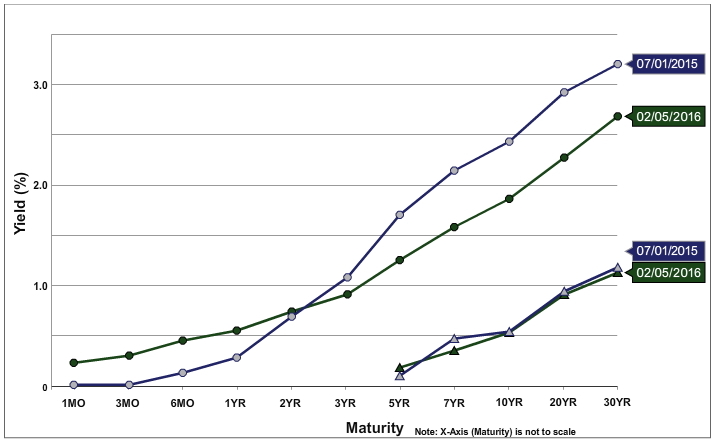
Another characteristic of the yield curve that has been the subject of much study over the years is the shape of the curve. Is it flat, steep, inverted, humped, etc.? A great deal of research has been done over the decades relating to the shape of the yield curve, certain spreads, and how they portend the future for the USEconomy. What you’ll see from the charts below is that the yield curve is flattening and that generally means a great deal of uncertainty regarding the direction of the USEconomy, which isn’t surprising. The fact that anyone is willing to loan the USGovt money for 30 days let alone 30 years at a negative rate ought to say enough about what is going on and how out of kilter things really are.
Below is the yield curve as of 7/29/2016:
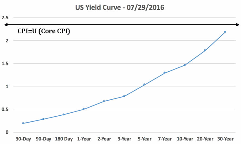
Also, the 20-year Bond generally yields around 200 bps (2%) more than the 30-day T-Bill. Today that is most definitely NOT the case with the spread being closer to 1.5%.
What we’re seeing above is a fairly ‘normal’ yield curve in terms of shape, but one that is completely negative. We’ve placed the horizontal line representing the Core CPI to illustrate this point. You can also see that the curve has flattened considerably, especially from 1-year and out when comparing the 7/1/2015 and 7/29/2016 curves.
This begs the question, why would investors, knowing what they do about the global state of affairs, tie up money at the longer durations? We don’t believe these are buy and hold folks, unless you’re talking about the not-so-USFed’s trading desk. Their role in all this hasn’t been discussed and is a topic for another day, but we’ll remind you again of their primary role – management of expectations, and basically holding this broken mess together as much as possible. Getting back to reasons for holding the longer maturities, speculation likely tops the list. Market actors expect crises to occur fairly regularly now, as has been the case. These same actors know that when a crisis hits, money flies into USTreasury debt, even the long end. Brexit is the most recent example of this. Money absolutely poured into the 10 and 30-year portions of the curve.
Frankly, gold is a much safer haven, but runs into the old argument that it doesn’t pay interest. Well people, neither do USTreasuries. They pay negative interest. So the question becomes would you rather own the debt instrument of an economically, financially, intellectually, and morally bankrupt entity intent on its own demise or own something that owes nobody, has been recognized as money for thousands of years and pays peace of mind as its ‘interest’? We happen to think this one is a no-brainer.
Graham Mehl is a pseudonym. He currently works for a hedge fund and is responsible for economic forecasting and modeling. He has a graduate degree with honors from The Wharton School of the University of Pennsylvania among his educational achievements. Prior to his current position, he served as an economic research associate for a G7 central bank.
By Andy Sutton
http://www.andysutton.com
Andy Sutton is the former Chief Market Strategist for Sutton & Associates. While no longer involved in the investment community, Andy continues to perform his own research and acts as a freelance writer, publishing occasional ‘My Two Cents’ articles. Andy also maintains a blog called ‘Extemporania’ at http://www.andysutton.com/blog.
Andy Sutton Archive |
© 2005-2022 http://www.MarketOracle.co.uk - The Market Oracle is a FREE Daily Financial Markets Analysis & Forecasting online publication.