


The Looming Financial Holocaust, Massive Bearish Patterns Across Multiple Markets
Stock-Markets / Financial Markets 2010 May 30, 2010 - 05:23 PM GMTBy: Clive_Maund

 We had expected the broad stockmarket and the resource sector to stabilize and start to recover last week and they did, and while we are likely to see further recovery in the days and perhaps weeks ahead, there have been some ominous developments in the recent past that we would be most unwise to ignore. The market did not go into full crash mode because it was not technically ready to, although it got close to it, and crucial support held - for now. However, heavy technical damage was inflicted and a broad review of long-term charts reveals that a blood-curdlingly dangerous setup has developed across a wide spectrum of markets.
You may recall that day early in May when the Dow Jones Industrials mysteriously plunged by nearly 1000 points intraday. In an effort to placate unnerved investors, the media tried to pass it off as a technical glitch. What actually caused it was a wave of heavy selling caused by those who suddenly �saw the writing on the wall�. If this drop was due to some technical glitch then why, after bouncing, did the market drop to even lower levels a week or two later?
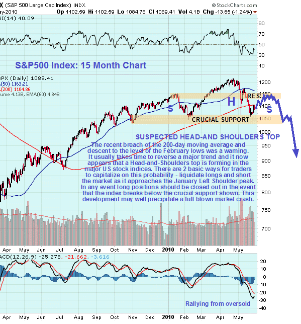
On our 15-month chart for the S&P500 index we can see why last month�s sharp drop inflicted such heavy technical damage. One reason is that it broke the market below its rising 200-day moving average, the first time that it has been below it for 10 months, which is the harbinger of a major trend change. Another reason is that it took the market down to its February low, which is the first time we haven�t seen a higher low.
The crucial support at the February low held, but bulls should draw little comfort from this as the way that the market dropped back sharply to these lows and has then bounced suggests that it is marking out a Head-and-Shoulders top, and if it is then the current rally can be expected to peter out at or below the January high, which is the Left Shoulder of the pattern. From a practical standpoint what this means is that investors in the broad stockmarket are being presented with one last chance to get out before the index breaks down from this pattern, which would be expected to lead to a rapid and severe decline. There is an argument that as we approach hyperinflation there will be more money flying around to drive up the price of everything and that, therefore, the stockmarket could rally in points terms, or nominally, even as its real value is falling.
What this ignores is that while the ordinary Joe may be paid twice as much as the year before, if the money only buys say 20% of what it bought the year before, his purchasing power is still greatly reduced. When people stop buying, companies stop selling and earnings collapse. The recent dramatic earnings recovery was the result of massive injections of newly created money and stringent cost cutting, and it was discounted by the market some time ago now, which is why we had the strong rally from March of last year. Whilst we acknowledge that these Head-and-Shoulders top patterns sometimes abort, it looks highly unlikely that this one will, especially as this pattern is confirmed by similar bearish patterns in other markets as we will shortly see.
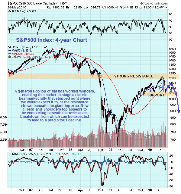
The 4-year chart for the S&P500 index is interesting as it reveals why the index topped out where it did in April - it had arrived at strong resistance approaching the giant 2000 - 2007 Double Top. This chart also makes it abundantly clear that this so-called bullmarket was nothing more than a sizeable bearmarket rally.
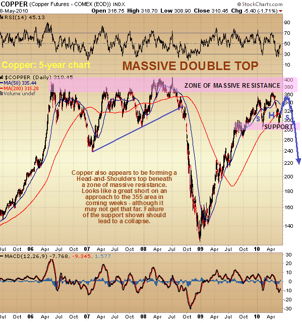
Copper has such a good record of front running major market moves that it has earned the nickname �Dr Copper� as it is frequently a good gauge of the future health of the market. So it is interesting and appropriate for us to take a look at the copper chart now. The 5-year chart for copper presents a bleak and ominous picture, for a massive Double Top appears to be completing with the price topping out beneath the zone of massive resistance approaching the 2006 - 2008 highs. Just as with the S&P500 index copper has dropped down to the neckline of a Head-and-Shoulders top area, and now appears set to mark out a Right Shoulder before finally breaking down and plunging. This hardly augers well for the world economy.
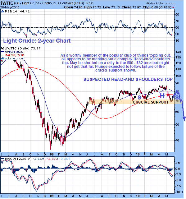
Moving on we now consider the 2-year chart for oil. We have been rather unsure what to make of oil for some time, but now the picture is becoming clearer. It too is weakening in a similar manner to copper and the broad market. It too broke well below its 200-day moving average on the recent drop and challenged its February lows. While the pattern is not so clear as it is with copper and the S&P500, it too appears to be completing a Head-and-Shoulders top, bouncing now to mark out some kind of Right Shoulder.
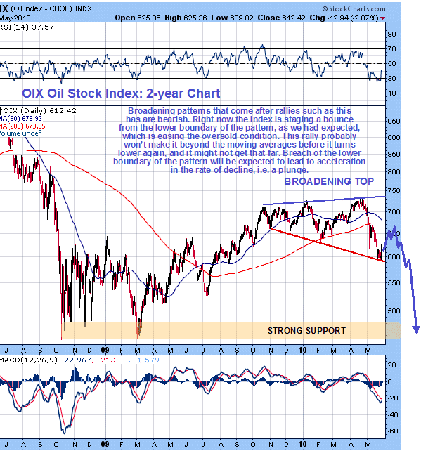
Oil stocks have fallen heavily in the recent past, partly due to the BP fiasco in the Gulf of Mexico, and oil stock index charts are starting to look decidedly bearish, with a bearish moving average cross imminent. We correctly predicted last week�s sharp bounce off the lower boundary of the bearish Broadening Formation shown on our 2-year chart for the OIX oil index. A weak rally is now expected that is unlikely to take the index beyond its moving averages before it rolls over and heads south again.
Having painted the backdrop, let�s now see how the Precious Metals sector fits into all of this. We will start by considering the silver chart, move on to the HUI index chart and the S&P/TSX Venture Comp index and end with gold, the reason being that gold is the only chart amongst all those presented here that still looks, on the face of it, quite resolutely bullish, and is thus anomalous.
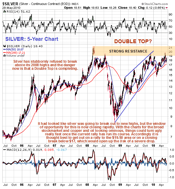
On the 5-year chart for silver we can see that it is now at a critical juncture. Unable thus far to break above the strong resistance approaching its early 2008 highs, it is clearly in danger of Double Topping with those highs, and with the more recent highs of last December. Early this month it had been looking poised to break out upside at last, but after the ugly turn of events of recent weeks, it is clear that the chances of an upside breakout have diminished considerably. If it doesn�t succeed in doing so on the current broad but limited recovery rally, which is thought unlikely, it will open up the risk of a plunge, especially given the current tight bunching of price and moving averages, which although bullishly aligned, will quickly swing to negative.
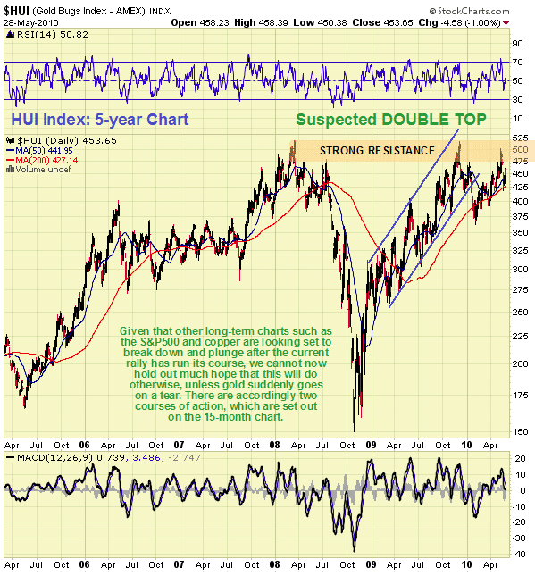
The 5-year chart for the HUI index shows an almost identical situation to that which exists in silver, with stocks Double Topping with their early 2008 highs and more recent December highs. What is expected to happen is that PM stocks rally feebly with the broad market, as it marks out the Right Shoulder of its H&S top, and then they crash once the market breaks down below the neckline of the H&S top, and as we can see on this chart, it�s a very long way down from here. PM stocks had been showing signs of breaking ranks with the broad market in recent weeks, but are likely to be overwhelmed by the ferocity of the decline in the broad market should it break down from its Head-and-Shoulders top.
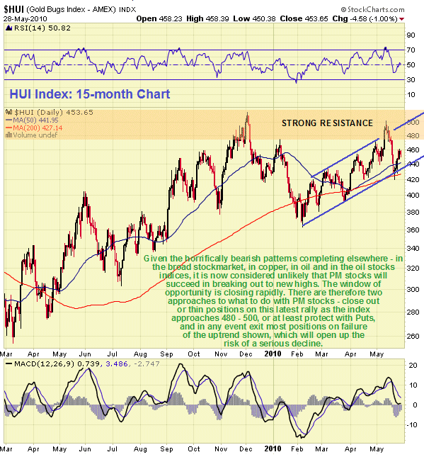
The 15-month chart for the HUI index shows recent action in more detail. On this chart we can see that the index did not break down from its uptrend in force from last February on the recent severe drop in the broad market, which is actually quite impressive. However, this uptrend can be expected to fail in once the broad market breaks down from its H&S top, and given the tight bunching of the index with its moving averages, this would be expected to lead to a 2008 style plunge. In favorable market conditions may rally up towards 500 in coming days or weeks. Break of the uptrend shown will be viewed as a general sell signal for the sector.
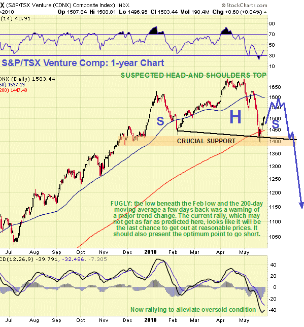
The 1-year chart for the S&P/TSX Venture Comp index looks ominous with this index having dropped back to make a low beneath its February low and test support in the vicinity of its 200-day moving average. Having arrived there in a very oversold condition as shown by its MACD indicator it is now bouncing to form what should turn out to be the Right Shoulder of a strongly bearish downsloping Head-and-Shoulders top. This bounce should be utilized as a final opportunity to unload positions and possibly short this market.
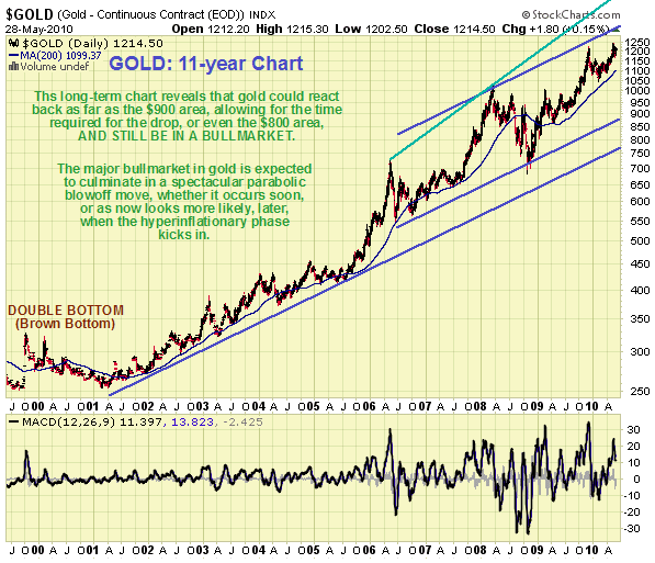
At first sight the gold chart continues to look bullish. It has continued to make new highs in the recent past, and there are still only faint glimmerings of possible weakness. Actually it is in position to �go parabolic� - but how likely is this if everything else caves in? - the answer is it isn�t, so we must look for alternative more conservative scenarios that accord more with what we are seeing elsewhere. The 11-year chart shows the gold bull market in its entirety from the time of the �Brown Bottom�, when Gordon Brown famously sold half of Britain�s gold reserves at the bottom of the market, generously ending a 20-year bear market in gold, for which he is presumed to have been rewarded with the promise of becoming the Prime Minister of Britain.
The positive thing about this chart is that it shows that gold could fall as far as the $900 area, or even the $800 area, without violating long-term uptrend support lines and ending the bullmarket. Given that the inevitable hyperinflation in the US is not expected to kick in for a while, perhaps 2 years, maybe 3, what could happen is that gold drops back to test either of the lower supporting channel lines shown on this chart, against the background of plunging commodity and stock markets, as in 2008, before turning higher and accelerating away to the upside as the expected hyperinflation approaches.
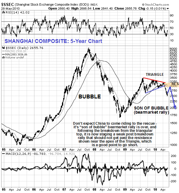
For anyone entertaining the notion that China will be the engine of growth that hauls the rest of the world out of the mire, the chart above for the Shanghai Composite index must be disconcerting. China�s post bubble bearmarket rally had already run its course by the middle of last year, after which it topped out with a triangular pattern, from which it recently broke down decisively. A final rally back up towards the underside of the Triangle is likely in coming weeks, which is expected to provide a last opportunity to get out of Chinese stocks and short the market.
The best course of action for investors and speculators going forward should be obvious from what is set out above. If you concur with the arguments presented here then you have the choice of either selling out most holdings into whatever strength we see in coming days or weeks, before the markets turn lower again, which will get you the better prices, or of waiting for the patterns to break down, which will make it more certain that we are in for a heavy decline. Note that at this point it is not clear how long the broad market will take to complete the Right Shoulder of its Head-and-Shoulders top - it could take as long as a month or two, but may take much less. Another point is that the Right Shoulder of the pattern is likely to top out at a level lower than that of the Left.
We are going to go into full defensive mode, which means cash, protection of any open long positions with Puts, and the use of conservative bear plays primarily to preserve capital but also as a means to profit from the expected heavy declines, for given that markets tend to drop twice as fast as they go up, because panic is a more powerful emotion than greed, as made plain by the events of 2008, there is no reason why we should sit on our hands and pass up the opportunities that will be presented by the general misfortune. We will be looking at a range of bear plays whose chief purpose is to safeguard capital, but also have the capacity to make substantial gains, over the next several days on the site.
Finally, we should note that although the markets appear to be drawing close to another 2008 style meltdown, there will be some big differences between the collapse in 2008 and the one that is looming. In the first place it could be considerably worse, as none of the underlying structural distortions and problems that led to the collapse in 2008 have been squarely addressed and dealt with - the problems have simply been swept under the carpet by the application of massive doses of additional liquidity and the further ramping of debt. Secondly we are not too talking about companies that are too big to fail needed to be bailed out at taxpayer�s expense, this time round we are looking at entire countries going bust - politely referred to as �sovereign defaults�, and unless other countries step up to the plate to bail out those heading for the rocks, they will have to bail themselves out - which means either devaluation of their currencies or self-monetization requiring a massive ramping of the money supply which will feed through into rampant inflation or hyperinflation.
This is the situation the US faces, as it has passed the point of no return, its debts and obligations are so huge they simply cannot be met, even at the current ridiculously low rates of interest. Thus we are likely to see unprecedented volatility in markets, and while the PM sector now looks likely to be taken down with the rest of the market due to forced liquidation leading to indiscriminate dumping, it is likely to come roaring back later as the hyperinflation approaches, particularly in the US. The same blind panic and flight to cash may well cause the dollar and Treasuries to continue even higher temporarily, although with the fundamentals for the dollar and the US economy that much worse than in 2008, a savage reversal and bear market is likely to follow immediately the dust starts to settle.
By Clive Maund
CliveMaund.com
For billing & subscription questions: subscriptions@clivemaund.com
© 2010 Clive Maund - The above represents the opinion and analysis of Mr. Maund, based on data available to him, at the time of writing. Mr. Maunds opinions are his own, and are not a recommendation or an offer to buy or sell securities. No responsibility can be accepted for losses that may result as a consequence of trading on the basis of this analysis.
Mr. Maund is an independent analyst who receives no compensation of any kind from any groups, individuals or corporations mentioned in his reports. As trading and investing in any financial markets may involve serious risk of loss, Mr. Maund recommends that you consult with a qualified investment advisor, one licensed by appropriate regulatory agencies in your legal jurisdiction and do your own due diligence and research when making any kind of a transaction with financial ramifications.
Clive Maund Archive |
© 2005-2022 http://www.MarketOracle.co.uk - The Market Oracle is a FREE Daily Financial Markets Analysis & Forecasting online publication.