


Two Key Indicators Show the S&P 500 Becoming the New ‘Cash’
Stock-Markets / Stock Market 2017 Sep 24, 2017 - 03:03 PM GMTBy: F_F_Wiley

 Pension plan administrators do it. Their actuaries and consultants do it. Professional endowment and foundation investors do it. Financial advisors do it. Private investors may or may not do it, but they probably should.
Do what?
All of these folks already are or should be asking themselves the following question: What’s a reasonable expectation for the long-term return on a broad-market equity investment?
Professionals usually answer the question using complex models, and there’s nothing wrong with that, but we’ll keep it simple here. Simple often beats the snot out of a long white paper, and two recent developments beg for simple.
First, on Thursday the Fed released its flow-of-funds data, which includes an estimate for the household sector’s overall asset allocation. Data show allocations to corporate equities reaching 25.1% of total household (and nonprofit) assets, a level only before seen between Q4 1998 and Q3 2000. Here’s the full history:
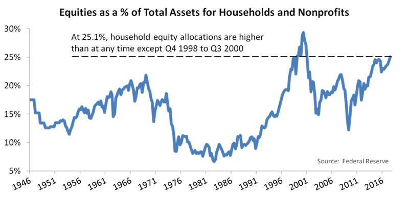
Now, you may say 25% is just a number, and we would agree, but only to a point. We don’t think the household sector’s current allocations tell us anything about the market’s near-term direction. In fact, we don’t detect any of the most common precursors to major market turning points, as discussed here. But we do think household equity allocations offer clues to long-term returns. Consider the next chart, which compares the allocation data to the corresponding S&P 500 returns over subsequent periods of six, eight and ten years:
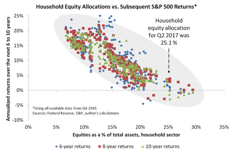
You’ll decide for yourself, of course, how to interpret the chart, but we’ll entertain three possibilities. First, you might rely on a few instances in which S&P 500 returns reached almost 4% after the equity allocation was 25% or more. Compared to today’s miniscule bond yields, 4% looks respectable. If stocks do, indeed, return 4% over the next six to ten years, that could be higher than the return on any other major asset class, which probably explains how stocks got so expensive in the first place.
Second, you might mentally project the scatter plot’s downward trend out to the current equity allocation. Doing that, returns appear to spread evenly around today’s cash rate of about 1%. So, whereas optimistically you might expect a return of 4% or thereabouts, more realistically a negative return is almost as likely.
Third, you might look at the data and say, “So what? We should really use a traditional indicator—one that compares prices to earnings—not an asset allocation measure.” Which brings us to another recent development that might alter future returns—the S&P 500 busting through 2500. To account for that latest market milestone, the next chart updates one of our favorite S&P 500 indicators, the price–to–peak earnings multiple or P/PE. (Unlike a standard price-to-earnings multiple that places the past year’s earnings in the denominator, P/PE uses the highest four-quarter earnings to date, mitigating distortions that occur when earnings fall in recessions.)
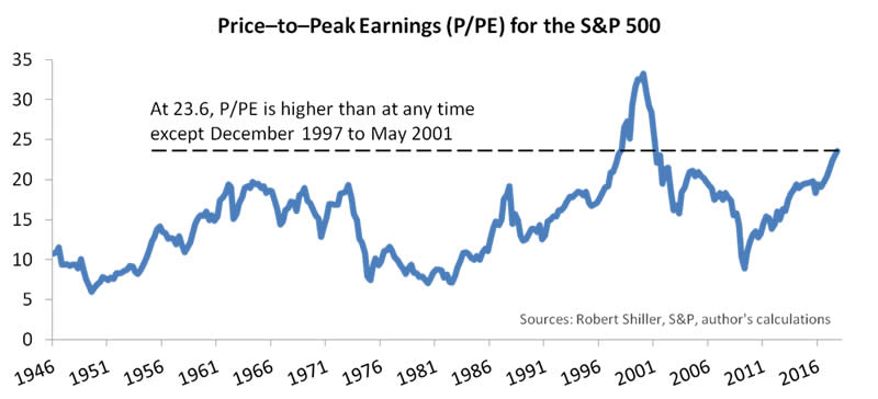
At a price–to–peak earnings multiple of 23.6, we’re currently at about the same valuation as in December 1997. Once again, you might find an optimistic interpretation—that is, the long bull market that finally ended in 2000 suggests there could still be room to bubble up from here. But the implications for long-term returns aren’t nearly as optimistic, as shown in our final chart:
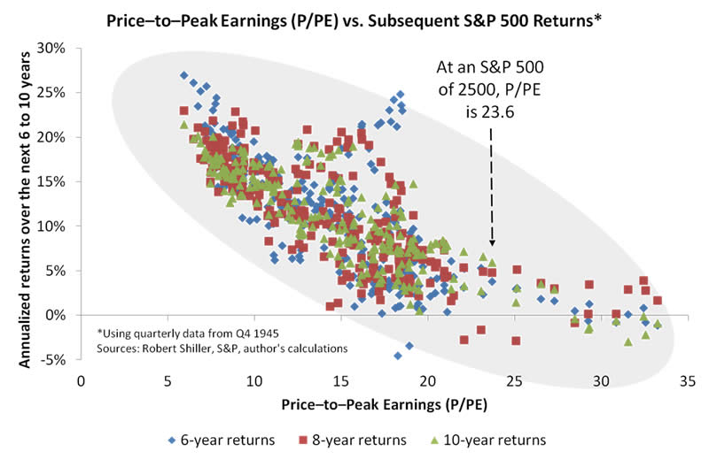
If you stare at the chart long enough, you might see a less bearish picture than in the first scatter plot above. (Stare even longer and you might see the King of France.) But the difference isn’t especially large. On either chart, the downward slope points to a meager long-term return. In fact, if we use only the scatter plots above to make our estimate, while also accounting for the Fed’s predicted interest rate path, the S&P 500 appears to offer a similar return to cash.
Conclusions
To be clear, we’re encouraging long-term bulls to reconsider their assumptions, but we’re not advising them to dismantle carefully diversified portfolios (meaning those that are spread sensibly among multiple asset classes). We would be more likely to recommend a major portfolio shift if the usual bear-market catalysts—sharply rising inflation, high interest rates and poor credit conditions—were present.
More to the point, it seems a good time for investors to check their expectations and risk levels. Investors should develop reasonable expectations informed by data such as those in the scatter plots above. And they shouldn’t take more risk than they’ll be able to tolerate as the next bear market plays out. As always, only a small percentage of investors will accurately time the next market cycle, and we shouldn’t bet too heavily on being among those fortunate few.
F.F. Wiley
F.F. Wiley is a professional name for an experienced asset manager whose work has been included in the CFA program and featured in academic journals and other industry publications. He has advised and managed money for large institutions, sovereigns, wealthy individuals and financial advisors.
© 2017 Copyright F.F. Wiley - All Rights Reserved
Disclaimer: The above is a matter of opinion provided for general information purposes only and is not intended as investment advice. Information and analysis above are derived from sources and utilising methods believed to be reliable, but we cannot accept responsibility for any losses you may incur as a result of this analysis. Individuals should consult with their personal financial advisors.
© 2005-2022 http://www.MarketOracle.co.uk - The Market Oracle is a FREE Daily Financial Markets Analysis & Forecasting online publication.