


Watch This Picture As Asset Prices Fall
Stock-Markets / Financial Markets 2018 Nov 28, 2018 - 04:23 PM GMTBy: F_F_Wiley


“It is high time we rediscovered the role of the financial cycle in macroeconomics.” —Claudio Borio, Bank for International Settlements
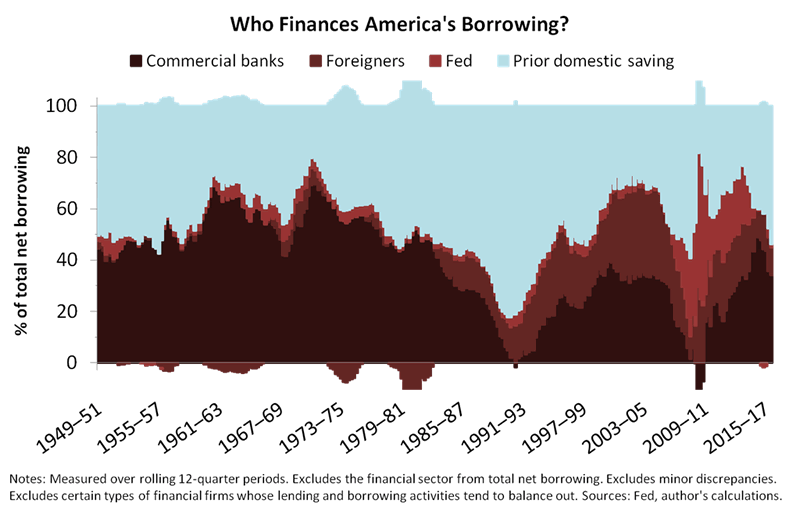
In May, we queued up the b-side of a record describing America’s balance sheet—we looked at the mix of lenders instead of the usual “a-side” analysis of the borrowers.
We showed that the balance sheet includes four types of lenders—banks, the Fed, foreigners and prior domestic saving—as in the updated chart below. And the “prior domestic saving” category, since you asked, is mostly households, pension funds and insurance companies investing in bonds and bond funds.
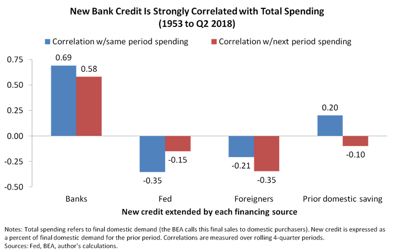
Then we showed why the b-side is so important, even as it gets little attention. That is, the four types of lenders are fundamentally different from one another—lending by banks is highly correlated to spending (same-period and next-period spending), whereas the other lenders show no such correlation.
But economic theory says all lending is the same—how can banks be different?
Finally, we shared a diagram that explains the previous result.
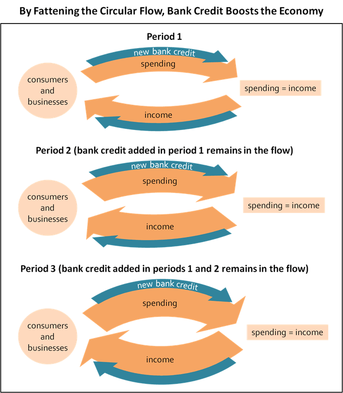
The diagram shows that bank lending is unique because it creates fresh spending power from “thin air.” We’ll leave further explanations aside for now, but you might check our articles here or here to review how banks create spending power from nothing, and why that process invalidates entire libraries full of mainstream thinking. (Or see our book for more detail.)
Bank balance sheets are also highly predictive, as we showed when we used bank credit to construct a business-cycle indicator. (Again, see the b-side article linked above.) Considering the connections—empirical and conceptual—between bank credit and the business cycle, our indicator might be the best first step to business-cycle forecasting.
Okay so banks conjure spending from thin air—does anything else do the same?
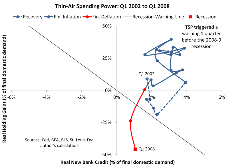
Now we’ll take a second step by asking: What else materializes from thin air? How about the gains and losses in your investment portfolio? It sure seems as though investment gains and losses pop up from nowhere. And by combining them with new bank credit, we’ll create a highly predictive composite indicator that we’ll call thin-air spending power (TSP). Here are the two inputs to the composite:
- Real new bank credit. Inflation-adjusted new bank credit aggregated over four-quarter periods and expressed as a percent of final domestic demand in the prior period.
- Real holding gains. Inflation-adjusted holding gains (household and nonprofit gains from equities, mutual funds, real estate and pensions) aggregated over four-quarter periods and expressed as a percent of final domestic demand in the prior period.
And the chart below provides an example, using data from 2002 to 2008, of how we can track real new bank credit and real holding gains through a business cycle by placing one on each axis. Note that we’re mapping a path through the two dimensions by connecting data sequentially. Although the path shows just a single cycle (the last decade’s housing boom), the pattern is similar to that of the previous eight cycles, which you can confirm by reviewing the chartbook we’ll link at the end of this article.
But what exactly does TSP tell us?
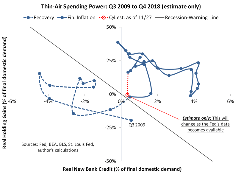
So TSP is a creature of habit, and it has a habit of cycling through three phases: recovery, financial inflation and financial deflation.
- Recovery. TSP meanders upwards and rightwards as the financial economy heals from the prior recession.
- Financial inflation. TSP enjoys the big air of the upper-right triangle.
- Financial deflation. TSP completes the cycle by becoming scarce once again, dropping below a diagonal recession warning.
In other words, TSP typically triggers a recession warning shortly before the onset of a recession, anywhere from one to five quarters before. But you might wonder where the recession-warning line comes from—how do we determine its slope and position? Here’s the rationale for our choices:
- Slope. We consider the additional spending that could result from a dollar of real new bank credit versus a dollar of real holding gains. We expect a dollar of real new bank credit to result in up to a dollar of additional spending, but probably not a full dollar due to the portion that banks invest in securities rather than loans—security purchases don’t always flow into the real economy as directly and reliably as loans do. And for real holding gains, there’s a substantial literature suggesting that each dollar of additional wealth boosts spending by anywhere from three or four cents to a little more than ten cents. So weighing up real new bank credit against real holding gains, we see a ratio of about ten to one as far as the effects on economy-wide spending, and that determines the slope of our recession-warning line.
- Position. We draw the line through the origin to keep it as simple as possible. That choice won’t be optimal in every cycle, but we don’t believe it’s realistic to think we can “engineer” a substantially better choice, especially as cycles change from one to the next.
Note that we’re cognizant of the risks of false precision. We didn’t fit the recession-warning line using regressions or other statistical techniques—we chose nice, round numbers that seemed reasonable, conceptually, and then we stopped there. Our choices may or may not hold up in the future, but we’d rather focus on whether current dynamics could be different to the past than on data mining the past to the fifth decimal point.
What can we say about the next few years?
And since we mentioned it, are we expecting the dynamics to be different this time? Or, will they be the same as usual?
You’ll form your own views, but our nickel’s worth of advice is to expect the usual. After eight rate hikes (and counting) and nine years of expansion, it’s natural for bankers, borrowers and asset markets to anticipate slower growth, and that’s exactly what we think we’re seeing in 2018. We’re seeing the financial economy lead the real economy. Or, to use a term that’s become popular in some circles of economics, the financial cycle is leading the business cycle. As a next step, we expect the financial cycle to fall into a more definitive contraction.
So once again, the financial cycle should drag the business cycle lower, and our TSP chart offers clues about the timing. Most importantly, the diagonal recession warning provides a decent tripwire for the countdown to the business cycle’s apex. We haven’t triggered the tripwire just yet, but we get an interesting result when we use high frequency data to estimate where TSP might fall at year-end. That is, our year-end (Q4) estimate sits only just above the recession-warning line, as shown below.
Conclusions
To be clear, we won’t know TSP’s actual Q4 reading until the Fed’s “flow of funds” data becomes available. But for now, we suggest watching the high frequency data, as above, especially as financial markets appear to be losing their nine-year-long buoyancy. (See this article for interesting research on how the struggle to regain buoyancy might play out.)
More generally, we’ll continue to promote the following beliefs:
- There is such as thing as a financial cycle (skeptics notwithstanding).
- The financial cycle explains a significant portion of the business cycle.
- To properly account for the financial cycle, you have to first reject a handful of the most pervasive and deeply held tenets of Keynesian, Monetarist and New Classical theories.
- The most predictive financial-cycle indicators are those that measure spending power created from thin air, as in our TSP chart.
- Other methods decompose the financial cycle into component cycles. (See our book, Economics for Independent Thinkers.)
To demonstrate the fourth point, in particular, we’ve published a chartbook with more history. The chartbook tracks TSP through every business-cycle expansion from 1954 onwards, among other charts, and shows that the two-dimensional approach has fewer anomalies than real new bank credit alone. Of course, that doesn’t necessarily make TSP better than other approaches—there are plenty of data-mined models that show ‘A’-grade back-tested results. But those models often require checking your intuition at the door, whereas our b-side approach is built mostly on intuition. In other words, we aim for indicators that extend our intuitive beliefs about how stuff works. If you’re willing to entertain that we might be onto something, check back for updates and further discussion.
F.F. Wiley
F.F. Wiley is a professional name for an experienced asset manager whose work has been included in the CFA program and featured in academic journals and other industry publications. He has advised and managed money for large institutions, sovereigns, wealthy individuals and financial advisors.
© 2018 Copyright F.F. Wiley - All Rights Reserved
Disclaimer: The above is a matter of opinion provided for general information purposes only and is not intended as investment advice. Information and analysis above are derived from sources and utilising methods believed to be reliable, but we cannot accept responsibility for any losses you may incur as a result of this analysis. Individuals should consult with their personal financial advisors.
© 2005-2022 http://www.MarketOracle.co.uk - The Market Oracle is a FREE Daily Financial Markets Analysis & Forecasting online publication.