


Gold Price Closely Tracks Debt-to-GDP Ratio
Commodities / Gold & Silver 2020 Apr 09, 2020 - 02:50 PM GMTBy: Richard_Mills

The debt-to-GDP ratio is an important metric economists use for comparing a country’s total debt to its gross domestic product (GDP).
The percentage arrived at by dividing the country’s total GDP by its total debt indicates the country’s ability to pay back its loans. The higher the percentage, the higher the risk of a country being unable to pay the interest on its debt, and therefore defaulting on its debt. (countries with high debt-to-GDP ratios typically have trouble paying off debts. Because they are a higher risk to paying loans back, creditors demand higher interest rates. If a country’s debt-to-GDP ratio becomes too extravagant, creditors may stop lending to it altogether)
While debt defaults are rare, they can and do happen. In 2010 the European Union faced a crisis when Greece threatened to default, potentially causing a domino effect, of highly leveraged nations like Spain and Italy doing the same, which likely would have destroyed the European Union.
To avoid default, the EU loaned Greece enough to continue making payments on its loans. According to The Balance, since the Greek debt crisis began in 2010, various European authorities and private investors have loaned the country nearly 320 billion euros, in exchange for austerity measures that kept Greece mired in recession until 2017. According to ratings agency Moody’s, since 1998 at least 16 sovereign bond issuers have defaulted. Latin America leads in sovereign defaults during the modern era; Venezuela and Ecuador have each defaulted 10 times, Brazil, Costa Rica and Uruguay have all defaulted on nine occasions.
The debt-to-GDP ratio tends to rise during periods of unrest, because when an economy is contracting, a central bank’s usual response is to facilitate increased borrowing, to stimulate growth and reverse falling demand. If GDP is dropping at the same time that public debt is rising, the ratio goes up.
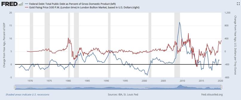
Apart from telling us which countries are good and bad credit risks, the debt-to-GDP ratio can also help in predicting the price of gold. The chart below, by the Federal Reserve Bank of St. Louis, compares total US public debt as a percentage of GDP, to the London Bullion Market gold fixing price.
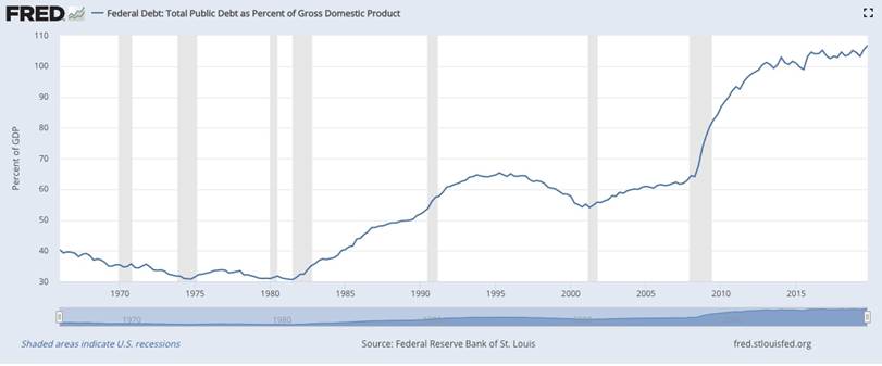
The next chart is simply the debt-to-GDP ratio, over the same period.
And the gold price since 1975.
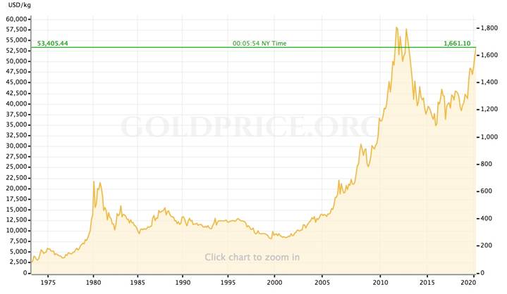
We see a positive, though fairly weak, correlation between gold (the red line in the first chart) and the US debt-to-GDP ratio (the blue line) from 1970 until 2008. A significant aberration occurs during the 1980-81 recession, when GDP falls and the debt rises, reflected in the blue line reaching close to 5%. This is also a bullish period for gold, with the gold price change in dollars per ounce reaching $400/oz in 1981, or as shown in the gold price chart, nearly $700/oz.
The red line gold price change flattens out in 1985 and continues to trade that way for about 20 years, until the financial crisis hits in 2007. Notice that during the 1990s, a decade of strong economic growth, low inflation and a surging stock market, gold (in the yellow chart) hardly deviates from a range between $200 and $400 an ounce. With the economy doing well, there is weak rationale for the central bank to increase the debt, and with GDP growth during the ‘90s peaking at 4.8% in 1999, the debt-to-GDP ratio actually falls, reflected in the diving blue line in the first chart (1991 to 2000) and the downward curve of the “hump” in the second chart.
Then comes the 2001 recession, presaged by the September 11 attacks. Between 2001 and 2004, the ramp-up of defense spending to fight the War on Terror pushes the debt-to-GDP ratio from 55% to 60%. The blue line in the first chart goes from almost -5% in 2000, to +2%, around 2002-03.
But the really big move in these charts, and the period we believe is most relevant to our current situation, occurs during the financial crisis of 2008-09.
Faced with a crisis in the banking system caused by excessive lending and a severe depreciation in the US subprime mortgage market, many central banks around the world turned to an unconventional monetary policy that came to be known as quantitative easing. In QE, a central bank purchases long-term securities on the open market in order to increase the money supply and encourage consumers and businesses to borrow. The policy also serves to lower interest rates by bidding up the prices of long-term bonds, and greatly expands the central bank’s balance sheet.
A key point about QE, is that when the Fed buys US Treasuries, to stimulate the economy, it is monetizing US debt. The Balance explains how the process works:
When the U.S. government auctions Treasuries, it's borrowing from all Treasury buyers, including individuals, corporations, and foreign governments. The Fed turns this debt into money by removing those Treasuries from circulation. Decreasing the supply of Treasuries makes the remaining bonds more valuable.
These higher-value Treasuries don't have to pay as much in interest to get buyers, and this lower yield drives down interest rates on the U.S. debt. Lower interest rates mean the government doesn't have to spend as much to pay off its loans, and that's money it can use for other programs.
This process may make it seem as if the Treasuries bought by the Fed don't exist, but they do exist on the Fed's balance sheet, and technically, the Treasury must pay the Fed back one day. Until then, the Fed has given the federal government more money to spend, increasing the money supply, and monetizing the debt.
During the rounds of QE conducted by the US Federal Reserve, starting in 2008, the Fed increased the money supply by $4 trillion. But there was also a massive fiscal stimulus package launched to get the economy moving again. Bailing out the banks cost $250 billion and the American Recovery and Reinvestment Act added $242 billion to budget deficits in 2009 and $400 billion in 2010.
Turning back to our charts, we see the debt-to-GDP ratio in the second chart jump from 62% in 2007 to 83% in 2009, 90% in 2010, and it has kept climbing ever since.
Gold, being a hedge against inflation, which typically rises when the money supply increases, has done very well under periods of quantitative easing, when central banks literally “print money” to purchase sovereign debt instruments (like US Treasuries) and mortgage-backed securities (MBS).
We see the red line in the first chart spike above $400/oz, within a couple of years of the blue line, the US debt-to-GDP ratio, in 2009 reaching a 50-year high of 15% change in debt-to-GDP ratio. The same pattern shows up in the second and third charts, where the debt soars to between 100 and 110% of GDP between 2012 and 2019 (2020 is not yet reflected in the first two charts) and the gold price rockets from about $800 an ounce in 2008 to an all-time high of $1,900/oz in 2011.
By now we hope you are beginning to notice the same trend we are: as the debt-to-GDP-ratio rises, either because of a drop in GDP due to a recession, or a jump in government borrowing that piles up debt, or both, the gold price reacts.
Turning to our current crisis situation, we have something similar to what occurred in 2008-09, but it’s different in some remarkable ways.
The similarity is that once again, the Fed and Congress have opened the floodgates to massive stimulus. To deal with the 10 million Americans (at last count) left jobless by the covid-19 pandemic, Congress and President Trump signed into law a $2.2 trillion emergency stimulus package. Included are a one-time $1,200 payment to most Americans who make under $75,000 a year, a $500 billion fund to help hard-hit industries including $50 billion for the airlines, and $350 billion in loans for small businesses.
Also, like in 2008, the Federal Reserve cut interest rates to zero percent, and made $700 billion in asset purchases, ie. it launched another QE.
However, while consecutive rounds of quantitative easing during the financial crisis were fairly circumscribed, with lots of debate around how much debt to add and how far to cut interest rates, this time around, the US government, the Fed and central bankers around the world are signaling they are willing to intervene much more in the financial system.
Reuters states: The G20 said on March 26 it would inject more than $5 trillion into the global economy to limit job and income losses and "do whatever it takes" to tackle the pandemic.
Indeed the Fed’s balance sheet - the amount of assets it has purchased in the name of keeping the flatlined economy on life support - has risen to an unprecedented $5.25 trillion - way beyond anything it did in the months and years following the financial crisis.
And it’s not only the US central bank that is printing money and buying up bonds and MBS like there’s no tomorrow. The European Central Bank has added 120 billion euros to its existing asset-purchase program of 20 billion euros a month, bringing the total to 1.2 trillion euros. The ECB also scrapped a cap on how many bonds it can buy from a single EU country, and cut interest rates to -0.75%, paving the way for more stimulus.
China is set to unleash trillions worth of its yuan currency, to pursue infrastructure investment. The People’s Bank of China lowered its prime lending rate, cut the amount of cash reserves banks are required to hold, to encourage lending, and made it easier for small and medium-sized businesses to get loans.
Japan announced 430.8 billion yen of extra spending, and will soon kick off a stimulus package that could be worth 10% of its GDP.
The Canadian government passed an C$82 billion emergency stimulus program that includes $27 billion direct aid to workers and low-income households, and $55B in tax deferrals for businesses and families.
The Bank of Canada also cut its overnight interest rate to 0.25%, and plans to purchase C$5 billion per week in a “made in Canada” quantitative easing program that follows the US Federal Reserve’s playbook.
So how does the correlation between gold and the GDP ratio help to predict what could happen to gold during and after the coronavirus crisis? Well, the first thing to understand is that, as the crisis continues to prevent businesses from opening, and people from getting out from their homes and spending money in the economy again, GDP will fall, likely dramatically.
According to Bloomberg Economics’ new GDP tracker, we were already in recession in March. It shows the global economy contracting at an annualized 0.5%, compared to 0.1% in February and 4.2% in January.
That’s the first part of a rising debt to GDP ratio - a fall in GDP. The second part is an increase in debt. A Bloomberg article states the Federal Reserve is “poised to spray trillions of dollars” into the US economy, made possible by a $454 billion fund in the aid package to backstop lending by the Fed:
That’s money the central bank can leverage to provide massive amounts of financing to a broad swathe of U.S. borrowers.
“Effectively one dollar of loss absorption of backstop from Treasury is enough to support $10 worth of loans.” Fed Chairman Jerome Powell said in in a rare nationally-televised interview early Thursday morning. “When it comes to this lending we’re not going to run out of ammunition.”
Combined with an unlimited quantitative easing program, the Fed’s souped-up lending facilities are set to push the central bank’s balance sheet up sharply from an already record high $4.7 trillion, with some analysts saying it could peak at $9-to-$10 trillion.
Wow. Consider what a $10 trillion Fed balance sheet will do to the debt-to-GDP ratio. Already at 108%, a level not seen since World War II, it’s not inconceivable for the ratio to spike to $150%, or 200%. That would mean for every dollar the US economy produces, it has to borrow $1.50, or $2.00. That’s insane.
Now think about what this could mean for gold. Historically, we know that as the percentage of debt to GDP rises, so does gold. For a reminder of how this works, look at the chart below, just a 5-year version of the 30-year chart above.
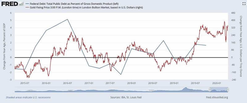
Moribund for five years, as the commodities boom of the late 2000s ran out of gas and led to a bear market for most metals, we see the gold price coming back to life in 2016 when it rose above $1,300 and has kept going to its current ~$1,600 an ounce. This corresponds to rising debt and falling GDP. In 2016 US defense spending was $736 billion, in 2016 it rose to $767B, and in 2017 Congress raised the debt ceiling, allowing the ratio to climb to 103%. The Trump administration’s $1.5 trillion tax cut later that year bumped debt up to 104% of GDP in 2018. Record-level defense spending in 2020 of $956 billion is projected to push the debt this year past $24 trillion, or 108% of GDP, the highest ever.
All of this was before the coronavirus crisis prompted emergency stimulus measures that includes at a minimum, $2 trillion in new spending, and possibly doubling the Fed’s balance sheet from its current $4.7T to $10T.
The longer stimulus measures continue, including a creeping expansion of the Fed’s balance sheet and negative real interest rates (interest rates minus inflation) which are always bullish for gold, we see no reason to doubt that gold will keep climbing. In the chart above, where the blue line flattens at the end of 2019, we expect it to make a very sharp turn upward, as truly awful first and second-quarter economic data come in, global GDP crashes, and worldwide government debt, which was expected to hit $53 trillion this year, (again this was before covid-19) soars.
Meanwhile gold’s red line which shows volatility at the far right side of the chart, reflected in the stock market convulsions in February-March owing to the pandemic, could very well begin a steadily upward trend, similar to what happened in 2008-11, possibly meeting and beating gold’s record $1,900/oz.
Want to know what happens to gold in future? It’s not that hard. Between following real interest rates and the debt to GDP ratio, we have a pretty good idea of where the precious metal is headed.
By Richard (Rick) Mills
If you're interested in learning more about the junior resource and bio-med sectors please come and visit us at www.aheadoftheherd.com
Site membership is free. No credit card or personal information is asked for.
Richard is host of Aheadoftheherd.com and invests in the junior resource sector.
His articles have been published on over 400 websites, including: Wall Street Journal, Market Oracle, USAToday, National Post, Stockhouse, Lewrockwell, Pinnacledigest, Uranium Miner, Beforeitsnews, SeekingAlpha, MontrealGazette, Casey Research, 24hgold, Vancouver Sun, CBSnews, SilverBearCafe, Infomine, Huffington Post, Mineweb, 321Gold, Kitco, Gold-Eagle, The Gold/Energy Reports, Calgary Herald, Resource Investor, Mining.com, Forbes, FNArena, Uraniumseek, Financial Sense, Goldseek, Dallasnews, Vantagewire, Resourceclips and the Association of Mining Analysts.
Copyright © 2020 Richard (Rick) Mills - All Rights Reserved
Legal Notice / Disclaimer: This document is not and should not be construed as an offer to sell or the solicitation of an offer to purchase or subscribe for any investment. Richard Mills has based this document on information obtained from sources he believes to be reliable but which has not been independently verified; Richard Mills makes no guarantee, representation or warranty and accepts no responsibility or liability as to its accuracy or completeness. Expressions of opinion are those of Richard Mills only and are subject to change without notice. Richard Mills assumes no warranty, liability or guarantee for the current relevance, correctness or completeness of any information provided within this Report and will not be held liable for the consequence of reliance upon any opinion or statement contained herein or any omission. Furthermore, I, Richard Mills, assume no liability for any direct or indirect loss or damage or, in particular, for lost profit, which you may incur as a result of the use and existence of the information provided within this Report.
© 2005-2022 http://www.MarketOracle.co.uk - The Market Oracle is a FREE Daily Financial Markets Analysis & Forecasting online publication.