


Stock and Bond Investors Perils of Relying on Black Box Price Data
InvestorEducation / Learning to Invest Jan 13, 2010 - 09:44 AM GMTBy: Richard_Shaw

 Investors today rely greatly on web data sources, but must for their own safety never forget that while most of the time most of the data is good, sometimes it is not — or is not what you think it is. Before taking capital risk based on web data, use basic logic as a reality check and alternative sources for confirmation that what you are viewing is reasonable.
We’ve written before about black box concerns with correlation tools and yield representations. The black box of concern today is StockCharts.com. It’s a tool we and many investors use extensively, and we are grateful that it exists. Investment blogs, including ours, frequently include their charts. We greatly admire its founder, John Murphy, and have read all of his books. On balance, StockCharts improves retail investors’ chances of success by providing a huge universe of charts and studies.
That said, the site’s tool is imperfect. Blind reliance on the charts could in some instances lead to erroneous conclusions.
A question to ask yourself when using their charts is whether you are seeing total return charts or price charts. If you compare the price chart of one security to the total return chart of another, you could develop inappropriate investment decisions.
Unfortunately, StockCharts does not indicate which approach they are using on a per security basis. They do chart some indexes that say “total return” in their name, but otherwise no distinction is made. It’s up to you to figure out what the charts represent — price or total return (regrettable, but true). In some cases, there is inconsistency that you must recognize to use the charting tool effectively and without generating the wrong impression of the situation.
There are potential pitfalls in the use of the charts with such key funds as those relating to the S&P 500 and the Barclay’s Aggregate Bond Index. Given that the allocation between bonds and stocks is one of the most basic asset allocation decisions, it is monumentally important that when you compare charts of those broad indexes to each other or to other securities or indexes, you understand just what it is you are actually comparing.
The charts that follow illustrate the interpretation problem.
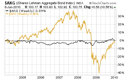
Did Bonds Beat the S&P Over 6 Years?
(Yes, by a little bit)
Did Bonds Beat the S&P Over 6 Years?
(Yes, by a wide margin )
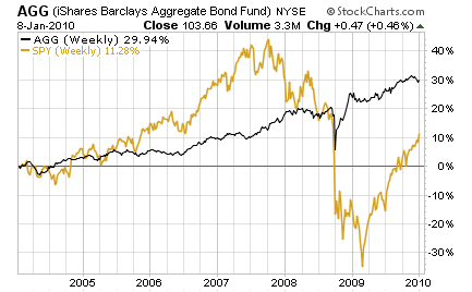
Well, both answers to the question cannot be correct. The charts are obviously not measuring the same thing and there is not enough information on the charts or in the symbols directory to tell you what’s what. While not labeled, it appears that the indexes are measuring price (that makes sense), but that the funds are measuring total return.
Unless you do some reality checking, you could use a chart like either of the two that follow and draw incorrect conclusions.
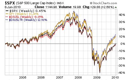
Bond Index vs a Fund Tracking S&P 500
(oops! stocks beat bonds)
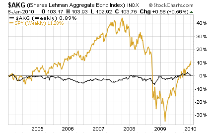
Fund Tracking Bond Index vs S&P 500 Index
(wait a minute, bonds beat stocks)
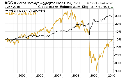
Once again, they can’t both be right. As part of a reality check (and compensation for inadequate labeling or explanation of symbols), we looked for and found some closely related symbols that would help us verify what measures what.
This chart plots the Dow Jones US Large Cap Index and the Dow Jones Large Cap Total Return Index versus the S&P 500 Index and SPY. We think that conclusively shows that the S&P 500 index at StockCharts is plotting price, and that SPY is plotting total return.
Problem Larger Than Labeling:
So, we see a challenge users face, and risks they take, by making assumptions about web data without looking closely to make sure they are comparing apples to apples and oranges to oranges.
It’s not just a funds versus indexes thing.
It seems that some funds at StockCharts measure price while some funds measure total return (even between share classes of the same asset pool), without an apparent consistency.
Consider this chart of the three share classes of the Vanguard Total Bond Market Index fund and the Barclay’s Aggregate Bond Index which they track. Each share class invests in the same physical pool of assets. The only difference between them is the expense ratio, and the obvious fact that one is an ETF, while the other two are mutual fund share classes with different minimum purchase amounts.
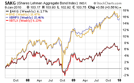
What becomes clear here is that StockCharts plots the total return for two of the share classes (BND and VBMFX) and price for one of the share classes (VBTLX). That is an inconsistency (that we think is actually an error as opposed to a policy) that could create major interpretation problems if not recognized by the user.
This could be a problem with the data feed they receive, or it could be an error in the way their software picks data from the feed, but either way investors could be confused and make bad decisions due to the inconsistent data.
For example, if you are able to make $100,000 investments in aggregate US bonds and you work with mutual funds, you would gravitate to VBTLX over VBMFX, which requires a lower investment amount with a higher expense ratio, but is otherwise identical. If you preferred mutual funds due to very large position sizes, you might prefer to own VBTLX over BND, due to liquidity issues, particularly on exit. However, the charts suggest that VBMFX and BND are much better investments than VBTLX — an incorrect conclusion. They differ by a few basis points in expense that could not generate a 10% difference in performance over 2+ years.
The inconsistencies in the chart data are a problem for which users must remain alert.
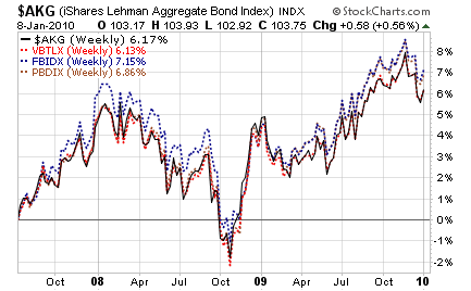
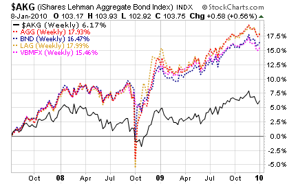
These two charts show that StockCharts plots total return for these aggregate bond exchange traded funds: AGG, BND and LAG; and for the Vanguard aggregate bond mutual fund “investor” share class; but tracks price for the “admiral” share class of the aggregate bond mutual fund from Vanguard, as well as price for these two other aggregate bond mutual funds from Fidelity and T. Rowe Price.
Bottom line — take nothing for granted. Make reasonableness checks on all information from data services. Look for inconsistencies, double check and seek alternate information sources when results don’t seem quite right.
If data will structure your larger market views or be the basis of a risk taking decision, use multiple sources to obtain information. They all have faults of one sort or the other. Don’t let a particular fault cost you unnecessary losses.
OTHER BLACK BOX DANGERS:
Correlation: Three years ago in January 2007, we wrote about “beware the black box” when we found that the fund correlation data from one major ETF sponsor did not reasonably resemble the correlation data from another major ETF sponsor. In that case one was correlating prices while the other was correlating total return, but the site doing price correlation did not say that. We resolved the matter after doing the calculations ourselves with a spreadsheet. After that exercise, we knew which site was doing total returns and which was not. If we had made investment allocation decisions based on blind faith in the wrong black box, we could have had adverse investment results.
Read the fine print on any correlation tool. Perhaps call the sponsor and inquire to make sure return and not price is being used. In some circumstances, calculate correlation yourself with a spreadsheet.
Yield: We have written several times recently about the perils of relying on dividend yield for gauging equity income, particularly if you depend on dividends to support your lifestyle and to minimize the “risk of ruin” associated with fixed draws on a portfolio with fluctuating prices.
The thing to establish is what type of yield they are discussing (e.g. trailing, prospective, or SEC, as examples). The labeling is not always good. Then know the “as of” date for the data, which is sometimes out-of-date. Then know if annualized data is properly annualized (e.g. annualizing an irregular dividend as if it were a regular periodic dividend). Also, make sure the periodicity for annualization is correct (e.g, wrongly using a 4 times multiple on the last dividend when the fund in question pays out only once or twice per year).
Data services are inconsistent in their production of yield data, leaving the investor’s final resort to examine the actual dollar distributions per security to corroborate any preliminary yield conclusions gained from a data service.
Black box reliance on yields is OK for a first pass, but NOT OK for a final determination in an income sensitive decision.
Passing the Buck:
We have contacted several organizations over the years about obvious data problems, and most of the time get the simple answer that they rely on the data they buy, and they can’t do anything about the errors.
The data vendor to them may in turn aggregate data from other data vendors. In the end, there is a certain amount of garbage in almost all data services to which you are likely to subscribe. Sometimes the data service you use makes programming errors or provides inadequate or incorrect labeling and data field definitions, but even the best of them end up buying data that to one degree or the other is faulty.
In the end, the buck stops with you. If you want to invest with good information, you must go to the source before making final decisions. Data from services is mostly pretty good and helpful for general big picture development, but not for ultimate risk taking decisions.
Data user beware. Black box user beware. Investor beware.
Compliance Disclosure:
We own BND, AGG, VBTLX and SPY in some, but not all managed accounts, and do not currently own any other funds discussed in this article. We are a fee-only investment advisor, and are compensated only by our clients. We do not sell securities, and do not receive any form of revenue or incentive from any source other than directly from clients. We are not affiliated with any securities dealer, any fund, any fund sponsor or any company issuer of any security. This report is for informational purposes only, and is not personal investment advice to any specific person for any particular purpose. We utilize information sources that we believe to be reliable, but do not warrant the accuracy of those sources or our analysis. Past performance is no guarantee of future performance. Do not rely solely on this research report when making an investment decision. Other factors may be important too. Consider seeking professional advice before implementing your portfolio ideas.
By Richard Shaw
http://www.qvmgroup.com
Richard Shaw leads the QVM team as President of QVM Group. Richard has extensive investment industry experience including serving on the board of directors of two large investment management companies, including Aberdeen Asset Management (listed London Stock Exchange) and as a charter investor and director of Lending Tree ( download short professional profile ). He provides portfolio design and management services to individual and corporate clients. He also edits the QVM investment blog. His writings are generally republished by SeekingAlpha and Reuters and are linked to sites such as Kiplinger and Yahoo Finance and other sites. He is a 1970 graduate of Dartmouth College.
Copyright 2006-2010 by QVM Group LLC All rights reserved.
Disclaimer: The above is a matter of opinion and is not intended as investment advice. Information and analysis above are derived from sources and utilizing methods believed reliable, but we cannot accept responsibility for any trading losses you may incur as a result of this analysis. Do your own due diligence.
Richard Shaw Archive |
© 2005-2022 http://www.MarketOracle.co.uk - The Market Oracle is a FREE Daily Financial Markets Analysis & Forecasting online publication.