


Stock and Commodity Markets Now Entering the Most Dangerous Period Since Mid 2008
Stock-Markets / Stock Markets 2010 Nov 26, 2010 - 04:55 AM GMTBy: Garry_Abeshouse

 “The best way to understand Wall Street is to view it as a heist movie, like “The Sting,” “The Italian Job” or “Ocean’s Eleven.”. There’s just one difference: In your traditional caper, a bunch of little guys get together to steal money from the big guys — a tycoon, big bank or major corporation. On Wall Street, it works the other way around.” – Bret Arends, Marketwatch, November 2nd 2010.
What Bret Arends should have added was that Wall Street also tends to treat the world’s financial markets as its own private gambling casino – a casino where the odds are more often than not skewed in favour of the “house”. The scale of this world wide casino is best illustrated by DK Matai, in his March 23rd 2010 article entitled “Derivatives Quadrillion Play: How Far Away Are We From A Second Financial Crisis?” , in which he says in part, “The USD 1.048 Quadrillion Play of derivatives remains colossal at 23 times world GDP. Even if 1% of the derivatives pyramid loses counterparties because they have become insolvent, that is more than 10 trillion dollars of a black hole. If that 1% becomes 5%, that is more than 50 trillion dollars, ie, more than the GDP of the entire world.”
“No, Virginia, there are no gods of Wall Street, they are merely the distillations and moonbeams of a compliant media, nothing more – their feet firmly planted in the air, supported only by insatiable greed and lusts for status and power. And as with all false gods, their time will come.” (My apologies to Patrick Dennis)
We are all subject to belief systems of varying validity. . . . . .
"Alice laughed: "There's no use trying," she said; "one can't believe impossible things."
"I daresay you haven't had much practice," said the Queen. "When I was younger, I always did it for half an hour a day.
Why, sometimes I've believed as many as six impossible things before breakfast." (Lewis Carroll, Alice in Wonderland)
In his UK speech entitled "Six impossible things before breakfast, or how efficient-market hypothesis (EMH) has damaged our
industry", James Montier, former co-Head of Global Strategy at Société Générale and author of a number of books on
behavioural finance, made a number of observations concerning beliefs verses logic in the field of finance:
"The first stock exchange was founded in 1602. The first equity bubble occurred just 118 years later - the South Sea Bubble.
Since then we have encountered bubbles with an alarming regularity. My friends at GMO define a bubble as a (real) price
movement that is at least two standard deviations from trend. Now a two standard deviation event should occur roughly
every 44 years. Yet since 1925, GMO have found a staggering 30 plus bubbles. That is equivalent to slightly more than one
every three years!
What all equity bubbles have in common is that they contain a small predatory group of people trying to sell a set of beliefs
to the majority.”
" . . . in general we, as a species, suffer belief bias. This is a tendency to evaluate the validity of an argument on the basis of
whether or not one agrees with the conclusion, rather than on whether or not it follows logically from the premise. . . . As
the chart reveals, it is the believability not the validity of the concept that seems to drive behaviour. When validity and
believability coincide, then 90% of subjects reach the correct conclusion. However, when the puzzle is invalid but believable,
some 66% still accepted the conclusion as true. When the puzzle is valid but unbelievable only around 60% of subjects accepted
the conclusion as true. Thus we have a tendency to judge things by their believability rather than their validity - clear
evidence that logic goes out of the window when beliefs are strong."
"Earlier I alluded to a startling lack of critical thinking in finance. This lack of 'logic' isn't specific to finance, in general we, as a
species, suffer belief bias. This is a tendency to evaluate the validity of an argument on the basis of whether or not one agrees
with the conclusion, rather than on whether or not it follows logically from the premise."
James Montier then goes on to discuss how we have been let down by economic forecasts over the last 10 years, illustrating this
in the graph below. The failure of governments, major economists and their multi million dollar computer modelling systems in
anticipating the financial meltdown over the last two years is not only well illustrated on this graph, but has historical precedent
during the entire Tech meltdown between 2000 and 2003.
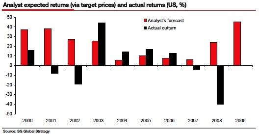
The question that needs to be asked then is, why are economic forecasts wrong so often by such a high degree? Perhaps it is the emotional need of forecasters to conform to the mean rather than pursue original thought which may differ considerably from that mean.
Again James Montier suggests that the answer is partly that economic forecasters, become scared that if their forecasts are too different from their peers it will adversely affect their careers.
"This gives rise to Homo Ovinus - a species who are concerned purely with where they stand relative to the rest of the crowd. (For those who aren't up in time to listen to Farming Today, Ovine is the proper name for sheep). This species is the living embodiment of Keynes' edict that "it is better for reputation to fail conventionally than to succeed unconventionally".
The effectiveness of charts as tools of trade in forecasting prices in financial markets are often stacked against their users.
We live in an age where high frequency trading moves unintelligible derivatives at unintelligible volumes off balance sheet and off market. These practices have become such a large part of the world’s financial markets, we technical analysts, need to be a lot more cautious as to how we interpret our charts – and choosing which charts we choose to follow. We ignore at our peril, the way today’s financial markets tend to be more the private gambling playthings of the largest hedge funds and merchant banks in one giant 24 hour a day worldwide gambling casino, rather than true free-flowing financial markets per se.
Because of these market inequities, we cannot and should not assume, that “everything we need to know is in the charts” as not all charts are equal in usability. Charts are always open to a variety of interpretations with differing chart styles, indicators and trend lines all competing for dominance in our thoughts. And the more our software fiddles with and adds algorithms to the price data, the further way from the real world we risk ourselves being placed. The facts are, that major market tops tend to also coincide with peak optimism and bottoms with peak pessimism. This underlines the frailties of a consensus view forced upon analysts both by similarly structured software trading programs and peer pressures against radically alternative views.
And as James Montier so insightfully pointed out, it will surely be a brave economic analyst who tries to stand out from the crowd in these difficult times and suggest that perhaps financial market do not move in straight lines after all.
We really should acknowledge the peril of placing too much trust in any one composite index to show where we are at any one place in time.
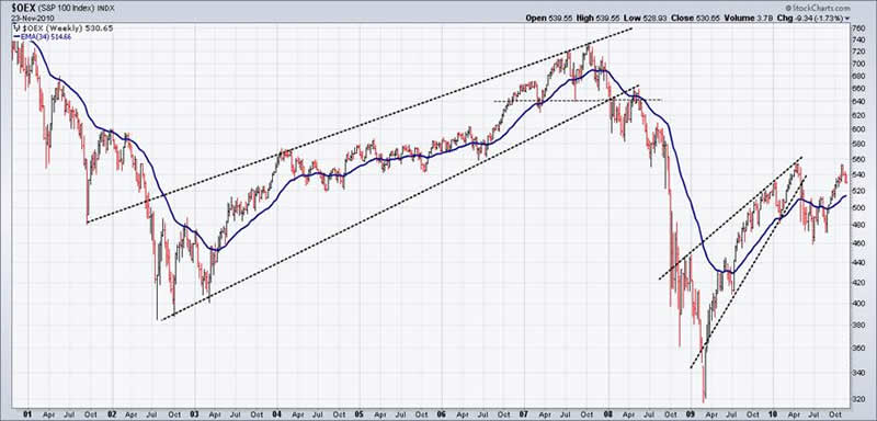
The potential effectiveness of technical analysis in understanding the vagaries of financial markets, has always been adversely influenced by the way many of the popular indices are calculated, ie being capitalization weighted, skewing the weight of the index away from the sector it is supposed to represent and towards the largest companies contained within the sample used. In the USA, I realise that the S&P500 and Dow 30 diehards will take umbrage at this view, but age and popular usage do not necessarily confer objective utility and no one index can be said to represent “THE” market as it stands today.
Many equity market indices do not necessarily reflect movements pricewise, that their names would suggest. For example, because the S&P500 Index ($SPX) is a capitalization weighted index, it tends to reflect movements of the heavier capitalized included companies, rather than be representative of the whole 500. Personally, I prefer to use mostly those indices that best reflect movements of the whole sector - rather than just part of it. This means selecting equal weighted or modified equal weighted indices where possible.
Current Technical view
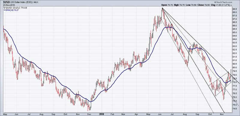
The USD Index is tentatively bullish and I expect heavier resistance to come in as it approaches 82. As of tonight’s trading, it is sitting on 80, right on an important pitchfork style resistance line on one of my Comex charts, which makes it sensitive to a retracement from this level. There is a history in the USD Index Chart producing large moves up and down without the normally seen retracements found in other charts, so it is important to remember that the USD Index is near the bottom of a 45 year bear market at a time when sentiment in the greenback is extremely bearish.
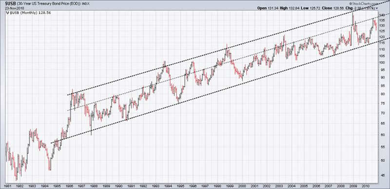
The monthly chart of the 30yr T-Bonds (see below) clearly illustrates an upward trend channel going back to 1986 – about the time when SE Asian imports were starting to decimate manufacturing in western countries. Shorter term charts of both the USA 10yr T-Notes and USA 30yr T-Bonds have formed potentially bullish style downward wedges on my Comex charts – contrary to what appears on some of the Candlestick/Bar charts I have seen recently, which have tended to push an opposing view. As of tonight’s trading, they are both edging into more bullish territory, but more work needs to be done and higher prices realised before a return to the bull trend is confirmed. And despite the bearish commentary on USA T-Bonds, I feel it is premature to be bearish on these bonds at this stage, especially while the uptrend is intact. Also should equities fall, money must go somewhere and for the time being at least for the risk averse, US T-Bonds are still guaranteed by the US government.
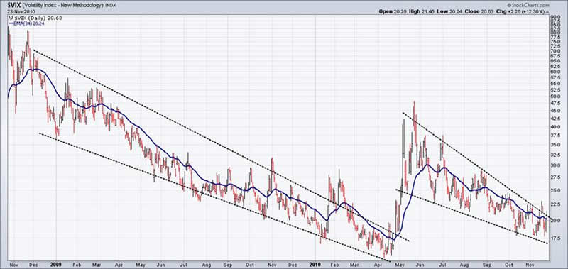
It is also constructive to compare the Volatility Index to the USD Index, as bullish moves in both are more likely to coincide with bearish moves in equities over the near term (see charts below).
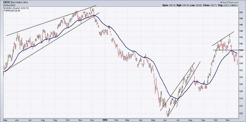
Comparatively speaking, the Euro, British Pound, Canadian Dollar, Australian Dollar, Oil and the Industrial Metals Spot Index all show potentially bearish patterns similar to the equity charts – opposite to the USD and the Volatility Index.
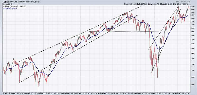
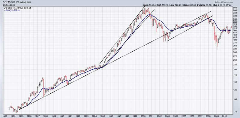
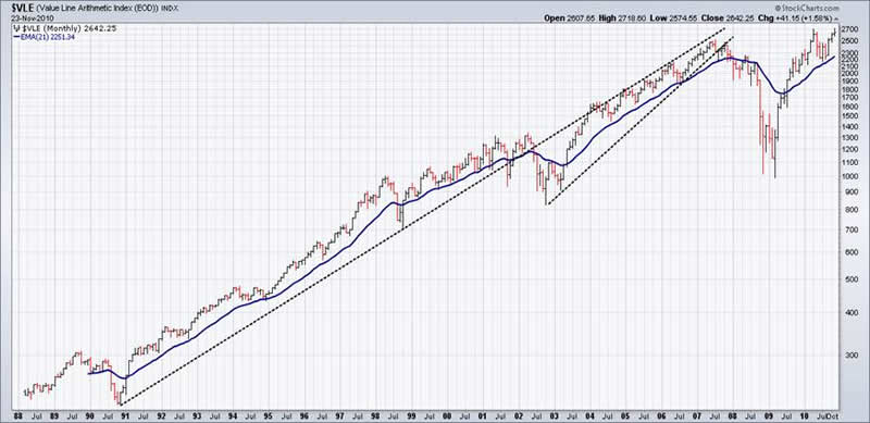
Rather than just looking at the S&P500 or the Dow30, a more constructive overview of the USA equity market may be obtained by comparing weekly charts of the S&P100 Leaders Index and the equal weighted Value Line Index of over 1600 stocks. As you can see from the monthly charts below, the S&P100 leaders index peaked at the top of the Tech boom along with the S&P500, Dow30 and the Nasdaq 100 (the last three not shown), while the more broadly based Value Line Index went up, up and away to make ever higher highs until peaking in 2008. The speculative nature of the rally since March 2009 is also highlighted by the poorer performance of the S&P100 (up 72%) compared to the Value Line Index (up 170%).
Comparing the recent blow out highs in stocks such as Apple and Baidu to the toppy nature shown in the Daily charts below, together with the complacency shown in the Volatility Index values – we arrive at a composite picture that suggests equities are in more than just short term danger. Confirming an end to this bear market rally would also infer that the March 2009 lows would no longer be sacrosanct.
In this context, the monthly chart of the Banking Index below clearly shows a strong pullback to the neckline of a 10 year broadening top between 1998 and 2008. The daily finance charts and other short term studies appear to confirm this view, heightening the view that we are at the mature end of the rally.
Not shown is the Australian ASX Finance Index (XXJ), which seems to be leading the pack of banksters downside, while the ASX 200 Composite (XJO) has fallen today to test the neckline of a 10 week broadening top.
The other equity charts below may try to short term rally. Holding above recent lows in equities, metal prices, oil prices and non-USA currencies over the next few days is absolutely essential, as any falls below these levels would begin to break many of the remaining trends and support lines.
.
My view still is that the rally in equity markets since March 2009, with its persistence of upward wedges and broadening top formations across such a broad range of financial entities and time frames, is compelling evidence of an extended bear market rally that will soon end. Should the USD Index move above 84 and the Volatility Index above 30 over the coming weeks, I would expect to see corresponding strong moves down in equities as well. Historically the low volume holiday period between mid December and mid January is considered a high risk time, which again reminds me of the end of the speculative mining boom in Australia in 1969/1970 – exactly 41 years ago.
Till next time.
Garry Abeshouse
Technical Analyst.
Sydney
Australia
I have been practicing Technical Analysis since 1969, learning the hard way during the Australian Mining Boom. I was Head Chartist with Bain & Co, (now Deutsch Bank)in the mid 1970's and am now working freelance. I am currently writing a series of articles for the international "Your Trading Edge" magazine entitled "Market Cycles and Technical Analysis".
I have always specialised in medium to long term market strategies and after discovering the excellent Point & Figure Charts from Stockcharts.com in mid 2008, have concentrated on this style of charting ever since.
© Copyright Garry Abeshouse 2010
Disclaimer: The above is a matter of opinion provided for general information purposes only and is not intended as investment advice. Information and analysis above are derived from sources and utilising methods believed to be reliable, but we cannot accept responsibility for any losses you may incur as a result of this analysis. Individuals should consult with their personal financial advisors.
© 2005-2022 http://www.MarketOracle.co.uk - The Market Oracle is a FREE Daily Financial Markets Analysis & Forecasting online publication.