


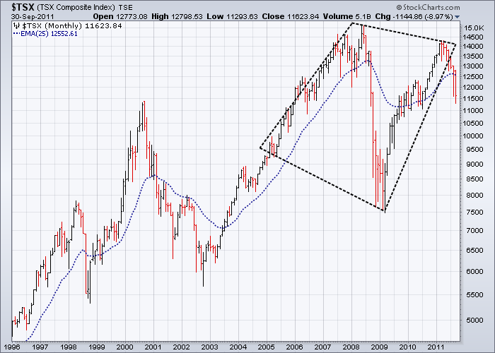
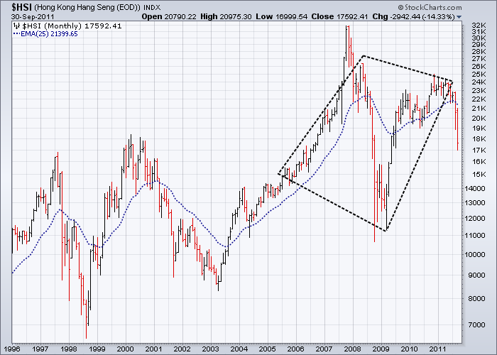
Two charts best define where we’ve been, where we are and where we are most likely to go
Stock-Markets / Stock Markets 2011 Oct 03, 2011 - 02:46 AM GMTBy: Garry_Abeshouse

 Sustainable bull markets cannot co-exist with falling bank stocks and when bank stocks fall the rest will follow.
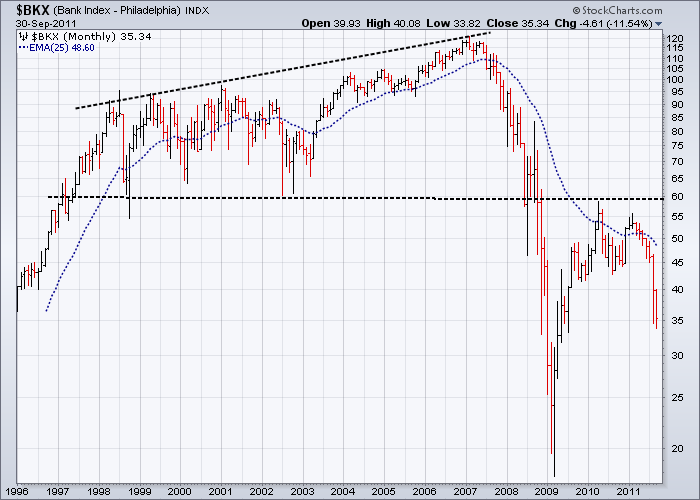
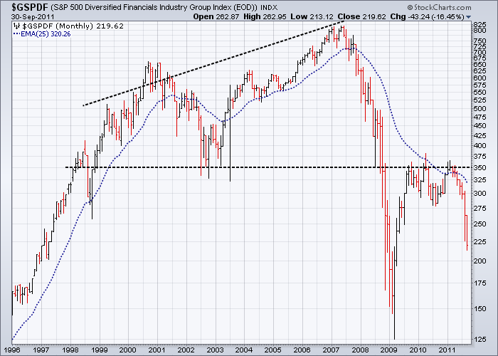
In my May commentary I reproduced the monthly chart of the Philadelphia Bank Index. For good measure this time I have added the S&P 500 Diversified Financials Industry Group Index as well. These two charts underline the story I have been trying to convey to my readers for just on two years now. These two charts are the most important ones here, as the bearish patterns have advanced to the point where they are almost impossible to reverse.
Both these Indices show identical well-defined 10 to 11 year broadening tops, with solid breaks below their necklines in 2008/2009 and pullbacks to their necklines over the last two years. This is classical text book pattern recognition and Technical Analysis at its most obvious – and all but ignored by analysts. Prices have already collapsed below the recent two year support indicating a return to what will probably be a testing of the 2009 lows. It is very difficult to even try and imagine a longer term bullish scenario for these two charts, even if there is a stronger rally from here.
My last commentary dated May 14th 2011 was headed:
“Charts showing more compelling evidence of an extended bear market rally soon to end”
Fifteen daily charts and two monthly charts were included to illustrate the dangers that lay ahead.
I would like to reproduce the first part of this commentary as at the time of publication, most market analysts were still bullish, even to the extent of expecting another rise in equities into new highs.
“On November 26th 2010 I posted “My view still is that the rally in equity markets since March 2009, with its persistence of upward wedges and broadening top formations across such a broad range of financial entities and time frames, is compelling evidence of an extended bear market rally that will soon end.
In my last posting on January 24th 2011, I wrote that equity markets were overextended, with upward wedge patterns and broadening formations still predominating in most of the leading US and world equity market indices.
Let me state now that nothing much has changed, except that many uptrends in equities have been broken and that probable tops continue to mature.
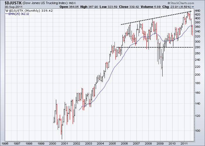
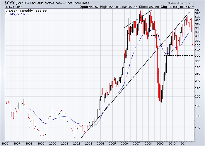
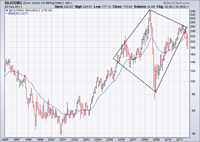
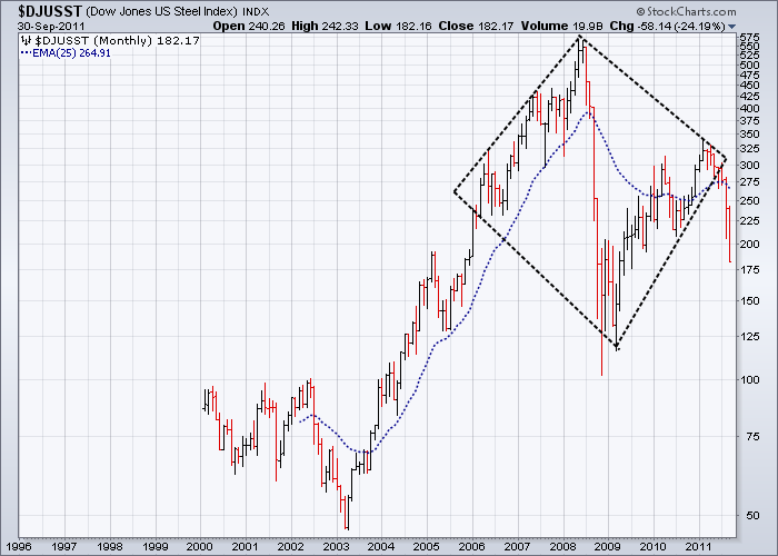
Pattern and trend analysis of key US Sector Indices highlight the mostly negative features over the short term. They also show clearly that the market as a whole is in a major decision mode, with very little room to move before one will be made. Note the close correlation between charts of the Mining Index, the Industrial Metals Index and BHP – where one goes the three will go and where these three go the rest of the market will follow – including the Australian Dollar.
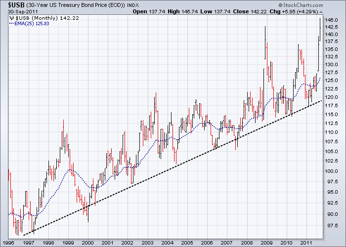
Over the last few months, equities and metal prices have deviated from the mean to bullish levels approaching the elastic limit of where they can go. Barring the traditional US “pulling the proverbial bullish financial rabbit out of a hat”, I expect the emphasis to remain on a topping out process, sensitive in the short term to a testing of current price support levels. If and when support lines, as shown in some of the charts below, are decisively broken, then money flowing out of equities and corporate bonds must go somewhere and that somewhere I expect will be US T-Bonds and the USD.”
Multi-year tops now show on many key charts
Admittedly, I did not expect the bear market rally to last as long as it did, but I think that is better than missing the recent breakdown of the top. In retrospect, the traders that would have made the most out of the 2 year rally were the ones that traded on expectations that you could always buy on the dips into a continuing bullish trend. This view was based mainly on the incorrect view that the economy was about to bottom out.
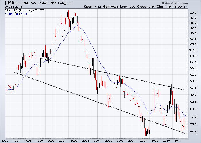
The tipping points that marked the end of the rally and the beginning of the new downward move have come and gone. Many of the world’s financial markets are now firmly entrenched in weakening multi-year tops that appear to be indicating a general world economic slowdown, rather than just markets reacting to a European financial crisis. In this scenario, it is unlikely any positive spin or short term resolution to the European crisis will change this outlook. Broadly speaking, the most likely outcome in equity and commodity markets over the coming months and perhaps years is going to be a strengthening bear trend. I expect the accompanying flight towards safety for the short to medium term at least will mean that cash, the USD, US T-Bonds and the ownership of productive assets will be the financial refuges of choice, with the euro designated by the UK’s William Hague “as a burning building with no exits.”
The sudden huge influx of unemployed workers worldwide from an overly bloated and parasitic financial service industry is also a sure sign the bear is becoming stronger. The western world is beginning to realise that having downsized manufacturing economies over reliant on financial services industries, easy credit and unsustainable consumption based upon access to diminishing resources, runs counter to a healthy economic future. In this scenario I expect commodity prices, real estate prices and SE Asian manufacturers to be significantly downsized over the coming months. This will have a negative impact on resource exporters such as Australia and Brazil.
Dave Rosenberg recently summed up the current economic malaise in the USA as “A modern day depression: The fact that there has been no sustained response to all these efforts by the government to turn things around is a testament to the view that this is not actually a traditional recession at all, but something closely resembling a depression.” The USA has now become a political and economic nightmare, held hostage not by Middle Eastern terrorists, but by selfish, short sighted and totally delusional Republican politicians, who would rather see the USA destroyed than Obama voted in for another term of office.
Despite all this, the counter intuitive prognosis for the USD is positive. It seems that in a world of weak currencies, it is the strongest of the weakest that shall be king – for a while at least anyway.
Edwards and Magee (“Technical Analysis of Stock Trends” – First Edition printed in 1948) became experts in market tops by observing first-hand the breakdown of the ones in 1929, 1936-1937 and 1945-1946 immediately prior to publishing their classic book – so the tops from these periods were very fresh in their minds. They saw Broadening Tops (common in 1929) and Diamond Tops (common in 1945) as more or less variations of complex Head & Shoulders style tops. But what these top patterns also had/have in common is a combination of well-defined symmetry and trend lines which are defined by often very wild price swings. High volatility in financial markets is often indicative of confusion compounded by highly emotionally charged and conflicting interpretations of the immediate future. These days, this usually compounded by tons of exaggerated political and media spin.
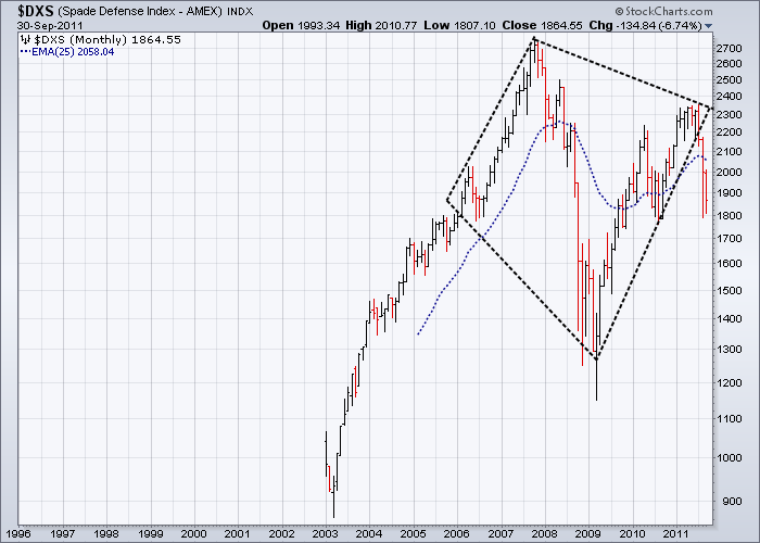
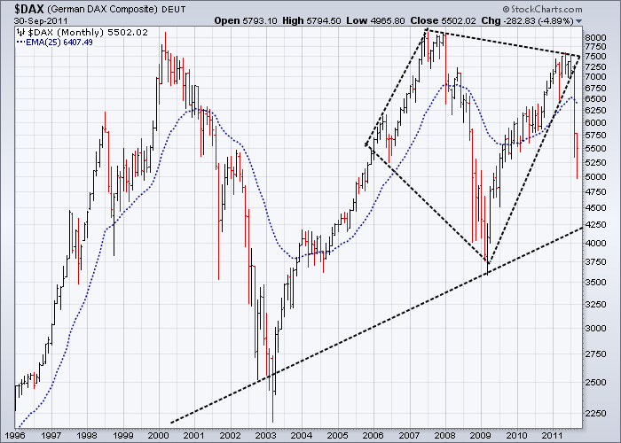
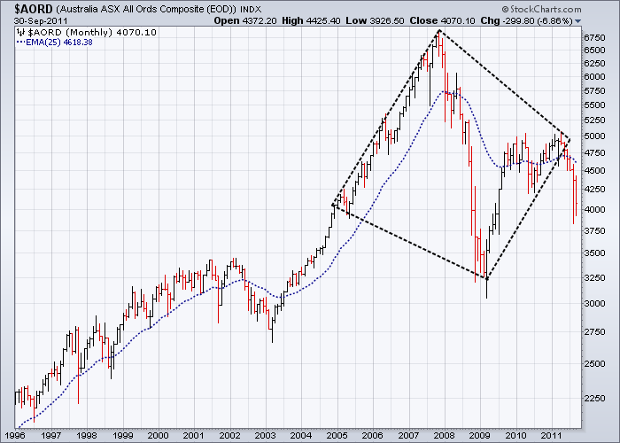
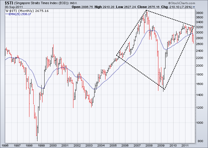
Here we are in the fourth quarter of 2011 and we have multiple instances of two well-defined types of tops with a history of preceding seriously large bear markets – signs we should not ignore.
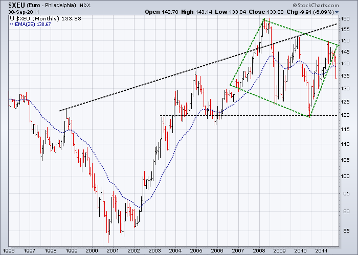
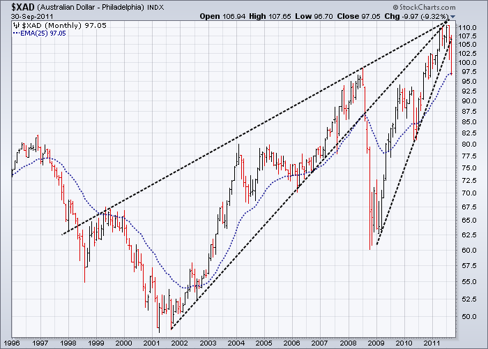
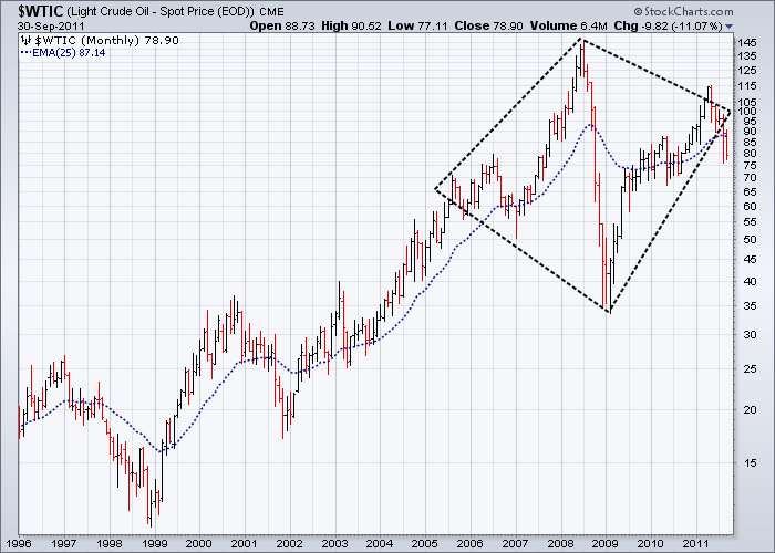
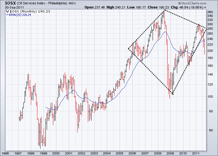
Eleven of the monthly charts below have diamond tops and were chosen from a broad range of markets to illustrate how dangerous the current market situation is. Note that diamond patterns are mostly asymmetrical - it is rare for them to be otherwise. Also the Euro chart has a diamond pattern within the broadening top – a bit of a worry for some, but not all of the Europeans.
The Bear Market returns
As I look over a broad cross-section of daily, weekly and monthly charts all I see is an ever expanding series of complete and/or maturing broadening/diamond tops and upward wedge formations – all with strongly bearish connotations. Historically, I have always associated these types of broadening tops and diamond formations with times of high volatility and confusion, which when resolved, result in very fast and dramatic downward moves. So when these chart formations have been confirmed as such, especially on the longer term on monthly charts, you know the ‘Bear’ is truly back in force. Perhaps the politicians and bankers will try their best to delay a full return to a bear market, but it is highly unlikely they will be able to stop it.
The monthly charts below cover a broad enough spread across currencies, raw materials and industry sectors to reduce any ambiguity that the bear market can be reversed without a great deal of pain.
In order to at least temporarily rally the market from here in a meaningful way, ie testing previous highs, both politicians and bankers across the world would have to act in unison in a totally uncharacteristic way by making some very hard decisions.
Saturday’s statement by Germany’s Finance Minister Wolfgang Schaeuble made this less likely by “ ruling out a higher German contribution to the euro zone’s rescue fund beyond the 211 billion euros approved by parliament last week. ‘Germany will take on 211 billion euros in guarantees and that’s it, that’s really the end of it with the exception of the interest costs on top of it,’ said Schaeuble, who has faced criticism recently for revising upwards earlier pledges on ceilings for the guarantees.” (Reuters).
Keeping the right perspective: the “Big Picture”
What largely appears to be absent from much of the Technical Analysis commentary I have read over the last few years, is careful analysis of the big picture. The almost total concentration on day to day moves on simple intra-day and daily charts together with the inane comparison of day to day statistics by the media, ignores the context in which these moves take place. The reality in the financial world today is that individual stocks, ETF’s and indexes do not usually move in isolation of the total market for any length of time. The sad reality is, that despite the unbridled enthusiasm of market newsletters encouraging mug punters to buy every time the market gets “oversold”, most day to day traders will lose money over the longer term. Ignoring or down playing the big picture adds significantly to the risk to these traders over time.
Obscured in the depths of “dark pools”, approximately 75% of total financial markets turnover these days occurs off-market, with possibly up to 50% of total turnover occurring off-balance sheet. These days a large part of total turnover involves various types of interest rate and currency transactions and derivatives with the bulk of these transacted by a very small number of large international banks. Less than 20% of these funds is allocated to equity markets. This humbling thought designates equity markets as little more than the financial playthings of the large hedge funds and a source of trivial news for the media as they anguish over the daily ups and downs. For those of us tracking equity markets the statistics immediately below are humbling.
OCC’s Quarterly Report on Bank Trading and Derivatives Activities in the USA for the Second Quarter 2011
The executive summary from this report noted in part that “The notional amount of derivatives held by insured U.S. commercial banks increased $5.3 trillion, or 2.2%, from the first quarter of 2011 to $249 trillion. Notional derivatives are 11.6% higher than a year ago. Derivative contracts remain concentrated in interest rate products, which comprise 82% of total derivative notional amounts. Credit derivatives, which represent 6.1% of total derivatives notionals, rose 2.2% to $15.2 trillion.”
What is scary about this report is that it looks at the exposure of U.S. banks ONLY, which has grown over the last three years by 37%. What is even more scary is that over 94% of this exposure is limited to four banks: J.P. Morgan Chase, Citibank, Bank of America and Goldman Sachs. And this is just their on-balance sheet exposure.
By comparison the world’s GDP over the past 12 months was about $65 trillion. This means the level of derivatives outstanding on balance sheet by US banks is, as I write these words, just under 4 times the total world GDP. That figure is certainly very scary to me.
The exponential rise in consumption we have experienced since the early 1980’s cannot be expected to go on forever.
In fact I would punt that the human consumption of goods and services in the western world probably passed its per capita peak sometime over the last five years. If this is so, as the slowing of western economies and the growth of debit vs credit cards seems to suggest, then that elusive goal of ever increasing GDPs has already been sent into the realm of political and economic fantasies.
For too long Chicago school economists, advocating financial markets more or less free of any controls, an ideology so influential over the last 50 years, have ignored the impact of human and corporate frailties such as self-interest, selfishness and greed that inevitably corrupts the free market process. During this time under the direction of these economists, the USA, large corporations and banks became like parasitic wasps, only able to survive by weakening and cannibalising other countries’ economies. Just ask the people of Chile about the ‘Chicago Boys’ and what they did to their country in the 1960’s and 1970’s or read about it and what they did to other countries in Naomi Klein’s book “The Shock Doctrine”. If you do, prepare to be shocked as I was.
The European financial crisis, the 10 year top on the monthly Banking Indices above and the tops on the charts below are merely symptoms of a most complex disease now facing the world – but these symptoms should not be confused with the disease itself.
It could well be argued that Chicago School economics has directly contributed to maintaining major wealth disparities across the world.
Unfettered financial markets and asset appreciation over the last 30 years in particular, have favoured most of the world’s economies. But during this time, multinational corporations and major banks used their clout and highly creative marketing to systematically increase the investment leverage of funds available to them. Combined with the advantages that globalisation, wars and slack financial and tax laws gave them, they accumulated incredible wealth and power, with little accountability to the countries that first sponsored them.
It is no accident that over this period Ayn Rand, with her philosophy of extreme selfishness combined with a total disdain for the bulk of humanity, became the patron saint of corporate executives, politicians and bankers. In 1987, Gordon Gecko’s famous phrase of “Greed, for lack of a better word, is good” from the movie “Wall Street” became the catchphrase of a generation of bankers and a symbol in popular culture for unrestrained greed.
To me it is quite obscene that almost half the world — over three billion people — live on less than $2.50 a day and around 80% of humanity still lives on less than $10 a day. This is in contrast to many of the key executives of the largest banks and corporations, who earn in excess of $50,000 or even $100,000 per day. Something to think about. When you are following numbers and graphs all day every day on computer screens, it is too easy to forget there are real people out there being affected by what goes on when those graphs and numbers go into a dive.
Today’s Reuters headline “More than 700 arrested in Wall Street protest” covering protests against home foreclosures, high unemployment and the 2008 bank bailouts may be an early sign of what we may be in for over the coming months and years – it’s not only third world countries that have poverty, it’s a growing problem in the west as well and these people are looking for someone to blame.
Leonard Cohen, Bear markets, History and “This time it’s different”
“Everybody knows that the dice are loaded,
Everybody rolls with their fingers crossed.
Everybody knows that the war is over,
Everybody knows the good guys lost.
Everybody knows the fight was fixed,
The poor stay poor, the rich get rich,
That's how it goes,
Everybody knows.
Everybody knows that the boat is leaking,
Everybody knows that the captain lied.
Everybody got this broken feeling,
Like their father or their dog just died.”
Whenever I hear this Leonard Cohen song, the real reasons why we shall always have market tops and bear markets come to mind. It takes a poet to point out why free market economics do not work – it ignores the human element. As I pointed out earlier, just ask the people of Chile.
These days we take for granted computer generated graphics and market prices sent to us in real time – it was not always like this. The 1980’s were a time when financial markets became computerised for the first time and software programs began to do the thinking for us. We demanded automated trading programs to eliminate the risks normally associated with buying and selling, so we created huge databases of statistics to help us chart what was going on. We created mathematical economic models to show us what to do and we wanted the population depersonalised so we would not have to consider the consequences of our actions. We employed Hollywood, Rupert Murdoch and the Religious Right to dumb us down, encourage us to consume more than we needed, to confuse and muddy the differences between fantasy and reality and to confuse and muddy the lessons of history.
So what did we do then?
Well one thing we did was create high frequency trading – the perfect solution for all of our trading needs. This was the answer to every trader’s fantasies – trading without risk. It was almost like printing money. By reducing the time between trades to milliseconds and by doing much of our trading in the “dark pools”, time related risk was reduced to a minimum. But as more and more traders start to use this technique, margins are squeezed causing everyone using similar software to make similar decisions at the same time. The same applies to other trading software as over time, decision making choices are narrowed with most software eventually making similar decisions at exactly the same time. For the market as a whole this becomes very dangerous, especially when automatic sell signals are triggered.
As computer software modelling becomes more complex, it is the nature of the beast to encourage people with ever higher mathematical skills to both write, understand and interpret the software for the mathematically challenged – which is most of us. The problem with this process is that it also encourages a disassociation with real world behaviour by these software writers, as the complexities of people’s behaviour are not neat and tidy like their mathematical formulas and models. If only we could get rid of people, then all our theories would be neat and tidy with no loose ends and everything would work as it is supposed to.
But it was this messy and unpredictable feature set of human behaviour, these loose ends, which tended to make it more difficult for computer modelling to form an accurate representation of the real world. This is why tops will continue to be periods of peak optimism and bottoms to be periods of peak pessimism. Economic extrapolations simply do not work at these major financial markets turning points, which is just one of many reasons why most economists will always be late in picking them.
And where does that leave us?
Well, perhaps we need to go back to basics and learn from history why we always seem to go down after we go up.
So stop reading Ayn Rand and start reading Naomi Klein.
Note that the uptrend on the monthly 30yr T-Bound Chart goes back to 1981.
Note that the uptrend on the $DAX Index starts in 1991 and hits it again in 1992, as well as 2003 and 2009.
Till next time.
Garry Abeshouse
Technical Analyst.
Sydney
Australia
I have been practicing Technical Analysis since 1969, learning the hard way during the Australian Mining Boom. I was Head Chartist with Bain & Co, (now Deutsch Bank)in the mid 1970's and am now working freelance. I am currently writing a series of articles for the international "Your Trading Edge" magazine entitled "Market Cycles and Technical Analysis".
I have always specialised in medium to long term market strategies and after discovering the excellent Point & Figure Charts from Stockcharts.com in mid 2008, have concentrated on this style of charting ever since.
© Copyright Garry Abeshouse 2011
Disclaimer: The above is a matter of opinion provided for general information purposes only and is not intended as investment advice. Information and analysis above are derived from sources and utilising methods believed to be reliable, but we cannot accept responsibility for any losses you may incur as a result of this analysis. Individuals should consult with their personal financial advisors.
© 2005-2022 http://www.MarketOracle.co.uk - The Market Oracle is a FREE Daily Financial Markets Analysis & Forecasting online publication.