


Impulsive Gold and Silver Game Plan
Commodities / Gold and Silver 2013 May 13, 2013 - 05:15 PM GMT

 Before we move on to the charts for this Weekend Report I would like to thank all the new subscriber who have joined us over the last several months. We are experiencing some growing pains at the moment that are being attending to by our wizard website designer audept. He is on top of the situation and we should be lightning fast once all the changes are made. Thanks for your understanding.
In this Weekend Report I want to get everyone up to speed and on the same page of what I’m seeing with the charts. I think there is a bit of confusion, especially with some of our new subscribers, on what the game plan is. Our game plan right now is fairly simple. As the longer term subscribes know we’ve been accumulating positions in some of the 3 X short etf’s like DUST which we started last December, DGLD & DSLV in the Kamikaze portfolio. The reason I have been recommending these trades, in the Kamikaze Portfolio, is because I think we are in a unique situation in regards to the precious metals complex. I have pointed out several different times that what we are experiencing right now isn’t normal and doesn’t happen many times in an investors career and that is to catch a big strong impulse move from the very beginning.
Riding these strong impulse moves seems easy when you look at a chart in hindsight as they stick out like a sore thumb. But when one has their own hard earned money on the line emotions can and usually do get in the way. Fear and greed are killers when it comes to the markets and everyone has their own level in which they have to operate. My job is to try and keep you on the right side of the trade for as long as possible and ride the trend for all it’s worth.
This week we finished up the fourth week of correction since the big breakdown. This is the time investors start to question whether they have made the right decision by hanging on to their 3 X short etf’s as they see some of their profits taken away by the market. That is exactly what a correction is all about. It is giving back some of your hard earned capital while the bulls and the bears fight it out for control of the next move. The old expression, the trend is your friend, applies to our current situation right now. As the trend is down the odds strongly favor the resolution will be with the bears when this correction is finished.
What does an impulse move in a stock look like? An impulse move happens after there has been a consolidation pattern formed that can take days, weeks or months to complete. The move out of these consolidation patterns are called impulse moves. These impulse moves can also occur from top and bottom patterns once they are complete. So lets take a look at some impulse moves so you can see exactly what I’m referring to.
For all the talk about all the manipulation in the precious metals complex, they have created some of the best looking consolidation patterns, followed by their impulse moves, that you will find anywhere. The gold bull market that started back in 2000 is the most beautiful example I can show you of how a bull market looks and acts. This bull market in gold will be studied in the future just as we studied the charts from the great depression back in 1929.
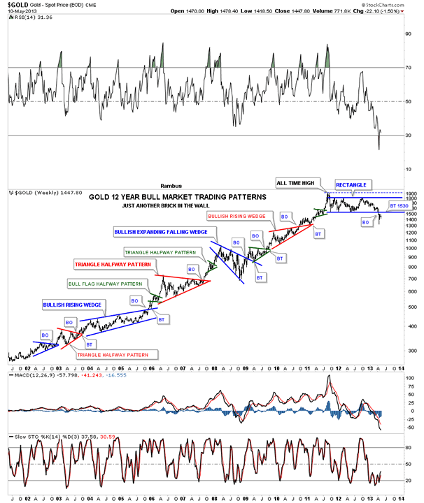
The first chart I would like to show you is a weekly look at the most beautiful bull market one could ever imagine form a chartists perspective. This weekly chart shows all the consolidation patterns that have formed over the last 13 years. The first thing to note, starting at the beginning of the bull market, is to look at all the lows that formed. Chartology 101 states an uptrend is a series of higher highs and higher lows. This sounds to simple to be of any use but I can assure you it’s one of the most important and basic pieces of Chartology you need to understand. There are only 2 times in the last 13 years that gold made a lower low on the weekly chart. Note the blue bullish expanding falling wedge, in the middle of the uptrend, that had the first lower low made during the big correction in 2008. Now look to our current trading action on the right side of the chart. With the breakdown of the 20 month blue rectangle 4 weeks ago, it’s the second lower low that has been made in 13 years. That’s pretty incredible. As it stands right now gold is officially in a downtrend with a series of lower highs and lower lows.The other important thing I want you to take away from this weekly chart for gold is after each consolidation pattern ended there was an a fairly vertical leg higher. Those are impulse moves. Most of the times you can see there was a backtest to the top rail of the consolidation pattern before the rally really took off. After the bulls and the bears fight it out, to the winner goes the spoils. In this case gold was in a bull market so the odds greatly favored the bulls would win the battles and an impulse leg up would begin. At some point the bulls become exhausted and the result is the breakdown that happened 4 weeks ago with gold making a lower low.
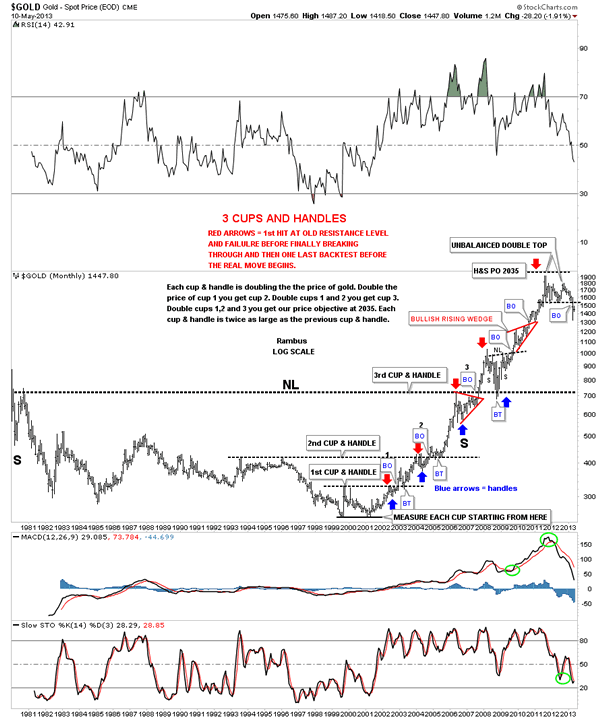
Below is a monthly chart that goes all the way back to 1980 that shows the big H&S base and the beautiful bull market that resulted from 20 years of sideways chopping action. The price objective of the massive H&S bottom had a price objective up to 2035 which ended up being about 100 points higher than the actual high. Pretty close for such a large base. Another important feature of this monthly chart is all the cup and handles that formed during the bull market. When you hear me talk of beauty and symmetry this is what I’m referring to. Note, each cup and handle doubled in price from the proceeding one. Also this chart is a very good study on how support and resistance works. The black dashed horizontal trendlines shows the top of each cup. Note how in each rally phase the price action rallied to the underside of the black dashed trendline, fell away and then the next move broke above the black dashed trendline with one last backtest from the top side to confirm the breakout, blue and red arrows. Even the 2008 crash found support at the top of the third cup which was also the big neckline. Double the distance from the bottom of the chart to the big neckline and you get the price objective up to 2035.
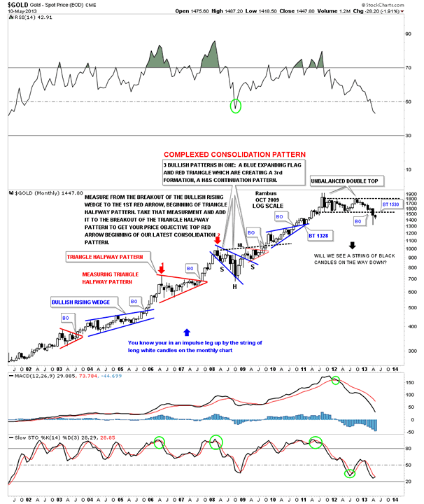
I would like to show you one more monthly chart for gold that uses candle sticks. This chart does a good job of showing each of the bigger impulse legs up after breaking out of each consolidation pattern. When your in a big impulse leg up you will see a lot of white candles form on the monthly chart. At the top right side of the chart I’ve labeled the top as an unbalanced double top because there was the initial top made at 1920 and then there was the 20 month rectangle that could only rally up to1800 giving us an unbalanced double top when the bottom rail was broken 4 weeks ago.
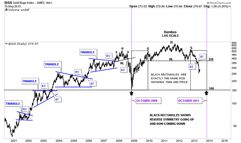
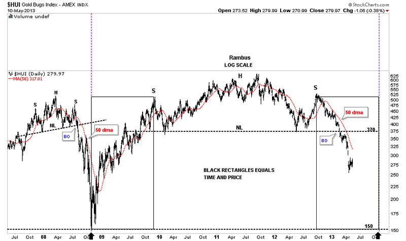
Lets look at one more chart that shows some beautiful consolidation patterns with nice impulse moves up. The daily chart below, of the HUI, shows the 4 blue consolidation patterns that formed during its bull market run. Note how each impulse leg up, out of each consolidation pattern, actually started as the last reversal point at the bottom of the blue patterns. These are impulse legs folks. Note the impulse leg down out of the 2008 H&S top. The bears finally won the battle on that one after losing each battle from the bull market low in 2001. As with the bull market uptrend I showed you on gold you can see each low during the bull market years from 2001 to the 2008 H&S top the HUI basically made all higher lows. Checkout the rally out of the 2008 low that shows there were no lower lows made until the top of the massive H&S reversal pattern began to roll over. You don’t have to be an Einstein to see what an uptrend looks like. A downtrend is the exact same thing only in reverse.
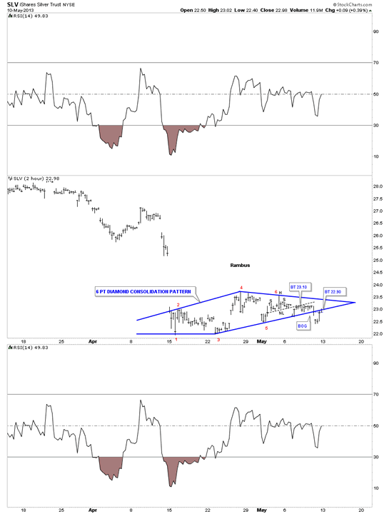
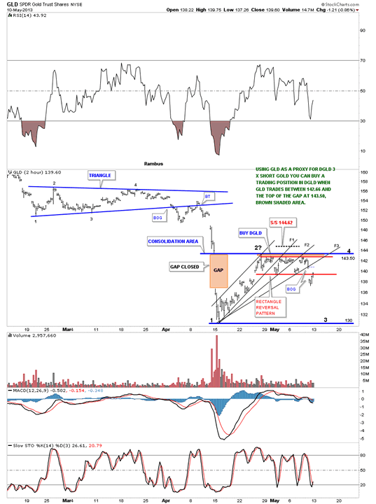
Now that you know what an impulse leg looks like and how they develop that brings us to the point of this weekend report. Four weeks ago gold and silver broke out of a 20 month rectangle consolidation pattern. This pattern is no different than any of the consolidation patterns I’ve shown you on the charts above except it’s in a downtrend instead of an uptrend. Same principal only it’s in reverse now. The chart below is a combo chart that shows gold on top and silver on the bottom. This is my dilemma right now. As you can see on the combo chart below both gold an silver have clearly broken out of their respective rectangles. For long term subscribers we have already taken positions up inside each rectangle and now a have some wiggle room in case gold and silver do a complete backtests to their bottom rails. This is one reason I have suggest to get an initial position in DSLV short silver etf just so you can have some skin in the game when silver broke down out of its 6 point diamond last Friday. Gold I suggested to take a DGLD short gold position up at the top of the big gap that has held resistance since the breakdown 4 weeks ago.
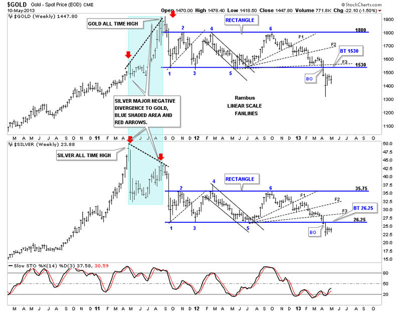
The shorter term minute charts are telling me we might not get the complete backtest if the diamond breakout holds or if the top of the gap holds resistance on GLD. It would be just like the markets to fool everyone that is looking for a complete backtest to the bottom rails of the rectangles and stall out just below like they have been doing. I believe we’ll know something next week if the diamond consolidation pattern is valid. It close last Friday right on the bottom rail.
SLV 2 hour 6 point diamond with breakout and backtest. The moment of truth is at hand.
GLD 2 hour fanlines. Moment of truth here also.
Lets look at the HUI that shows my biggest concern for getting new subscribers on board with the DUST trade. The reason it’s my biggest concern is because it has already fallen much more than gold and silver. As you can see on the chart below the HUI broke out of its massive H&S top 100 points ago around the 370 area and now we are down in no mans land. There is a possible small consolidation pattern that is forming on the HUI 60 minute chart that may give us a chance to get in. We’ll just have to see what next week brings. I’m going to use the 50 day moving average on the HUI for our sell/stop on our DUST trade. As you can see the crash that occurred in 2008, after that smaller H&S gave way, held resistance all the way down. So this is going to be our new sell/stop for the time being.
The bottom line is I believe we are in an impulse leg down in the precious metals complex that has further to run. Getting on board is a little more tricky right now especially with the DUST trade. We just have to see how the short term consolidation pattern develops over the next several days to weeks to find a good entry point. With DGLD and DSLV positions can be taken right here and up to the bottom rails of their respective rectangles with the bottom of their rectangles being the lowest risk entry point. You can expect to be behind in these trades initially until the next move lower begins. It’s just part of the game. Little risk little reward, big risk big reward.
When you look at the Kamikaze Portfolio you can see we took many small trades at different times that added up to full positions. I will do my best to try to get you in but if you get behind for awhile please don’t panic. Divide your capital up into smaller portions and take one position at a time. Eventually you should get full positions to work with. The name of the game right now is to accumulate shares whenever possible for the bigger move down. The time to sell will come and hopefully you will have made a decent profit to buy the next round of precious metals stocks when the time is right. Many will ride this whole thing down and when it finally does bottom they won’t have any capital to buy the bargains when they show up. I hope this brings everyone up to speed and what we are trying to accomplish during this major impulse leg down in the precious metals complex. All the best…Rambus
PS: I’ve been asked about this article going around where the analysis is looking for a bottom Monday or Tuesday that is the final bottom for the rest of the bull market. Maybe he’s right or maybe he’s wrong. Nobody knows for sure which way the markets are going to move with 100% accuracy. I’ve tried to layout the big picture showing you many different charts from gold, silver, HUI and the dollar to name just a few that are showing me the longer term trend is down. The very short term trend, as I have shown you on the gold and silver charts above, a backtest could take place to the bottom rail of their rectangles before the move takes hold to the downside.
All the best
Gary (for Rambus Chartology)
FREE TRIAL - http://rambus1.com/?page_id=10
© 2013 Copyright Rambus- All Rights Reserved
Disclaimer: The above is a matter of opinion provided for general information purposes only and is not intended as investment advice. Information and analysis above are derived from sources and utilising methods believed to be reliable, but we cannot accept responsibility for any losses you may incur as a result of this analysis. Individuals should consult with their personal financial advisors.
© 2005-2022 http://www.MarketOracle.co.uk - The Market Oracle is a FREE Daily Financial Markets Analysis & Forecasting online publication.