


Gold And Silver – A Telling View Through ETF Charts
Commodities / Gold and Silver Stocks 2015 Feb 14, 2015 - 03:52 PM GMTBy: Michael_Noonan

 The changes going on in the world continue to accelerate, but changes that directly relate
to gold and silver are hard to find and correlate to developing price activity. This was
addressed in the first two paragraphs of last week’s article, Forget The News, so there is no
need to repeat how fundamental news is not driving price.
The changes going on in the world continue to accelerate, but changes that directly relate
to gold and silver are hard to find and correlate to developing price activity. This was
addressed in the first two paragraphs of last week’s article, Forget The News, so there is no
need to repeat how fundamental news is not driving price.
None of the fundamentals are reliable for market timing, charts being preferred for that aspect, and even the charts are not indicating the “when” will gold and silver embark on a change in trend. With an overload of news events, a shorter read of what is going on in the markets via the charts makes more sense.
This week, we take a look at ETF charts to see if/how they may be helpful for clues in reading the futures gold/silver charts. The net effect is how the ETFs can be used as a tool to confirm the futures charts at/near turning points like swing highs and lows. After a review of silver, there are six ETF-related charts with some short observations, followed by gold and eight gold ETF charts
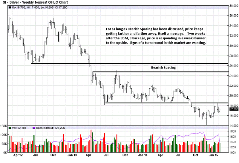
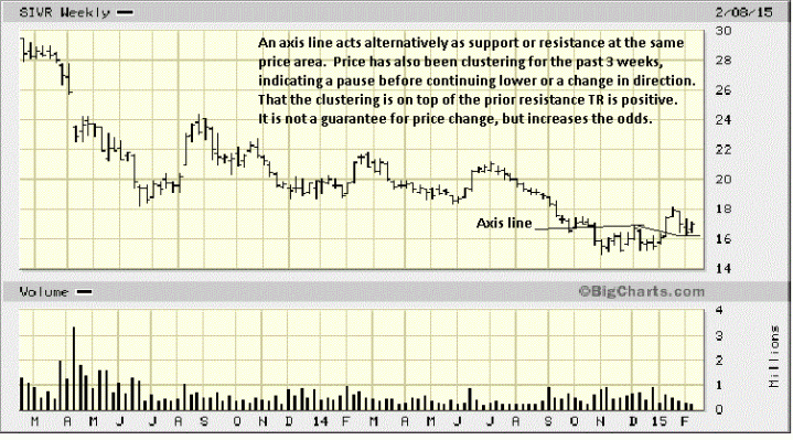
The takeaway on weekly silver is a lack of defining activity that indicates the bottoming process is ending. Simply put, there is none. The greater ease of market movement is still on the downside. We call it EDM [Ease of Downward Movement], and the direction of most ease of movement is with the trend. In an up trend, there would be EUM [Ease of Upward Movement].
The EDM, 3 bars ago, is an alert to see how the market responds, either with more ease of movement lower or a lack of follow through, for both convey market intent. The two weeks following show an inability for buyers to overcome efforts of the sellers, especially when the reaction rally stopped cold at resistance. Looking at the markets more from a logical perspective, it is easier to avoid the “noise of the news” that has no lasting impact.
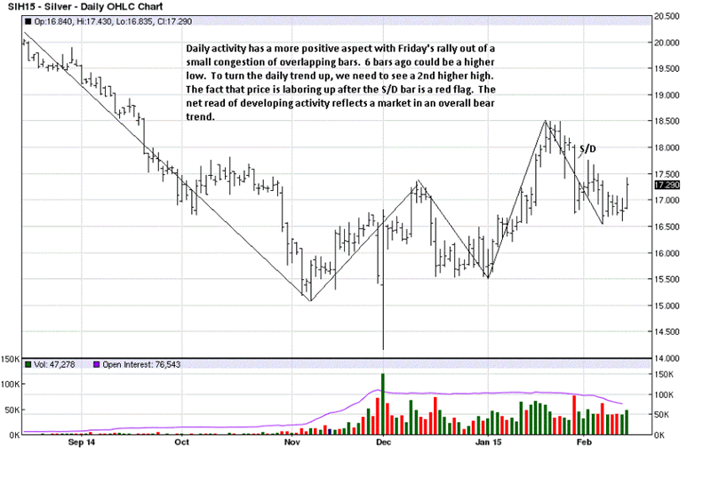
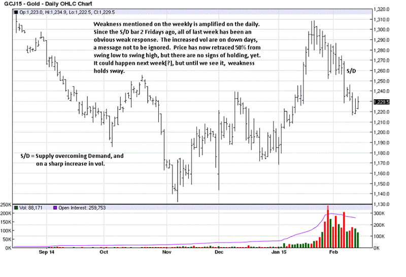
While it appears price is putting in a better show on the daily chart, Friday’s rally gets lost when compared to its net effect relative to the S/D bar [Supply over Demand] on a significant increase in volume at the end of January. When you think of volume as a source of energy driving the market, compare the next 11 TDs and consider how all of that effort failed to negate the S/D bar. It is hard to be enthusiastic about Friday when put in that context.
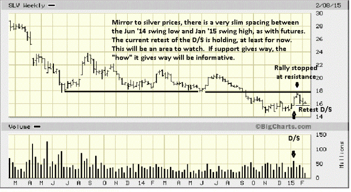
SLV is the iShares for silver. We show a D/S bar [Demand greater than Supply] on increased volume. This is a weekly chart. The above example of S/D was on a daily. The significance of a D/S bar is that it will act as support on a retest. The question is where will support be found? It will be anywhere from the high of the bar, down to the low. In a strong market, the upper part of the D/S bar will act as support. In a down market, the lower end of the D/S will often be retested, as is happening in this chart.
While the low-end of the D/S bar is holding, note that price is not reacting away to the upside, and that makes potential support suspect.
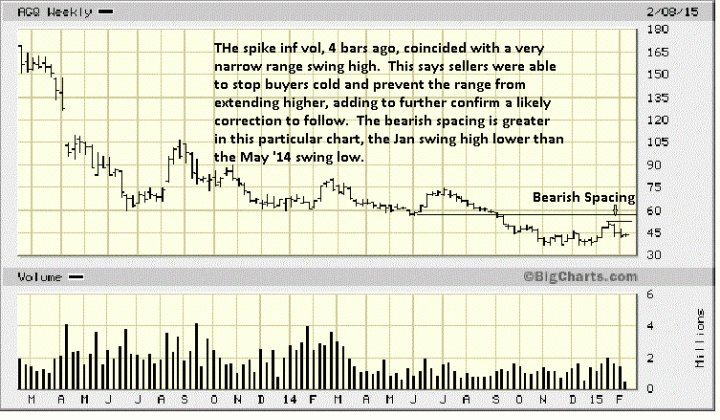
ACQ is Pro Shares Ultra Silver. The spike in volume at the reaction swing high of the rally on such a small range bar was a huge red flag. Here you see the opposite of any ease of movement. The narrowed range tells us the sellers were stopping all efforts of the buyers to extend the rally. Buying power was matched and spent. This opened the door for the sellers to take over in the constant ebb and flow of control.
What is useful in viewing this chart is the fact that the rally high failed to fill the gap from the last swing low, back in June ’14. This little space is how “bearish spacing” is formed. It is an indication that buyers are too weak and seller are in more control. Using this information with the futures chart, above, acts as additional confirmation to the red flag indication on that chart.
The holding of price at the EUM bar low, 5 bars ago, also adds to the retest on SLV and how price marginally held on the daily silver chart. The interplay of these charts may not be absolute on all occasions, but they can serve as a secondary source of confirmation.
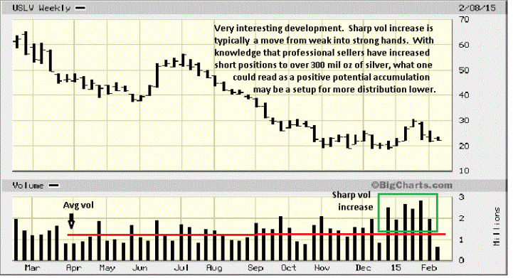
USLV, Velocity Shares, 3x Long Silver presents an interesting dilemma in reading the sharp increase in volume activity. It could be viewed as bullish, as in strong hands buying all the offerings from tired weak hands in preparation for a move higher, but we keep coming back to that chart showing the largest traders short over 300 million oz of silver, [see Forget The News, first chart]. It then makes more sense to view the volume as strong hands selling as much as they can to weaker hands that will jettison their newly acquired long positions on the next drive to lower lows, should it develop in that manner.
You do not get as clear a volume read on any other chart as this one, and it shows the importance of being aware of the ancillary ETF charts.
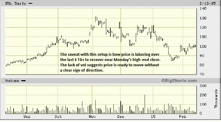
ZSL is Pro Shares Ultra Short Silver, and a daily chart. At first, this looked like possible accumulation in preparation for a rally higher, however, in context with the other charts and massive short positions, a second read is less positive. The high volume at the rally high is a red flag, [increased effort, no follow-up payoff], and the rally stopped at the gap down resistance from the middle of January.
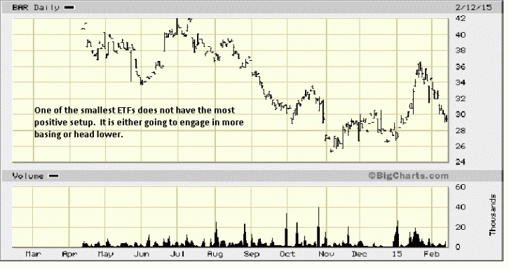
DSLV is 3x Inverse Silver. Chart comments apply.
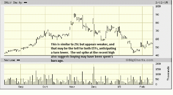
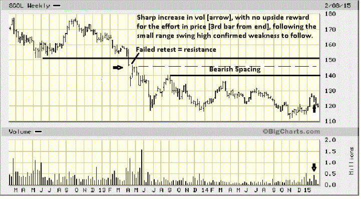
Chart comments spell out how to view weekly gold. One should never lose sight of the fact that gold is in a protracted trading range in a likely, but unconfirmed bottoming process. Ironically, for all of the possible news/events that can impact the price of gold, whenever price is in a TR [Trading Range], the level of knowledge is at its lowest because price can move in either direction within the TR and not mean anything. This is why it is important to keep a market in its context.
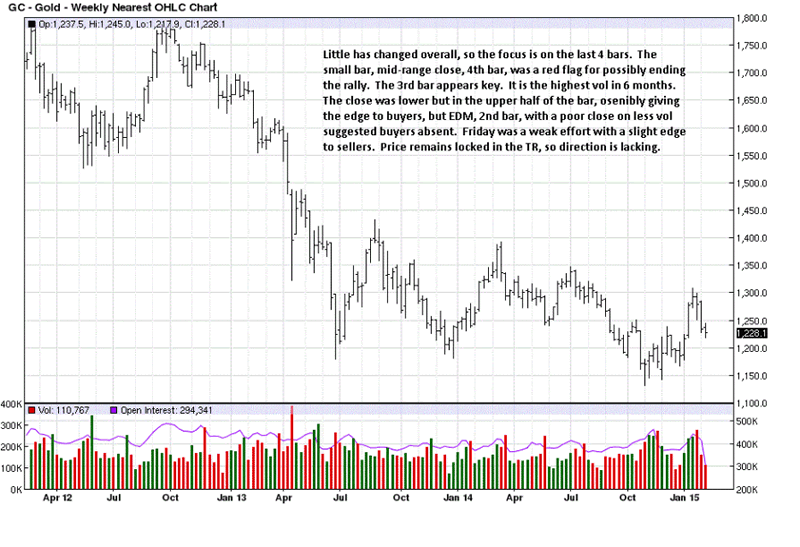
S/D and its opposite, D/S, are important bars of which to be aware because they are more often than not created by controlling influences. It is also why these ranges act as support or resistance. This is especially true when volume is greater than normal.
Here, the S/D bar acted as resistance, and price was unable to rally even to the half-way point of the bar. Contrast this with the SLV analysis with a D/S bar in a down trend. Look at how weakly price has been, drifting yet lower, unable to mount any challenge to a S/D bar while in a down tend and momentum of price direction. This is yet another example of why knowing the trend is so important.
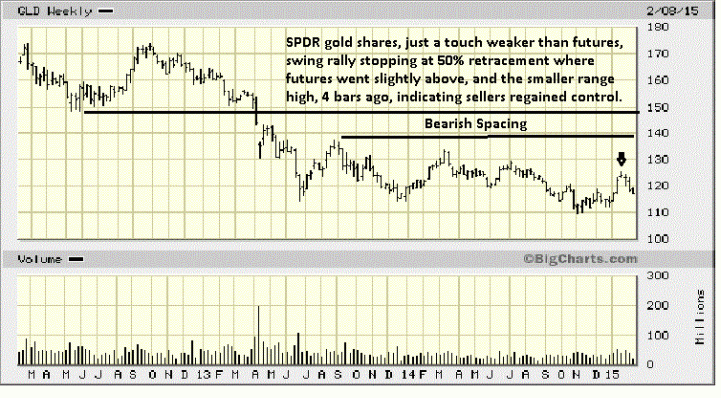
Compare this red flag warning [arrow] at the rally high with the weekly gold chart, and you can better see how a clearer signal was being issued by the market.
Another example of understanding the trend that makes reading developing market activity more meaningful in harmony with the trend.
IAU is the iShares Gold Trust
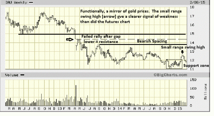
After the more obvious tell from the small bar at the swing high, this ETF gave more information the following week with an increase in volume effort that yielded no result higher. If that is the case, expect more downside. Again, the interplay of extracting information from different but similar market sources can enhance one’s read of the developing activity and lead to a better informed decision process.
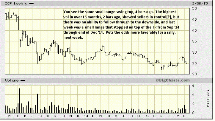
DGP = Power Shares DB Gold Double Long. The interpretation of the high volume bar, 2nd bar from right, leads to an observation, and an observation does not mean one should take action, rather, use it to see if the market responds to how you read it. While we say odds may favor a rally, the trend could very well negate that interpretation. Always go with the trend.
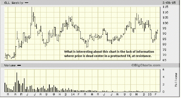
GLL is Pro Shares Ultra Short Gold. We mentioned how the level of knowledge is at its least when price is in a TR. The lowest level of knowledge is when price is in the middle of the TR. Price could rally to 105+ or decline to 78+ without leaving the TR, but if you pick the wrong direction in taking a position, losses will occur. This is a low-level trade area for making a decision. The best decision is not making one.
The trend, the trend. It provides important information.
While this and the above chart are not compelling, they do provide a perspective that clearly says gold is unlikely to turn around and change trend regardless of whatever news you may read or some pundit claiming an upside move is imminent, or worse, already underway. The charts do not lie.
By Michael Noonan
Michael Noonan, mn@edgetraderplus.com, is a Chicago-based trader with over 30 years in the business. His sole approach to analysis is derived from developing market pattern behavior, found in the form of Price, Volume, and Time, and it is generated from the best source possible, the market itself.
© 2015 Copyright Michael Noonan - All Rights Reserved Disclaimer: The above is a matter of opinion provided for general information purposes only and is not intended as investment advice. Information and analysis above are derived from sources and utilising methods believed to be reliable, but we cannot accept responsibility for any losses you may incur as a result of this analysis. Individuals should consult with their personal financial advisors.
Michael Noonan Archive |
© 2005-2022 http://www.MarketOracle.co.uk - The Market Oracle is a FREE Daily Financial Markets Analysis & Forecasting online publication.