


Gold and Silver - It's ALL about The Big Picture After All
Commodities / Gold and Silver 2015 Apr 27, 2015 - 01:21 PM GMT

 Today I would like to focus in on the bigger picture by looking at some long term charts for the precious metal complex. I know most enjoy the action by looking at the minute charts but they're more likely to morph into something different as time goes on. On the other hand looking at the long term charts changes come much more slowly and they're less likely to morph into something else. A short term bottom on a minute chart vs a long term bottom on a monthly chart have two completely different meanings. If you see a big bottom on the monthly chart you know that the move will last more than just a few weeks or even a few months. It took a lot of smart investors with deep pockets to build out a bottoming formation that aren't going to bail out of their potions easily. Minute charts have their place in trying to fine tune and entry or exit point. They can also be used when a bigger pattern is building out with smaller individual chart patterns that end up creating the much bigger finished product. I also have a lot of ratio charts to show you that compare gold to the stock markets and some commodities.
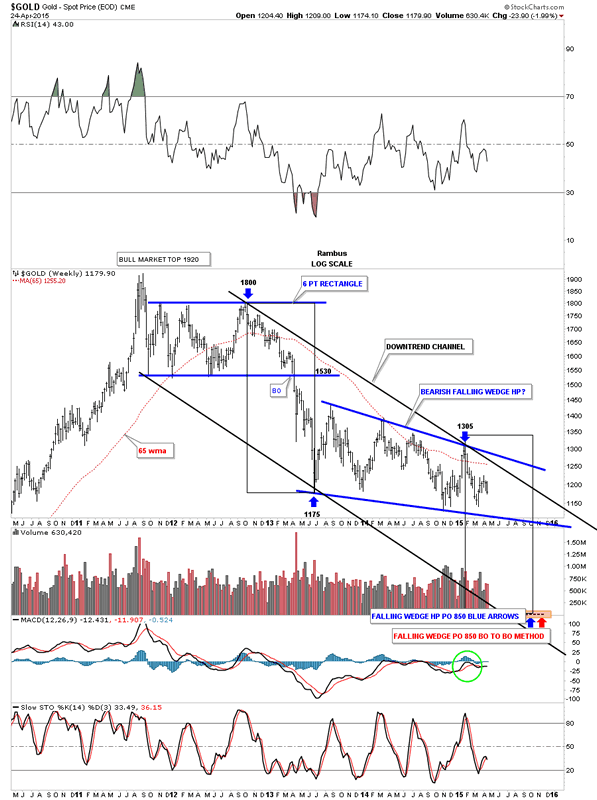
These charts will give us a feel for how gold is actually doing vs some other areas of the markets. As you know commodities fell very hard last year and have been basically consolidating since the first of the year. Gold on the other hand has been chopping out a sideways trading range going nowhere fast. The first chart I would like to show you is a weekly look at gold so you can see the downtrend that has been in place since gold topped out in 2011. When you look at this chart you're seeing a classic downtrend where a stock is making lower highs and lower lows. To become even remotely bullish I would have to see gold takeout the top rail of the downtrend channel and then the top blue rail of the falling wedge. There is also the very important 65 week moving average that has done a pretty good job of holding resistance.
Spot Gold Weekly Chart
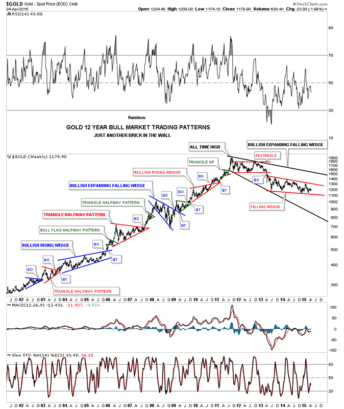
This next very long term chart for gold shows all the chart patterns that it formed during its bull market years. This chart gives you a good idea on how a stock moves. As you can a stock it's either building out a topping, bottoming or consolidation pattern. Once one of those patterns are completed you get an impulse move, rinse and repeat. It's how any stock or market moves. Identifying a top, bottom or consolidation pattern is the hard part. Once you have that figured out the impulse move is easier compared to all the chopping around before the impulse move actually begins.
Spot Gold Weekly Chart 2
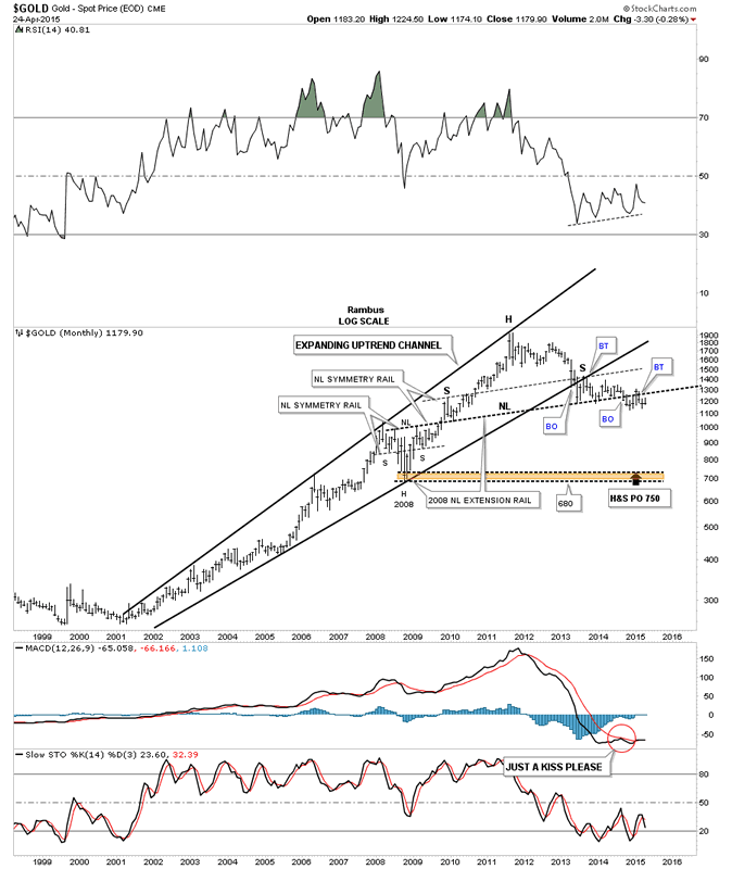
Now lets look at some very long term monthly charts for gold. This first chart I've been showing for a very long time which shows gold's bull markets as an expanding rising channel. Note the area, at the top of the chart, where gold broke below the bottom rail of the expanding rising wedge then backtested it from below which built out the right shoulder of the massive H&S top. If you recall the big neckline is taken from the 2008 H&S consolidation pattern's neckline which I extended to the right side of this chart. Note how the heavy black neckline also is the same angle as the 2008 left and right shoulders and it also shows us the height for the shoulders on the massive H&S top, labeled NL symmetry rail.
Monthly Gold Chart
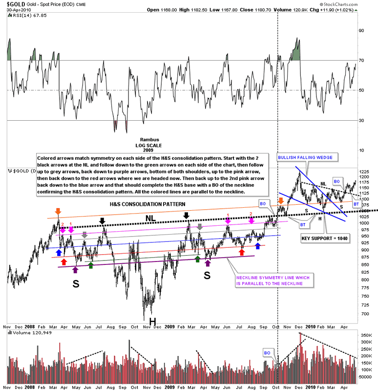
Before we move on to another monthly chart I would like to show you the beautiful symmetry of the 2008 H&S consolidation pattern as I charted it during big correction. It's very easy see the symmetry as shown by the colored lines and arrows. This has to be the most symmetrical H&S pattern I've ever seen. The neckline is the heavy black dashed line which gave all the lower symmetry lines their angle. Note the two black arrows that sit on either side of the head, on the neckline. The best way to see the symmetry is to follow the price action down on the left side of the chart to the green arrow and symmetry line. Before you go to the next arrow follow the price action down on the right side starting at the black arrow and following that side down to the green arrow. Then the rally up to the grey arrows and then back down to the purple arrows that shows the bottoms for the left and right shoulders. Where the pink arrow is on the right side of the chart is the only place where the price action failed to match the left side perfectly. As you can see it didn't affect the actual breakout and backtest which was dead on the money. You can see how the big black neckline and the top brown symmetry line helped form the H&S consolidation pattern that began in 2010 with the head forming on the big black neckline and the bottom of the left and right shoulders forming on the brown symmetry line. One last note. I have shown you in the past how a rising or falling wedge can be part of a H&S pattern. The blue falling wedge shows you a perfect example of this. The left shoulder and head were formed inside the blue falling wedge and the right shoulder was formed after the breakout. This big H&S consolidation pattern is what launched the finally parabolic rally that ended this portion of gold's bull market.
Daily Gold Chart
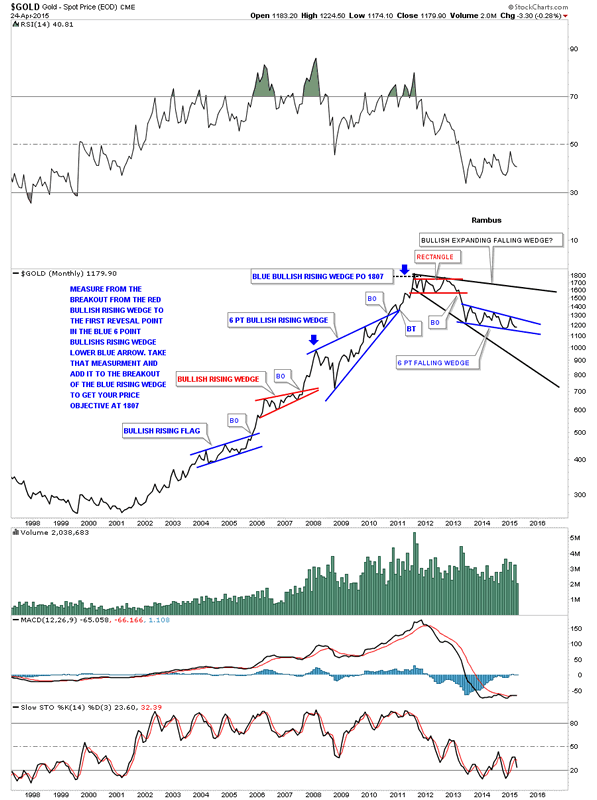
The next chart for gold I'm using a monthly line chart which shows us gold made three big consolidation patterns that were all rising wedges or flags. I explained on the chart on how I measured for the the blue 6 point bullish rising wedges price objective. You can use that same principal and measure the red bullish rising wedge as a halfway pattern from the breakout of the bottom blue bullish rising wedge. Note the price action on the left side of the chart which is a bull market compared to the price action on the right side of the chart which is showing us a bear market.
Monthly Gold Chart 2
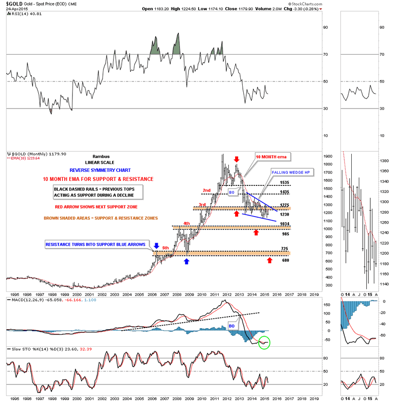
It's been awhile since I showed you this monthly chart for gold that uses the 10 month ema for support and resistance. On the way up it held support like a rock until the 2008 crash. On the way down it also has done a good job of holding resistance. This chart also shows the brown shade support and resistance zones that were taken from the bull market side of the chart. I have to admit that I didn't think it would take almost two years for the blue falling wedge to mature. What I think is happening now is that the almost two year blue falling wedge is going to be a halfway pattern down to the bear market low. I can see, once gold breaks out from the blue falling wedge, that we'll see a drop down to the brown shaded S&R zone at the 1034 area and then a backtest move to the underside of the blue falling wedge and then the capitulation phase begins in earnest. It's how I'm conceptualizing it at this point in time.
Monthly Gold Chart 3
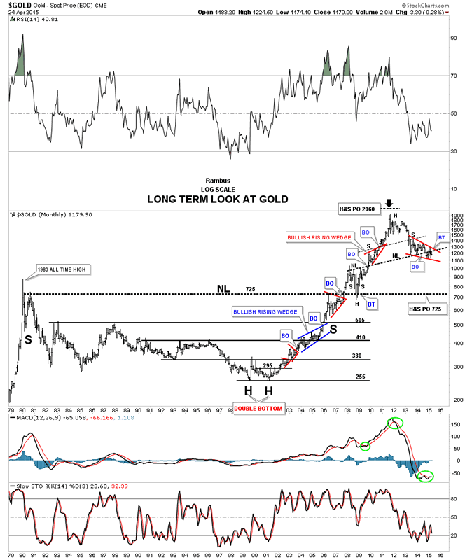
This last long term look at gold goes all the way back to the 1980 high and shows the bear market that ensued that lasted until to the double bottom was put in place in 2000. You can see how the left side of the chart played a key role in how the bull market found support and resistance. Note the neckline at 725 which held resistance on the initial hit in 2007, declined a little bit and then broke through in grand fashion but ran out of gas with the onset of the 2008 crash. Gold found support right where you would expect to find it, right on the neckline taken from the first reaction high off of the 1980 bull market. What is interesting is the H&S top, you see at the top of the chart, has a price objective down to the 725 area which would be a logical place for a bottom of some kind to form.
Monthly Gold Chart 4
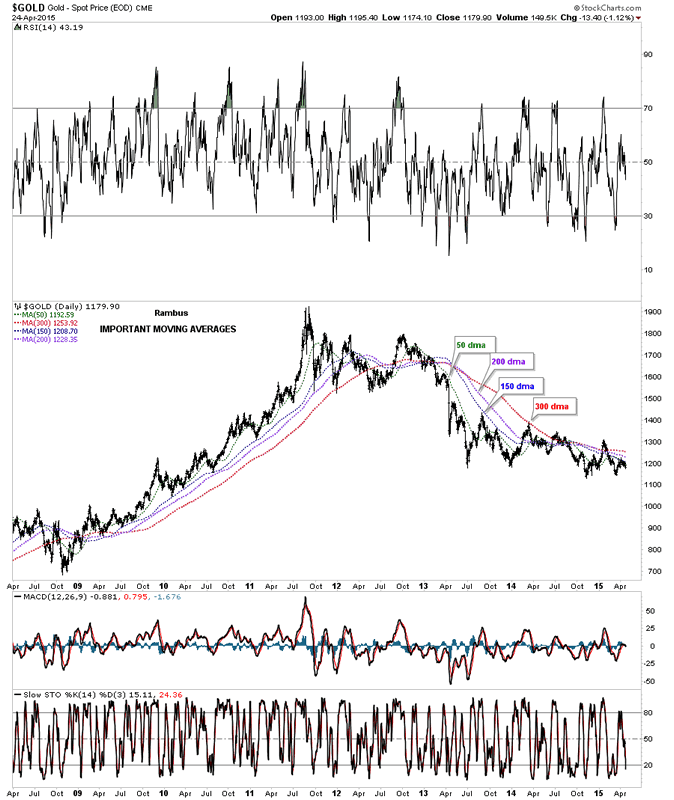
The next chart is a long term daily look that shows the most important moving averages for gold. As of today gold is trading below all four moving averages.
Daily Gold Chart 2
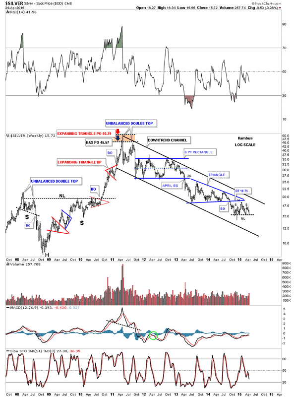
Lets now look at a couple of long term charts for silver that shows the big picture. This first chart is a weekly look that shows silver built out a H&S consolidation pattern during the 2008 crash which led to its parabolic run to fifty. The brown shaded area at the top of the chart shows two price objective based on two different methods. The little red expanding triangle halfway pattern was the key to finding those price objectives. This chart shows you how much weaker silver has been vs gold as it broke down below it last consolidation pattern, the blue triangle last year. Gold still hasn't broken below it huge consolidation pattern but it looks like it's getting close. As you can see silver has been in a nice defined downtrend channel during its bear market. It still remains to be seen yet but it looks like silver is building a small H&S consolidation pattern similar to the one we looked at on some of the PM stock indexes.
Weekly Silver Chart
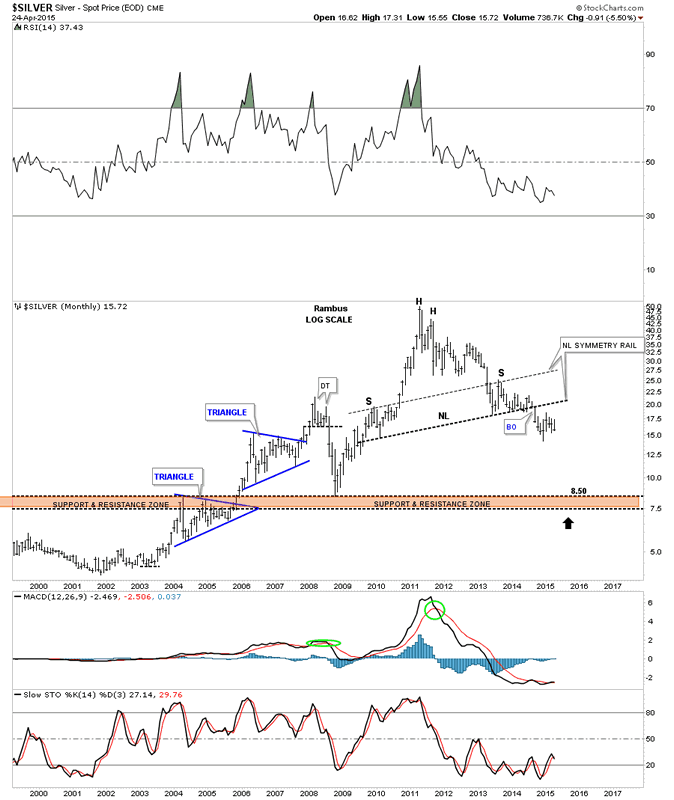
It's has been awhile since I showed you this long term monthly chart for silver that shows a very large H&S top that it has already broken down from. The brown shaded S&R zone is where I would expect silver to find support during the next impulse move down. Note the neckline symmetry rail that showed the height for the right shoulder that is just a parallel neckline moved up to the top of the left shoulder. It won't take much of a move down for silver to reach brand new lows going back to 2009 or so.
Monthly Silver Chart
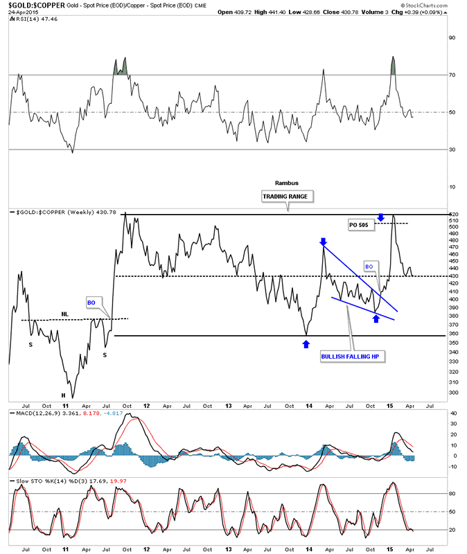
Now I would like to show you some ratio charts. The first ratio chart I compare gold to copper that looks like the ratio maybe topping out. The reason I say that is because the price objective of the blue falling wedge is right up there at the top of the big trading range. You can see how quickly this ratio has turned down meaning copper is outperforming gold at this moment.
Gold:Copper Weekly Chart
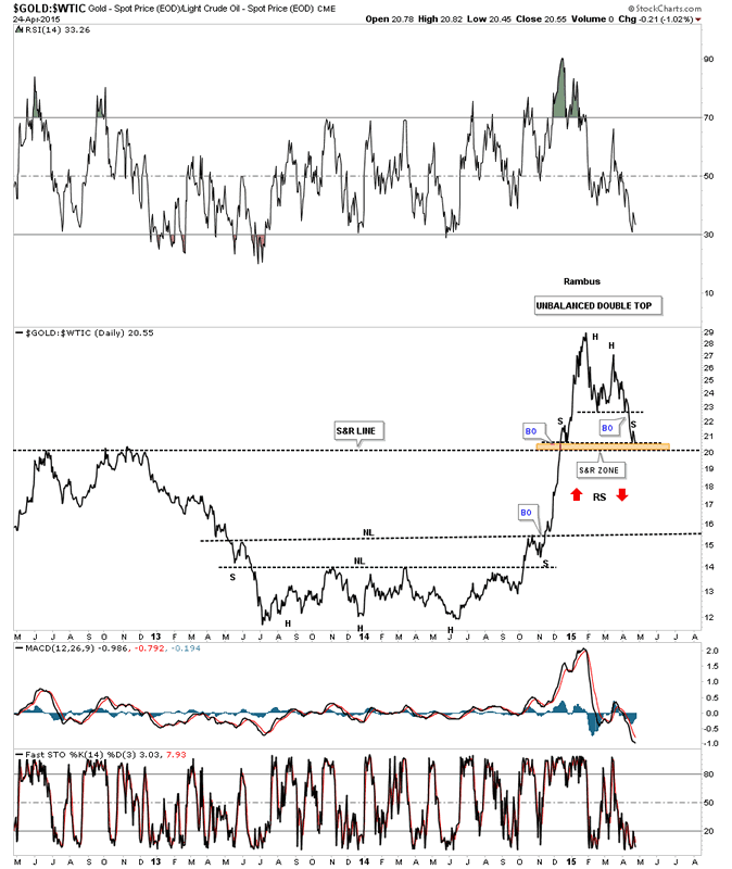
I have to say I find this next ratio chart which compares gold to oil quite interesting. Last year when oil was in a parabolic decline this ratio spiked up in a parabolic rally even though gold didn't really do that much. It was the decline in oil itself that cause this spike in the ratio chart. If there was ever a place to look for some reverse symmetry this chart is showing the setup is there. Right now this ratio is finding some initial support at the previous highs made back in 2012. If this ratio breaks below the brown shaded S&R zone there will be little in the way to hold back the decline once it gets started. The neckline from the H&S bottom would be the first area to offer some support.
Gold:WTIC Daily Chart
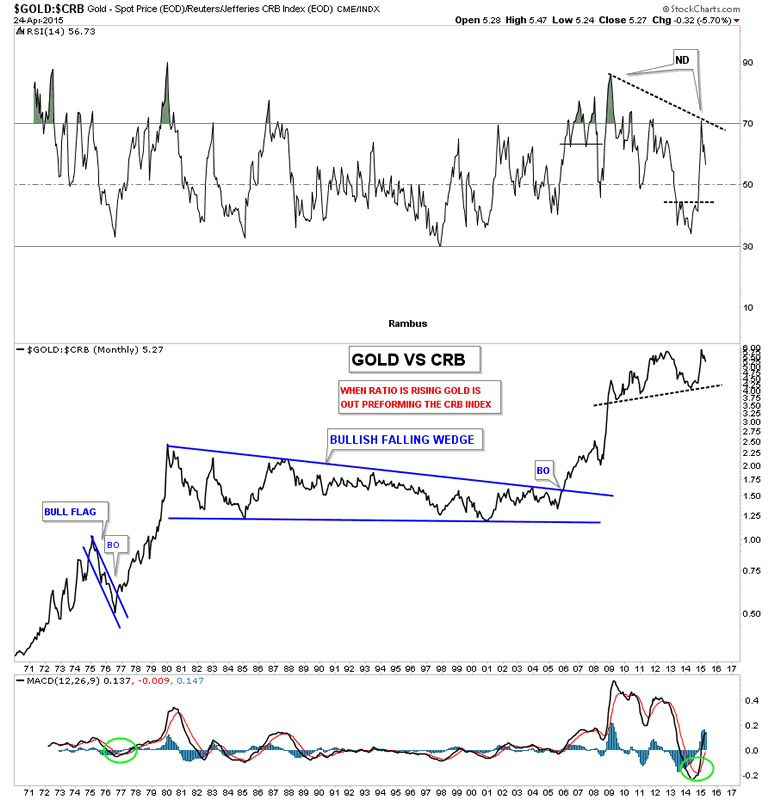
This next chart I compare gold to the CRB index which is holding up the best so far. I put a S&R line just below what could be a top as shown by the negative divergence on the RSI indicator at the very top of the chart. A top won't be confirmed tho until the S&R line is broken to the downside. It's just a possibility right now.
Gold:CRB Monthly Chart
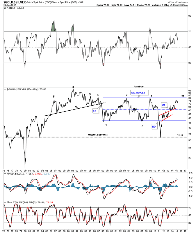
Next I would like to compare gold to silver which shows this ratio rising which means gold is outperforming silver. What is interesting about this ratio chart is it's getting up to the top of the 17 year trading range. It has taken four years to go from the bottom, when silver made its parabolic move to 50, to the top of the trading range around the 81 area.
Gold:Silver Monthly Chart
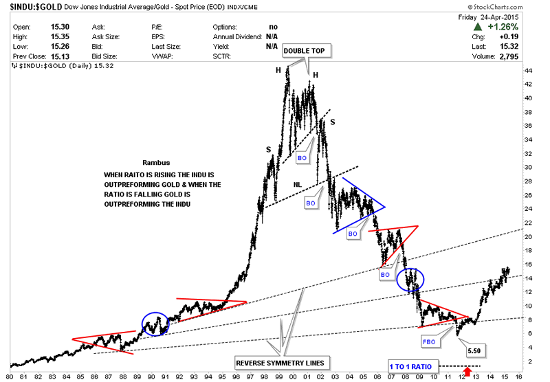
This next very long term ratio chart I'm going to compare the INDU to gold so you can see how this ratio works in bull and bear markets. When this ratio is rising the INDU is outperform gold. Note the parabolic move this ratio had in the 1990's when the bull market was in full force in the INDU. Then the reversal of fortunes, in 2000, which the INDU topped and gold bottomed. This ratio bottomed in 2011 at 5.50. I know many goldbugs were looking for the ratio to go down to 1 : 1 like in 1980 but they got left holding the bag waiting for the 1 : 1 ratio to come into play. This ratio chart shows the INDU outperforming gold since the middle of 2011.
Dow/Gold ratio Daily Chart Since 1980
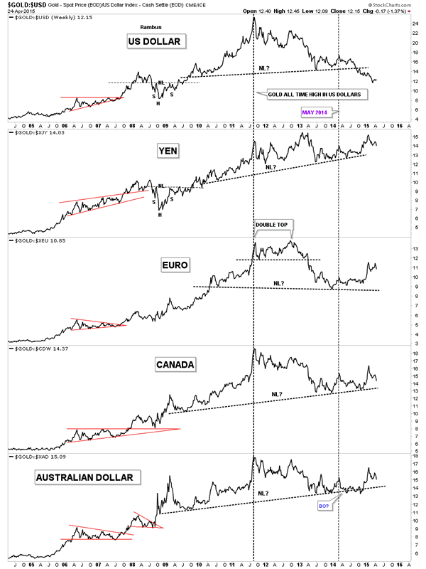
Now I would like to show you a few combo charts. This first one shows gold in many of the most important currencies of the world. What's interesting but not unexpected is gold in US dollars is the weakest of the currencies. As you can see it's trading well be low its neckline. All the other currencies have had a good bounce off of their necklines but they look like they could be building out at least a short term top since the first of the year.
Gold/US Dollar Chart
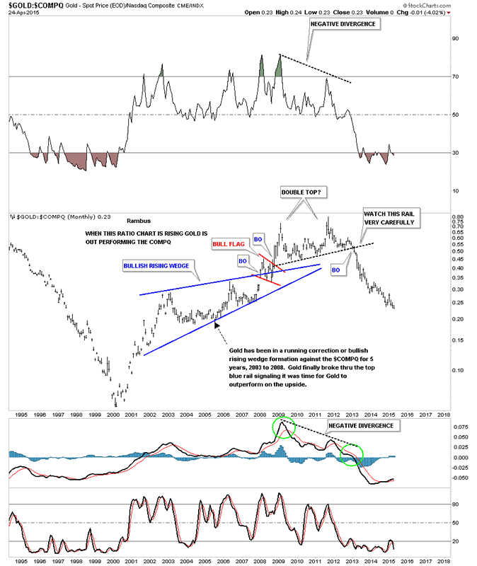
This next combo chart I compare gold to the COMPQ which are the tech stocks. As you can see it's making a multi year low this month.
Gold/NASDAQ Monthly Chart
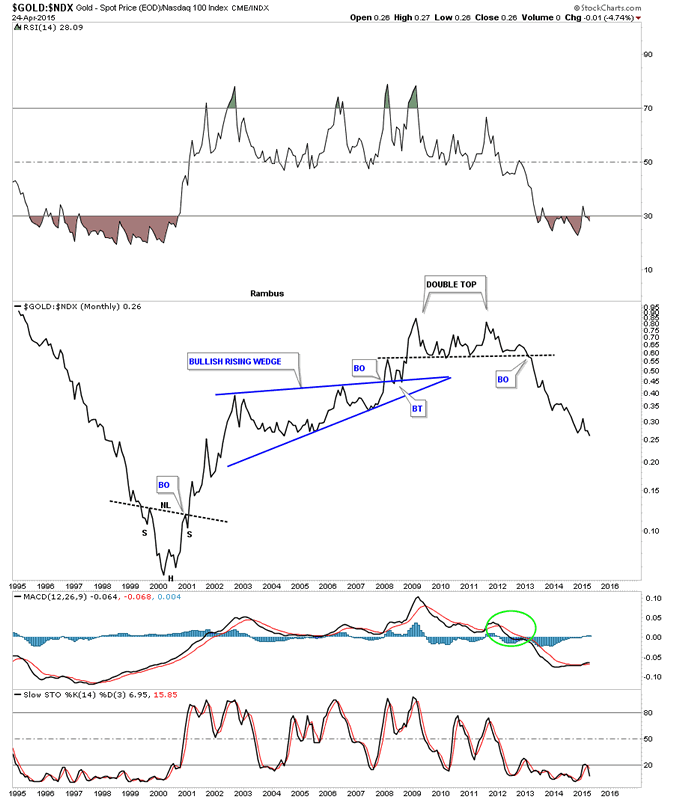
Gold:NDX 100:
Gold/NASDAQ 100 Monthly Chart
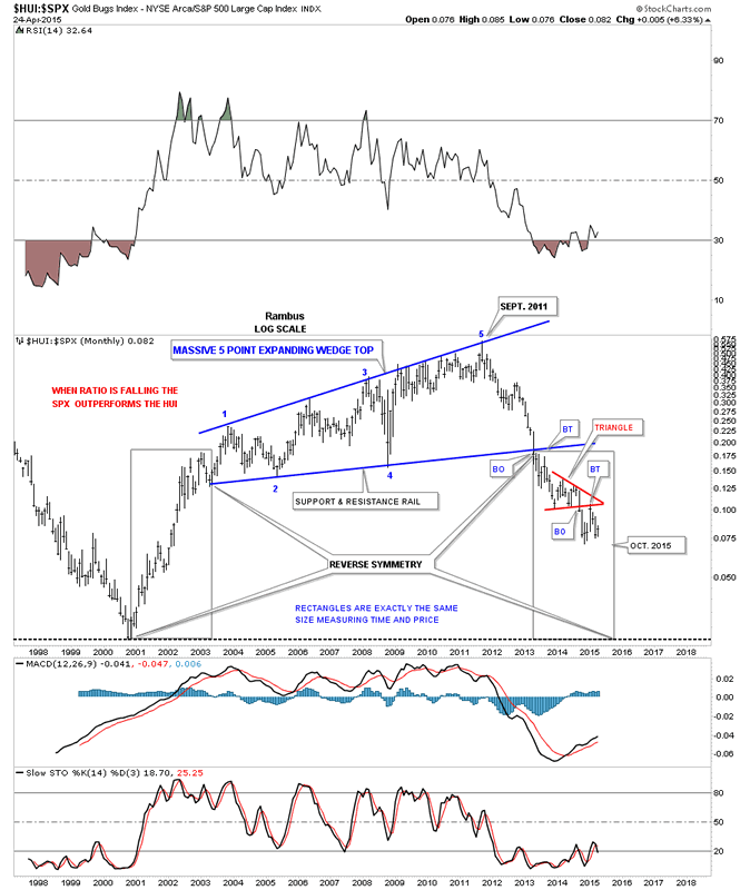
Now lets see how the HUI is performing against the SPX. Some of you may remember this long term monthly chart when I first showed the price action breaking down below the bottom rail of the blue massive 5 point bearish expanding rising wedge. It still remains to be seen yet if the time and price rectangles will play out with a low sometime around October of this year. This ratio is going to have to get into gear as there are only about six months left for the ratio to achieve its goal.
HUI:SPX Monthly Chart
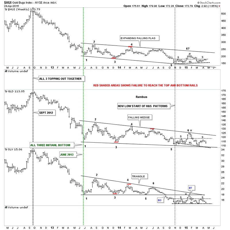
This next combo chart I've been posting every other week or so as it shows how the HUI on top, GLD in the middle and SLV on the bottom are following each other in a similar fashion, not exactly but pretty close. On the far right hand side of the chart you can see all three are building out potential H&S consolidation patterns. None have broken their neckline yet but it looks like silver will be the first one to do so as it's sitting very close to its neckline compared to the other two.
Gold Bugs Index Weekly Chart
This last combo chart we'll look at is a line chart that has gold on top and silver on the bottom. On the left side of the chart you can see that silver topped out in April of 2011 while gold didn't top out until September of that same year. Here you can see how they tend to top and move together even though silver is leading gold lower, red dashed vertical lines. The million dollar question is are these two building out a H&S consolidation pattern ?
And there you have it. Long Term Charts trump everything. Keep them in mind every day.
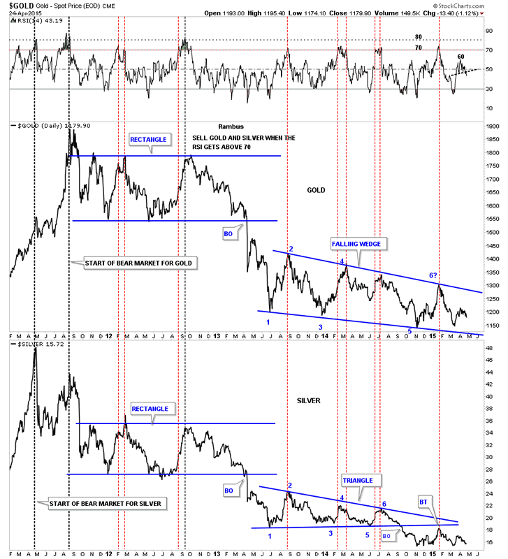
Gold and Silver Daily Charts
All the best
Gary (for Rambus Chartology)
FREE TRIAL - http://rambus1.com/?page_id=10
© 2015 Copyright Rambus- All Rights Reserved
Disclaimer: The above is a matter of opinion provided for general information purposes only and is not intended as investment advice. Information and analysis above are derived from sources and utilising methods believed to be reliable, but we cannot accept responsibility for any losses you may incur as a result of this analysis. Individuals should consult with their personal financial advisors.
© 2005-2022 http://www.MarketOracle.co.uk - The Market Oracle is a FREE Daily Financial Markets Analysis & Forecasting online publication.