


Gold vs Stocks Macro Changes
Stock-Markets / Financial Markets 2016 Feb 08, 2016 - 05:00 PM GMTBy: Gary_Tanashian

 A picture is worth 4-plus years and thousands of words, and the picture below has a lot to say. I'll say some words as well, since I have kept them bottled up for years in an effort to make sure we operate with discipline as opposed to gold bug style emotion.
The bear market and subsequent inflation-fueled credit bubble early last decade was when I first started paying close attention to macro markets (as opposed to stock trading, which I had done for a few years prior) and how they operate. Having seen well paid professionals lose half of my IRA in 2002, I took over all of our finances and never looked back. But I needed to understand how markets worked and that has been a challenging and rewarding endeavor, not to mention an ongoing learning experience.
I use talky charts like the one below because I need to be talked to, or coached. But I need this coaching to be 100% honest and accurate, not the ranting of some biased lunatic who would have me buy in to his world view. The chart below honestly shows exactly what gold did vs. the S&P 500 during the 2007-2009 US crisis, the Euro crisis and subsequently, the aftermath of unprecedented policy interference in financial markets.
Why care about what gold did vs. the S&P 500? Because it is perhaps the best macro signpost I know of when trying to determine what sort of macro phase we are in. Conventional economists and analysts advise riding out the correction, imploring people to remain calm and hold stocks for the long-term, while this chart is opening the prospect of a cyclical change, as in a counter cyclical change.
I call financial services professionals "conventional" because the vast majority are always going to keep their clients buying and selling stocks or simply holding long, depending on how their compensation is best served. Brokers want trading, fund companies want holding (and buying the dips) and sales people of all stripes want to keep you in the game at all costs. Eventually, they will puke. But if the macro is changing as this and other charts seem to imply, their puke point will come only after more pain stimulates and reinforces their (and especially their clients') fear.
Interlude: As if by divine intervention this headline of an article written by a CFA just showed up in my inbox as the lead item from Contrary Indicator Central, AKA Seeking Alpha: The Stock Market Decline is Entering its Puke Phase. The market will bounce (sometimes strongly) several times along the way, but when the final puke comes 99% of CFA's are not going to be calling it.
I don't play the conventional game. I use 'talky' charts like the one below to tell me that Alan Greenspan instigated a bubble in commercial credit, which spoon fed liquidity into asset markets and eventually encouraged enough risky behavior and leveraged speculation by our buttoned down friends in the various financial services industries (using other peoples' money) that the whole thing (boom) needed to be flushed (bust).
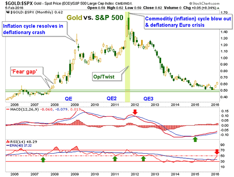
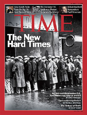
Gold, as a risk 'off' asset was preeminent during the resolution of the excess. That is the counter-cycle. But the 2007-2009 risk 'off' phase went too far and even a person as negative on the methods used by policy makers as your letter writer had to become bullish in the face of Time Magazine 's The New Hard Times headline, complete with a soup line of displaced workers. From NFTRH 9 on November 22, 2008...
"Okay, everybody's got the memo; deflationary depression it is. Well not everybody... I'll go with the old pros [ed: my late friend Jonathan Auerbach and a veteran trader who came out of retirement to work at Jon's shop due to the bullish opportunity] and stick to my story that there will be recovery - born of inflation - and there will be places to invest and places to avoid. With the entire world now expert on deflation and 1930's history, I have got to believe we have a huge counterparty of 'sissies' [Jon's term for weak hands and fearful market participants] waiting to take the other side of the trade.
I personally believe any coming stock market rebound is a trade only and things could get worse before they get better [they got worse, into March 2009]. But if I were a deflationist I would be uncomfortable with the level the major media and by extension, the public are up to speed on the concept just as I was uncomfortable with every Tom, Dick and Harry on board the inflation express."
The point of this segment is not to brag about being a successful contrarian. Honestly, that is how I am wired anyway and it has not always worked to my benefit. For instance, I was unable to get contrary to my own belief system and take significant advantage of the massive stock bull market that I believe was created out of unsound policy.
But I do have the patience of an elephant and I have kept charts like the above, and especially its message, in mind every step of the way. The chart goes on to say that Operation Twist successfully "sanitized" (the Fed's word) inflation signals, just happened to coincide with a global deflationary phase, a 'best of all worlds' Goldilocks phase in the US and best of all, for those revived conventionalists now operating with the public's confidence once again, put risk 'off' gold on the outs.
The chart says gold may be coming back on the ins relative to the S&P 500 after an unprecedented phase of über confidence reset the picture and nullified the lessons of 2008 for a vast majority of market participants. We've come full circle.
NFTRH 381 then went on to dial in the necessary up to the minute info on the precious metals move, US and global stock markets' technical status, bonds, currencies and perhaps most important of all, the macro indicators that steadily guided us to this point over the last year.
Subscribe to NFTRH Premium for your 25-35 page weekly report, interim updates (including Key ETF charts) and NFTRH+ chart and trade ideas or the free eLetter for an introduction to our work. Or simply keep up to date with plenty of public content at NFTRH.com and Biiwii.com.
By Gary Tanashian
© 2016 Copyright Gary Tanashian - All Rights Reserved
Disclaimer: The above is a matter of opinion provided for general information purposes only and is not intended as investment advice. Information and analysis above are derived from sources and utilising methods believed to be reliable, but we cannot accept responsibility for any losses you may incur as a result of this analysis. Individuals should consult with their personal financial advisors.
Gary Tanashian Archive |
© 2005-2022 http://www.MarketOracle.co.uk - The Market Oracle is a FREE Daily Financial Markets Analysis & Forecasting online publication.