


An Honest Look at Gold Chartology
Commodities / Gold and Silver 2016 Nov 21, 2016 - 12:03 PM GMT

 For the last two weeks, since the US elections, we’ve been discussing the possibility of strong inflection points building out on many different areas of the markets. These are areas where the markets can turn on a dime leaving those folks looking one way while the markets go the opposite way. Important inflection points are more of a price thing than a time thing. An inflection point can last days or weeks before they finally resolve themselves.
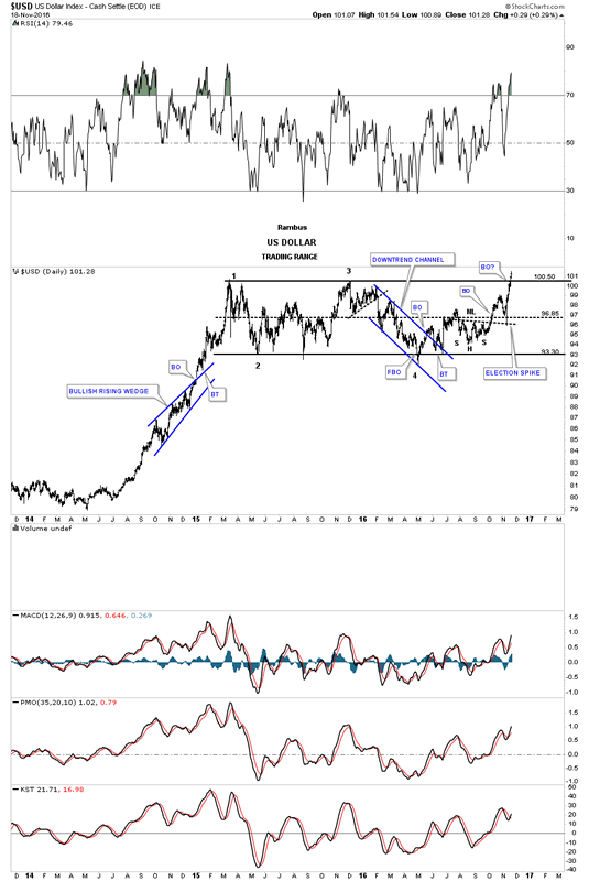
Lets start by looking at the US dollar, as it plays such a key role in so many markets. Below is a three year daily chart which shows its major impulse leg up out of the mid 2014 low, and topped out in the spring of 2015. For just under two years the US dollar has been chopping out a sideways trading range, rectangle consolidation pattern, and closed above the top rail this week. The breakout is not actually confirmed yet as the price action would have to close above the 103 area and then a backtest to the top rail around 100 would have to hold. For the time being, we have to give the benefit of a doubt, to the US dollar bulls until proven otherwise.
There is one thing I would like you to show you before we move on and that is the backtest to the neckline, which occurred during the US elections. That sharp reversal off the neckline needs to be respected, as that spike shows up in other areas of the markets.
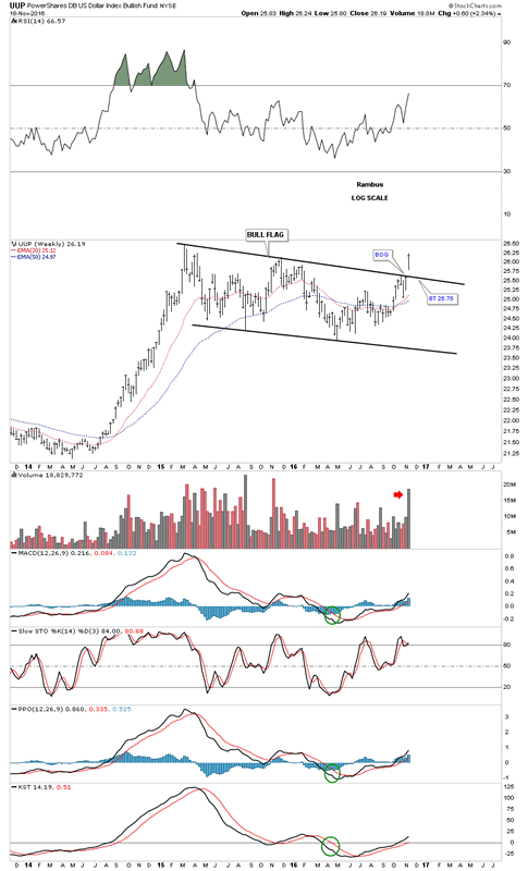
I’m going to skip over the longer term charts for the $USD, as we have been following them pretty closely. There are two other proxy’s for the $USD I would like to show you which may be giving us some confirmation the breakout may be the real thing. Below is a weekly chart for the UUP, which shows its sideways trading range as a bull flag. Note the big breakout gap that occurred last week on heavy volume. A backtest to the top rail would come in around the 25.75 area, which should be expected but not required.
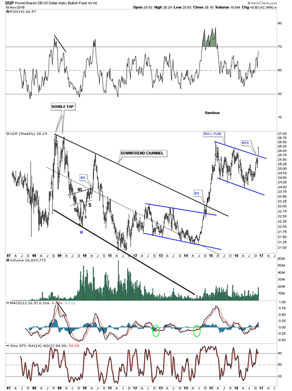
This next chart for the UUP is a longer term weekly look, which puts the bull flag in perspective. Again, if the UUP is truly breaking out in its next impulse leg up then we should see the backtest hold support at the top rail at 25.75. We have a very clean line in the sand, above the top rail is bullish and below is bearish.
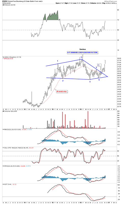
The USDU is another index I like to track for the US dollar. The USDU has a more equal weighting than the $USD. This proxy for the USD actually broke out of a six point diamond consolidation pattern about eight weeks ago. Note how the 30 week ema has done a good job of showing us where support and resistance comes into play. To really confirm the next impulse leg up is truly underway, we’ll need to see the price action takeout the old high at reversal point #3. As the charts above show, this is the strongest the US dollar has been since the beginning of the last impulse leg up in the summer of 2014.
Keeping these US dollar charts in the back of your mind I would like to show you what I think may be happening in the precious metals complex. First, I’m fully aware that the PM complex and the US dollar can rise in tandem for short periods of time, but in a general sense they pretty much move opposite to each other. As I have stated many times in the past, “the only rule in the markets is, there are no rules.” This is an important concept to understand. It means there are no guarantees of what may have worked previously will work again.
This next statement may sound a bit counter intuitive, but one has to have a game plan, right or wrong, in which to invest in the markets. As long as ones game plan keeps working you stay the course, but when you start to see things develop that shouldn’t be, then you have to reassess the situation with an open mind and figure out why the original game plan is not working as it should. This can be one of the toughest parts of trading, knowing when something might not be working out as originally expected. One has to be totally honest with themselves in order to see the charts for what they may be showing. It’s easy to sweep the dirt under a rug but that doesn’t solve the problem it just masks the problem, so keeping an open mind is critical in understanding what a chart may be showing you.
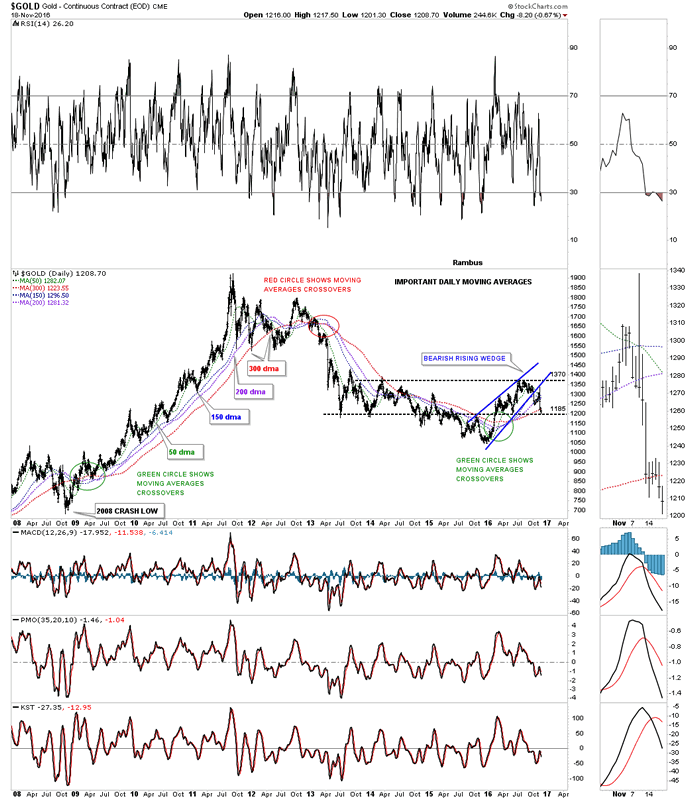
Now that we have that out of the way lets look at some charts for gold, which hasn’t been behaving very well lately. Last week we looked at the important moving averages chart, which as of Thursday shows gold is now trading below all the moving averages including the 300 day moving average. It’s not the end of the world but it does throw up a red flag as the 300 day moving average has done an excellent job of holding support during the bull markets years.
Less than two weeks ago, before the US elections, gold along with the rest of the PM complex looked fairly healthy, but that now looks deceptive. Below is a daily chart for gold which shows a black bearish rising wedge. You can see the initial breakdown was pretty strong, but on the night of the elections gold put on one of the biggest rallies in years, which we can now see was a backtest to the underside of the black bearish rising wedge. That is the same spike we looked at on the US dollar chart. You can see the 50 day ma has already crossed below the 150 day ma, and is close to breaking below the 200 day ma. This is not what you want to see during an impulse leg up. Also, gold has now closed two days in a row below the 300 day moving average, which is definitely something you don’t want to see during a bull market.
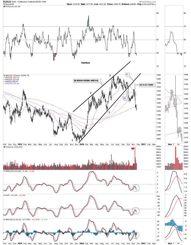
This next long term daily chart for gold shows a possible horizontal trading range that may develop between 1370 and 1185 to match the left side of the chart. There is one issue with that scenario. The price objective for the bearish rising wedge would measure down to the beginning of the bearish rising wedge, which would put gold at the December 2015 low at 1050 or so.
As we move further out in time by looking at the eight year weekly chart for gold you can see how the bearish rising wedge fits into the big picture. On the positive side there is the top rail of the three year falling wedge, which comes into play at the 1165 area. Gold also broke below the 65 week ema which usually does a good job of holding support during a bull market. Also note the indicators at the bottom of the chart, which are starting to roll over.
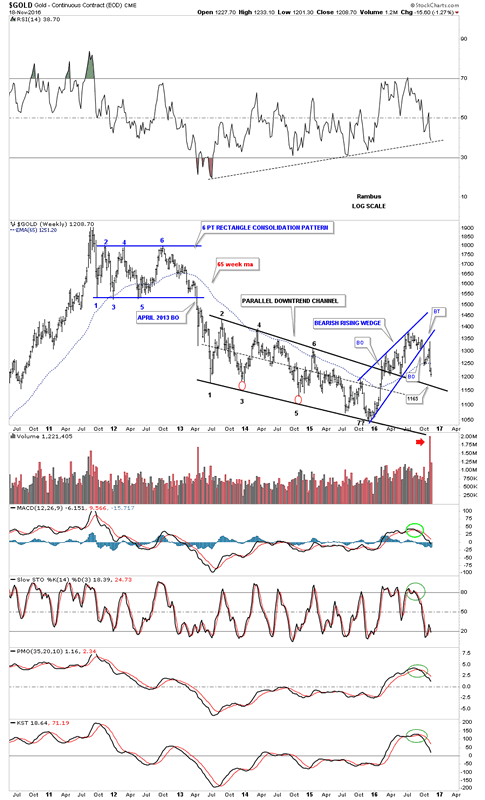
I’m going to start putting the pieces of the puzzle together by looking at this next weekly chart for gold which begins to show you a potential bearish setup taking place if the 1185 area fails to hold support. Note the top rail of the bear market downtrend line that began to form in September of 2011. What makes that top rail so compelling is the way the price action interacted with it, just before and right after the US elections. I’ve shown you on the daily combo chart for the PM complex the possible H&S tops that may be forming. I don’t show it on this chart, but the potential H&S top would be forming just below the top rail of the downtrend line, which is another reversal pattern forming at a most critical place. Some of you may be starting to see a potentially very large pattern developing, which I don’t believe anyone else sees yet.
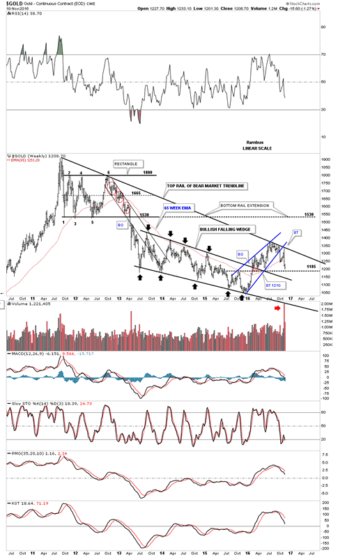
I’ve been showing you this next chart for gold’s bear market since the 2011 top which shows an expanding falling wedge. Inside the expanding falling wedge is a rectangle consolidation pattern toward the top of the chart, and the seven point bullish falling wedge reversal pattern at the bottom of the chart. Up until the US elections everything looked fine with a backtest to the top rail at 1240 in place. As you can see, the price action closed out the week below that important top rail, which is not what I wanted to see at this point in time. Until last Thursday it looked like the top rail was going to hold support, but that day marked the break below the top rail and the 300 day moving average, which has to make one question what’s going on.
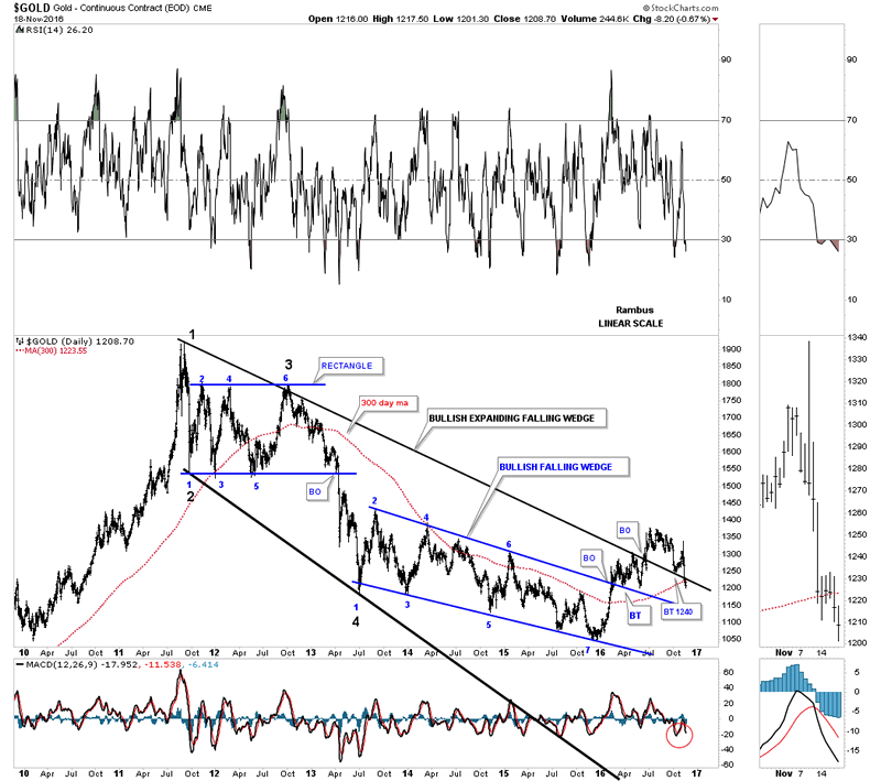
We are now at the point where we have to be honest with ourselves and put away all our preconceived notions of what we believe is really taking place in the PM complex. As they say, “honesty is the best policy.” Believe me I don’t like this next chart anymore than anyone else but the potential is there for one more move lower in gold”s bear market. When you look at the Chartology of the black falling wedge it begins to make some sense. A move to the bottom rail would come in around 975 which would create panic in the bull camp, and euphoria in the bear camp. It would also complete the all important fourth reversal point which is needed to create a consolidation pattern. Gold will still be in a bull market with a slightly different consolidation pattern. Note the price action at reversal point #3 with the hit at the top rail, and the breakout below the bottom rail of the blue rising wedge we looked at earlier. The inflection point is the backtest to the blue rising wedge that was made on election night.
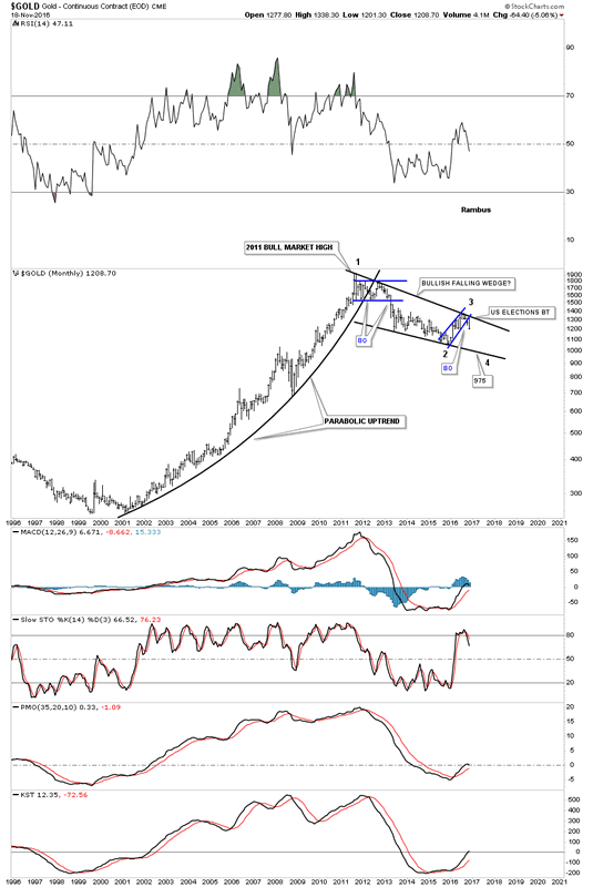
This next chart is a long term monthly look at gold which shows its bull market uptrend channel we’ve been following that is still in play, as long as the bottom rail holds support at the 1125 area. There is still a week and a half to trade this month but for the moment gold is trading under its 10 month ema, which is a negative. gold-major-uptrend-channel
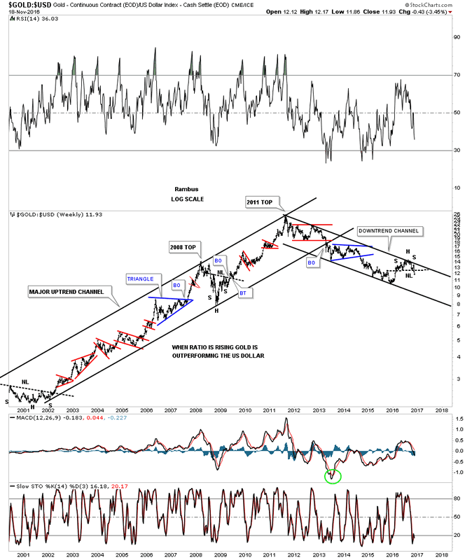
The potential negative looking charts above are predicated on a strong US dollar breaking out of its year and a half trading range. Below is a ratio chart which compares gold to the US dollar. When the ratio is rising gold is outperforming the US dollar and vice versa. You can see this ratio topped out in 2011 along with the rest of the PM complex and has been building out a parallel downtrend channel. Note the small H&S top which just broke down last week. That was bearish.
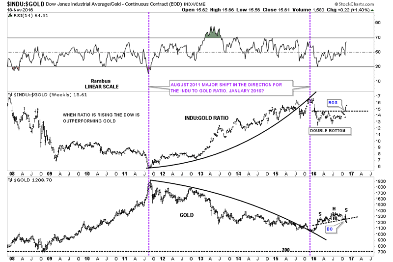
Below is a ratio combo chart with the INDU:GOLD on top and gold on the bottom. This chart shows how these two tend to move opposite to each other, not always but in general. Note the big breakout gap that occurred less that two weeks ago on the ratio chart on top, and how gold broke below its neckline at the same time. Was that just a coincidence? I doubt it.
I have many more charts I could post to make a case for caution ahead in the PM complex. It’s not what I want that matters, it’s what the PM complex wants that matters. There is no doubt that the price action since the August highs in the PM complex has stumped most trading disciplines. Sometimes the markets are tough to trade but having a game plan to follow is critical in understanding what to do, right or wrong. Up until two weeks ago the PM complex looked like it was ready to move higher right after the elections, but the price action has shown us a potential different scenario, which we need to heed.
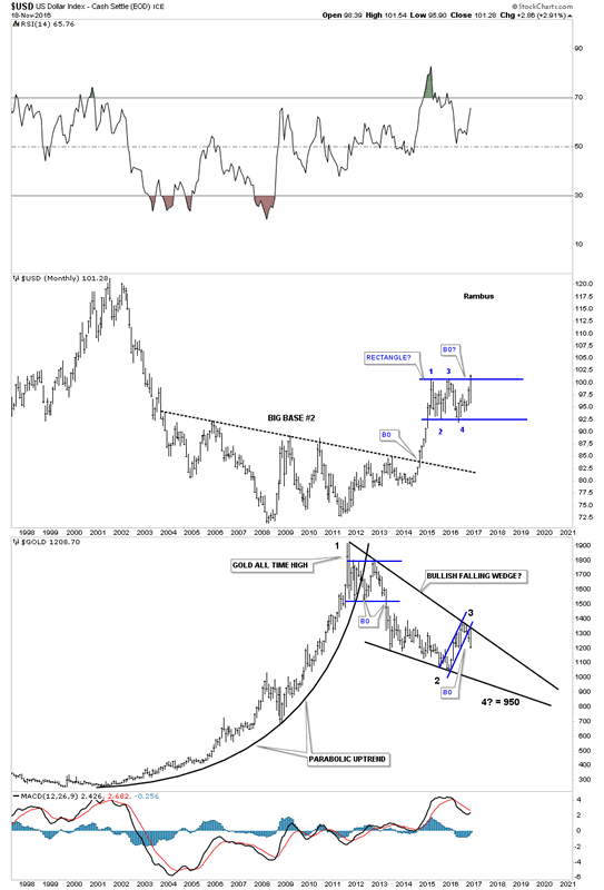
This last chart for tonight is a combo chart which puts everything in perspective. On top is the USD and on the bottom is GOLD. I’m not going to argue with what this combo chart is strongly suggesting, which is that the US dollar is breaking out from a big rectangle consolidation pattern, and gold is breaking down from the top rail of a, what we can still call, a bullish falling wedge. I know this Weekend Report isn’t what everyone wants to see but it’s an honest opinion of what may take place over the coming weeks. All the best…Rambus
All the best
Gary (for Rambus Chartology)
FREE TRIAL - http://rambus1.com/?page_id=10
© 2016 Copyright Rambus- All Rights Reserved
Disclaimer: The above is a matter of opinion provided for general information purposes only and is not intended as investment advice. Information and analysis above are derived from sources and utilising methods believed to be reliable, but we cannot accept responsibility for any losses you may incur as a result of this analysis. Individuals should consult with their personal financial advisors.
© 2005-2022 http://www.MarketOracle.co.uk - The Market Oracle is a FREE Daily Financial Markets Analysis & Forecasting online publication.