


Value Line Geometric and Arithmetic Averages
Stock-Markets / Stock Markets 2011 Jan 23, 2011 - 11:44 AM GMTBy: Tony_Caldaro

 Value Line maintains two averages of the universe of stocks that it tracks. The Arithmetic average tracks the average percentage change of all stocks in its index. Naturally, small and midcap stocks will usually move in greater percentages than large cap stocks during a bull and bear markets. It takes a lot more money to move large caps than small/mid caps. The chart below illustrates this index since its inception in 1988.
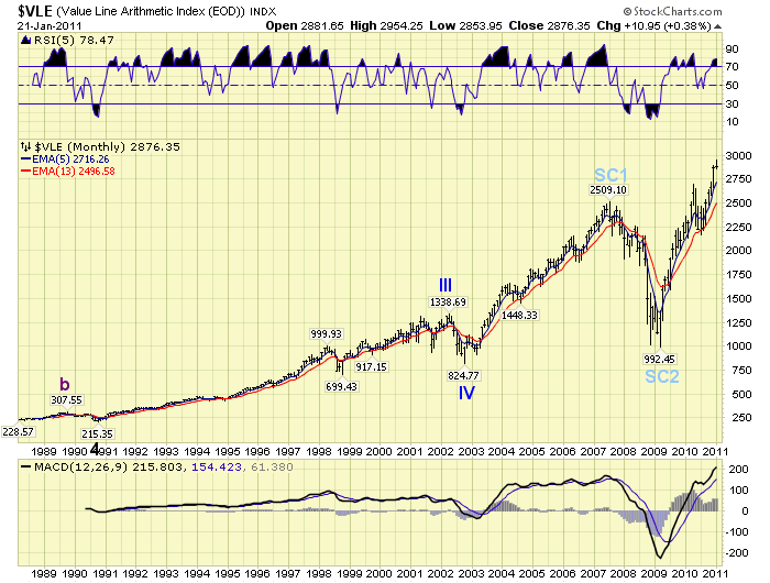
Notice it generally moves with the overall market, but not always. Case in point. From 1988 – 2000 it tracked the general markets. In 2000 when the general market entered a 34 month bear market into October 2002, this index continued to rise until early 2002 before correcting and bottoming in late 2002. After that this index has again somewhat followed the general market. What this chart suggests is that it is a good index to track the strength in small/mid cap stocks in relation to the overall market. It is not a good index to track the overall strength of the general market.
Value Line’s Geometric index tracks the same universe of stocks with emphasis on the geometric mean in relation to each stocks market capitalization. In other words it is more representive of the actual strength of the general market than the simple percentage average of the Arithmetic index. In fact, as you will observe, it is quite a useful index to track especially during bull markets. The chart below displays its price action since 1980. It offers lots of technical information, as well as, a very nice OEW wave count that generally tracks the market.
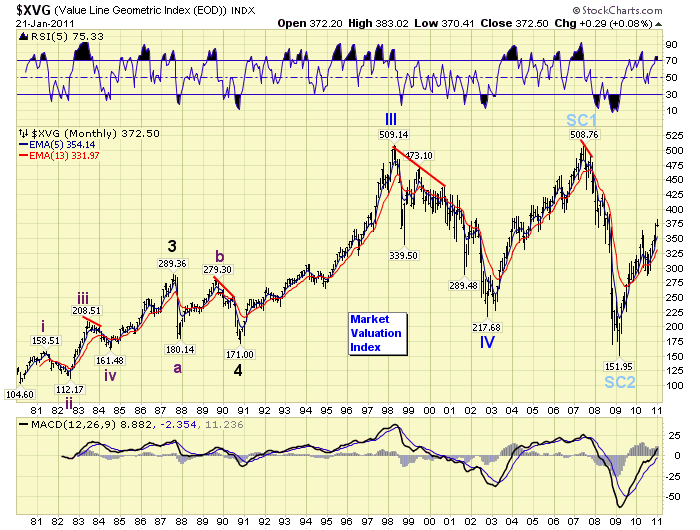
The first observation is that the wave count from 1980 is slightly different in structure than the general markets SPX/DOW. There is good reason for this. This index is not tracking price performance like the general indices. It is tracking market valuation! Let’s start at the beginning of the chart.
Nothing of significance occurs until 1983. Notice as the DOW, (chart below), rose into late 1983 this index was displaying a negative divergence for several months. What this suggests is the market hit an overvaluation level in mid-1983 and as the market continued to rally in late 1983 it became more and more overvalued. This typically occurs in fifth waves in OEW terms. And, that continuation in price appreciation was a fifth wave. A 20% market correction followed. Over the next 25 years every market peak, with one exception, displayed the same type of negative divergence. The only exception, oddly enough, was 1987. We continue comparing the VLG to the DOW. We’re using the DOW instead of the SPX because up until the mid to late 1990′s the DOW was considered the bellwether index for the US market.
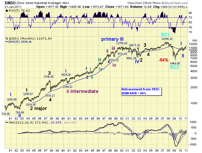
After the market crashed in 1987 the DOW dropped down to 1986 levels, but the VLG dropped to 1984 valuation levels. The market was now undervalued in relative terms and a bull market followed. In late-1989 the VLG failed to even reach the valuation peak of 1987 when it started negatively diverging again. This time about 9 months ahead of the fifth wave market top in mid-1990. The market corrected 20% in 1990, but the VLG dropped below its 1987 low. The market was now extremely undervalued. What then followed was the spectacular bull market of the 1990′s.
In 1998 the VLG hit its valuation peak and started diverging again. Yet, this was the dotcom bubble boom and the DOW continued to rise for two years thereafter. Charts display a fifth wave blowoff from 1998-2000. What followed, after the price peak in 2000, was a 40% decline in the DOW but a 60% decline in valuation levels in the VLG. Valuations levels hit an extreme in 1998, continued to get stretched as the market rose into 2000, and then collapsed into 2002. While the DOW only declined to 1997 price levels the VLG dropped to 1990 valuation levels. Another bull market followed.
The 2002-2007 bull market in price took the DOW about 30% over the 2000 peak. The VLG reached the same level as the 2000 peak before it started to negatively diverge again in mid-2007. The bear market that followed, (2007-2009), took the DOW back to 1996 price levels. Yet, the VLG dropped to 1982 valuation levels. Stocks were now extremely undervalued. Currently, in this new bull market, the DOW is about 16% below its 2007 peak. Yet, the VLG has only retraced a bit more than 50% of its 2007-2009 decline. This suggests, taking its entire 30 year range between 1981 and 2000/2007, that stocks are fairly valued at current prices. Not undervalued, nor overvalued.
Fortunately the VLG unfolds in waves just like the general market. These waves can be quantified and labeled using OEW. In essence, we can now track market valuation as it unfolds during bull and bear markets. We are adding this index to our public charts just under the NYAD (market breadth) on page 6 of our chart link:
CHARTS: http://stockcharts.com/def/servlet/Favorites.CServlet?obj=ID1606987
http://caldaroew.spaces.live.com
After about 40 years of investing in the markets one learns that the markets are constantly changing, not only in price, but in what drives the markets. In the 1960s, the Nifty Fifty were the leaders of the stock market. In the 1970s, stock selection using Technical Analysis was important, as the market stayed with a trading range for the entire decade. In the 1980s, the market finally broke out of it doldrums, as the DOW broke through 1100 in 1982, and launched the greatest bull market on record.
Sharing is an important aspect of a life. Over 100 people have joined our group, from all walks of life, covering twenty three countries across the globe. It's been the most fun I have ever had in the market. Sharing uncommon knowledge, with investors. In hope of aiding them in finding their financial independence.
Copyright © 2011 Tony Caldaro - All Rights Reserved Disclaimer: The above is a matter of opinion provided for general information purposes only and is not intended as investment advice. Information and analysis above are derived from sources and utilising methods believed to be reliable, but we cannot accept responsibility for any losses you may incur as a result of this analysis. Individuals should consult with their personal financial advisors.
© 2005-2022 http://www.MarketOracle.co.uk - The Market Oracle is a FREE Daily Financial Markets Analysis & Forecasting online publication.