


These 6 Charts Show Why the Average American Is Fed Up
Economics / US Economy Aug 18, 2016 - 03:48 PM GMTBy: John_Mauldin

 BY JOHN MAULDIN writes: The last 20 years have brought great wealth to a few while most of the population was lucky to break even.
Whether you’re a member of the elite/protected class or one of the unprotected, it’s hard to deny this reality.
Household income is going nowhere
Here’s an update of Doug Short’s household income chart:
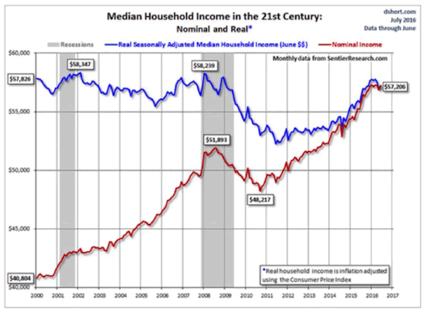
Inflation-adjusted household income (blue line) in the US has gone nowhere in the last 16 years. Notice also that it kept dropping even after we came out of the last recession (gray shaded area).
Keep in mind, this is the median, not the average. Half of households earn even less than this amount. Worse, the inflation adjustment is based on the Consumer Price Index, which we know has understated the real cost of living for most people.
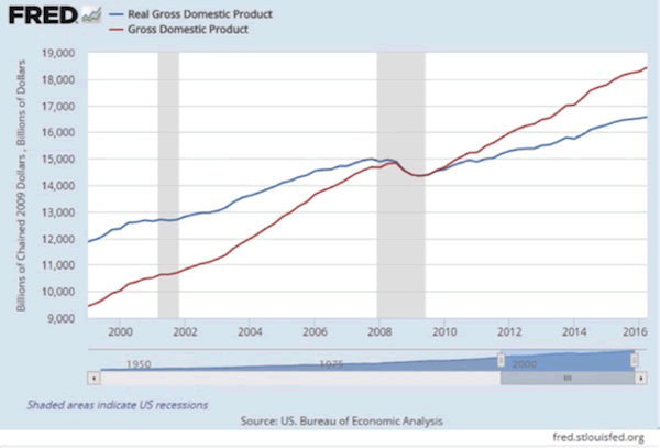
Is income flat because the economy hasn’t grown? Let’s take a look.
In the next chart, we have nominal and real (inflation-adjusted) GDP for the same period. Notice that in simple dollar terms the economy has roughly doubled in the past 18 years.
Not bad given two recessions, except for this fact. After you take out inflation, the economy has grown just a little more than 30%. This is roughly in line with 2%-a-year real GDP growth.
But wait, you say, the previous chart showed median income slightly down since 2000. As Master Po on the TV series Kung Fu would say, “Ah, Grasshopper, you must look deeper.”
If you do, you’ll see that GDP growth on a per capita basis (which accounts for population growth) is less than 17% since 2000. And it’s less than 2% since the beginning of the Great Recession.
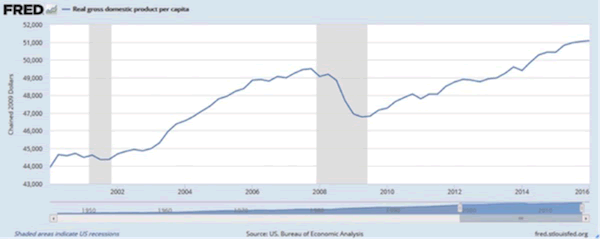
In chained 2009 dollars, per capita GDP was $43,935 in Q1 2000 vs. $51,090 in Q1 2016. So the economy grew over 16% in total, but most households saw little or no income growth.
Average household income has taken off for the top 10%
Here’s another chart, from Sydney-based Minack Advisors.
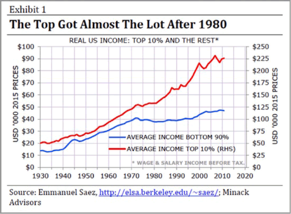
The first chart we looked at was median income. That’s what the person right in the middle made. That’s not average income, which is much higher.
The average (figured as the mathematically correct “mean family income” from the same St. Louis Fed database) was $88,765 as of the beginning of 2014. But remember, the top 10%, (and especially the top 1/10 of 1%) raise the average for everybody.
Average income for the top 10% of the population (red line, right-hand scale above) rose roughly in line with the bottom 90% (blue line, left-hand scale) from 1930–1970. Then something happened: income growth accelerated for the top 10% and flatlined for everyone else.
What happened in the 1970s to cause this?
Globalization has caused wages to converge
One obvious suspect is China’s opening to world trade and the start of globalization. Over the next few decades, many low-skilled jobs moved from the US to various emerging-market countries. This changed the relative value of capital and labor all over the world.
Wealthy people get a larger share of their income from investments than from their labor. They own the “means of production,” and the producers have done quite well since the ’70s. That’s one reason the red line picked up steam. Businesses moved production overseas mainly to take advantage of lower labor costs.
This next chart, again from Minack, shows how manufacturing pay changed in the US, Japan, Brazil, Korea, and China.
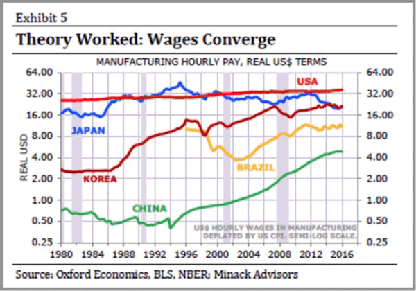
Some of this wage convergence is due to currency movements, of course. Note also that the chart has a semi-log scale. Each horizontal line is double the one below it.
The results are pretty obvious. Chinese workers’ pay grew more than 10x during this period. US factory workers saw much less wage growth. Making workers from all these countries compete with each other had the expected effect: their pay converged into a narrower range.
The result for American workers (once you consider taxes and inflation) is the flat line in the chart above.
Less education means less income
The pain is greater for those with less education, as we see below. Anything less than a bachelor’s degree means below-average wages.
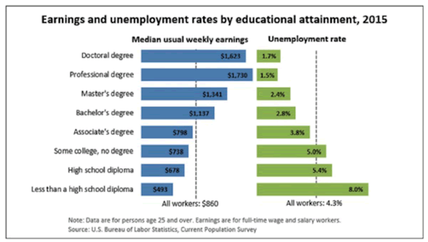
People in the lower tiers of this chart are struggling. Would getting them more education help? Maybe.
What would really help is getting them better jobs. But that isn’t happening, because those jobs no longer exist in the US.
Globalization has created divisions between skilled and unskilled workers. Too few of the gains from growing trade are going to the unprotected class. They’re angry. We’re seeing this backlash now in people’s attraction to Trump and Sanders, who promise to bring jobs back.
A Glimpse of the Future in Aug. 23 Q&A Session with John Mauldin
If you wonder what the future might hold for the US and global economies and stock markets, get answers in the free Q&A session “When the Future Becomes Today” with John Mauldin and his colleagues Patrick Watson and Robert Ross, on Aug. 23, 2:00 PM EDT. Click here to register for the call and to submit your questions.
John Mauldin Archive |
© 2005-2022 http://www.MarketOracle.co.uk - The Market Oracle is a FREE Daily Financial Markets Analysis & Forecasting online publication.