


Stock Market Post Bubble Contraction Finally Arrives
Stock-Markets / Stock Markets 2020 Mar 02, 2020 - 01:08 PM GMTBy: Plunger

I would like to put out a quick special report to update you on the big picture in light of all of the market turmoil and provide some of the concepts which may suggest where we are going from here.
First off I you were reading these reports in the late summer of 2018 I put out a 3-part series on the Post Bubble Contraction (PBC). Well the PBC has now arrived. Of course it was virtually impossible to predict when it would finally get triggered since it was the FED fueling the bubble for as long as they could. But it appears the bubble has finally been pricked by a black swan from left field.
The below concepts you have all heard from me before, but now we see them actually unfold, so let’s review them again.
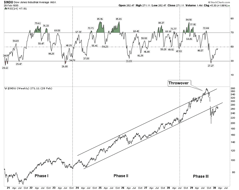
The Stock Market Top is in…But the Bear Market actually began on December 14th 2018.
December 14th, 2018, according to Dow Theory Methodology, was the date that a bear market sell signal was triggered, announcing that we were now in a bear market. This valid signal only occurs in Phase III of a bull market. Since then, despite the wild blow off top to new Dow highs the sell signal was never reversed and remained valid. To reverse the signal would require the transports going to new highs along with the Dow. Since this never occurred the signal remained in affect.
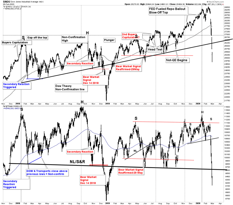
This has been a topping process where the FED again intervened aggressively into the market with their monetary bazooka after the Dow sell signal. The effect was to levitate the markets for over an additional year, but were not able to reverse the DT Sell signal.
A tenant of DT is that once a valid DT sell signal is triggered the bear market goes to completion. What that means is that the bear market progresses until the price level has fully discounted all of the ills in the economy. This is what is now occurring.
This entire process of the past 15-17 months reminds me of the call by Richard Russell back in 1966 that a bear had begun. The market then underwent 3 cyclical upswings (call them cyclical bull markets) before the final washout came in November 1974. He was doubted and ridiculed during the whole time, but ultimately his stance proved to be the correct call and saved his subscribers. Dear Investors, the market has been in a bear market since December 14th 2018, but FED intervention masked what was really going on under the surface, but Dow Theory ferreted it out.
Mr Charles Dow has spoken so where to now?
I challenge you to find a bull market where volume shrinks throughout the entire uptrend in price. I have only found two. The bull market of the past 11 years and the bull market from 1932-1937. Back in the 1930’s it was believed that the government was “spending us out of the depression”. Does this sound familiar to you? Yes, it’s what the FED and government have been doing now for 12 years. In other words it has been an artificially engineered bull market where artificially low rates allowed borrowing to fund stock buybacks. This boosted the market and lowered the share count, leading to lower volume.
With less liquidity in the market due to lower volume price gaps open up due to the vacuum that exists once the market begins to fall. We are now beginning to see this.
Note below the trend towards lower volume:
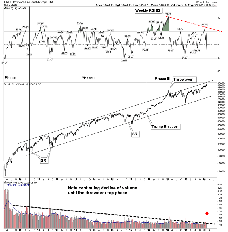
The throwover top in late 2017 recorded the highest RSI reading in 120 years of stock market history, (by far , by the way) Note the divergence which occurred with the recent price peak.
Now let’s look at that 1937 bull market and see how it compares and how it resolved itself:
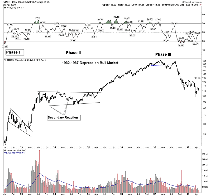
The volume is much more erratic, but the trend was down over time. The next chart zooms in on the bear market which followed:
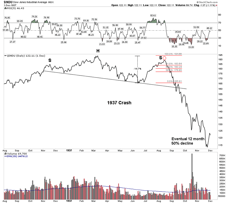
This was a relentless 50% decline in 12 months… let that sink in for a while.
As a matter of interest here is what the 1920’s looked like and the initial sell off in 1929. Could we be in for something like this?
I am now going to post some highlights from my PBC series from the summer of 2018. You can go back and review these as they were posted beginning in August 26, 2018.
I referred to the piece written by Dan Oliver
Oliver claims the contraction has now begun and it will be different than the WFC we saw in 2008. My view is it will appear like a mix of the 1997 Asian crisis, the 2000 dot-com bubble and the 2008 credit crisis all rolled into one. Yes, it will prove to be much worse than the 2008 WFC. Although the central banks of the world successfully reinflated the bubble, it will now be time to pay for it and the bill will be larger than 2008. Why will it be worse? Because the excesses are much larger and there is no longer a fire department to call since central bank tools are now exhausted.
A Contraction of Credit
We are now set-up for a classic world wide credit contraction. The bubble expansion of the past 10 years has been driven by the intervention of central banks injecting credit into the world. Recall that credit spending entails pulling future demand into the present. If the free cash flows from that capital investment are not positive then when the future arrives that debt cannot be serviced. That’s where the world sits right now. Once the crisis gets rolling I believe the core of it lies in China. For years they have been building ghost cities enabled by credit conjured from thin air. I will offer only one chart representing the growth which is the increase of domestic credit. Chartologists should quickly see that this is a parabola and we all know how parabolas resolve themselves. This chart should put one on high alert.
The chart was the Aussie Dollar which since then has gone straight down.
Regarding what we now see occurring in commodities:
Over a 40 year period we see the secular bear in commodities from 1980-2001, then we see the effects of the China build out from 2001-2011. Since then commodities have been deflating. In 2015 the currency broke a 15 year up-trend line and has been backtesting it until recently. These are slow glacial moves but It now appears to have begun an impulse wave down. It is resuming its downtrend in what may prove to be a half-way pattern. Conclusion: a contraction in commodities lies ahead.
Regarding the USD this was posted back in the time where it was popular to trash talk the USD
The USD
In a PBC money flows from the peripheral economies of the world back to the world’s financial centers. It principally flows towards the senior currency which of course is the USD. This is because it not only seeks safety and liquidity but it must service the debts originated in the financial center. These debts are denominated in US dollars so require the purchase of dollars for repayment. This is how foreign debts act as a synthetic short of the dollar. So when the USD declined for the entire year of 2017 it seemed a conundrum. The catcalls were heard daily that the USD was “toast” whenever the case was made for a stronger USD. It appears now that the 2017 decline was likely just a correction of its upside move during 2011-2016. The USD bull market, reflecting money flows towards it, now seems to have resumed.
The Long Bond as the best trade:
The Trade- Long the TLT
All of these market moves can be expressed in one single trade… go long the TLT. We are not futures traders, so this is the most simple vehicle to use to align ourselves with the PBC at this time. Later down the road other positions will present themselves, but for now the TLT is the #1 set-up.
Again the narrative is that rates are set to go higher which explains why there is a record short interest in the US 10 year bond which is betting rates are going higher. These trades are based off a lack of understanding of the PBC and how money will flow towards the US Government bond. Yes, I understand that cogent arguments can be made for a weaker bond due to the US governments massive financing needs. This is a reality, but world wide money flows will dwarf this argument once the ball gets rolling. Let’s take a look at what Mr. Market is signaling:
The below chart is a picture of the accepted Wall Street narrative. Interest rates are set to go higher or said differently the TLT is about ready to break down. We see the H&S building out right before our eyes. But as Joe Granville used to say “what is obvious is obviously wrong!”
These passages are just some of the highlights from this series which I posted. It outlined what was coming and gave actionable strategies that have correctly addressed how to position oneself for the upcoming PBC. Oh I didn’t get everything right such as positioning into uranium, but as you know investing is hard.
If one had just bought the long bond and waited for the PBC to begin he would be miles ahead of everyone and be in the drivers seat.
So where to now?
We are now in a liquidity event. I think everything goes down except maybe government bonds. Gold and silver stocks probably get hit further from here. Expect the stock market to go to shockingly lower levels in this first leg down…Perhaps S&P 2,000. But once this first leg down in the market is over the gold stocks resume their bull uptrend and the PBC dynamic begins to kick in.
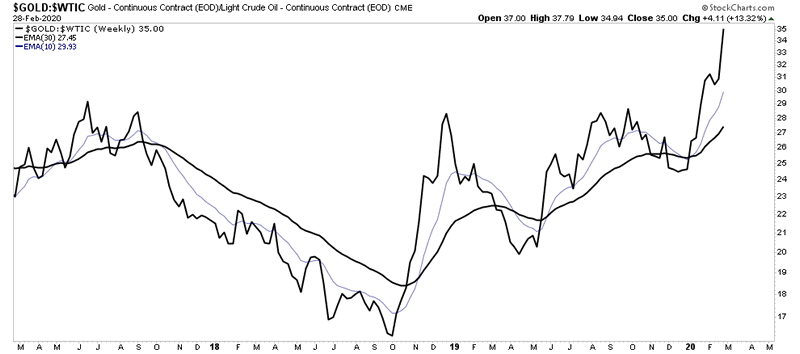
Below we see the Gold to Oil ratio. Oil is at least 30% of the input costs to mining extraction. So with costs going down and gold eventually going up the profits flow to the bottom line and fuel the bull market.
GDX the immediate horizon:
As mentioned, the gold stocks are caught in the market collapse and they are stocks after all so lower levels are likely. So here is my forecast:
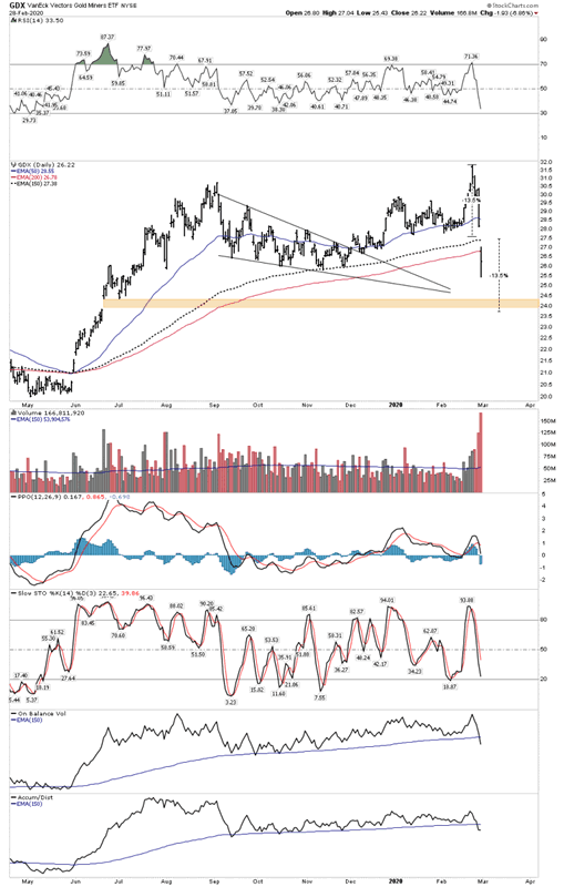
In the next leg down the GDX is likely to fill its tan colored open gap above 24. We can use the recent downside gap in the chart at the 200 EMA as a mid range point in the current down move. This measures to about where the unfilled gap is at the 24 level. Once this gap is filled around 24 that’s the all clear to pile back into the market and the positive part of the PBC begins.
Meanwhile stay out of the general stock market as Mr Bear is in town.
Good Luck
Plunger.
Editor’s Notes
1…Plungers Epic One of a Kind Analysis on the post Bubble Contraction is preserved on the sidebar ( scroll down) for those new members interested and for those who would like to review it.)
2…Plunger hangs out at the chartology forum and is holding court there if you have any questions
3…Who is Plunger ?
https://goldtadise.com/?p=435881
All the best
By Plunger
FREE TRIAL - http://rambus1.com/?page_id=10
© 2020 Copyright Rambus- All Rights Reserved
Disclaimer: The above is a matter of opinion provided for general information purposes only and is not intended as investment advice. Information and analysis above are derived from sources and utilising methods believed to be reliable, but we cannot accept responsibility for any losses you may incur as a result of this analysis. Individuals should consult with their personal financial advisors.
© 2005-2022 http://www.MarketOracle.co.uk - The Market Oracle is a FREE Daily Financial Markets Analysis & Forecasting online publication.