


Gold historically follows Inflation higher. Will it do so Again?
Commodities / Gold and Silver 2021 May 22, 2021 - 09:51 AM GMTBy: Richard_Mills

Precious metals are among the best places to park your money in times of economic or political distress.
Gold and silver offer stability during a period of extreme stock market volatility and low bond yields, and while they do not pay interest or dividends, they are not subject to inflation like paper currencies.
It is also, in my opinion, a smart strategy to allocate a portion of gold and silver to your investment portfolio, knowing that precious metals can be used as a “fail-safe” currency in the event of a total financial collapse.
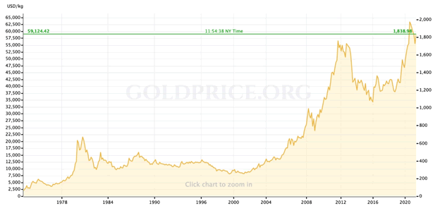
Historical gold price. Source: Goldprice.org
The evidence suggests that gold, the granddaddy of precious metals, is a popular choice of mainstream investors, both in terms of bars or coins, and gold jewelry.
According to the World Gold Council, gold is the third most consistently bought investment (46%), behind savings accounts (78%) and life insurance (56%).
The research also showed that two-thirds of retail investors believe that gold is a good safeguard against inflation and currency fluctuations, and 61% trust gold more than fiat (paper) currencies.
In a previous article we showed that the current environment of monetary stimulus, designed to boost borrowing and spending, and fiscal stimulus, in the form of trillions in government spending, combined with supply chain disruptions, has created the perfect conditions for inflation. The average person may not see it yet, but it’s here. The numbers don’t lie.
The data also shows that the US Federal Reserve is downplaying the inflation risk. This is important for investors to recognize as they seek to navigate what’s ahead for their investments and how to protect them.
Inflationary pressures building
Inflation can mean either an increase in the money supply or a rise in price levels. Loose monetary policy such as we see being practised by the US Federal Reserve currently, ie., money-printing to pay for pandemic-related spending, along with monthly asset purchases, thus creates a risk for inflation.
How do prices rise? An economy operating at near full employment (with healthy GDP growth say in the range of 0 to 5%) is known to cause two things to happen: aggregate demand for goods and services increases faster than their supply, causing prices to rise; and companies raise wages because of a tight labor market. These wage hikes are usually passed onto consumers in the form of higher prices.
Readers will recall that, in 2020, the US Federal Reserve dropped interest rates to near zero, after letting them rise, modestly, for the previous three years. The goal was to get higher inflation. Other central banks did the same.
Now, as economies slowly begin to recover from the pandemic, lockdowns are lifted, and vaccination programs accelerate, there is an opposite concern, of economies overheating.
The concern is well justified.
North Americans have likely been noticing their trips to the grocery store are getting more expensive.
The pandemic has put tremendous pressure on supply chains, and the prices of many agricultural commodities such as grain, corn and soybeans, have skyrocketed. This is due to a number of reasons including heavy demand from China, the world’s largest consumer of commodities whose economy grew at a blistering 18% in the first quarter, bad weather and drought
The Wall Street Journal reported on Wednesday that the US consumer price index (CPI) surged in April by 4.2%, the most in any 12-month period since 2008, as economic activity picked up but was constrained in some sectors by supply bottlenecks.
Among the costlier items, gasoline rose 50%, while the prices of used cars, representing a third of the CPI increase, climbed by 10%, the most on record; car and truck rentals shot up 82% and airline fares leapt 9.6%.
“The CPI data point feeds into a myopic narrative that the US is overheating and the Fed is one step away from tightening,” Bloomberg quoted Mike Bailey, director of research at FBB Capital Partners, a wealth management firm.
US stocks slumped this week after a report showed inflation rose more than forecast, stoking concerns that price pressures could stifle a recovery.
Producer prices surged the most on record in April, a year-on-year increase of 6.2%, beating expectations of 5.8%.
The US Federal Reserve has already said it will tolerate inflation above the normal 2% target, and let the economy run hotter before stepping in to cool it with rate hikes.
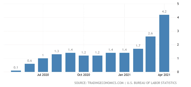
US inflation, 1 year
Commodities and inflation
Commodities are generally massive winners when it comes to inflationary periods.
Over the past year the entire commodities complex, everything from copper and steel to crude oil, cotton and soybeans, has climbed steadily; the Thomson Reuters/ Core Commodity (CRB) Index is up 70% since last May.
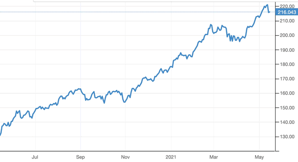
CRB Commodity Index, 1-year. Source: Trading Economics
Among the highlights are steel, meat, corn, soybeans, lumber, iron ore and copper.
Gold and inflation
Gold and silver are the best defensive commodities to own when the prices of goods and services start to become more dear. This is not only true intuitively (the yellow metal is the ultimate store of value, proven to have held its worth over time, unlike fiat currencies which are subject to inflationary pressures and over the years, lose their value) —
we can prove it in a chart.
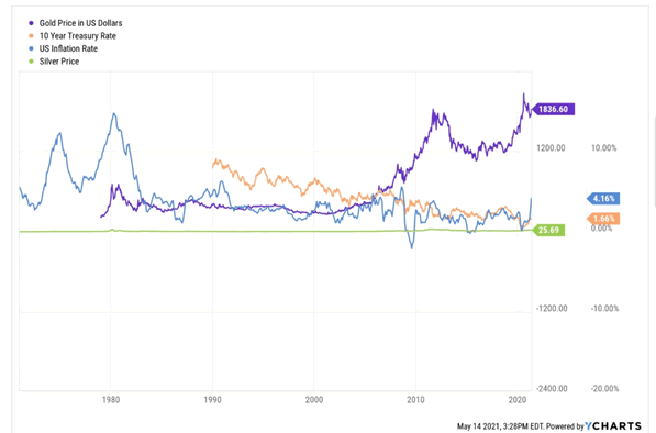
Source: YCharts
The chart above constructed using YCharts shows gold and silver prices since gold was taken off the gold standard (removed from its dollar peg) in 1971 (purple and green lines).
On the far left notice the two large peaks making an ‘M’ shape. This is when the US experienced historically high inflation of 11% in 1974 and 13.5% in 1980 (average CPI).
In 1980 the gold price reacted to inflation, hitting a then-record $850/oz, as shown by the purple line forming a double-peaked small ‘M’ directly under (happening at the same time as) the record-high 13.5% inflation of that year.
Nothing much happens until 2003, when gold started climbing amid the 2000s commodities boom, 9/11 and the wars in Iraq and Afghanistan. Within a decade bullion prices rose over 300%.
Remember when gold hit a new high of $1,800 in September of 2011? On our chart, this corresponds to low interest rates (see the US 10-year Treasury orange line falling since the mid-90s) and a relatively high 3.6% inflation that year.
The movement of the gold price, US 10-year Treasury yields and the rate of inflation between 2008 and 2014, can all be explained by quantitative easing.
In 2008 in response to the financial crisis, the US Federal Reserve began a new monetary policy to try and kickstart the economy which had entered a deep recession. The idea was to “create money” to capitalize the banks so they could lend individuals and businesses more money to get the economy moving again. At the same time, monthly purchases of government bonds and mortgage-backed securities were designed to increase demand for US Treasuries and push their yields down. The interest rate environment that resulted was meant to incentivize people to borrow and spend.
Financial experts thought that quantitative easing, or “QE” as it came to be known, would create massive inflation, but it didn’t. That’s because the money that was created/ printed didn’t find its way into the economy; it stayed within the banking system.
Back to the chart, notice that when QE started in 2008, the gold price began a steep upward climb, as inflation hit 3.8%, the highest since 1991. The following year though, inflation fell to -0.4%, and the gold price reacted, dropping about $200/oz.
Gold started climbing again in 2010, and we can see inflation echoing that movement by the two blue peaks, just to the right of when inflation falls below the green silver price line.
Remember gold’s dramatic slide in 2013? Over-priced bullion abruptly fell out of favor and continued to languish for the next seven years, apart from a brief run in 2016. During this period we saw inflation bottom out, as QE programs were wound down, and policymakers and investors around the world grew used to “lower for longer” interest rates.
Recently though, we’ve seen the return of quantitative easing, resulting in higher precious metals prices and the first signs of inflation. It’s early days for the latter, but we can already see it forming in the chart.
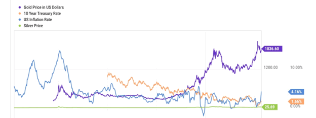
At the far right, notice the gold price started moving up in 2019, then really took off in 2020 with the onset of the cononavirus pandemic and all that entailed, ie., lockdowns, fear, the return of QE and massive pandemic relief spending. See the orange line, the US 10-year, plummet along with the inflation rate, as economic growth ground to a halt and central banks dropped rates to near 0%. Recall for awhile in 2020 the “real rates” (bond yield minus inflation) in several countries were negative.
Now we see rates rising, mostly due to inflation fears, shown by the orange line moving up at the far right to 1.66%, the gold price falling a bit from its 2020 record to the current $1,836, and inflation kicking up to 4.16%.
Bogus CPI
According to the chart, other than two huge peaks, one in the mid-‘70s and one in 1980, inflation has been tamed. But remember, this is the Consumer Price Index (CPI), and it can’t be trusted.
Common sense tells us the CPI is not an adequate measure of inflation because it doesn’t measure price increases, rather it tracks a range of consumer spending. Say what?
Every month the bean-counters at the Bureau of Labor Statistics (BLS) track about 800 consumer products that become its monthly Market Basket of Goods. This data is then plugged into a formula along with other factors including census information and consumer spending patterns.
As a Forbes column on the topic of understanding “the real rate of inflation” remarks, the CPI doesn’t measure changes in consumer prices, rather it measures the cost-of-living. Further, the government makes the assumption that consumer spending habits change as economic conditions change, including rising prices. So if prices rise and consumers substitute products, the CPI formula could hold a bias that doesn’t report rising prices. Not a very accurate way to measure inflation.
The CPI doesn’t even meet the BLS’s own definition of inflation, which is “as a process of continuously rising prices or equivalently, of a continuously falling value of money.”
If it did, the CPI would account for M2 money supply, a measure of monetary inflation that counts up the economy’s supply of dollars. M2 includes cash, bank deposits, and money market funds. The more money that is created, the less valuable it becomes. But currency depreciation isn’t reflected in the government’s official inflation rate, the CPI, even though the Fed is “printing money” through quantitative easing, currently in the amount of $120 billion in asset purchases (mainly government bonds) per month.
As shown below, M2 money supply rose sharply over the past year, as the Fed’s balance sheet nearly doubled from just over $4 trillion before the pandemic to the current $7.8T.
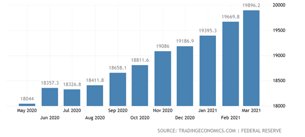
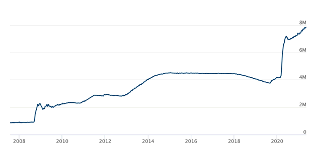
Federal Reserve balance sheet. Source: US Federal Reserve
There are other shortcomings of the CPI inflation index.
The first thing to notice is the pace of current inflation. Over a three-month period between February and April, the CPI jumped by 1.7%, or 7% on an annual basis, according to the Bureau of Labor Statistics. So while the monthly increase is the figure usually quoted, ie., 0.8% in April from March, the actual annual inflation rate is 7%!
Next we need to consider the purchasing power of the consumer dollar — something else that is also not reflected in the CPI. This metric, calculated by the BLS as an average across US cities, has fallen from 47.6 in December 2008 to the current 37.4. Over the last 10 years the dollar’s purchasing power for consumers has slumped 15.1% and since 1913 has plummeted a shocking 96.3%! Notice the blip in 2008-09, when the financial crisis dropped inflation to zero, allowing for a temporary gain in the consumer dollar’s purchasing power.
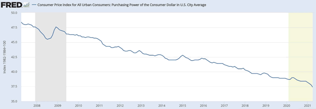
Source: US Bureau of Labor Statistics
Now we must unpack, as Wolf Street does in a recent column, what is actually being measured in the CPI, versus what is being left out. Doing so makes the current rate of inflation much higher than is being reported.
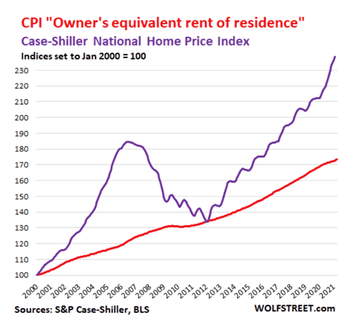
The most egregious example is the housing component. Housing costs including rent and home ownership account for one-third of the CPI, so how this is calculated is important.
In the current CPI, the rent component and the home ownership component both ticked up by 0.2% from March to April, or 2.4% annualized. But as Wolf Richter explains, this is based on surveys of homeowners’ estimates of how much their home might rent for. It is essentially a measure of rent, as seen by the homeowner.
Huh? If we want to know how much housing costs are really going up, we need to look at something called the Case-Shiller National Home Price Index. Graphing the CPI “Owner’s equivalent rent of residence” against the Case-Schiller National Home Price Index as Richter does below, shows that housing prices year over year in April actually soared by 12%!
Put another way: annual home ownership inflation is not 2.4%, but 12%.
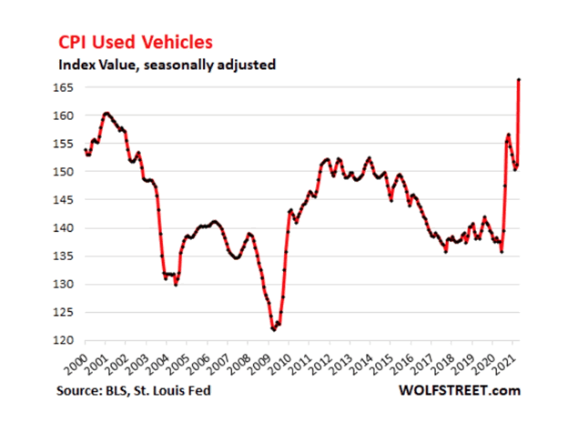
Finally we need to talk about “hedonic quality adjustments”. For durable goods like fridges, televisions and cars, hedonic quality adjustments in the CPI remove price increases due to improved technology. The idea is that inflation measures the cost of the same item over time; when new technology is added, it is not considered inflation because you get more as you pay more.
In an earlier article we noted that used car prices rose 10% in April, the most on record. Hedonic quality adjustments though are applied heavily to used cars, as Richter’s chart below showing CPI Used Vehicles demonstrates:
[A]s you can see from the astonishing fact that the index in 2020 was below where it had been 20 years earlier, even though actual prices of used vehicles have soared over those 20 years. It took this massive spike in April to put the index above where it had been in the year 2000.
Conclusion
Having skewered the CPI for everything it’s worth, you may be wondering the value of our earlier analysis comparing precious metals prices and bond prices (using the 10-year Treasury note as a proxy) to the Consumer Price Index.
The truth is we need to take the CPI with a liberally sprinkled grain of salt. There are just too many shortcomings for it to be an accurate measure of inflation. We can get a better idea by looking at things like housing, food and fuel separately. When we do so, we see that all are going up at a much greater clip than the CPI would seem to indicate.
From our chart, we can definitely say that the gold price reacts to inflation. It did so in 1974 and in 1980 when US inflation reached double digits (it’s of no use to compare gold/ inflation before these dates – gold was pegged to the US$), and it’s doing so again, now that inflation is upon us and accelerating. Consider: in April 2020 the CPI was 0.1%, last month it was 4.2%, a 420% increase!
In fact, inflation is a lot higher than that, given CPI’s shortcomings. We believe gold’s recent rebound is due to Fed money-printing/ quantifornication – as I like to call it – and is a reaction to the inflation that people are seeing every day, not the official statistics.
We also believe it will keep rising, as long as inflation runs hotter, as we expect it will, and is not transitory, like the false narrative being peddled by the Fed.
By Richard (Rick) Mills
If you're interested in learning more about the junior resource and bio-med sectors please come and visit us at www.aheadoftheherd.com Site membership is free. No credit card or personal information is asked for.
Richard is host of Aheadoftheherd.com and invests in the junior resource sector. His articles have been published on over 400 websites, including: Wall Street Journal, Market Oracle, USAToday, National Post, Stockhouse, Lewrockwell, Pinnacledigest, Uranium Miner, Beforeitsnews, SeekingAlpha, MontrealGazette, Casey Research, 24hgold, Vancouver Sun, CBSnews, SilverBearCafe, Infomine, Huffington Post, Mineweb, 321Gold, Kitco, Gold-Eagle, The Gold/Energy Reports, Calgary Herald, Resource Investor, Mining.com, Forbes, FNArena, Uraniumseek, Financial Sense, Goldseek, Dallasnews, Vantagewire, Resourceclips and the Association of Mining Analysts.
Copyright © 2021 Richard (Rick) Mills - All Rights Reserved
Legal Notice / Disclaimer: This document is not and should not be construed as an offer to sell or the solicitation of an offer to purchase or subscribe for any investment. Richard Mills has based this document on information obtained from sources he believes to be reliable but which has not been independently verified; Richard Mills makes no guarantee, representation or warranty and accepts no responsibility or liability as to its accuracy or completeness. Expressions of opinion are those of Richard Mills only and are subject to change without notice. Richard Mills assumes no warranty, liability or guarantee for the current relevance, correctness or completeness of any information provided within this Report and will not be held liable for the consequence of reliance upon any opinion or statement contained herein or any omission. Furthermore, I, Richard Mills, assume no liability for any direct or indirect loss or damage or, in particular, for lost profit, which you may incur as a result of the use and existence of the information provided within this Report.
© 2005-2022 http://www.MarketOracle.co.uk - The Market Oracle is a FREE Daily Financial Markets Analysis & Forecasting online publication.