


Gold, The Most Important Chart You Will See!
Commodities / Gold & Silver 2009 Sep 23, 2009 - 03:09 PM GMTBy: Peter_Degraaf

 A chart is like a photograph. It locks in ‘the activity’ right up to the last moment. A chart is a reflection of the actions of multiple humans interacting in the marketplace. Since humans tend to act in ‘herd-like’ manner, reacting to the news they hear, read and see, a chart has a certain amount of predictive energy while it reflects the past.
Although technical analysis based on charts should not be used in isolation, but always in conjunction with fundamentals, a chart is nevertheless a valuable tool as it conveys recent history, and since history repeats, it can provide clues for the future.
In the words of wise king Solomon: “That which has been is what will be, that which is done is what will be done, and there is nothing new under the sun.” Ecl. 1:9
The first chart in this essay compares the price of gold to the price of the 30 year bond, (often referred to as the ‘long bond)’. People who buy long bonds are not worried about price inflation. They are laboring under the influence of the ‘deflationists’. They see prices falling in sectors like the housing market and extrapolate that trend into other sectors, while forgetting that the reason prices in the housing sector are falling is because they had risen too high, due to the ‘easy money’ policy of the US Federal Reserve under Mr. Greenspan. Prices in the food and energy sectors are not falling. They are at best holding steady. Deflationists expect falling prices everywhere. If they were right, then this next chart would not be the most important chart you’ll see all day!
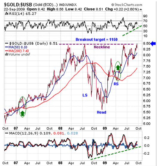
Featured is the index that compares the performance of gold to the performance of the long bond price. For the past two years there has been a struggle between two trends: Gold versus Bonds - Inflation versus Deflation.
The chart pattern is a bullish ‘reverse Head and Shoulders’ pattern. A breakout at the blue arrow sets up a target at 1150. This breakout may not happen today, but it could, and it appears ready to do so soon!
On September 22nd price closed at 8.51. This was the highest closing price since the gold bull market began in 2001. The RSI and MACD (supporting indicators) are positive (green lines). The 50DMA is in positive alignment to the 200DMA (green arrows). The last time the ‘50’ rose above the ‘200’ was in early 2007. The index subsequently rose for a whole year, from 5.75 to 8.50.
The implications of a bullish trend in the above chart are positive for gold on two levels. Fundamentally it causes investors to sell their bonds to buy gold, and technically, as the trend in this chart rises, so does the trend in the price of gold itself – see next chart and compare.
“Historically, bonds have always turned out to be ‘certificates of guaranteed confiscation’.” - Ludwig von Mises.
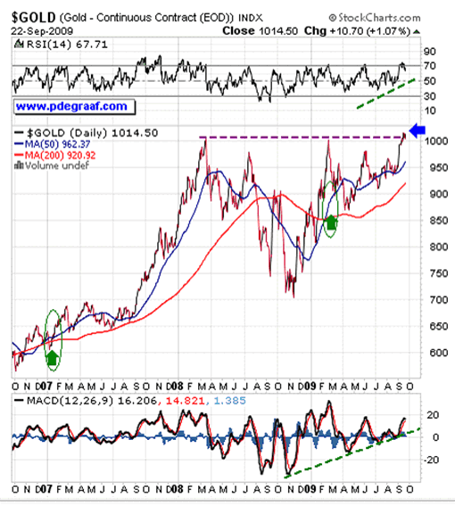
Featured is the gold price chart that covers the same time span as the first chart we examined. Notice the similarities. Notice a price that is ‘itching’ to break out at the blue arrow. The gold price has now closed at or above the magic ‘1000’ level for the past eight trading days. The supporting indicators are positive. The 50DMA is in positive alignment to the 200DMA and both are rising strongly! The last time the ‘50’ turned positive to the ‘200’ was in early 2007. Gold subsequently rose up from 600 to 1025. The likelihood of an upside breakout in the first chart (the most important chart you’ll see today) is very real. Once it breaks out above the blue arrow, the target is 1150. This translates into a gold price of $1,500.00! The expected date for that target, once the breakout occurs, is 12 – 13 months hence - October-November 2010.
“History does not always repeat – but it often rhymes.” - Mark Twain.
Here are some fundamental reasons why this target is realistic:
- Once the $1,000.00 level for gold in US dollars is history, there are no more barriers to the price.
- The massive currency degradation occurring on a worldwide scale is unprecedented in history.
- Central banks that formerly ‘capped’ the gold price by dumping gold have stopped selling, and some have turned to buying: The Russian Central Bank is reported to have purchased 300,000 ounces in August. The Chinese Central Bank has expressed an interest in buying the entire 403 tonnes of IMF gold that is up for sale. The Chinese bankers have indicated that they will buy gold ‘during any dips in price.’ Much of the gold on the books of some Central Banks has been leased out. It no longer exists except on the books at those banks. The gold at Fort Knox has not been audited since 1953! The threat of IMF gold coming on-stream caused barely a ripple in the gold price last week!
- The Chinese government is encouraging its citizens to buy gold. This is a total reversal of the policy that formerly forbade its citizens to own gold. This policy is extremely bullish for gold, as an increasing number of Chinese banks and coin stores will be stocking up in order to have inventory. This inventory takes supply away from the market since it is replaced as soon as it is sold to retail customers.
- The Chinese government is expressing its dissatisfaction with the US administration for causing the US dollar to drop due to the loose US monetary policy, and for imposing a 25% tariff on Chinese tires. This anger on the part of Chinese officials will translate into increased dumping of US Treasury bills and bonds and converting the proceeds into ‘real stuff’, such as gold and commodities.
- The huge ‘net short’ position accumulated by the commercial traders and the 2 or 3 US bullion banks will have to be covered. The vast majority of these contracts are now showing a loss and margin calls are mounting.
- Once the gold price is firmly established above the 1000 level, the hedge funds that own most of the ‘net long’ positions on the Comex will likely add to their positions, using some of the margin money they have accumulated on the way up. This will put further pressure on the 2 – 3 bullion banks to ‘cut bait.’ At the moment the hedge funds have these banks over a barrel.
- More and more investors are becoming aware of the fact that the GLD and SLV gold and silver ETFs probably do not have as much gold and silver backing them as they should have. There are no regular independent audits conducted on these two ETFs. The next chart in this essay supports this observation. This will cause investors to abandon those ETFs and opt for physical gold.
- Monetary inflation continues worldwide at double digit levels. Meanwhile the gold supply is limited to an annual increase of about 1.5%. ‘More money chasing fewer goods’ invariably causes those goods to rise in price.
- Gold mines are a ‘depleting assets’. Each mine has a predictable mine life. Unless new deposits are found, every gold mine eventually faces extinction. According to mining experts, new deposits are not keeping up with the current rates of mine depletion. Production in South Africa has been steadily declining. Environmental concerns in many countries make the production of a gold mine expensive and very time consuming.
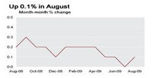 Featured is the Consumer Price Index chart courtesy Federal Reserve Bank of Cleveland. No deflation here! The chart shows an up-tick in price inflation during the month of August. Economist John Williams at Shadowstats.com shows price inflation numbers even higher than this. This is one more factor in support of higher gold prices.
Featured is the chart that compares the performance of CEF, the Central Fund of Canada, to the performance of the GLD gold ETF, since the credit crisis of last year.
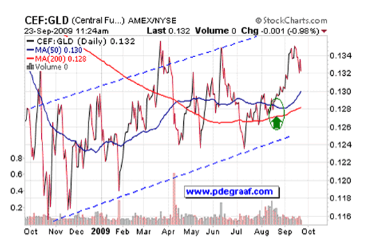
The rising channel and the positive alignment of the 50DMA above the 200DMA clearly show CEF to be a superior investment. (Part of the reason why CEF is outperforming GLD is the fact that CEF is 50% gold and 50% silver). The main reason however is the fact that CEF conducts independent audits twice a year and has a 30+ year history of good management.
You are invited to visit our website www.pdegraaf.com where you will find a number of free features, including: The Stock Pick of the Week; My Expectations of the Future; Worthwhile Quotations, along with an archive of previous articles.
Happy trading!
By Peter Degraaf
Peter Degraaf is an on-line stock trader with over 50 years of investing experience. He issues a weekend report on the markets for his many subscribers. For a sample issue send him an E-mail at itiswell@cogeco.net , or visit his website at www.pdegraaf.com where you will find many long-term charts, as well as an interesting collection of Worthwhile Quotes that make for fascinating reading.
DISCLAIMER: Please do your own due diligence. I am NOT responsible for your trading decisions.
Peter Degraaf Archive |
© 2005-2022 http://www.MarketOracle.co.uk - The Market Oracle is a FREE Daily Financial Markets Analysis & Forecasting online publication.