


An Historical Look at Gold and Silver Stocks
Commodities / Gold and Silver Stocks 2014 Feb 24, 2014 - 12:44 PM GMT

 In this Report would like to show you some very long term charts for some of the precious metals stocks that shows us where we’re at in the big picture. For me it’s important to know where a stock has been so I can have and idea if it’s close to a previous low or high or is it just trading in the middle of no mans land. It just provides perspective that one can use as they can then start to reduce the time lines down to the daily and even hourly charts to help make a decision on where to buy or sell a stock.
When you view these precious metals stocks you will see a lot of potential looking double bottoms that have formed from the June and December lows of last year. Keep in mind in order for these possible double bottoms to complete the price action has to trade above their double bottom humps to complete their bottom reversal patterns. Also look at the RSI at the top of the charts for a positive divergence in many cases. At the bottom of the charts you will see the MACD and the Histogram along with the slow stochastic. Again, on many of the precious metals stocks you will see the MACD getting ready to crossover which will give a buy signal with the blue Histogram, which is approaching the zero line, also helping confirm the buy signal.
So far the move off of the possible double bottoms doesn’t look very impressive yet as these are some very long term charts but you can see the potential is there if these precious metals stocks can continue to rally. With that said lets look at some precious metals stocks and see how the present time frame fits into the longer term look.
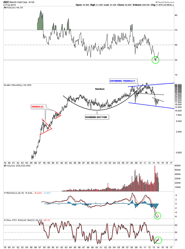
Lets start with a chart for ABX that shows the complete history of this stock. You can see the big H&S top that was put in over the last several years and the decline that took place last year. It’s trying to put in a bottom that is actually a little bit lower than the 2008 crash low. If this current bottom can hold then the first real area for resistance will be the big neckline. Note how close the Histogram is to the zero line and the MACD has just given a buy signal with the black line just now crossing over the red line. Keep in mind this is a very long term chart and these kind of buy signals don’t come around very often.
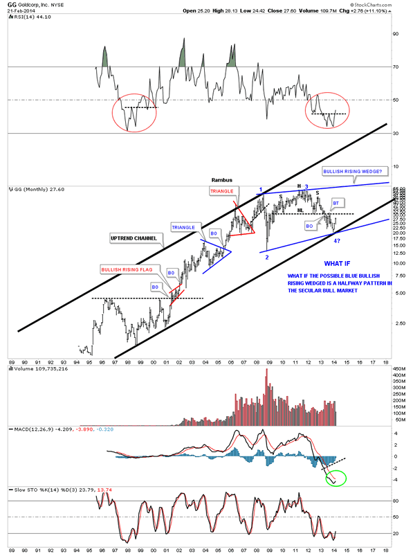
GG was probably been one of the stronger big cap precious metals stocks during the 2013 decline as the current price action is trading well above the 2008 crash low unlike so many others in this sector. The first real test of strength will be when GG tests the big neckline just above. This is only speculation at this time, as the move off of reversal point #4 is just beginning, but I’ve added a “WHAT IF” comment that GG could be forming a consolidation pattern going back to 2008 high just before the crash. As you know I always look for at least four reversal points in a consolidation pattern before it’s complete. What if this is the fourth reversal point being put in place right now that is part of a five year consolidation pattern?
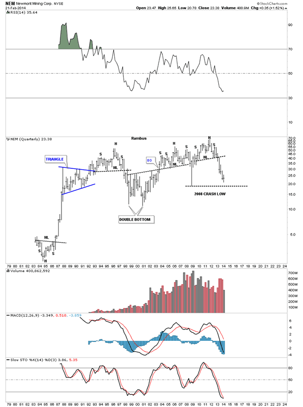
NEM on the other hand is not showing us anything to get excited about. You can see the MACD is still falling along with the Histogram. The price action shows no signs of a bottoming pattern. The only thing positive about this stock is that it’s still trading above its 2008 crash low. NEM is a good producer of some very nice H&S tops which is important when the precious metals complex is topping out. We can always count on NEM to show us a top.
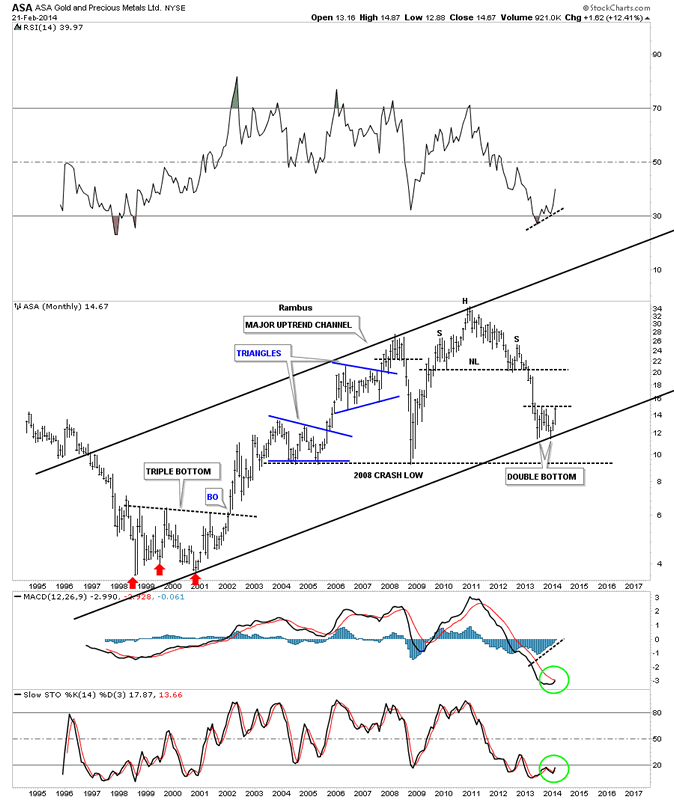
Lets take a look at the history of ASA that has been forming a possible double bottom on the the bottom rail of its uptrend channel. As you can see it’s at a critical juncture right here as the price action is trading right up to the possible double bottom hump. If ASA can break above that DB hump that area should offer support on a backtest. The big H&S neckline is going to be the first real area of resistance if ASA puts in a double bottom. It’s all about taking it one step at a time. There is a nice positive divergence on the RSI at the top of the chart. The MACD just had a positive cross with the Histogram just shy of the zero line.
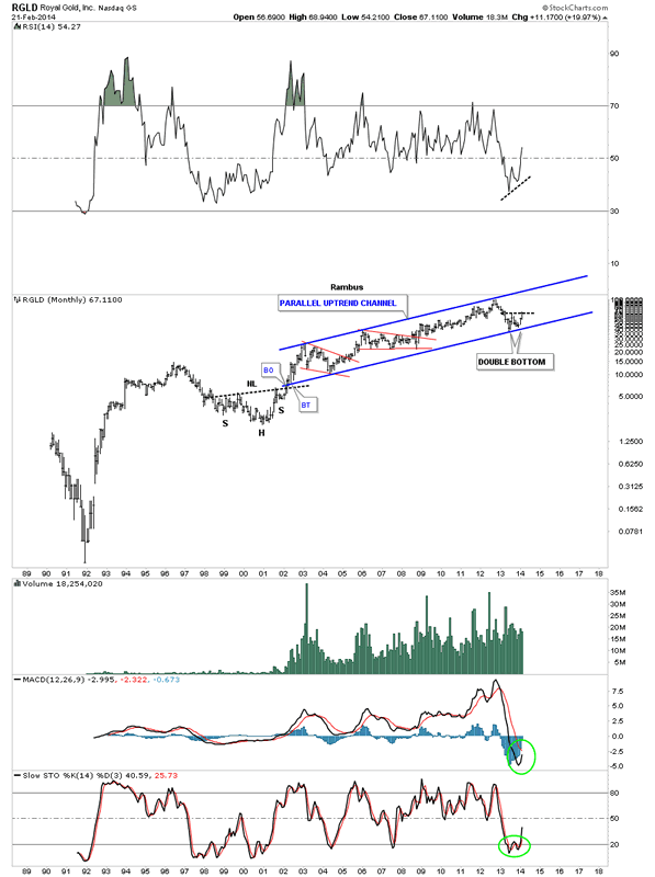
Lets look at several Royalty stocks as they usually are the strongest in the precious metals sector. RGLD has been trading in a parallel uptrend channel for most of its bull market. As you can see it’s forming a possible double bottom on the bottom rail of the parallel uptrend channel. The 2008 crash low is hardly visible on this long term historical chart of RGLD. This could be one to watch that shows us the way higher. The MACD and Histogram still have some work to do but there is a positive divergence on the RSI indicator at the top of the chart.
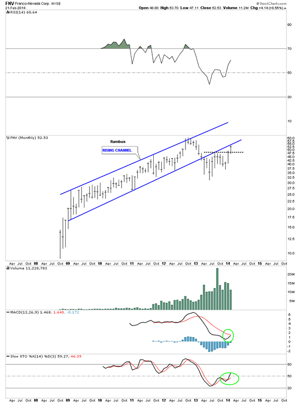
FNV is another Royalty company that looks very similar to RGLD. As you can see it’s still trading below the bottom rail of its uptrend channel. What really needs to happen is for FNV to tade back inside the rising channel to negate the breakout. On a positive note it has made a higher high and a higher low which is technically an uptrend. The MACD and Histogram still have a little more work to do before they can offer a buy signal.
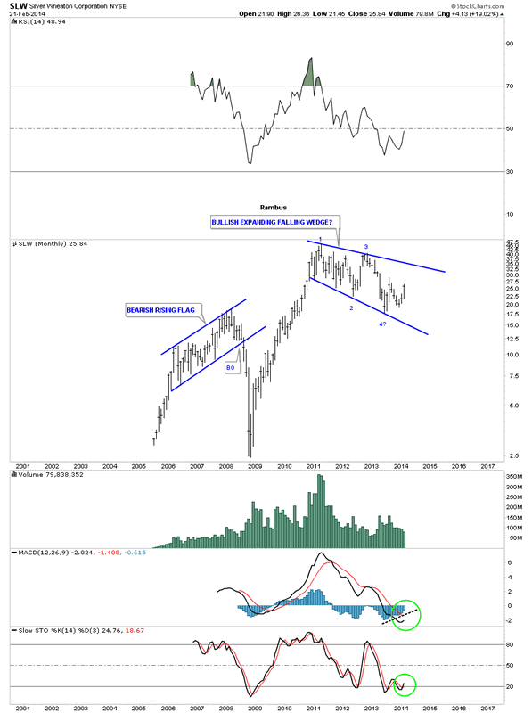
SLW hasn’t been around for very long but this stock can really move once it gets going. It could be forming a bullish expanding falling wedge if it can ever trade above the top blue rail. The 2011 high shows up on a lot of the precious metals stocks that suggest that if the PM complex is still in a secular bull market then many of these types of consolidation patterns will be formed at the halfway point. Time will tell. It always does.
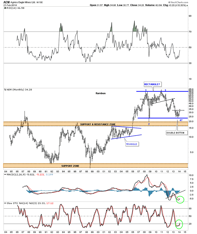
This next chart shows the total history of AEM which is quite interesting. I clearly remember this stock being one of the first PM stocks to start its bear market. Note the brown shaded support and resistance zone in the middle of the chart that held resistance until AEM finally broke through in 2005. Notice how this S&R zone has reversed its role and has held support ever since. As you can see it was tested from the topside once in 2008 and again just recently. Here you can see a possible big blue rectangle that maybe forming with this latest bottom being the 4th reversal point. The MACD has just had a positive cross with the Histogram well above the zero line.
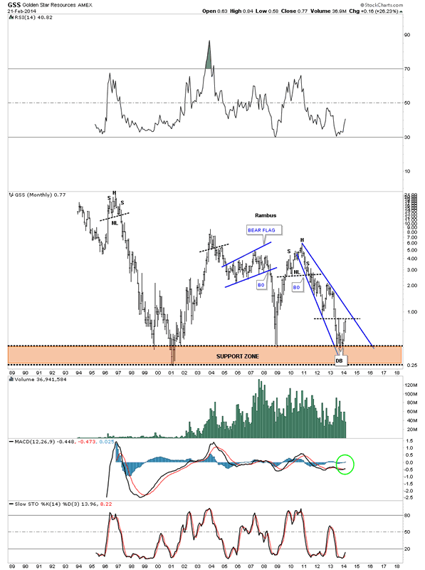
GSS has had several good moves during its lifespan but has always given back the gains. As you can see it has just bounced off the brown shaded support zone which has launched several good rallies in the past. It’s currently testing the possible double bottom hump that it needs to break above to confirm a double bottom is in place. The MACD has just had a positive cross and the Histogarm is above the zero line.
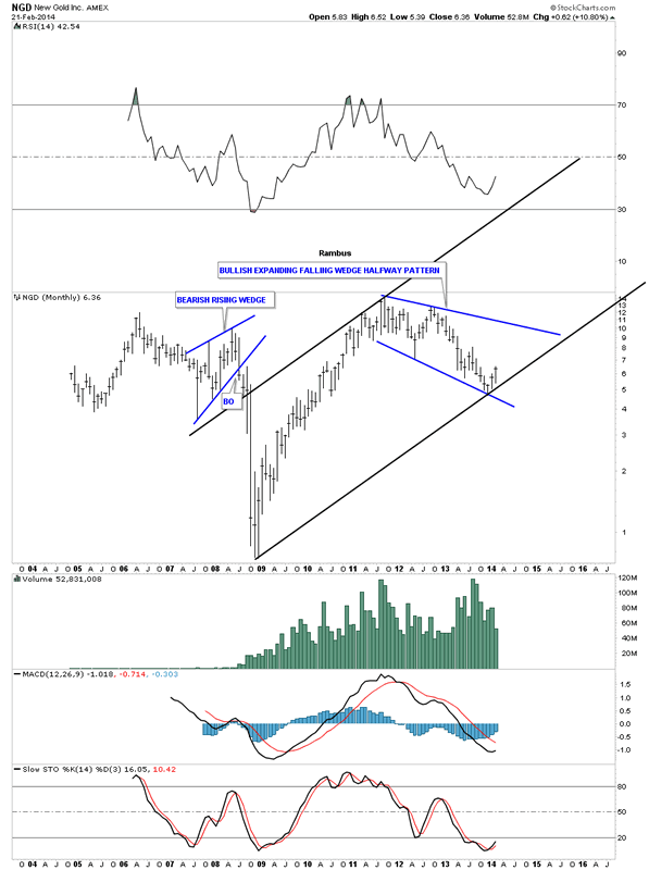
NGD hasn’t been around very long but it really had a good rally off of the 2008 crash low. This stock shows another example of a possible bullish expanding falling wedge that began at the 2011 high. As I stated earlier, if we’re still in a secular bull market for the precious metals complex, I would view the blue expanding falling wedge as a halfway pattern to the upside.
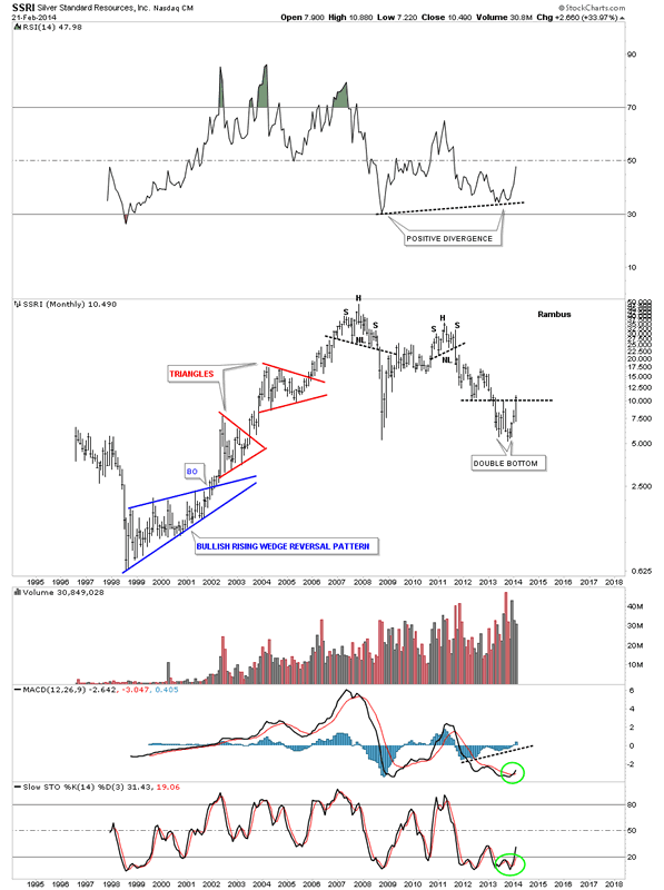
These last two precious metals stocks were the first ones on my radar screen that suggested a bottom maybe forthcoming in this sector. SSRI is now starting to trade above the double bottom hump which is a big deal. As this was one of the first PM stocks to bottom I expect it to show the way higher. SSRI was one of the first PM stocks to cross on the MACD. The Histogram is also trading above the zero line. On the long term charts this is what you want to see happen.
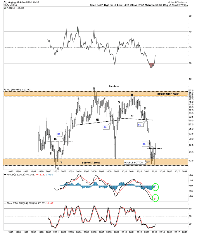
AU is the other PM stock that caught my attention early on as one of the leaders coming out of the bottom. Notice the brown shaded support zone at the bottom of the chart that has led to several very strong rallies. Also notice the clean breakout above its double bottom hump which now should offer support on any retest. The MACD has a positive cross and the Histogram is above the zero line.
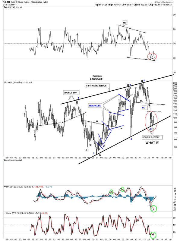
I would like to show you one last chart which is for the XAU that I’ve shown you before. The XAU, which has the longest history for the precious metals stocks indexes, is also building out a possible double bottom which would be the 6th reversal point . Note, the little spike below the bottom rail of the rising wedge, at reversal point #6, which now looks like a bear trap.
There are many more precious metals stocks that are showing more positive chart patterns in the junior’s sector. The juniors have really been leading the way higher with some of them making some pretty impressive moves so far. There are a lot of positive things going on in the precious metals sector right now that is very encouraging. There is still a lot of work to be done before we can definitely say the worst is behind us but so far in 2014 things are looking much brighter than the dismal year of 2013 for most of the precious metals stock investors. A reversal has to begin somewhere and this area looks like as good a place as any in which to begin a new leg up. So until something changes some of these charts above, to the negative side, we have to give this new trend a chance to show itself and see what happens. All the best…Rambus
All the best
Gary (for Rambus Chartology)
FREE TRIAL - http://rambus1.com/?page_id=10
© 2013 Copyright Rambus- All Rights Reserved
Disclaimer: The above is a matter of opinion provided for general information purposes only and is not intended as investment advice. Information and analysis above are derived from sources and utilising methods believed to be reliable, but we cannot accept responsibility for any losses you may incur as a result of this analysis. Individuals should consult with their personal financial advisors.
© 2005-2022 http://www.MarketOracle.co.uk - The Market Oracle is a FREE Daily Financial Markets Analysis & Forecasting online publication.